How Miller and Smith Used Crazy Egg to Create an Actionable Plan to Improve Website Usability

"Crazy Egg made my job easier. It provided easy access to the right data, and allowed me to see what was going on and understand it instantly."
Erica Bell
Marketing Manager, Miller and Smith

decrease in bounce
rate
increase in goal
conversion
-
Heatmaps and session recordings
-
On-site visual user behavior analytics
-
Easy-to-use analytics platform
Make your website better. Instantly.
Challenges
Understanding website user behavior
When Erica Bell joined Miller and Smith as their new marketing manager in 2019, the company was in the process of redesigning their website. The new version was sleeker and much more visually-appealing, she found.
But when Erica wanted to learn more about on-site user behavior, she found that the Google Analytics in place didn’t give her enough information. She needed more detailed insights to see where users were coming from and how Miller and Smith’s marketing efforts were performing. She wanted to make sure the website was user-friendly, in addition to being visually appealing.
"The main thing we needed was help understanding our audience. We had a pretty website, but we needed more information to see how our visitors were interacting with each page of the site."
Solution
Fast, detailed feedback on user interactions with their website
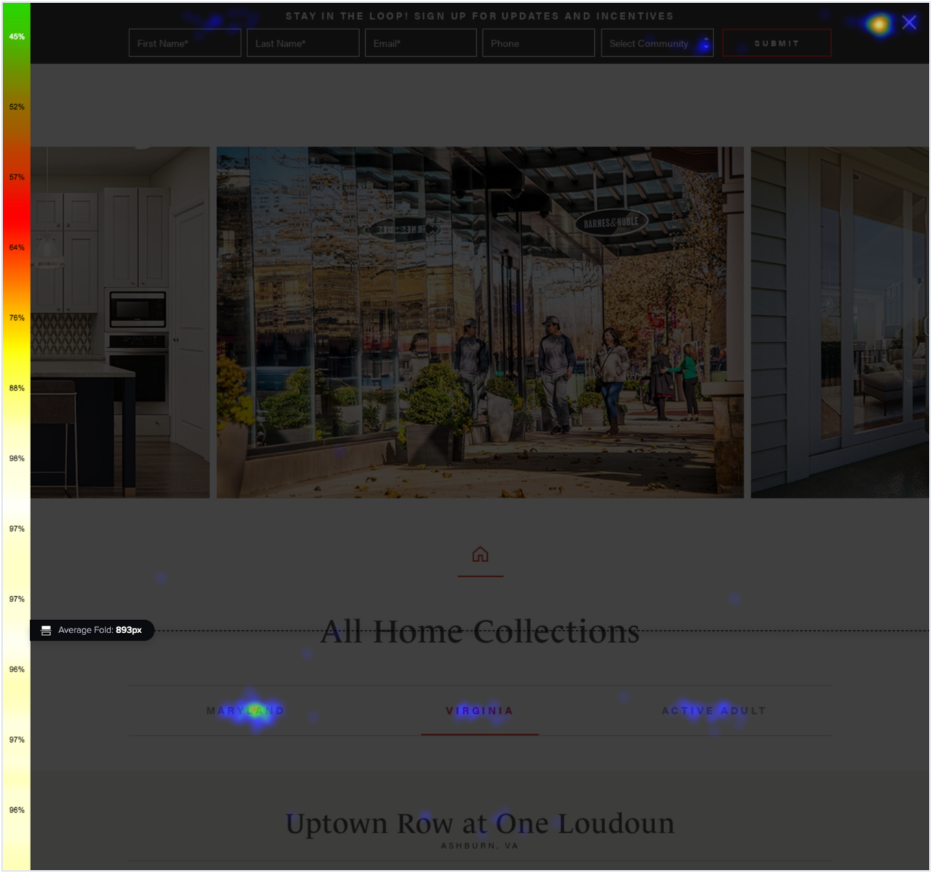
Erica installed Crazy Egg to get visual insights into website user behavior. Within just a few weeks, she had lots of data to work with: the session recordings helped her understand how users were navigating the site, and the heatmaps feature allowed her to see where users were clicking—and what they were skipping.
Now that she could see how users were behaving, she realized that:
-
Visitors were scrolling right past beautiful photos at the top of the community page and skipping down to the floor plan at the bottom
-
Visitors kept returning to the menu, trying to find the layouts of the communities Miller and Smith was building
-
Visitors were clicking on unlinked text throughout the site, looking for more information
-
Some visitors spent most of their time on the site browsing through image galleries
-
Visitors were interacting with one of the website’s SEO pages much more than she had anticipated
Seeing these patterns with her own eyes helped her understand where Miller and Smith could improve their website’s usability. Now, she just needed to create a plan to address it.
"Crazy Egg made my job easier. It provided easy access to the right data, and allowed me to see what was going on and understand it instantly."
Results
Improvements to their website’s usability that lead to lower bounce rates and higher goal conversion
Erica used the insights that she got from Crazy Egg to create a plan to make Miller and Smith’s website more user-friendly.

The changes she proposed were:
-
Removing the photos from the community page, so the information customers want is right at the top
-
Adding a thumbnail of the community layout so visitors could find it more easily
-
Adding links to relevant pages in places where visitors were trying to click
-
Adding captions to the images in the galleries, so visitors would know which communities they are from
-
Improving the content on the often-visited SEO page, and adding links to other parts of the website
Thanks to Crazy Egg’s detailed reports, convincing the whole Miller and Smith team to make the changes was easy, Erica says. She could show them exactly how visitors were using the website, and why these changes would improve their experience.
Once she had the green light, she made the changes with her team. The plan paid off, and she saw results within just a few weeks: the bounce rate improved by 7.5%, and goal conversion increased 8.5%, compared to a similar period the previous year.
"Having those visuals and being able to see parts of the recordings, and the heatmaps, made it very easy for me to explain the issues, and for the whole team to understand them. It made the whole process very fast."
More Case Studies
-

Case Study
How WallMonkeys increased their conversion rate by 550% using Crazy Egg's heatmaps and A/B testing tools
-

Case Study
How Crazy Egg’s heatmaps and scrollmaps allow Radio Free Europe/Radio Liberty to optimize the 100+ sites that they run across the globe
Read story -
Case Study
How Crazy Egg Helped Happy Trail Save Over $90,000 in Sales Over Four Months
Read story


