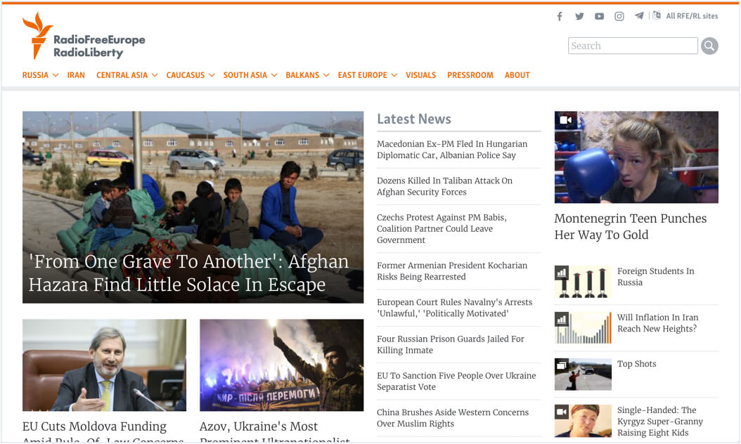
How Radio Free Europe/Radio Liberty optimize the 100+ sites that they run across the globe

"[Crazy Egg] became an essential element of our qualitative performance evaluation. The teams that pay attention to the maps get their pages improved dramatically."
Arkady Pildes
Radio Free Europe

Make your website better. Instantly.
For over four decades, Radio Free Europe/Radio Liberty has given journalists a safe haven to report the news in 20 countries where the free press is banned by the government, or not fully established.
With such a critical mission on their hands, attracting a strong readership and constantly improving the way content is surfaced to readers is of key importance to this nonprofit organization.
In the world of website design, it’s common to make assumptions about where content should be placed or how it will be consumed by visitors.

Senior Product Manager Arkady Pildes says, “Working with news we assume that the most recent and the most important (from the editorial point of view) content should be consumed the most. On the home pages, we expect a proportional gradient on the scroll maps, hotter click spots on the top stories, etc. On the content pages, we also expect the clicks on media content and as light as possible article scroll maps.”
However, these expectations are not always accurate, and the RFE/RL product team has made several important discoveries over time. In some cases, articles believed to be the most popular have not been — due to positioning on the site, or the content itself.
Below, Arkady shares how Crazy Egg’s heat maps and scroll maps shed light on the user experience, allowing Radio Free Europe/Radio Liberty to optimize the 100+ sites that they run across the globe:
Homepage Design
“We use the maps to find the best content presentation pattern on the home pages. Usually, we do an analysis, make small changes, evaluate again, and continue until we reach the desired level of user interactivity.”
Website Navigation
“We use multiple page maps to see how the users interact with navigation on individual pages, and the website as a whole.”
Article Layout
“We use scroll-maps to see what's going on with our most popular articles. We analyze if the produced content was partially or fully consumed. The tool helps us find out where and why users stop reading or scrolling.”
At RFE/RL the product team presents their findings to the editorial team throughout the year, sharing the most common issues and explaining how to structure pages properly to avoid "dark" heat- and scroll-maps. When the editors have plans to update the layout of the website, the product team will also run several rounds of Crazy Egg mapping so they can provide effective recommendations.
One of the major benefits of user behavior reports is knowing that your decisions – and results – are rooted in real data.
"[Crazy Egg] became an essential element of our qualitative performance evaluation. The teams that pay attention to the maps get their pages improved dramatically."
More Case Studies
-

Case Study
How WallMonkeys increased their conversion rate by 550% using Crazy Egg's heatmaps and A/B testing tools
-

Case Study
How Sendible Switched to Crazy Egg to Save 10+ Hours per Month and Gained Unparalleled Insights Into Website User Behavior
Read story -
Case Study
How Crazy Egg Helped Happy Trail Save Over $90,000 in Sales Over Four Months
Read story


