You shouldn’t understate its utility. The 404 page is perhaps the most neglected web design element.
When your website visitors land on your 404 Page Not Found page, it can be everything from a major inconvenience to a pleasant surprise.
While this page has the sole function of telling the user where to go next, the creation of your 404 page should be approached from both a creative and functional point of view.
In this article I’ll present a few techniques to keep in mind when designing 404 pages of your own.
1. Explain the Issue
Ease the worry in the user’s mind by addressing the issue that landed them on this page. Simple errors may be a mistyped URL, slight variations in the URL, or even a recent site re-launch.

Gog’s 404 page alerts users the page doesn’t exist, and then encourages them to check their spelling and try again. If that fails, they also have the option of reporting an error. The simple design also stays true to the design of Gog.com and allows for easy navigation through the menu and search bar at the top.
This 404 page gives the user a few valid reasons why the page doesn’t exist. This actual 404 page is integrated into the design of the site, placing no doubt in the user’s mind where they are. Doing so also allows the user easy access to other content on site and encourages them to stick around.
2. Speak in Plain Language
User’s are never happy to see a 404 page when they have a designated goal in mind – to reach a page as quickly as possible. You can ease this frustration by injecting a little personality and humor into your 404 page. Your page need not be a hodgepodge of technical terms.

This 404 page provides a humorous short animation upon landing on the page. The text supports the playful feel of the animation, while directing the user to where they should go through a clear call to action. The link to the homepage is commonly used on 404 pages to entice the user to stay longer on the site and get to know the company.

The light-hearted text on this 404 page alludes to the imagery it supports. It also offer the user the option of visiting the homepage and contacting the site to address issues.
3. Provide Tools to Remedy the Situation
A professional graphic with some light-hearted text is sometimes enough to soothe your but your goal is to keep user’s on your site as long as possible. Give them paths to follow to prevent them from leaving. Some common tools to remedy the situation include:
- Search bar: If the page has been moved, give the user the option of searching for where it’s been moved to by including a search bar on the page.
- Contact Information: If the user has found a faulty link on your site you’re not aware of, you’ll want to know about it. Including contact information, or a form, easily allows them to send you a message. If using a form, you may want to ask them to tell you which page they came from and what link they followed.
- Menu: Including a menu allows the user to take paths in reaching their designated spot. It’ll also help retain the design of the rest of your pages so it’s not a complete departure from your brand.
- Link to Homepage: If they’ve arrived at your site from another website, providing a link to your homepage allows them to get familiar with what your site offers.
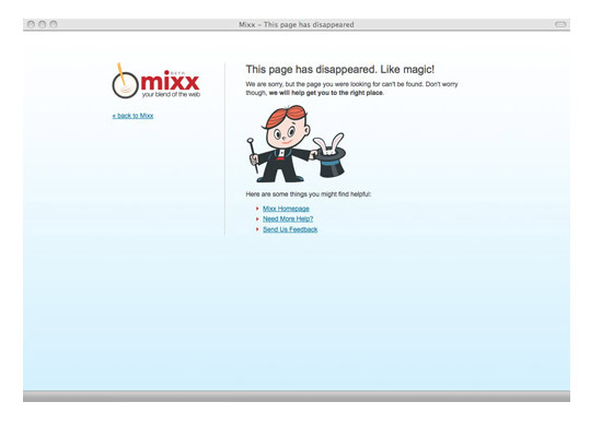
The 404 page for Mixx explains the issue succinctly while providing links that allow the user to move on, including a link to the homepage as well as a way to get in touch with them for further questions.

This personalized 404 page shows a hint of animation studio’s personality, while making it easy for the user to get back on track by providing a menu of links.

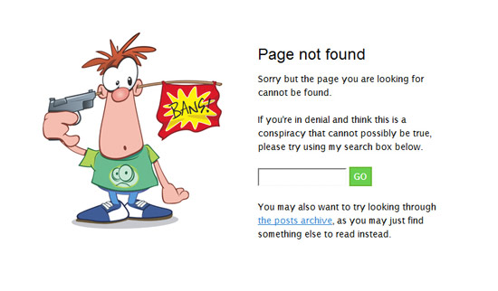
Providing a search bar allows the user to search for where the page has been moved. Providing a link to post archives also aides the user in finding what they’re looking for much faster.
4. Retain the Same Design
Your 404 page shouldn’t be an unfamiliar departure from the rest of your site. This page should retain the same branding as the rest of your pages by including the same fonts, colors, and style.

The 404 page for Carsonified retains the style and visual language of the rest of the site, yet is unique enough to stand on it’s own. The page is integrated into the existing design, which establishes a sense of familiarity while encouraging the user to explore.

This 404 page retains the visual style of the rest of the site while being unique in it’s own right. Some characteristics of well-designed 404 pages appear here, such as the use of plain language, explaining the issue, and proving tools to remedy the situation.
5. Fix Broken Links
The best way to prevent a user from landing on your 404 page is to constantly check for broken links within your site. Once a month is ideal for checking for missing articles, videos, pictures and so on so your viewers will come across a 404 page less and less.
Nobody wants to encounter a 404 page. But it happens.
When it does, equip your errant site visitor with a user-friendly page that communicates the issue effectively with your audience. Remember your goal is to retain visitors and give them incentive to stay; the combination of thoughtful design, along with useful resources that get them closer to their destination are key aspects that factor into a successful 404 page.
Have you found some unique 404 pages that aren’t listed above? Or tips to make a 404 page the best it can be? Please share with us!


