Marketers know that website usability testing is one of the most effective ways to optimize your site. Whether you’re troubleshooting low conversion rates and engagement or proactively trying to prevent them, testing your site for usability is the best way to diagnose problems (or potential problems) and find the right solution.
We’ve noticed that a lot of the guides out there treat usability testing like a one-step thing. They tell you how to make changes to your website and test them.
But based on our experience working with hundreds of thousands of companies over the past 14 years, we believe conducting a website usability study right requires 3 steps:
- Getting a background on how people currently use your site
- Identifying usability problems and hypothesizing about the cause(s)
- Making changes, testing, and iterating on solutions.
Without the first two steps, those changes are no more than a shot in the dark. You end up with a bunch of data that doesn’t point to any clear-cut problems or solutions. In short, you end up without any actionable takeaways from the testing.
Below, we share the full three-step process for web usability testing that we recommend to our customers. Then we talk about some of the software and tools that can help you accomplish that process and pull actionable insights out of the testing process.
Note: Ready to see how your website’s usability holds up? Get to know your visitors’ click behavior, plus how you can optimize your website for more conversions when you sign up and try Crazy Egg free for 30 days.
Why You Should Test Your Website for Usability
Before we go any further, we want to make sure we’re on the same page about what website usability testing is and why it matters. Simply put, website usability testing is a process of looking into how visitors use your website and then identifying areas of friction or difficulty for them.
While optimizing your website for conversions is a noble goal in itself, there are a few other key reasons why marketers should do website usability testing:
- Testing for usability helps you better understand what website visitors are doing, including whether their behavior diverges from what you expect or ideally want them to do on your site.
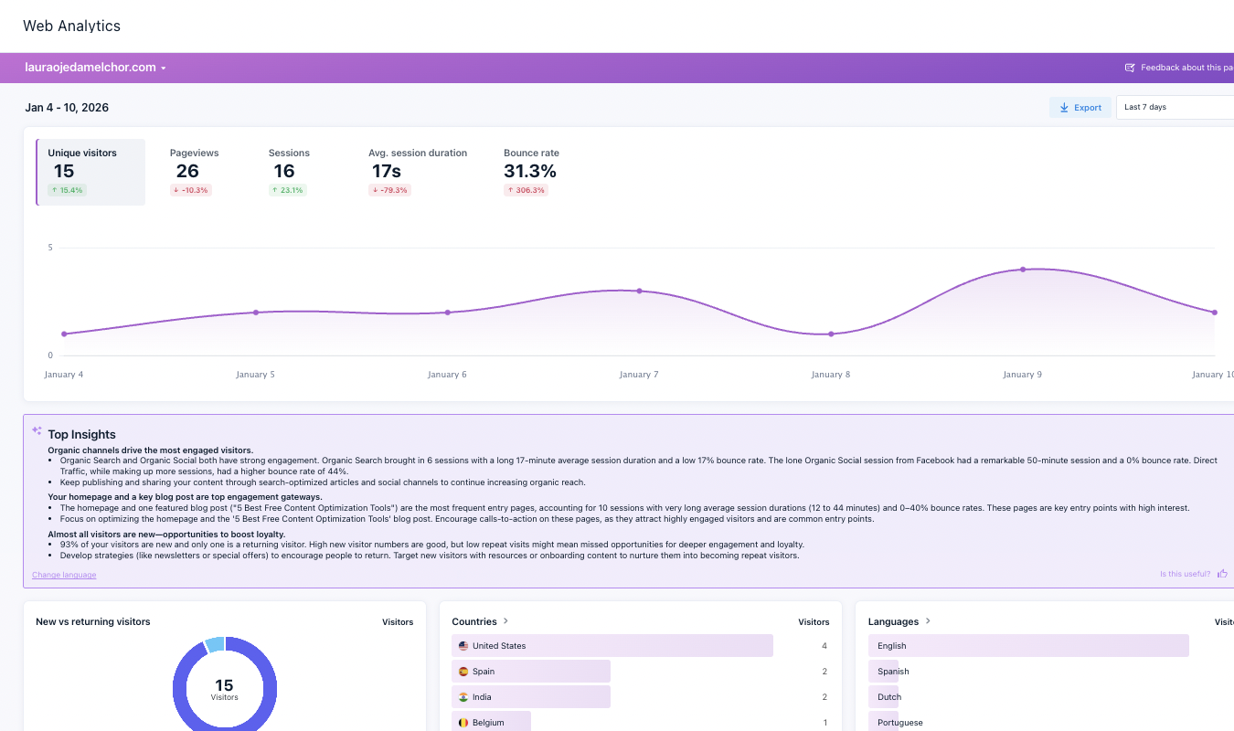
- Running website usability tests can also help to explain many of the anomalies you might see in your Google Analytics data — adding a layer of why to what users are doing.
- Usability testing gives you a mechanism for website design decisions and overall user experience in a data-driven way. Instead of guessing your way through the development process, you can design for what you know will encourage users to convert.
- Lastly, when you test your website’s usability regularly, it enables you to continuously boost conversions and better accomplish website goals.
Website Usability Testing Methods and the Process We Recommend
Now that we have that squared away, let’s get into that three-step process we mentioned before.
Step 1: Run Baseline Heatmaps and Recordings
Before you do any usability testing or make changes to your website, it’s absolutely vital that you take a step back to understand the current state of things.
It’s easy to see low conversions in Google Analytics and immediately assume your call-to-action (CTA) copy isn’t compelling enough. But there are a lot of different reasons for low conversion rates — and changing up the copy won’t solve many of them. For example, your CTA may be placed farther down the page than most people scroll. Or you may have a pop-up that blocks users from the CTA on certain devices or screen sizes.
That’s why gathering as much information as possible about how real users are currently behaving on your website is the first step. It gives you a baseline idea of how people are moving through your website and some insight into why they’re behaving as they are.

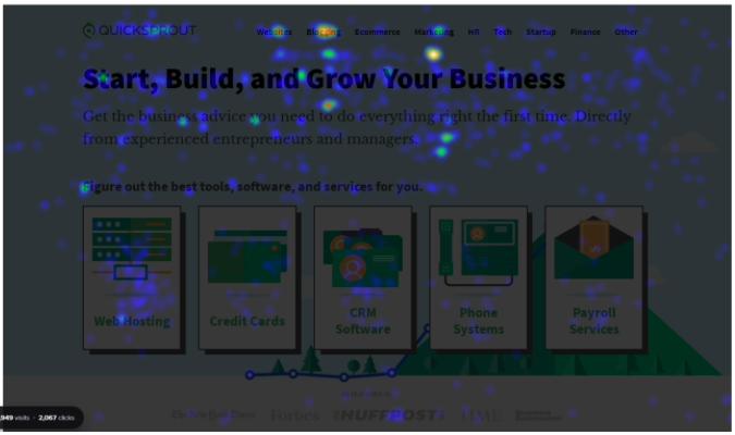
Heatmap reports show you where users are clicking and the frequency of clicks across a page.
To do that, you can run heatmap reports and session recordings on the primary pages you want to test.
- If you aren’t sure about the path users take through your website, it’s best to go big here — gathering as much data as you can on your most important pages.
- If you’ve spent time mapping out your conversion funnel and know where the breakdown is happening, you can focus your heatmaps and recordings on the problem pages specifically.
Note: If you aren’t sure where to start with baseline measurements and user feedback, don’t worry. We share our recommended website usability testing software stack later on in this post.
Step 2: Identify Points of Friction and Hypothesize Causes
Once you have a baseline understanding of user click behavior on your website, you can start to identify usability issues: areas where users are running up against friction that blocks them from taking the next step you want them to take.
(For a more detailed explanation of how to interpret your heatmap reports, read our guide to interpreting and using the five reports Crazy Egg offers.)
At this step, you can bring in data from Google Analytics and any other website analytics tools you use. This data can help you narrow your focus on the web pages showing problematic conversion or engagement numbers.
Diagnosing Friction on Your Website
From there, you can diagnose “friction” depending on the type of page you’re looking at.
On your homepage, for example, it’s normal to see visitors taking different paths. You might see some users click on your CTA and convert right away; others will travel deeper into your site to learn more about the company and your products. Some might jump to your blog in search of case studies on how your product works for other companies.
In this case, friction likely looks like users exiting your website from the homepage.

Crazy Egg’s List Report can show you where people are going when they leave a landing page without converting.
But on a landing page, your only goal is to get users to convert. You want them to fill out a specific form or click on a specific CTA. If they aren’t doing that, there’s friction — even if they don’t exit your website.
Figuring Out the Cause of User Friction
Once you identify that point of friction, you can hypothesize about why users are butting up against it.
- In the landing page example, you may be offering too many links or navigation menus, giving users too many options other than “convert now.”
- Alternatively, the sources leading to your landing page could be setting inaccurate expectations about what users will find there — or that they aren’t actually reaching your target audience.
- On your homepage, users may be exiting the website because you haven’t given them a clear or compelling-enough next step.
If you can’t find a clear cause for why friction is happening on your website, you can run additional, more qualitative tests to get more feedback directly from end users. For example, surveys or session recordings with live feedback can help you dig deeper to identify why users behave the way they do on your site.
Step 3: Make Changes and Test with New Heatmaps, Recordings, and A/B Tests
Now that you have an informed, data-backed hypothesis about why users aren’t converting or engaging with your website, you can start working to change their behavior. The key here is to lay out clear changes you think will help — and then test them one at a time.
Continuing with our landing page example, if you found that users seem to have too many options for where to go from the page, you could test removing the site navigation menu entirely. The testing is important because you don’t actually know that navigation options are the problem until you remove them and see an improvement in your conversion rate.
For example, you might find that removing the menu doesn’t help boost conversions.
In that case, you’d go back to step 2. Your next hypothesis might be that the copy on your landing page isn’t compelling enough to get website visitors to convert. From there, you can test changing the copy to see if that helps to increase your conversion rate.
Successful website usability testing is all about testing and iterating to find the most effective version of each page and your conversion funnel as a whole.
Website Usability Testing Software Stack and Tools
When it comes to testing your website’s usability, having the right software stack in place means you can gather, analyze, and take action on all of your data. If you have the right tools set up:
- You can avoid having some data siloed away from the rest
- You don’t have to spend time hopping back and forth from one tool to the next
- You can seamlessly analyze the data, make changes to your site, and test those changes.
To that end, we recommend these four website testing tools to all of our customers.
1. Google Analytics and/or Adobe Analytics

Traditional website analytics tools, like Google Analytics and Adobe Analytics, can help you identify when friction occurs and narrow in on where in the conversion funnel (the specific pages) things are breaking down.
2. Crazy Egg

With Crazy Egg, you get access to five different types of reports plus options for digging even deeper into each one. Our tool includes user recordings to see what’s happening in each session as well as A/B testing features to take action on all the data.
Note: Get to know your visitors’ click behavior, plus how you can optimize your website for more conversions when you sign up and try Crazy Egg free for 30 days.
3. UserTesting

If you get hung up on identifying why friction is happening or why users behave as they do, UserTesting’s session recordings and user research tool can help you gather more direct user feedback right from real people using your website.
4. Survey Monkey

Whether you’re troubleshooting proactively or reactively, surveys can help you gather very specific, targeted feedback from users.
Website Usability Testing: Better Customer Experience and More Conversions
When you test your website for usability issues and other problems, you create an opportunity to provide a better user experience (UX), cut down on friction, and boost your conversion rate.
By combining traditional website analytics tools (like Google Analytics) with a heatmap solution like Crazy Egg, you get access to the most important feedback there is: real user behavior. Then you can make the best decisions to improve your website’s UX and turn more website visitors into customers.


