Creating a website simple.
You don’t have to be a tech expert or designer.
Anyone can create a stunning website today.
There are tons of website builders and tools out there that make it easy to create a new site from scratch.
But, most websites haven’t been optimized from a design perspective.
But let’s take a closer look.
Why is design so important? Simple really.
It takes just 50 milliseconds for a new website visitor to form an opinion about your site.
People are judging your website within fractions of a second of landing on it. The first impression determines whether or they like your site and if they’re going to stay or leave.
94% of first impressions are design-related.
Beyond the visual appeal, web design has a significant impact on the performance of a website as well.
Web design has an effect on conversions, branding, and the credibility of your business.
That’s why well-designed websites are so successful. If your web design has been optimized for UX, visitors will convert and return in the future.
For those of you who are getting your feet wet with web design, this guide is perfect for you.
Whether you’re creating a new website from scratch or revamping your site’s existing design.
If you’re learning how to become a web designer, we provide you with web design tips and best practices that set you up for success.
Getting Your Site Structure Right
When you think about web design, most people automatically jump to the visual elements of a website. But before you focus on colors, images, themes, or page layouts, you need to get your site structure right.
What is website structure?
In short, site structure determines how your website is connected. It dictates how your home page and other main pages lead deeper into other pages on your site.
Optimal site structure is based on hierarchy, starting with the homepage at the top. It will look something like this:

Why is this important to web design?
If you strip away all of the other design elements (graphics, typography, whitespace, etc.), a well-designed website is all about site structure.
This component will have the most significant impact on user experience.
When people land on a website, they expect things to be found in a certain way. Site structure is all about the user. It’s about creating a logical hierarchy of pages in a way that makes sense to the navigation.
For example, if you have a website about sports equipment, you wouldn’t put “baseball bats” or “golf tees” as a main top page leading to subtopics about “football” or “surfing.” That doesn’t make any sense. Instead, “baseball bats” would be a subtopic of the “baseball” page.
Site structure falls within the technical scope of website design. In addition to improving the user experience, it’s also excellent for SEO purposes. So once you get the site structure right, then you can focus on other design elements.
Building a High-Converting Homepage
The homepage is the backbone of your website; everything starts here.
Every homepage must be optimized for conversions.
Sometimes people get so caught up in designing a website, they lose sight of their goals—getting traffic to convert.
To build a high-converting homepage, you need to leverage tools that will tell you exactly how visitors are navigating on your website and where they’re getting stuck. This will allow you to make data-driven design changes.
The Crazy Egg heatmap tool is the best way to do this.

Heatmaps will help show you exactly where you should place certain website elements.
Without these tools, your web design is just guesswork. It’s like throwing a dart and putting your CTA button wherever it lands. What are the chances that your random guess was the most optimal position for design elements? It’s very unlikely.
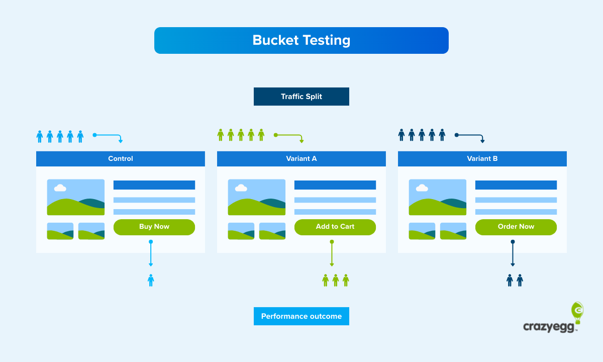
Use Crazy Egg to get visual reports about your homepage. Run A/B tests to make sure that all of your conversion elements have been properly optimized. From content placement to copy, images, CTA, colors, and more, this tool will turn your homepage into a conversion machine.
To get started, check our step-by-step guide for how to create a heatmap online for free in less than 15 minutes.
How to Design a Magnetic Brand
Consumers are constantly being bombarded with advertisements. In fact, the average consumer is exposed to 5,000 ads in 24 hours.
With such a marketing overload, people have learned to just drown them out and ignore the majority of this exposure. So trying to be the loudest brand in the room to seek attention and stand out from the crowd isn’t enough. You must draw consumers in with magnetic branding.
Position your business in a way that attracts people. Create a physiological connection between your brand, your audience, and their experiences.
Web design and branding go hand-in-hand. It’s crucial that you design a website that represents your company’s branding strategy, which will draw people to your business.
Something as simple as your company logo and the color scheme on your website can have a significant impact on your brand’s magnetic power. So you need to keep this in mind as you’re designing each element of your website, which we’ll discuss in greater detail shortly.
Copy vs. Design: What Matters More?
This is a common question that I hear all of the time. Is it more important to focus on website copy or design?
The reality is this; both of these components matter equally.
Focusing all of your efforts on one and neglecting the other is a recipe for disaster. A great design is useless if the copy isn’t written well. The best copy in the world won’t matter if the design stinks.
Both copy and design will have an effect on user experience, conversions, branding, SEO, and the ultimate success of your website.
With that said, it’s easier to design components of your website around its copy. It’s much more difficult to try and plug-in text to a predefined design.
So always write your copy first. Then create your design around that copy.
Perfecting 9 Website Elements
Now that you have a background on some general web design best practices, it’s time to take a look at some of the specifics.
I’ve narrowed down the top nine most important website elements for beginner designers to focus on. For each one, I’ll give you some tips on how to design them properly.
1. Menus
The site menu is the blueprint for user navigation. Your menu should echo the site structure, which we talked about earlier. That’s why it’s so important to get your site structure right ahead of time.
Limit the number of items in your top-level navigation menu. Less is more. Depending on who you ask, most experts will tell you that a high-converting menu should have no more than 5 or 7 options.
Why? It all falls back on user experience.
According to a recent study, users say that simple navigation is the most important factor in the design of a website.

If your menu has dozens of navigation options, your visitors will be overwhelmed. They won’t be able to easily find what they’re looking for, which will cause frustration and bounces.
2. CTA Buttons
In order to convert, visitors must click on your call-to-action button. Think of your CTA as your “money button” as you’re going through the design process.
People who land on your website should be able to spot the CTA immediately. If it’s hidden at the bottom of your pages, buried between other site elements, or camouflaged with your background, people won’t convert.
Remove clutter surrounding your CTA, so it’s easy for people to see. Use a heatmap tool to get data-driven analytics for the best CTA placement.
Consider placing your CTA on a sticky navigation bar at the top or side of the screen. So when visitors scroll on the page, it remains in plain sight at all times.
3. Signup Forms
A signup form or opt-in form can be another component of a CTA.
In some cases, this could be a singular form field asking for an email address. In other instances, the sign-up form could be asking for more information, including a name and billing information for a subscription service.
Whatever the case might be, make sure to design your signup forms as simple as possible. The more form fields you have, the lower the conversion rates will be.
For longer signup forms, put the fields into columns so the entire form fits on the screen without any scrolling required.
4. Images
All of the visual components of your web design need to blend well, including the images.
While images are an important piece of web design, make sure to use them sparingly. Try not to have more than one image on the screen at the same time. This can overwhelm the visitor since they won’t know where to look. As the visitor scrolls down the page, a new image can appear with more relevant and supporting content.
Each time you insert a new image into your design, consider its level of importance compared to the surrounding elements. Is the image just used for aesthetic purposes? Or should it be a focal point of the page?
Check out this example from the Bluehost home screen.

The design choices here are excellent. While the image isn’t necessarily related to the brand or product itself, it serves a purpose in terms of aesthetics.
But that’s not all. Notice the gaze of the woman’s face. It leads you directly to the copy on the left side of the screen.
If the face were staring straight at you or gazing in the opposite direction, the effect wouldn’t be as impactful. A second or third image somewhere on this page would be too overwhelming.
5. Headlines
Headlines are the best way to separate different areas of your design. Depending on the type of page you’re designing, headlines can serve multiple purposes.
Don’t make your headlines too long. From a design perspective, this can pose a problem for other elements on the page. Use size, spacing, and contrast to draw attention to your headlines.
Headlines aren’t meant to tell the full story. When designing for headlines, plan to accommodate supporting text in the same area.
6. Copy
This piggybacks off our last point. Headlines are just one component of your copy. But you’ll need to write more text that is impactful while still making sense for your design.
Check out this example of copy from a Lululemon product page.

The headline is short but clearly shows the visitor what this section of the page is about. While the headline is the focal point, the supporting copy tells the rest of the story.
7. Typography
Typography is an important, but often overlooked, element of website design.
By definition, typography is the art or practice of arranging letters to make written text legible, readable, and appealing when displayed. Elements of typography include things like typeface, font, alignment, weight, size, and kerning.
Look back at the sample we used in the previous section about copy. The typography of the header and text below are both very different. When you look at an example like this, it might seem obvious to arrange your typography this way. But you’d be surprised how many beginner web designers make mistakes here.
Your typography must be legible while always establishing a hierarchy. Size and placement are two of the easiest ways to create a hierarchy with typography.
8. Blank Space
The best web designs are simple. Don’t feel obligated to fill every section of the page. Use blank space to your advantage.
The key to using blank space effectively is by finding ways to draw attention to the most important sections of the screen.
Here’s a simple example to showcase my point.

The design on the left side is a bit more cluttered. The CTA is crammed between the headline and the supporting copy below.
Now, look at the design on the right. All of the content is identical, but spacing was added around the CTA. This design choice helps your CTA breathe. It stands out more, draws attention, and will ultimately have a better impact on your conversions.
9. Color Scheme
Color scheme is another website design element that many people consider an afterthought. Does it matter if your website is blue vs. purple? Green vs. red? Black vs. white?
In short—yes.
The color of your website has a direct correlation to your branding strategy. Refer back to what we talked about earlier in terms of creating a magnetic brand.
Different colors make people feel a certain way. Other colors are difficult to read. I’ll give you a couple of extreme examples to illustrate my point.
What would you think about a law firm website that had a pink and purple color scheme? Or what would you think about any website that had yellow text on a red background?
Pink and purple work for some websites, but they generally don’t convey professionalism for a lawyer. Yellow and red can also work well together (think McDonald’s); but the contrast can make text difficult to read.
These are the types of design choices that you need to keep in mind when you’re choosing a color scheme and layout for your website.
Increasing Conversions From Your Website Design
The design of your website will have a direct impact on conversions. But with so many elements to take into consideration, how can you possibly know which is the most optimal design for you?
What will happen to your conversions if you move the CTA button? Do headers convert better on the left or right side of the screen? Are your images in the right place?
The list of questions is never-ending. The truth is this; no website will ever be 100% perfect. But there is always room for improvement.
Heatmaps allow you to make data-driven design choices. That’s why it’s always in your best interest to use a heatmap tool before redesigning your website.
Once you see a data visualization report, you’ll have a better understanding of which design elements can remain the same and which ones need improvement. If you’re on the fence about what changes to make, the best heatmaps have additional tools for things like A/B testing.
What’s the best heatmap tool for real results? There is one clear winner—Crazy Egg. Sign up today and try Crazy Egg free for 30 days.
For beginners and experienced designers alike, a heatmap is the secret to creating a high-converting web design.


