They say a picture is worth a thousand words—but online, a chart or infographic could be worth a thousand backlinks.
What’s that you say? You’re the farthest thing from a graphic designer?
No problem. Here are seven of our favorite online visualization tools that make all that data creative, fun and engaging.
Dipity
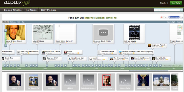
Dipity is an online tool that lets you create interactive timelines. Within each timeline, you can create a number of events. Each event is clickable and has its own description and comments, as well as links to share the timeline tidbit on social media.
With a free account, you can add up to 150 different events, but you’re limited in the design and branding of your timeline. A premium account (starting from $4.95/month) gives you more customization options, analytics and much more.
Easel.ly
Easel.ly lets you create your own infographic from among dozens of stylish templates, including Venn diagrams, bar charts, “road maps” and social charts. You can also use a blank template as a starting point for your own designs, but each template contains its own customizable options.
Easel.ly is currently in beta, meaning there may be some bugs or other issues crop up—but it’s free to use, and of this writing, over 400,000 infographics have been created through their service.
Gliffy
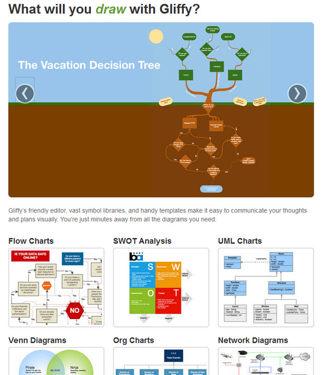
Want to create a chart without all the fuss and flair? Gliffy is the tool for you. Whether you need a diagram, flowchart or analysis, you can create them all online with this drag and drop web-based program.
If you find yourself creating certain types of charts often, you can add them to a sort of “favorites” for frequent use.
iCharts
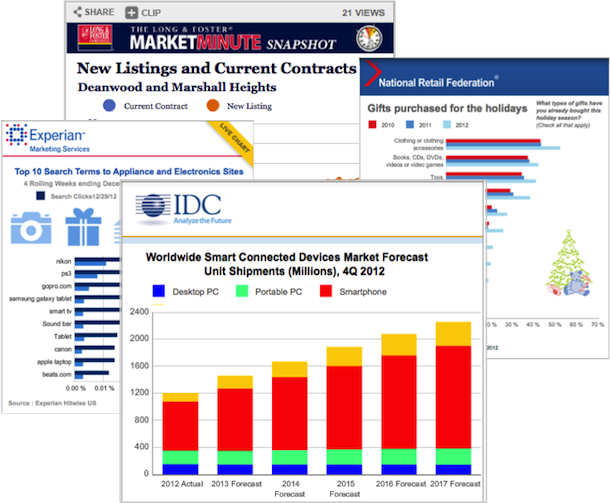
iCharts allows you to easily create vibrantly colored, easily understandable charts of all kinds. Used by well-known companies including Coca-Cola, the International Retail Federation and MarketWatch to name a few, iCharts lets you load Excel spreadsheets, Google Drive documents or type data in manually.
You can then use their pre-defined design templates to make your charts fully interactive, automatically. Because the charts are hosted in the cloud, updating them is simple and hassle-free.
Plus, they’re SEO-friendly and can be embedded in newsletters, social networks and websites.
LovelyCharts
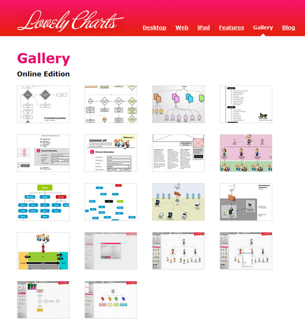
LovelyCharts makes diagrams in the same way as many of the other resources listed here. However, what sets it apart from the crowd is the fact that it’s available nearly everywhere—including as a desktop application, mobile app (for iPad) and as a web-based tool.
You can drag and drop the built-in images or import your own and save the resulting document as a JPG, PNG or PDF. Even if you have the graphic design skills of a shoe, you’ll find LovelyCharts’ interface lets you create some stylish, easy-to-follow charts with zero hassle.
Piktochart
One of my personal favorites, Piktochart lets you create beautiful infographics in just a few clicks. With a variety of templates to choose from, many spanning specialized themes including holidays and specific industries, there’s no shortage of inspiration here.
Just add your statistics and symbols to instantly get a beautiful infographic that’s ready to share online. Discounts are available for non-profits and educational institutions and monthly packages start at $29/month (with discounts applied if you order for a quarter or a year).
Canva
Although it’s still in beta, Canva allows anyone to easily create flyers, business cards, Facebook covers and other types of graphics without the need for a graphics editor.
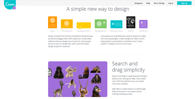
With over one million images in its graphics library (many of the free or available for as low as $1), Canva brings drag-and-drop simplicity to the world of design, letting anyone express themselves and create stunning graphics in minutes. Canva is currently free to sign up and use.
Bonus Site
Now that you’ve got the tools, where do you get the stats? Good question. Here’s my recommendation:
If you’re short on data, take a look at Statistic Brain. They provide the research behind some of the world’s most successful and highest trafficked news sites, including the Huffington Post and Wikipedia.
From coffee drinking statistics to cyber bullying and everything in between, you’ll find a wide range of statistics spanning dozens of industries, political goals and more.
What are some of your favorite visualization tools? Share them with me in the comments!
Check out other Crazy Egg articles by Sherice Jacob.

