There’s no lack of data to suggest how visual-oriented we are as humans.
For instance, “90 percent of information transmitted to the brain is visual, and visuals are processed 60,000x faster in the brain than text.”

Or this: “65 percent of people are visual learners, and one of the best ways to drive messages home is through visual content.”
This data helps explain why visual marketing has really exploded recently, and visual-centric content such as infographics are so popular.
Seeing is one of our primary senses by which we intake information and understand the world.
Basically, it’s a big deal.
So it only makes sense that effective website design is done with visual perception in mind.
Not only does it influence your bounce rate, average session duration, and conversion rates, but it heavily impacts your brand equity as well.
In fact, “46.1 percent of people say a website’s design is the number one criterion for discerning the credibility of a company.”
Getting it right from a visual standpoint is essential, so plenty of effort needs to go into understanding visual perception and the underlying psychology behind “making a site look good.”
Here are some ways that visual perception applies to web design and some specific principles you can apply for an optimal UX.
Keep in mind, these are big picture ideas, not nifty little tactics. Rather than provide prescriptive how-tos regarding visual perception, I’ve sketched data-driven, high-level principles that can be applied in virtually any industry, business vertical, or niche.
Strong Visual Hierarchies Provide Clear Guidance
The moment someone lands on your website, your goal is to guide them on a journey that ultimately culminates in a conversion.
To accomplish this from a design perspective, it’s essential to create a visual hierarchy.
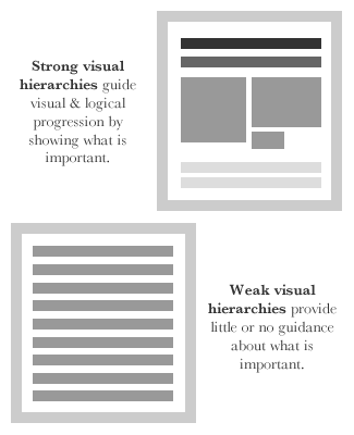
52 Weeks of UX offers an excellent description of this process:
They also provide a nice example of a site with strong visual hierarchies versus one with weak visual hierarchies.
The aim of a web designer is to rank the various elements of a site in terms of importance as it relates to meeting your business objective.
For instance, the focal point of a homepage might be a large image to instantly capture a visitor’s attention. This might be followed by a headline stating what’s being offered and then a well placed CTA for visitors to click on.
Here’s a really good example from the TOMS homepage that follows this formula.
The key here is to rank the elements of your site according to their importance and arrange them in a way that walks your visitors through in a frictionless way.
Eyes Tend to Follow an F-Shaped Pattern
I’m not going to waste your time going into all of the gory details of this phenomenon. It’s already been covered extensively.
But it’s necessary to point out that multiple eye tracking studies using heatmaps found a common trend in the way that people view website content.
By and large, eye movement follows a distinct F-shaped pattern.
One of the more notable studies done on this subject came from Nielsen Norman Group back in 2006.
Here’s the crux of what they found:
And here’s what that looks like visually:
The first page on the left is the “about us” section of a website. The middle page is a product page of an Ecommerce site. The third page on the right is a SERP.
As you can see, there’s a discernible pattern that arises between all three types of page.
While the F-shaped pattern is most prominent on the product page of an Ecommerce site or SERP, it’s clear that other types of content are digested in a similar manner.
Optimal desktop user experience can often be achieved by structuring your page layout following this principle in order to direct a visitor’s attention.
White Space Plays a Bigger Role Than You May Think
White space or “negative space” is the area between objects. It’s the empty space that separates graphics, text, headers, columns, etc.
While it may seem insignificant, white space actually plays an integral role and greatly impacts the overall aesthetics of a site. If you really think about it, it’s the white space that enables objects to exist in the first place.
A cardinal sin that’s committed quite frequently is overloading a website with excessive objects to the point that it looks clunky and saturated. You can think of it as digital maximalism.
While loading a site up with more “stuff” may seem like an effective way to grab the user’s attention, this is generally regarded as an ineffective practice. That’s because this tends to be distracting and can overwhelm the visitor to the point of cognitive overload occurring.
In a world that’s saturated with data and information in excess, what most users crave is simplicity.
There’s a great post from ConversionXL that discusses why “simple” websites are scientifically better.
In the article, the author references a 2012 study from Google that says, “Visually complex websites are consistently rated as less beautiful than their simpler counterparts.”
So there’s some real truth this argument. Less is more.
Here are a couple of examples of websites that pull this off seamlessly:
Simply put, leaving plenty of white space in web design gives a site a clean feel and makes it easier for users to focus on your core message. They can absorb your copy more efficiently are more likely to notice focal points such as your CTA.
Eyes are Naturally Drawn Toward Contrast
This ties in with our previous point and suggests that one of the most effective ways to get eyeballs to your intended focal point is to create contrast.
It’s one of the principles of Gestalt Theory, which “attempts to describe how people tend to organize visual elements into groups or unified wholes when certain principles are applied.”
The other principles include proximity, similarity, multi-stability, continuity, and closure.
This aspect of visual perception is actually a big contributor to our collective survival as a species. Our ancestors’ ability to identify contrast in their environment (e.g., a predatory animal in the woods) is what alerted them to danger and helped them stay alive.
Spotting contrast is what we do as humans. So when it comes to getting visitors to take notice of key elements on your website, it’s obviously beneficial to create contrast.
Wonder Bread’s website pulls this off really well and incorporates plenty of contrast.
Your eyes can’t help but gravitate to the bread.
Similarity Aids in Content Digestion
Similarity is another principle of Gestalt Theory, which states that, “Elements that share similar characteristics are perceived as more related than elements that don’t share those characteristics.”
Simply put, arranging various elements into groups allows users to quickly differentiate them from the rest of your site. This is beneficial because it allows for a more seamless UX and requires less mental energy to be expended.
Here’s a simple example from the Harvard Business Review homepage where they place the HBR newsletters into a single group:
The bottom line here is that using similarity is a highly effective way to break down the various sections of your site so that everything is easily digestible.
Proximity Also Helps
There’s one last principle of Gestalt Theory that I would like to point out, and that’s proximity.
It’s pretty simple. “Objects that are closer together are perceived as more related than objects that are further apart.”
Just take a look at these groups of dots.
We’re naturally inclined to consider the dots on the left as a singular object. However, we perceive the dots on the right as two separate objects.
The law of proximity enables us to better understand website content and break various elements down into different categories.
Here’s an example:
You can use this aspect of visual perception to break content down to create categories and even sub-categories. In turn, this should add to the flow of your site and help users navigate it with greater ease.
The Golden Ratio Can Optimize Overall Aesthetics
The concept of the golden ratio goes back well over 2,000 years and has been studied by everyone from Plato and Euclid to modern day mathematicians such as Roger Penrose.
To put it very simply, the golden ratio is 1.618.
Here’s what that looks like visually:
Also known as divine proportions, it’s a ratio where elements are proportioned in a way that they’re aesthetically pleasing to human eyes.
You see it in everything from ancient architecture…
To the human body…
And even on the macro level in the universe itself.
It’s pretty amazing.
It’s a phenomenon seen all throughout the natural world. And interestingly enough, it can also be applied to web design.
Here’s a good example:
Notice how the layout and arrangement of elements fit in perfectly with the golden ratio. This is a scientifically proven way to maximize the eye appeal of your site.
To learn how to apply divine proportions to your site, check out this guide from Tuts+.
Conclusion
Visual perception as it relates to website design is incredibly complex and multifaceted. What’s amazing is that the principles I covered here are only a slice of what goes into the process.
However, I feel that these principles are some of the most integral to effective web design.
Understanding how people visually perceive content and the underlying psychological processes that take place put you in a position to optimize your site and create the best possible UX.
This has its obvious benefits and allows you to maximize conversions and ultimately increase sales.
What do you consider to be the most important visual element in a website?


