UX researchers help organizations better understand their target audiences through data. The data researchers collect supports better business decisions, drives design improvements, and ultimately delivers a better user experience. All this leads to better customer retention rates.
Companies that recognize the importance of UX research want skilled researchers that can deliver this data effectively and efficiently. Here are the top skills they look for in a UX researcher.
Command of UX Research Methods
The core function of any UX research role is to collect and analyze data. This data is gathered through a variety of data collection techniques and focuses on two types of data–qualitative and quantitative.
Both are important. A good UX researcher understands when to use each type of research and how to successfully execute each.
- Qualitative research – This type of data is about the feelings and emotions of your target audience. It’s subjective data, and best collected through things like interviews, video recordings, focus groups, open-ended survey responses, and ethnographic studies. This type of data is collected in smaller batches, then interpreted and collated by UX researchers. The end result is subjective insights.
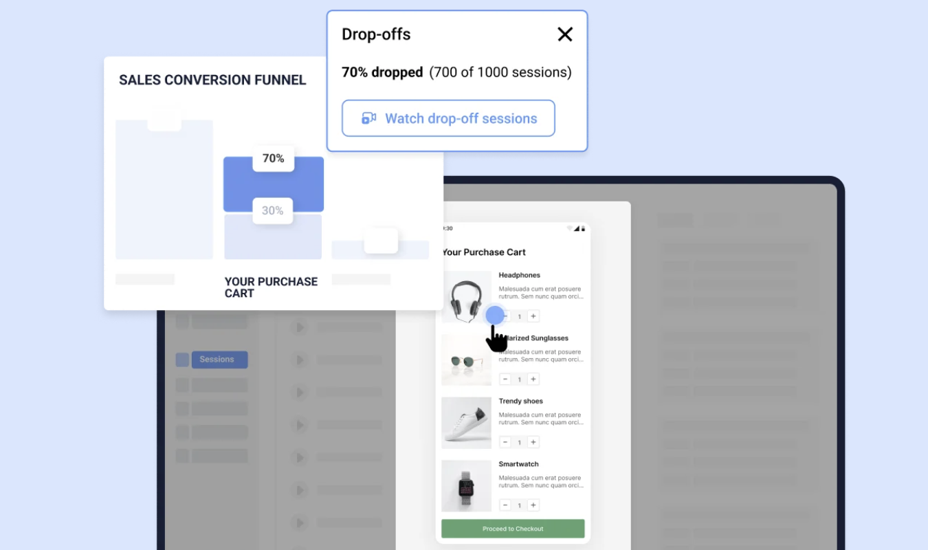
- Quantitative research – This research focuses on gathering hard data, like numbers and statistics. It’s data that is easily measurable and able to be completed by very large groups of users. These are tests like card sorting, tree testing, closed-question surveys, heatmaps, and A/B tests. This kind of research results are objective. Numbers don’t lie.
Good UX researchers also understand the different phases of research and which tools to use during each.
- Primary research – this research helps UX design teams validate initial ideas and concepts by diving deep into their target audience’s needs, wants, and desires. Primary research ideally occurs at the very initial stages of any new project, before design work begins. It can also occur anytime a design team wants to recalibrate on a project. Primary research usually entails things like one-on-one or small group interviews and focus groups. However, if a design prototype is already developed, usability testing can also be rolled out to uncover any issues along the way, preferably before design work gets too far along.
- Secondary research – this is when you use existing research materials to validate design ideas and support your primary research. This material can come from a variety of sources, including internal company data, industry sources, scholarly articles, books, and internet research. Another great source for secondary research is the historical data a client already has about user behavior related to their product. There is one caveat when it comes to secondary research. Always be mindful of using outdated information. Things change quickly when it comes to websites and applications, so what was true two years ago may no longer be applicable today.
When an employer is adding a UX researcher to the team, expectations about their knowledge and skills in this area vary depending on the seniority of the role.
For a candidate brand new to UX research, having a baseline understanding of the different research methodologies and tools is usually sufficient. Having some involvement with research tests in action would be ideal. But that isn’t always possible when you’re just starting out. Being able to speak knowledgeably using industry-appropriate words and phrases is often enough to demonstrate your qualification for an entry-level research role.
For more senior-level roles, employers will assume you already know the basics. What they will be looking for is a candidate who can share “tales from the trenches” that demonstrate the candidate’s first-hand experience running research tests, analyzing the data, and solving the usual problems that come with UX research. Employers are assessing critical thinking skills, leadership qualities, and problem-solving techniques through demonstrable proof.
Data Analysis and Synthesis
All the UX research tests in the world are useless unless the data that’s collected is turned into actionable insights. Interpreting and synthesizing data is the most important part of this process.
This is where a few different skills will come into play.
- Critical thinking – when a researcher is pouring over data (especially qualitative data), recognizing common themes and evaluating that information while being aware of bias or assumptions is critical. It is the way researchers come up with cohesive summaries of key findings that are trustworthy and reliable.
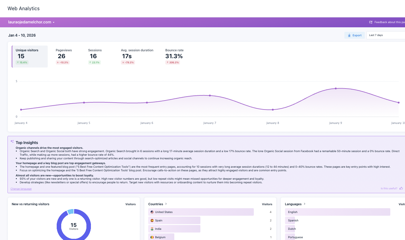
- Tool knowledge and skill – Researchers often rely on tools to automate large parts of the analysis phase. Trying to go through all the data manually takes too much time and opens the door for human error. There are different tools that excel for different types of UX testing. A successful UX researcher will have an aptitude for learning and using a variety of software to expedite this analysis phase.
- Reporting results – UX researchers are responsible for presenting findings to the bigger UX design team, stakeholders, and other interested parties. The ability to present the data in a way that is easily understandable and supported by the data is essential. While tools may generate helpful reports, a good UX researcher must have the ability to present and explain data in layman’s terms and point to specifics to support findings.
Employers will want to know that any candidate possesses the mental aptitude to turn raw data into understandable results. While they won’t expect an entry-level UX researcher to be presenting findings to the C-suite, they will be looking for sharp analytical minds and technical aptitude.
When it comes to more senior-level UX roles, employers will want to see real-world examples of how a researcher has communicated findings across all levels of an organization. They will want work samples and explanations of how the researcher worked a project from start to finish, along with the reports they generated and shared. At this level, employers want big-picture thinkers who can also execute on the ground.
People Skills
UX research is as much about working with people as it is working with data. Whether it is running an in-person interview or presenting findings to key stakeholders, a good researcher has to have a strong set of soft skills to be successful.
- Collaboration – good UX research doesn’t happen in a vacuum. Researchers are always working together with others to achieve a common goal. This means that a collaborative mindset is essential for success. You have to be able to actively listen and effectively share knowledge with everyone you work with. This helps the entire team succeed.
- Communication – excellent written and verbal communication skills are essential for success as a UX researcher. Not only will you be tasked with running interviews and focus groups (verbal communication skills), but you’ll also be reporting findings to your internal team and other stakeholders (written communication skills). Being able to clearly express yourself and respond effectively to questions is important.
- Empathy – the point of UX research is to understand the needs and desires of a target audience. This is best done when a researcher can identify, understand, and share someone else’s experiences, emotions, and feelings. That’s empathy and you cannot be a great UX researcher without it. The good news is that empathy is a skill that can be learned and developed with practice.
Just like technical skills (learning how to run focus groups or card sorting tests), soft skills can be learned and developed. You can take online courses and participate in training programs, and you can also do things that help your soft skills improve naturally.
Observe people who you think are great communicators or collaborators and emulate their actions. Ask trusted colleagues or mentors for feedback on your strengths and weaknesses. Practice active listening and pay attention to non-verbal cues. The list goes on.
The importance of soft skills cannot be understated. Since these aren’t UX-specific technical skills, employers are going to have the same expectations for anyone applying for a UX research role, no matter their UX experience levels.
Employers want to hire people who are at ease communicating and do it effectively. They’ll scrutinize your written application package, but the interview will be your chance to shine. They want to hear examples of your collaborative nature, so get some success stories ready to share. Empathy isn’t something you can prove with tangible data, but you can show it by actively listening to the interviewer and providing responses that are targeted and self-aware.
In the employer’s eyes, the way you present yourself to the hiring team is a good indicator of how your soft skills will help you perform in the role.
Develop User Personas
One way UX teams guide their work is through the use of user personas (also referred to as customer or buyer personas). Each persona represents one of the typical users of a product or app. There can be–and usually is–more than one persona. The key is to define the most typical users, then flesh out their unique needs, wants, and goals.
Personas are usually the result of initial research and information collected from existing customers, which is where UX researchers come in. They’ll study the trends, demographics, and habits of these customers to identify commonalities, then design personas for each of the most common types of customers. If a company is brand new, researchers will look to competitors to gauge the type of customers they have, then extrapolate that information.
Once personas are in place, UX researchers will share them with the bigger UX team. The team will then use these personas to map out a user journey for each. This is the typical path a persona follows when engaging with a brand or product.
The design team uses all of this information to guide design development. UX researchers also use personas when deciding how and when to run tests when a deeper dive into needs and wants of specific user groups is required.
For entry-level UX researchers, understanding the importance of user personas is sufficient. If you have prior experience developing them, all the better. But most employers recognize that new researchers just breaking into the field may not have that opportunity. Instead, employers will look for underlying skills like critical thinking and analysis that will be necessary for a researcher to successfully build personas down the road.
For mid- to senior-level researchers, though, employers will expect a lot more. They’ll want to see a deep understanding of the role user personas play in the overall process, as well as tangible evidence of past projects where the researcher actually created personas and deployed them successfully. Employers will be looking for specifics, so be prepared.
Understand Basic Design Principles
You don’t need to know how to code to be a great UX researcher and you don’t have to be a designer, either. But to be successful, you should at least have an understanding of how the design and development process works. And if you know how to do some (or all) of the following things, that makes you a very valuable UX researcher.
- Wireframes – this is when designers mock up and refine possible designs in order to test them and get stakeholder buy in before sending designs to developers to code. Wireframes help avoid unnecessary coding. UX research data is essential to create wireframes, as well as to refine them once they’re created. Wireframes can be hand-drawn, but most design teams opt for tools like Figma, Adobe XD, or Sketch to enable efficient collaboration. A good UX researcher should know their way around one or more of these common tools.
- Information architecture (IA) – this is how information is organized on a site or app. The goal is to have navigation menus and site maps that are intuitive for users and don’t confuse them. It is helpful if researchers understand the theory behind what makes a good IA. When they do, they can take the data from research tools like card sorting and tree testing, and make meaningful recommendations for solutions to identified issues.
- UI design – this is the look and feel of a product, as well as how a user interacts with it. Good UI design visually guides a user through the product interface. Every button, icon, font choice, color, and responsive feature is there because of UI design decisions. UI design is not the same as UX design, but rather a subset that includes the specific elements a user interacts with. Still, UX researchers who understand the “why” behind UI design decisions are better able to translate research findings into actionable insights to positively influence designs.
No matter where you are in your UX research career path, having a working knowledge of these three areas will help boost your value to future employers. Some of this knowledge you’ll learn on the job, but some you can learn on your own through courses, hands-on practice, and reading industry-specific magazines and resources to stay up on trends.
Employers will have different expectations, depending on your years in the industry. Nobody expects entry-level UX researchers to know Figma inside-out. What they do expect is you know and have at least some familiarity with the most common tools. They will also expect you to have a basic knowledge of design principles.
If you’re a seasoned research professional, though, the bar is higher. Not only must you have a deep knowledge of the industry and emerging trends, but you also must demonstrate a strategic mindset and leadership skills to help guide business decisions and product design. Employers will also be looking for candidates that have the potential to effectively mentor and develop junior researchers, relying on knowledge and expertise to do so.


