Optimizing the user experience (UX) on your website or app creates more satisfied customers, keeps them around longer, and boosts conversion rates. All of this is good for your organization’s reputation and bottom line.
If your site or app could use a UX boost, read on for nine easy tips you can implement right now.
Watch people use what you built
If money were no object and you had a limitless budget, the easiest way to figure out what’s working (or not) on your website or app is to recruit a large panel of users and run a bunch of UX tests. Whether it’s qualitative or quantitative data you’re after, formal testing helps you pinpoint specific design areas for improvement.
But if you’re just starting out or don’t have much of a budget right now, that doesn’t mean you can’t get good UX insights. One of the easiest things you can do is hand-pick a few people new to your site or app to engage with it.
Ideally these people are current or past customers familiar with your brand or someone who matches your ideal customer persona. If you can’t find someone like that, friends or family who have a baseline of technical proficiency can step in. Now is not the time to ask Aunt Betty who has trouble composing an email.
Once you have your tester lined up, the next step is setting up a video conference. You want to screen share and record the entire interaction for later review. Then, give the tester one or two tasks to complete, like placing an order, viewing a certain item, or finding an answer to a question. Then, start recording and observe them as they work through the assignment.
The goal is to see where users struggle as they use your product. What is their body language? Facial expressions? Verbal cues? What questions are they asking? Did they get stuck anywhere? If they did, how and why? Some users will be quite expressive and vocal, others a bit more subtle. The cues are all there, though, so watch closely.
The goal is to pinpoint elements of your design that cause a user difficulty or frustration. Typical issues that surface tend to involve navigation and information architecture, faulty search functionality, confusing or complex forms, or load time issues. But anything can be a pain point, so observe closely.
When you run this kind of observational testing, you can find these issues quickly and get busy fixing them. Even if you do it bare bones.
Strive for lightning-fast load times
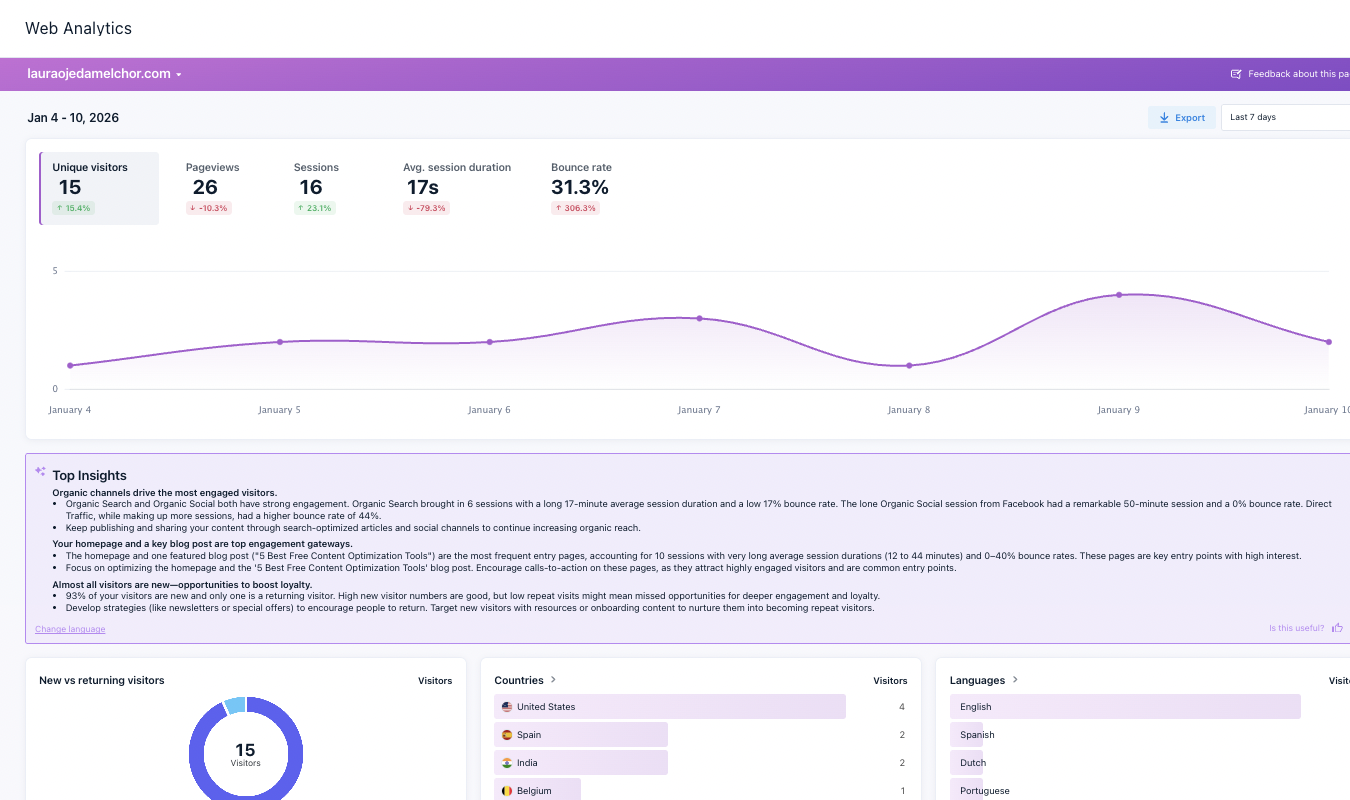
Nothing kills a user experience faster than a site or app that takes forever to load. According to Google, as page load time increases from one second to three, bounce rate goes up 32%. Make a user wait five seconds? The probability of bounce increases by 90 percent.
If you have a slow-loading problem, prospective customers are likely to bail. They disappear, you end up with a high bounce rate.
And while high bounce rates equal frustrated users and a bad UX experience, there’s something even more dangerous going on. High bounce rates also negatively impact your site ranking with search engines.
So you need to keep your site loading lightning fast. Here’s how to do it.
Start by testing. There are many tools available to do this. Our favorites include Google PageSpeed Insights, Pingdom, and GTmetrix. All of these are free and provide information on page loading speed plus insights to boost overall site performance.

Once you know where the problems are, you can start fixing them.
One big culprit is often high-resolution images. Be sure you compress every image. There are plugins that will do this for you automatically. You can also use a Content Delivery Network (CDN) to cache your site assets and speed up content delivery by geographic area.
Once you’ve made the needed changes, test your site again. The goal? A site that loads in less than two seconds.
Deliver responsiveness for all
More than half of all web traffic comes from mobile devices. This means you need to make sure your site looks equally impressive regardless of device, operating system, screen size, or browser choice. The same is true for apps. This is achieved when your design is fully responsive.
If it’s not, the user experience suffers. But it goes beyond that. Google also wants responsive sites, and rewards or punishes a site’s ranking accordingly.
Testing responsive design is easy. For websites, look at it on a desktop computer, then visit the site on your mobile phone. How does it look? Can you find the menu and navigate easily? Issues will quickly become apparent. For apps, do the same across iOS and Android devices, smartphones and tablets of all sizes.
How you resolve potential design responsiveness issues, depends on how tech savvy you are. If you had a hand in designing things yourself, you can usually use your website or app builder to test for responsiveness. For example, WordPress builds it into its page builder functionality. If you hand off development to someone else, they can do the heavy lifting to ensure a fully responsive design.
Either way, delivering a seamless experience across all devices, platforms, and operating systems means you’re providing a positive user experience to everyone.
Offer simple navigation
It doesn’t matter if a user is browsing your site on a laptop or using your app on a train, clumsy navigation kills the experience. Your navigation should be easy to understand, intuitive, and consistent.
When it is, users tend to stick around and finish what they arrived to do. When it isn’t, users disappear with a poor impression of your brand.
Some things you can add to your site to make navigation crystal-clear:
- Simplified menus – aim for a top-level menu of 5-7 items. Any more than that and things start to get cluttered. Sub-menus are ok, but only when they make sense. Resist the urge to add everything and the kitchen sink to your main menu. You can always include occasionally-used items in your footer area.
- Breadcrumbs – give users an easy way to remember where they are. Putting these helpful paths in a consistent place lets users move around without confusion.
The goal with all your navigation elements is to give users the simplest way to browse your site and find solutions.
Make search options obvious and effective
Good search functionality gives users a way to find exactly what they’re looking for without feeling like they’re on a mission a/k/a Indiana Jones seeking hidden treasure. Ignore this expected feature on your site or app and risk the wrath of users–usually in the form of complete site or app abandonment. Not the user experience you want.
Great search on a site or app means putting a search bar in your header and ensuring it’s visible on every page. It also means making sure your content is tagged properly so when a word or phrase is typed in, your system returns the most relevant content.
You can boost the likelihood of search success by incorporating autocomplete features into your search bar. As a user begins to type, natural matches are shown. This takes the guesswork out of searches, and delivers a more helpful user experience.
Best of all, there are excellent search plugins available, so you don’t have to reinvent the wheel. You can implement robust search functionality into your site with just a few clicks.
Give visitors the help they need
The more self-help resources you provide on your site or app, the less stressed your users will be. It doesn’t matter if someone can’t figure out how to do something, has a product complaint, or wants to explore options, being able to find answers quickly and on their own keeps people coming back. It also boosts your brand image.
Here are some help resources to include on your site or app:
- Contact information – do not bury this deep in your menu system or in an obscure location. Make all the ways a user can reach you super easy to find, and give them plenty of options, too. Despite what Gen Z might claim, a phone number is still a good idea. Some people still make calls. Honest! But include other contact methods, too. This ensures all users, whatever generation they’re from, can reach out with ease.
- Chat – most people are used to seeing the chat option bubble floating in the lower right-hand corner of their screen. Be sure you add this functionality to your site or app. Whether you use a chatbot to automate customer inquiries, add a live chat feature, or a mix of both, that’s up to you. The point is to have chat available.
- Frequently asked questions – give the people what they want–answers. You know the most common questions you get from typical users. Summarize those and display them for the world to see in an easily-findable spot.
- Help library – this is especially helpful if you’re a SaaS operation. Users have varying levels of tech savvy and knowledge. Give them the tools they need to resolve questions on their own, and watch satisfaction levels increase.
Provide great content
Compelling content is one of the easiest ways to boost the user experience on your site or app. It will show in things like increased time on page metrics and higher engagement rates. Conversion rates will go up, too.
Great content is a win-win for everyone.
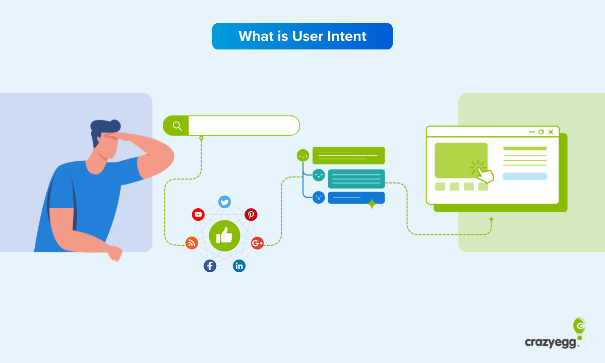
So how do you make sure your content isn’t just good but great? It starts with understanding your audience and why they visit your site or use your app. Users are there for a reason–to solve an issue, answer a question, learn something new. These are all user pain points, and when you understand what makes users tick, you’re halfway to creating great content.
Your content should resonate with users, reassure them you understand their pain, and offer solutions. Storytelling is one way to do this, interactive elements like quizzes or videos are another. Eye-catching visuals help to break up text, as do lists, bullets and jump links.
One other great way to ensure every user gets the most out of their experience is to incorporate dynamic content delivery. This strategy relies on information you have about a user (site behavior, demographics, preferences, etc.) to personalize the user’s experience in real-time. A common example of this is saving a shopping cart and reminding users about it next time they return.
Shorten those forms
Whether used to subscribe, sign up for an offer, register for an event, buy something, or download a freebie, forms are a ubiquitous presence on websites and apps. But are they always delivering an optimal experience to users? Sadly, no.
It turns out, effective form design is equal parts art and science.
Users have a low tolerance for forms that are too long, ask for too much too soon, or are difficult to complete. Whatever the reason, you want your forms to add to the user experience, not detract from it. Here’s how.
- Less is more – the fewer the fields, the more likely a user is to complete and submit your form. Stick to asking only what is really needed, and combine fields whenever possible. Do you really need to know someone’s title? Probably not, so skip it.
- Guide the user – don’t leave users guessing, especially when it comes to entering things like telephone numbers or credit card information. Show example data inside complicated fields, use pop-up calendars for date entry, provide error messages in real-time so users can correct mistakes before hitting submit.
- Optimize the flow – especially important for ecommerce checkout, try to fit everything into a single page. But avoid displaying endless fields and the need to scroll, scroll, scroll. Use sections that expand as a user works their way through the checkout process. And ask for sensitive information like card information last.
Share social proof
Not much can boost user confidence and deliver a good experience than sharing what other users think about your product or service. The good news is that people love to share. Everywhere.
Testimonials, social media posts, product or service reviews from third-party sites, and case studies are all examples of social proof. Where and when you incorporate each in your site or app is important and can make a huge difference.
Things like product reviews are most helpful on product pages. Testimonials are very powerful on home pages, as new users are determining the legitimacy of your brand. Case studies help potential customers understand how your product or service solves issues for others just like them.
The point is to sprinkle this social proof throughout your site at key touchpoints. This helps build credibility and provides a positive experience for users.


