UX metrics help identify where users struggle when using an app or website and where they are successful. The data collected helps designers, developers, and product managers make improvements to deliver an optimized user experience.
If you’re new to UX metrics, these are the ones to focus on first.
Task Success Rate
Task success rate (TSR) is the percentage of tasks a user successfully completes when they’re on your site. A high number suggests users use your site with minimal friction. A lower number means your design and functionality should be tweaked to make things smoother.
Task success rate is measured with two pieces of data–a defined goal and a definition of success. You calculate task success rate by dividing the number of tasks the user completed successfully by the number of total tasks attempted. The formula looks like this:
Task success rate = (# of successfully completed tasks / total # of attempted tasks) x 100
Anyone running an ecommerce site loves this UX metric. It helps UX teams optimize the sale process for users. It is also easy to measure.
Let’s say the goal is to complete a sale. You know you hit that goal when the checkout confirmation screen displays.
If 1,000 users make it to the checkout page (attempts) and 600 make it to the confirmation page (success), the task success rate is 60%. This isn’t a particularly impressive TSR. Studies have shown that around 78% is the average task completion rate.
This helps the UX team zero in on specific areas for improvement. They can streamline their approach and allocate resources effectively. This avoids reinventing the wheel when just a spoke is broken. Task error rate helps UX teams find the broken spoke.
Time on Task
Time on task (TOT) tells you how long it takes a user to complete a task. This metric is directly related to how easy and user-friendly an experience is. The faster a user can finish something, the more satisfied they generally are. Conversely, if they struggle to accomplish the task, the more likely they are to bounce.
Calculating TOT requires you to determine the goal, then track a user from a starting point to an ending point of that goal. The time in between the two values is the time on task.
Time on Task = End Time – Start Time
Time on task isn’t a one-size-fits-all number, and it’s not always about speed. Different tasks take different amounts of time, especially for new users versus experienced ones. There is even a case to be made that a longer time on task can capture user engagement and interest.
Measuring a single user’s TOT isn’t valuable. The true value comes when the data can be aggregated to determine average task times for different user groups and specific tasks. To extract the real value from this metric, start by benchmarking TOT for specific user groups, then compare TOT over time.
This aggregate data, combined with other metrics like error rate and task success rate, helps UX teams pinpoint the specific tasks that may be causing users headaches. The team can then redesign process flows, create a more streamlined experience, and reduce time on task for core processes. This leads to increased customer satisfaction.
Error Rate
Error rate shows how many times a product user makes a mistake while using a website or app. This includes things like opening the wrong page, mistyping information into a form field, or clicking an area that isn’t clickable. Understanding error rates helps identify pain points in the user experience.
Why is this important? Jakob’s Law states that users want your site to function like the other sites they regularly use. When your site diverges from these expectations, users make mistakes and error rates go up.
To calculate error rate for a task, you need to know the number of errors and the total number of task attempts.
Error Rate = (# of errors / total number of attempts) x 100
You can’t calculate error rate in a vacuum. You also need to figure out your product’s overall error occurrence rate (EOR). You do that by dividing the total number of errors by the total number of possible errors. This will give you an average against which to compare task-specific error rates.
Your UX and product teams use this information to identify errors, prioritize them, and allocate resources.
Churn Rate
Churn rate measures how many users stop using a product within a specified time. It’s an important number to know, because it helps you understand how successful your product is at keeping users onboard.
It is 5-25% more expensive to acquire a new customer than retain existing ones. Keeping existing customers happy and your churn rate low is a solid business decision.
You need two pieces of information to calculate churn rate. The number of users you had at the beginning of a defined period (week/month/year) and the number of users you lost during the same period. Divide the number of lost users by the total number of customers.
Churn Rate = (# of lost users / total number of users at start date) x 100
If you had 1,000 users on the start date and lost 200 during the defined time period, your churn rate would be 20%.
(200 / 1,000) x 100 = 20%
Lower churn rates mean higher client retention.
Churn rate alone doesn’t tell UX teams what there is to fix. But it is the first step in diving deeper into the user experience to identify what issues there might be. When churn rate is high, UX and product teams can look critically at other metrics, like time on task, error rate, and task success rate to develop a plan for design improvements.
Retention Rate
Retention rate measures the percentage of users who keep using a product over a given period of time. The higher your retention rate, the better for your bottom line.
The most common way businesses calculate retention rate in the context of websites and apps is to measure users every month. You divide the active users still around at the start of the second month with the number of active users at the beginning of the first month.
Retention Rate = (# of active users in second month / total # of active users at the beginning of the first month) x 100
If you have 1,000 users on January 1 and 900 of those same users are still with you at the start of February, your retention rate is 90%.
You can modify this formula to measure any other period you like. Mobile teams will often measure daily retention at days 7, 14, and 30 (D7, D14, and D30). Ecommerce and retail companies will often measure annual repurchase rates.
Just make sure you don’t factor in new customers that were acquired between periods. Take a single cohort of users or customers, then measure how that group changed by the second period.
UX teams can have a significant impact on user retention. Frictionless onboarding, streamlined checkout, and other elements of the user experience are all things the UX team can optimize to boost retention rates. The team can start with a baseline, make design changes, then measure again to see how those changes influenced retention rate.
Search vs. Navigation
Understanding how users get around your website is measured by comparing those who use your navigation menu versus those who rely on the search option. Both options are important to have on any site, but search requires more cognitive effort from the user. It’s important to have a well-designed navigation system in place.
You measure both navigation and search with the same formula–number of tasks completed via search or navigation divided by the total number of completed tasks. To do the comparison, you do the calculation twice, once for navigation and once for search. Then you compare the percentages.
Percentage of Navigation = (Number of tasks completed with navigation / total number of completed tasks) x 100
Percentage of Search = (Number of tasks completed with search / total number of completed tasks) x 100
Typically, you’ll get about 30 percent of site visitors using your search function. The rest are relying on your navigation menu.
When the percentage of search is high compared to navigation, it could indicate that something in your navigation system is confusing or broken. This tips off the UX team to re-evaluate how menus are structured and implement solutions to make things smoother.
This doesn’t mean that search doesn’t have its relevance. The UX team needs to also focus on that, since search functionality is an essential component of good website design, especially on mobile devices. Search users tend to convert up to 5-6 times higher than non-search users.
Click-Through Rate
Click-through rate (CTR) calculates the number of users who click on a design element, like a call to action, versus the total number of users who saw it during a specified timeframe. The CTR measures how successful your site or app is at engaging users and getting them to take a desired action.
Calculating CTR requires two pieces of information–the number of clicks on an element and the total number of site or app visitors to the page where the element is located. Here’s the formula:
CTR = (Number of clicks / Number of views) x 100
For example, if your CTA button received 100 clicks and was seen by 1,000 users, your CTR rate would be 10%.
CTR allows UX teams to identify design elements that are underperforming. This helps the team prioritize improvement on those design elements and allocate resources effectively. CTR can continuously be measured after design changes are made to gauge the effectiveness of the changes.
Conversion Rate
Conversion rate is the percentage of users who visited your site and completed a specified task compared to the total number of site visitors. It’s a measure of how easy it is for visitors to get what they want while on your site or app.
You calculate conversion rate by dividing the number of conversions by the number of total visitors.
Conversion rate = (Number of Conversions / Number of Site Visitors) x 100
When conversion rates are low, UX teams can use other metrics like time on task and error rates to pinpoint problem spots in a process flow. This helps allocate design resources efficiently and resolve them quickly.
Let’s say you want a site visitor to fill out and submit a form, but you’re having trouble with low conversion rates for that goal. It may be that the form itself is the issue. It could be too long or ask for too much sensitive information in the first few questions.
The UX team can revise the form design to make it shorter (or break it up into smaller sections) and put the sensitive asks towards the end. Well-designed forms build user trust and encourage form completion. Users who have worked through the majority of the form are more willing to provide the sensitive information they may not have been willing to give up at the start.
System Usability Scale (SUS)
The System Usability Scale (SUS) is a 10 question survey a person completes after using a product. The answers are subjective, but can be used to calculate an overall SUS score that helps guide product decisions.
Here’s an example of a SUS questionnaire from the Journal of User Experience. While the wording of your questions might vary slightly depending on what you’re testing, the layout and question order is the same for every SUS questionnaire. That is by design.
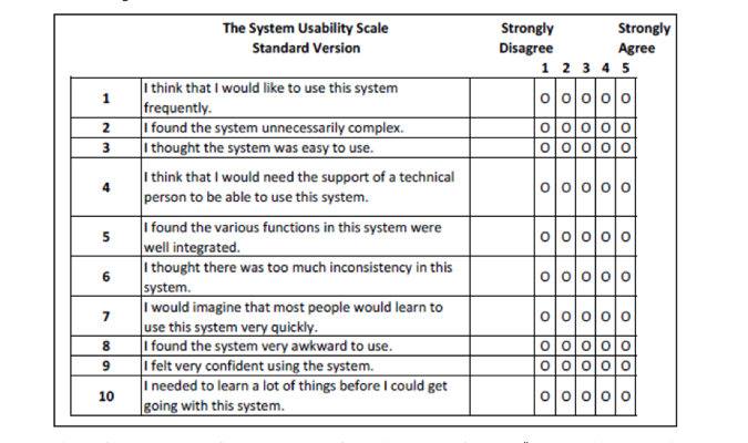
The odd number questions ask about positive things, and the even number questions ask about negative things. This helps prevent a user’s tendency to check the same value down the page on these types of questionnaires. This layout does make the SUS score a bit complex, but there are calculators that can help.
A SUS score helps UX teams identify needed design updates and guides them to prioritize their work. Changes get implemented and new SUS scores can be obtained to gauge the effectiveness of the changes.
Customer Satisfaction (CSAT)
The customer satisfaction score measures how satisfied users are with a product or feature. This UX metric is one of the easiest to implement. You ask users a single question.
“How satisfied are you with _______________?”
The user rates their satisfaction on a scale of 1 (very unsatisfied) to 5 (very satisfied). You calculate the CSAT by adding up all the respondents that gave a 4 or 5 rating, then dividing that by the total number of respondents and multiplying that figure by 100. The higher the percentage, the higher customer satisfaction.
CSAT = (Number of 4 & 5 Ratings / Total number of responses) x 100
Typically, CSAT is about the number rating. But to make the CSAT more valuable for UX teams, you can add a comment section so users can elaborate on their rating. This provides concrete data about specific issues that influenced the score.
UX teams can use the comments to identify pain points and formulate solutions. Then, after design updates are made, review new CSAT score comments to see the impact of the changes.
Net Promoter Score (NPS)
The Net Promoter Score (NPS) quantifies how likely users are to recommend a product to friends, family, or colleagues. NPS is closely tied to the user experience. When users find your product easy to use, they are more likely to recommend it to someone else.
NPS is calculated by asking users a single question.
“How likely are you to recommend __________ to someone else?”
The user chooses their response on a scale of 0 (not likely) to 10 (very likely). Responses are grouped into Detractors (0-6), Passives (7-8), and Promoters (9-10). You subtract the percentage of detractors from the percentage of promoters to calculate an overall NPS. The higher the NPS score, the more happy users you have.
NPS = (# of Promoters/total # of respondents) – (# of Detractors/total # of respondents)
Let’s say you surveyed 100 people, with 60 giving you a Promoter score, 20 giving you a Detractor score, and the other 20 giving a Passive score. Your NPS would be 40.
60% Promoter Score – 20% Detractor Score = NPS of 40
You can also include a comment field in your NPS quiz to allow respondents to further explain their rating. While this information is not officially part of the NPS, it can be a valuable resource to understand the “why” in order to guide product and design changes.
Marketing teams love NPS, because a high number lets them tell a success story to stakeholders. But this kind of information is helpful to UX teams, too, especially when the comment field is included. Users often add comments that can point to design or functionality flaws, helping designers and developers resolve these issues efficiently, improve the user experience, and boost NPS scores.
Accessibility
Every website has to provide an equal experience to every user, no matter what limitations a user has. It’s not just a legal thing, it’s an ethical one. You want your site or app to be inclusive, not exclusive.
Accessibility standards are laid out in the Web Content Accessibility Guidelines (WCAG). One big part of this for the UX team is designing a site that is compatible with screen readers. Accessibility is one of the most important web design best practices.
Screen reader compatibility tests five things–non-text content (charts, photographs, illustrations), headings, form labels, keyboard interaction, and on-page links. There are many free and paid tools and services out there that designers and developers can use. If you’re not sure where to start, the Web Accessibility Initiative (WAI) has a list of testing tools they endorse.
The accessibility metrics provided by these tools tells you how well your site or app accommodates users with disabilities. UX teams can use these metrics to make changes to a site to deliver a full, rich experience for every user.


