ClickMechanic conducted extensive user experience testing before relaunching its website. The testing resulted in an impressive 50 percent increase in conversions.
Clearly, there’s a correlation between user experience testing and conversions. So how do we tie the two together?
Here’s out what I’m going to cover:
- What Is User Experience Testing?
- Why Is UX Important?
- 10 User Experience Testing Methods
- The Best UX Testing Tools
- Common User Experience Testing Questions
What Is User Experience Testing?
User experience testing is the process of testing different aspects of user experience to determine the best way for a website and its elements to interact with its audience.
It’s not dissimilar to running a brick-and-mortar store. You want to know which aisles attract the most customers, which shelf heights move the most product, and what types of signage convince customers to convert.
Many stores use digital tools to measure UX testing in-store.

For online businesses — whether B2B, B2C, e-commerce, or service-oriented — user experience testing helps identify areas of weakness and improve upon them.
You can test for trust, first impressions, comparison (e.g. A/B testing), time on page, and more. As you compile data, you’ll start to see patterns.
Why Is UX Important?
Think about your website for a second. What are your goals?
You obviously want to increase sales, but how do you make it happen? You can’t just click a button and flood money into your bank account.
Instead, you have to figure out what influences (or dissuades) consumers from buying your products and services. That’s the heart of user experience testing.
To increase sales, you have to fulfill each user’s needs. What does he or she need to complete the checkout process?
A few things come to mind immediately:
- Clear navigation
- Easy access to product information
- Easy checkout processes
- Trust symbols
- Social proof
The list goes on. However, what one audience needs, another might not. That’s why you can’t just follow UX best practices blindly and assume you’ll rake in the dough.
Advice and best practices give you a starting point, but you have to test your hypotheses with your own user base.
What is the difference between UX and UI?
User interface (UI) is a component of user experience (UX).
Think of UX as the user’s entire experience from first landing on a website to leaving it for the last time. UI refers to the specific ways in which users interact with elements on the page.
UX is an umbrella term, while UI is just one of its spokes.
10 User Experience Testing Methods to Improve Your Website UX
User experience testing follows the scientific method. You identify a question or need, generate a hypothesis, set up the experiment, run the test, and analyze the results.
Sounds complicated, right? It doesn’t have to be.
There are tons of tools available to help you better understand UX testing, but we’ll get to those later. First, I want to share some of the most common methodologies for user experience testing.
1. Card Sorting
Think of card sorting as a way to efficiently determine how elements of your website should be organized. You’ll develop a site hierarchy and navigation that meets your users’ specific needs.

At first, you don’t know the order in which the cards go. As you test, you’ll figure it out.
Take the jumbled card graphic above. Each card has information on the reverse side: product descriptions, for instance, or support pages, informational content, and so on.
You ask users to categorize the content. You want rows and columns. Columns might represent page categories, for instance, while rows show importance.
You can do this with people in person or virtually through an online tool. Either way, you want real users’ feedback.
2. Moderated User Testing
In moderated user testing, someone moderates the testing experience. It could be an individual in a room with participants or a moderator in a discussion group.
Whatever the case, moderators can answer questions from participants, help guide the process, and provide insight into what the website wants to achieve.
Moderated user testing is also useful when you want someone to explain how a product or interface works. If confusion exists, there’s probably an issue with UX. A moderator can report back on what he or she witnessed during the test.
3. Unmoderated User Testing
Many experts believe that unmoderated user testing is more effective. After all, won’t people feel more comfortable sharing their actual feelings when nobody’s breathing down their necks?
This is true to a certain extent, but you also have to leave room for user error and unfocused participant behavior. Running both moderated and unmoderated user experience testing can make the results far more accurate.
4. Voice of Customer
There are a few hard facts when it comes to customer feedback.

For instance, fewer than 5 percent of dissatisfied customers actually contact the company to complain. This means that 96 percent simply suffer in silence, and according to one study, 90 percent will never return to that business.
Learning how to listen to your customers can become an excellent exercise in user experience testing. Sources of information might include:
- Product or service reviews on your website
- Reviews on third-party websites
- Emails and phone calls
- Submitted feedback forms
Don’t just ignore those points of feedback. Add them to your database for further study.
5. Asking your users
You don’t have to wait for users to contact you. Consider setting up a poll or survey to ask people for their opinions directly.
You can do this on your blog, homepage, or anywhere else you like. If you have a large social following, consider asking users to weigh in on Facebook, Twitter, or Instagram.
6. Recordings
Have you ever wondered how exactly users interact with the pages on your website? If so, you can find out through recordings.
This type of user experience testing allows you to record sessions as users interact with your website. You’ll see where they click and how they navigate the site.

You’ll learn what elements interest your users the most.
7. Availability and accessibility
You’ve probably encountered this before. You type a URL into your web browser and see something like this:

Annoying, right? That’s a problem with accessibility.
Maybe you’ve also visited a website where you click on what you assume is a link, but it doesn’t take you anywhere. Or perhaps the link to the About page in the navigation pane leads you to the contact page.
Auditing for accessibility and usability is essential for user experience testing.
8. Aesthetics
We’ve all heard you shouldn’t judge a book by its cover, right? But be honest. Which of these two books would you be most likely to buy?

I think we can all agree that one is more appealing than the other.
User experience testing should always involve aesthetics, However, everyone has different opinions about beauty.
That’s why you can’t take one person’s opinion. You need a representative sample to figure out what aesthetic details your specific audience prefers.
9. Brand Consistency
When your brand appears, sounds, or behaves differently from one page of your website to the next, you risk confusing — or worse, alienating — your target audience.
It’s kind of like your favorite comedian. You’re used to his specific brand of jokes. Then you buy tickets to his latest show, and you’re flabbergasted. He sounds nothing like himself.
And you might never buy tickets to one of his shows again. Why? You wouldn’t know what to expect because his credibility has been shattered.
10. A/B Testing
I run lots of A/B tests. If you asked me how many I’ve conducted over my career, I couldn’t tell you.
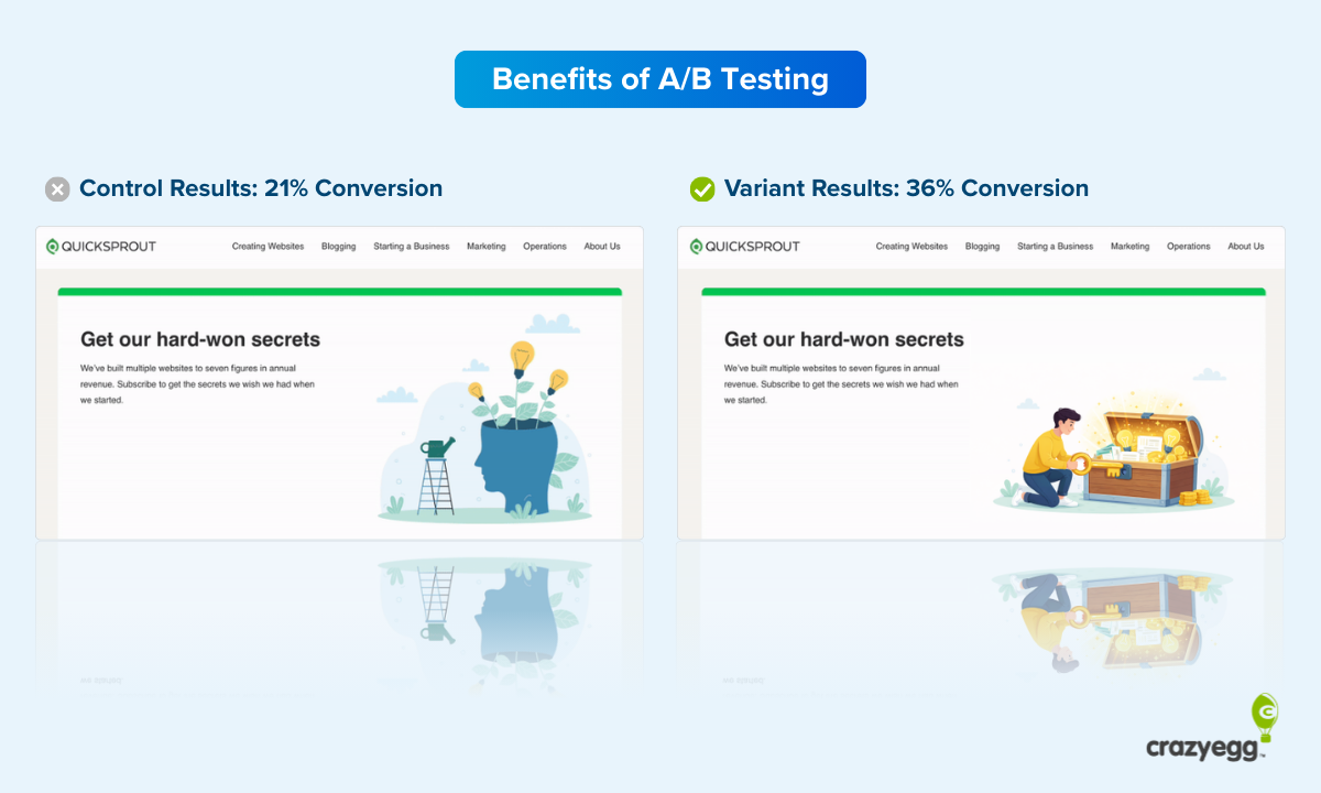
And I still stand by them. There’s no easier way to compare two versions of a marketing asset, collect results from your target audience, and identify a clear winner. You change one element on the page or in the email — or whatever you’re testing — and you push both versions live. At the end, you know which one performed better.
It’s like the two book covers I showed you above. I could make the test a little more practical by changing nothing more than the color.

I’m not a fan of manual A/B testing though. I don’t have time to rifle through pages and pages of data. That’s why I love tools like Crazy Egg and Hello Bar. They let you run automated A/B tests to your heart’s content.
The Best User Experience Testing Tools
Now that we’ve covered some user experience methods, what should you use to perform the actual tests?
Choosing the ux tools is essential because you need high-quality data, well-developed analytics, and a solid company behind the tool.
Let’s look at some of the most popular and well-regarded user experience tools:
Optimizely
Optimizely bills itself as the “world’s greatest experimentation platform.” It offers tons of tools you can use to run experiments, analyze them, and apply the resulting conclusions.

It has a lot of integrations and partners (including Crazy Egg), which is great if you already use those tools, and you can use it to test everything from marketing materials to product onboarding processes. It’s also a great tool for personalization.
GTmetrix
You probably already know that page load speed can make or break a conversion. When consumers get irritated with slow-loading pages or modules, they click away fast.
And they’re likely going to your competitors.
You can use GTmetrix to test your page load speed, and then figure out what might be going wrong. It’ll point out errors like CSS mistakes, javascript problems, and image compression issues.
Crazy Egg
Maybe I’m a little biased, but I’m proud of what Crazy Egg offers our customers. It provides tons of tools to help you zero in on UX errors or mistakes, then correct them before they slow down your momentum.
Start by running recordings of your users in real time. Heatmaps show you where on each page your users click most often, while scroll maps show where on the page most users stop scrolling. Consider sticking a CTA right there.
You can also use Crazy Egg for other reports to help you nail down the ideal user experience. Over time, running more tests and paying attention to the data will help you adapt to your customer base’s changing needs.
Zurb
Zurb lends itself primarily to recall and web design aesthetic testing. In other words, it helps you figure out what users recall after interacting with your websites and whether they like your web design.
It’s also a great tool if you want to test mobile apps, web portals, and emails.
BrowserShots
Lots of browsers exist. Maybe you’re married to Chrome or devoted to Firefox, but your users might have other favorites. BrowserShots helps identify UX issues between browsers so your site performs optimally on all.

Once you discover compatibility issues, you can work with your web development team to correct them.
UXPunk
I like free tools as much as the next guy, and UXPunk has you covered. It allows you to run card sorting tests (which I covered above). Use it to help understand the best hierarchy for your website’s contents as well as the most important pages to display prominently on your site.
Common User Experience Testing Questions
If you’re new to user experience testing, you might have some questions about what you need to test, how to go about it, and what to do with the data you are collecting.
Unfortunately, some businesses make UX mistakes. If you’re not sure whether you’re on the right track, you might need some guidance. Following are a few of the most common.
How do you measure user experience testing results?
Ideally, you’ll use an automated tool to conduct UX testing with a large number of participants. When you have more participants, your results become more accurate.
For instance, 10 people might provide their feedback — and some of it will be highly valuable. However, if you run tests with 1,000 people, you’ll get more data and see more patterns emerge.
Tools like Crazy Egg, for instance, allow you to conduct testing with a portion of your site’s visitors. You can see recordings, view heat maps, and evaluate scroll maps to determine information about your users’ activities.
Who should be your testers?
Your testers should belong to your target audience. For instance, if you’re selling diapers, you wouldn’t want to test using people who don’t have or work with children. They aren’t the people who might buy your diapers.
That’s why harnessing your existing traffic can prove invaluable. People visit your site because they’re interested in your content, products, and services. Testing them will provide you with more valuable information.
How many tests do you need?
For a test to offer legitimate, valuable information, you need enough testers to reach statistical significance. In other words, you need the data to provide you with answers that might apply to your entire target audience.
Additionally, one test is never sufficient. Your brand and company evolve, as do your customers. You might introduce new products, add more services, or change your content production schedule. These changes warrant further testing.
Running user experience testing in cycles can help you advance your efforts. You’ll see how the changes correlate with your site’s content, interactivity, and other elements.
When should you run user experience tests?
There’s no time like the present! However, you don’t want to conduct UX testing until you have enough testers, website visitors, or participants to give you accurate feedback.
For instance, if your website only receives 100 visits per month, you’re probably not ready for UX testing. Focus on generating more traffic, then shift your focus to UX.
Conclusion
User experience testing is one of the most impactful ways to improve your conversion rates, increase brand loyalty, and drive more traffic to your site. Fortunately, there are plenty of tools available to help you get the information you need.
UX testing involves determining the best way to meet your users’ needs. If you meet — and exceed — their expectations, you’ll have won yourself a loyal customer.
Your goal is to perfect the website experience so users can find what they need, when they need it. Some visitors might be at the top of the conversion funnel. They’re looking for information.
Visitors at the bottom of the funnel are checking out your products and looking for an excuse to buy.
Knowing your conversion funnel will help you apply these tips more effectively.
Continue to test using user experience testing methods like card sorting, the voice of the customer, recordings, and aesthetics, as well as the other methods I mentioned. Check out tools like Crazy Egg to make testing more efficient and accurate.
Before you know it, you’ll have a website that impresses every visitor and meets their specific needs.
For more insights on optimizing user experience, check out our guide on UX optimization tricks.


