Trust. It could easily be the least understood and the most essential element for increasing conversions and extracting the maximum value from your website.
Think about it.
You can offer the best product or service in the market. But if visitors don’t trust your site, they won’t buy. Put more bluntly, you’ll be the only person in the market who thinks you’re the best.
Once trust is established, however, everything changes. Engagement and conversion rates can skyrocket. Trust is the tipping point that can catapult your brand to the top of your market.
[Tweet “Trust is the tipping point that catapults your brand to the top.”]
But trust is also one of the most intangible elements in your conversion optimization toolbox. What is it? And how do you know you’re generating it?
The Meaning of Trust
According to the D.M Rousseau, a professor at Carnegie Mellon University,
For those seeking to increase conversions, this basically means knowing (and testing) what page elements and content will create a customer decision journey that results in conversion — overshadowing any fear about you or your product.
But the question remains. How do you build trust in marketing?
Two-Step Methodology to Increasing Trust
The primary way of gaining trust is to EARN it by developing and nurturing a relationship with your customers or future prospects.
After you’ve done this, you can then work on INSPIRING trust with credibility indicators, design cues, testimonials, security assurances and whole myriad of other conversion rate tactics.
So trust is a two-step process. It depends on relationship first, and then on reminders that the relationship is valuable.
[Tweet “Earn and inspire trust through relationship and trust signals.”]
To build relationship, depend on savvy content, social media and email marketing. To remind visitors that their relationship with you is valuable, keep reading.
What follows is an actionable list of 30 things you can do right now to increase trust — and hence conversions — on your site.
Let’s dig in.
1. Be completely transparent with your audience
Traditional marketing was all about controlled messaging. Brands had defined and distinct boundaries, all placing the primary focus on the company itself. However, in today’s social environment, consumers are in control of the conversation.
Why is it important, you ask?
Nowadays, everything is in public view — both personal and corporate secrets. What’s worse, it can all be discovered with a few lines of code or a quick Google search. So if a company isn’t being honest, it’s just a matter of time till they’re unmasked.
Transparency refers to the quality of making something simply accessible. Transparency gets your brand attention, though with a unique twist, as we’ll see below.
Example 1: One great example is when Buffer revealed the pay structure of their entire company (all the way down to CEO!). This had the impact of increasing the popularity in their company (and also to an influx of resumes).
Example 2: McDonald’s had been fighting with the rumor that some of its food was made from “pink slime.” To make matters worse, there were a whole bunch of photos on the internet attesting to this.
To fight this allegation, McDonald’s Canada published behind-the-scenes footage that documented the process of making their food. The result? Nearly 3 million views and being lauded for its increased transparency.
2. Use testimonials, case studies, testimonial videos or endorsements
Include some sort of case study that shows the end result of using your product.
Testimonials are a great way to build trust and amplify desire on your website. They work on the principle of social proof. People will think: “If someone else has bought in the past and had a positive experience, there’s less chance that I’ll regret my purchase down the road.”
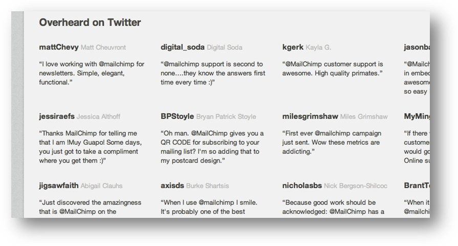
If you have a comment system or customer review section on your blog, use Facebook comments to improve the authenticity. Also, a live Twitter feed of people mentioning you is good.
Example 1: Search Engine Strategies did a great job of this at their SES San Jose function.
Example 2: MailChimp’s Overheard on Twitter. (Note: This feature has now been taken off MailChimp site.)
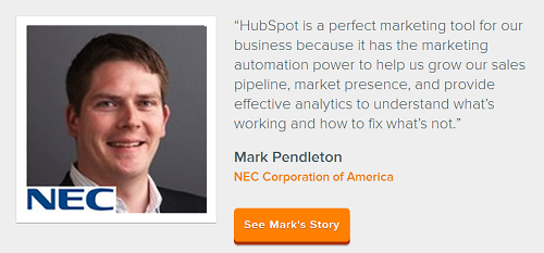
Example 3: A Testimonial for Hubspot
Example 4: Video Testimonial for Unbounce
3. Showcase your current or past customers
By displaying well-known brands/organization names, you can create a level of trust for new and repeat users. Knowing that big brands trust you with their needs will make it easier on smaller businesses to make a decision.
This will show visitors that others have already bought your products and found them useful — and help them believe that you’ll deliver as promised.
Example:
Here’s an example from Crazy Egg listing big-name companies that use their heatmaps.
4. Mention specific numbers
For someone first coming into contact with your platform and your brand, there’s no way to know how powerful your brand name is, unless you spell it out for them. Some hard numbers can help in this regard.
Example 1: Beachbody
“3 MILLION COPIES SOLD”
Example 2: Basecamp
Example 3: Show that you’ve already had 5000+ customers
To add social proof, showcase that you’ve already had 5000+ customers. You could add a mention of it (e.g., ‘Over 5000 companies have already made the change’) on top of the logos of the past customers.
This would prove to new visitors that others have already changed their habits and made the transition into using your product or service.
5. Provide no-brainer guarantees
It’s important to assume as much risk as possible to reduce the anxiety of your prospect and clear the path for a worry-free sale. Guarantees are usually the best way to do this.
Example 1: Moz.com
Example 2: Zappos
6. Implement a money-back guarantee
It has been shown by many of the most successful online retailers that the longer the money-back guarantee is, the greater the positive impact on conversion rate.
The heuristic is simple: Consumers are scared and nothing instills more confidence than asserting, “We’ll happily give you your money back if you’re not satisfied.”
For many eCommerce stores, the higher conversion rates this strategy yields far outweigh the cost of any increase in refund rates.
You could also consider offering a guarantee that’s based on results, but that works only if the customers can relatively easily measure the impact of your product or service. See the example of Hampton’s guarantees:
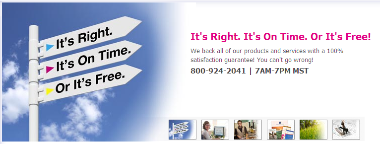
As an alternative, you can offer a money back guarantee if your product fails to meet certain conditions. Like Printingforless’ guarantees:
7. Show your money-back guarantee more prominently
You offer a money-back guarantee, but it’s not shown anywhere on the site. Why?
A strong guarantee creates a lot of trust. It tells the visitor that you’re confident in your products and your ability to make them happy. It also assures customers that they won’t lose anything, even if they misunderstood something.
Example: Here’s how Kogan, a prominent ecommerce site, shows their 14-day money-back guarantee:
8. Provide timely point of action assurances
It is right before clicking your call to action (CTA) that prospects’ anxiety levels start rising. Therefore, it’s up to you to reassure them that they are making a good decision.
Email sign-up reassurance
Under the email field, tell people you won’t spam them. Phrases like, “We hate spam as much as you do” or “We won’t spam you,” are fine, but they are getting pretty common and can stereotype you as just another sheep following the crowd.
Communicate your assurances using your unique brand voice — it’ll make you more authentic. And be sure to test your form with and without those assurances. They may not actually help increase your conversion rates.
Another idea is to incorporate a ‘NO SPAM’ shield like the one below.
Example: mixergy.com/hi does this well:
Order button re-assurance
Under your order button remind them of your guarantee and the core benefit (in as few words as possible).
Example: EasyJet
Registration page reassurance
Just because someone is on the registration page doesn’t mean they are not feeling any anxiety. Always reassure prospects that they are indeed making a good decision.
Example: Basecamp
9. Go overboard with credibility indicators
Business awards
If you’ve won any business awards, don’t be afraid to tell people.
Industry regulations: Providing links to industry bodies shows you understand the regulations, and are one of the good guys.
Membership of industry associations
Include their logo and describe your involvement.
Media
If you’ve appeared in any popular media, have an ‘As Seen In’ area showing their logo and linking to that content.
Active social media profiles
If you’re ACTIVE on social media, include links to them. If they are sitting there collecting digital dust, it’s probably not a good idea to add them as it looks like you don’t care.
It also diminishes your social proof. Why would you want to do that?
Security and trust seals
If your brand isn’t widely recognized, most visitors won’t have full confidence in your security. By showing security seals (e.g. VeriSign) you’ll take away the visitors’ fear of losing their private information.
Other badges (e.g. industry association logos) show that you’re a trustworthy company that’s run by real people who take their business seriously enough to join an industry association.
Examples:
Third-party trust seals give instant visual feedback to visitors on whether a website is credible, and safe. There are three types of trust seals:
- Security seals: They ensure your website is free from hacker attacks, and that under normal circumstances your customers are protected when transacting.
- Privacy seals: These seals verify that you have certain statements in your privacy policy that protect your customer.
- Business identity seals: These exist for customers to verify your business address, phone, and email, giving them peace of mind that you are who you say you are.
Trusted payment gateway logos
Displaying the VISA, MasterCard and PayPal logo serves several purposes:
- It has been shown to create trust.
- It gives the customer assurance that your online business has been around for quite some time.
- Answers an immediate question that’s on your customer’s mind: “Do they take my credit card?”
- When tested, it almost always improves conversion rate.
Example:
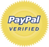
The PayPal Verified logo
Calling out the fact that your payment provider is PayPal. This can actually serve you as an additional credibility factor, if your PayPal account is eligible to use the “PayPal Verified” logo.
This logo (pictured above), when placed on the site, can serve as a credibility symbol that makes your visitors feel more secure, and more comfortable about making a purchase from you.
10. Replace generalities with specific language
In Scientific Advertising, Claude Hopkins states,
“To say that something is ‘the best in the world’ makes no impression whatever. That is an expected claim. The reader may not blame us for exaggeration, but we lose much of his respect. He naturally minimizes whatever else we may say.
On the other hand, when you state actual figures, definite facts, they accept them at par. Such definite statements are either facts or lies, and people do not expect that reputable people or concerns will lie.”
For example:
It’s better to say “takes 5 minutes to assemble” than “easy to assemble.”
It’s also better to say “developed by engineers at MIT” instead of “advanced engineering.”
By adding specific details, you can be more descriptive, present more useful information and, more importantly, look more credible.
11. Tell them what you can’t do
When you tell a prospect what you can’t do, they’re more likely to believe you when you tell them what you can do.
Example: “The unfriendly doctor”
The headline here is quite eye catching:
You don’t want me to be your family doctor.
Pretty brazen for a doctor. And attention getting. Having gained your attention, Dr Goodman explains,
“Neurosurgery is one of the few medical specialties for which I am well-suited. I am not warm and fuzzy. I could never be successful as a pediatrician or in a family practice — no one would come back a second time. But I am very good at what I do.”
In fact, saying what he wasn’t allowed Dr. Goodman to stand out amidst the clutter and numerous doctors that are available for surgery.
12. Openly admit you are not the cheapest option
Educate consumers on what it means to buy the cheapest option in your market — and assure them that your product remains very competitive for what they get.
Admitting that other vendors are cheaper may seem counterintuitive, but a higher price tag positions your product as higher quality.
13. Demonstrate your customer support by creating a knowledge base
Sometimes people don’t buy because they aren’t sure if they’ll get support after the purchase. To overcome this obstacle, show prospects how fast and easy it can be to get in touch with customer support.
Knowing that help is readily available if anything goes wrong, your customers may feel more confident taking action.
Example 1: Apple’s Knowledge Base is a great example of a trust-building knowledge base.
Example 2: Proposify’s knowledge base is another example.
14. Show ratings on the product
Ratings have been proven to increase trust. If you don’t post them on your website, prospects will search for them elsewhere. So why not put them on-site?
Example 1: Appliancesonline
Example 2: Amazon.com
15. Make decision-making easy
It may be as simple as adding a new category such as “Best-Rated Products.”
If you think about it, this is a no-brainer. It makes it easy for buyers who don’t like making decisions. And it demonstrates that you know your customers’ preferences.
Example:
16. Invest in a professional design
There’s no denying that a professionally designed website can increase trust and credibility. While it may not be necessary to do a complete redesign, it is important to keep your website fresh and updated.
A site that looks old or outdated makes visitors believe you aren’t actively supporting customers. Or worse, makes them think you aren’t a legitimate business.
Example: Apple
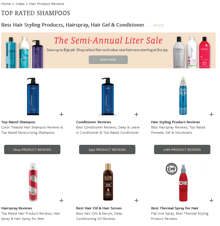
17. Compile all trust-related links into one group in the footer
Putting all your trust-related pages in one widget or tab has a double function – highlighting that you want to give customers all the information they need, and creating a powerful bulleted list of sales points.
You have to admit, this looks compelling.
Example: www.psprint.com
18. Create an FAQ section at the bottom of product pages
Most people who are buying your products will have similar questions.
By answering those questions on the product page (rather than making them hunt for them), you not only overcome objections as they arise, you also create trust. After all, how can you have FAQs if you haven’t told the product frequently?
The questions could include:
- “What if I have to cancel my order?”
- “Can I change the order after I’ve made the payment?”
- “What kind of guarantees do you offer?”
- “How do the returns work?”
Example: kajabiapp.com
19. Create promotional videos showing your products in action
Sell physical products? New customers may worry that your products are “flimsy.” Overcome this fear by creating videos that show how durable your products really are.
Here’s an example of how BlendTec has used promotional videos to prove its products’ durability:
Example:
20. Add live chat
No one wants to do business with a company that isn’t actively supporting customers. Live chat shows visitors you are not only active, you have real people ready to help them right now. It also shows your dedication to customer service, so they are more confident to make a purchase.
But there’s a bonus for you.
Use a live chat tool for market research. What are your visitors’ most pressing questions? Your live chat operator can let you know — while also nudging visitors to purchase now.
The visitor insights you collect can help you find the elements on your website that aren’t working, the gaps in your sales presentation, and the messaging that will most likely attract and convert your ideal customers.
Example:
21. Add an “As Featured In” section
When you see that a brand has been featured in mainstream media — particularly if that media is well-respected — it immediately shifts your perception. They go from “just another vendor” to “someone worth listening to.”
Think of it as social proof, on steriods.
Examples:
Michael Hyatt earns immediate credibility with such respected media as The New York Times and Forbes.
22. Provide valuable training for free
If you remember from the introduction, trust builds on relationship. Any trust-builder that also helps you develop relationship with your visitors is a no-brainer.
One way to do that is to create valuable training, available free in exchange for opt-in.
This is a great way to get visitors onto your email list so you can provide unique touches that build relationship and trust.
The training could be a recorded webinar you held on “How to Increase Activity in Your Community.”
Or it could be a crash course that helps your visitors master a difficult topic.
Then, through automated email follow-up, you can educate prospects about what you do, planting the seeds of why your product or service is the obvious choice for them.
23. Keep your name in front of visitors
“The Rule of Seven” isn’t new. But few companies remember it. Essentially…
Now, the number seven isn’t cast in stone, but it is rare for people to sign up on their first visit.
If you’re not following up with your prospects, they may stumble onto your competitors and buy from them, or they may decide to “buy it later.” The trouble is, later generally means never.
To prevent this, you need to stay top-of-mind.
You can do this through Google AdWords remarketing, Facebook advertising, or simply by staying active in social media and email marketing.
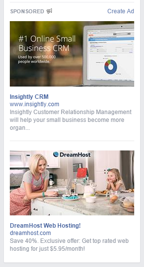
Here are some examples of Facebook ads, reminding me that I visited their website recently.
24. Place social follow buttons/icons where they’re easy to see
You can take a subtle approach, placing social icons in your header.
Or you can use the buttons provided by each social platform.
The idea is to make it as easy as possible for your visitors to take that first step toward relationship while also conveying that you’re active and accessible in social media.
25. Implement social sharing buttons on your Blog page.
Just as you want to make it easy for people to follow you, you also want to make it easy for people to share your content.
The easiest way to do that is to add floating social media sharing buttons to your blog. Like these
If you get a lot of shares, make sure to publish the numbers.
26. Show how many people follow you on social media.
Here’s another place to show off your numbers. If you have a considerable number of followers, showcase it.
You can do this by using a Facebook “like” box that shows your real-time number of fans. At the same time, the box makes it easy to LIKE your page so you’ll get even more followers.
Examples:
Social Media Examiner has this widget in their sidebar:
Mari Smith uses this. Notice she adds images of your friends who follow her, making it feel like you’re being excluded if you don’t follower her as well.
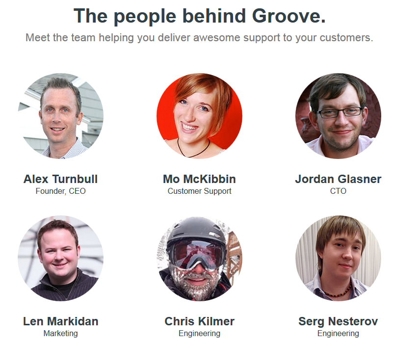
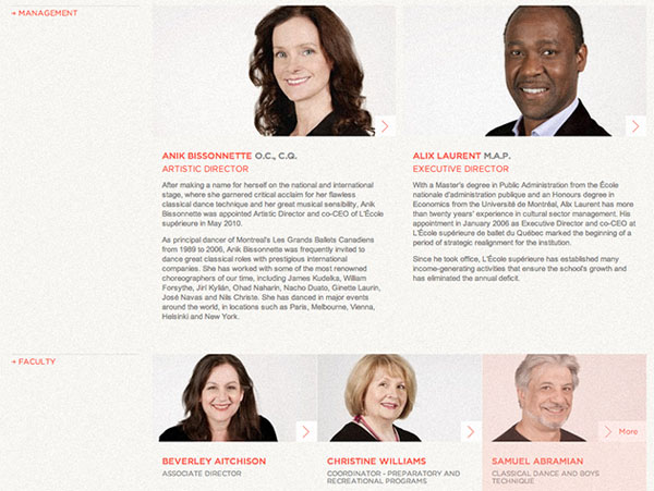
27. Add images to your “About Us” page
People want to do business with people. So don’t be bashful. Add your and your employees’ headshots to the About Us page.
Let your personalities show. This enables people to get a taste of your company culture.
Example 1: GrooveHQ
Example 2: ESBQ
28. Showcase that you’re a long-established company
People trust long-established companies more than new ones (assuming the long-established company doesn’t look dated or poorly maintained).
If you’ve been in the business for 50 years, say so. That’s an easy way to instill trust.
Example: BatesCarter
By the way, you could add a mention of this to the header or on the home page as well. That’s a smart PR move.
29. Copyright notice in footer must be up-to-date.
Make sure your copyright notice is up-to-date. Format it as a range, your first year, hyphen, the current year (like this: 2003-2012) to show the length of time you’ve been in business — again, adding to your credibility.
Example: Sitetuners.com
30. Show off your environment badges
Whatever socially responsible thing you do, show it off. Today’s consumer want to do business with companies that care about the world and their community.
To promote your support (and get more people to like and trust your brand for it), you need to show them off elegantly.
We recommend you add the non-profits’ logos in your footer with a link to their respective pages for more information.
Whilst most visitors probably won’t be interested in clicking through and exploring further, simply seeing them will give them positive reassurance that being a customer of your brand will allow them to indirectly contribute to social causes.
This simple tweak makes visitors feel good about your brand, which often results in more sales more often.
How many trust elements are you using?
Today’s consumers are different. They’re looking for more than a service provider or seller. They’re looking for relationship and a unique brand experience.
But they’re most interested in working with brands they trust.
Your challenge is to become a trustworthy brand. You need to send signals, loud and clear, that communicate trust.
This is obvious when selling to people face to face. Less so online. But if you review the list above, you probably agree that the rules haven’t changed that much.
You must build trust in marketing your products.
You need to EARN it by being transparent and human. You also need to INSPIRE it by being credible. After that, it’s all about communicating your value without resorting to hype or manipulation.
Do that, and you’re nailing the trust thing. And you’ll likely be able to measure it in your bottom-line profits.


