Making a good landing page isn’t rocket science—but it does take some work.
You need to learn how to make a good landing page that gives the customers what they want. That means going beyond simply designing something that “looks good.”
So how can you demystify the process and unleash your landing page, to the amazement of the watching world?
Keep reading, and I’ll lay it out for you.
What Is a Landing Page?
The goal of a great landing page is to increase conversion rates in order to reach your marketing or business growth goals. A landing page can be your homepage, or another page within your taxonomy, or it can be a standalone page created for a specific campaign, sale, or product.
When it comes to a landing page vs. a homepage or other page your visitors find through a search engine, people often get confused.
It all comes down to how they find your page and why the page exists in the first place. People often find homepages through word of mouth or social media, while landing pages are often found organically, using keywords and high-ranking search results.
Each page has its own purpose: to inform, to act as a gateway to the rest of the site (as in your homepage), or a number of other reasons.
A landing page is usually promoted through Google Adwords or another similar service, and it exists for one reason only: to convert. Again, this can be your homepage, if you set it up to increase conversions, for example.
Here’s one of the best landing pages examples I have seen. It’s for Nigella Lawson, the famous chef.

It’s actually carrying two conversion goals in one simple design:
(1) First, it’s promoting her tour, an intimate evening with Nigella Lawson. It contains a simple headline, a brief description, and a strong CTA.
(2) Underneath is another call to action, this one for looking up recipes, which is why many people probably come to her site in the first place.
It contains all of the effective elements of good landing page design, which we’ll get to. But before we do, let’s talk about how a landing page benefits your company.
Benefits of Effective Landing Pages
There are a few benefits of effective landing pages, beyond increased conversions.
Getting SEO Ranking
Landing pages are crafted to target a specific set of search terms. They’re also promoted using Google Adwords and other paid boosting methods. Both of these move the landing page up in ranking and get your product, promotion, or sale in front of people searching for similar topics.
Promoting an Upcoming Product or Sale
A landing page focuses on one promotion, product or sale. It lives outside of your site’s taxonomy and exists solely to get one message across. This is good in a few ways:
- It moves one specific sales or marketing goal to the foreground for higher conversion
- It gives you the opportunity to isolate and track the success of a particular product, goal or set of keywords.
Make the Buying/Subscribing Process More Efficient
A high converting landing page acts simply as a portal to move visitors down the funnel more efficiently. Rather than people stumbling upon your CTA somewhere in your right rail or on your homepage, they find it right away on the landing page and move on to subscribe, sign up, buy or join.
The Truth About Good Landing Pages
It’s important to note that there’s no standard manual on the creation of a perfect landing page.
Landing pages that convert are as different as the people looking at them. Each one has a different call to action to drive, a different reader in mind, a different product or service to offer, and a different niche to address.
For example, consider these three scenarios:
- One landing page is selling zero drop shoes to ultramarathoners.
- Another landing page is inviting in-house marketers to a two-day conversion conference in Toronto.
- A third landing page is asking sommeliers to take an online pairing quiz.
The page design that works for any of these three is unlikely to work for either of the other two.
That’s because there’s an incredible amount of variation among their audience, purpose, intent, product, angle, focus, industry, niche, perception, buy-in, cost, messaging, value proposition, and testimonial approach.
(Among a whole host of other factors.)
So one size does not fit all.
But there are unifying elements that characterize highly successful landing pages. I want to give you the closest thing to a magic bullet as possible with these tips.
Despite the huge potential for variation, some things do remain constant. High-converting landing pages often have these characteristics in common.
How to Create a Landing Page That Converts
Before you even begin putting together your landing page, you need to determine what you want it to accomplish. Are you looking to grow your email list? Promote a new product? Promote a discount on a subscription service?
Once you have your goal, think about what your message will be. How can your offering — whether that be a subscription for content, an email list, or a product — solve someone’s problem?
Then you can start your keyword research. What do people type in when they’re searching for solutions to the problem that your sale, product, or newsletter can solve?
Once you have your goal, message, and keywords, you can start putting your landing page together. Start thinking about the elements you want to include: a CTA, a sales pitch video, or maybe a form.
All effective landing pages have nine common elements. Let’s take a look at each of those elements in detail.
9 Essential Landing Page Elements
1. A Killer Headline
A headline is where everything begins — interest, attention, and understanding.
It’s what compels a visitor to stay and learn more about what you’re offering — or not.
Here’s what it needs to accomplish:
- The headline should grab the reader’s attention.
- The headline should tell the reader what the product or service is all about.
- The headline should be short. Never make it more than 20 words, and preferably limit it to 10.
It’s also worth noting that if your headline complements an image that explains the product or service, then you don’t need to go into quite as much detail in the copy.
Now that we’ve established the basics of an effective headline, let’s jump into some examples of companies who’ve written them well.
First, take a look at this landing page for a popular UX design tool.

The headline is short, sweet, and gets to the point quickly. This product is clearly built for teams.
If a visitor relates to or is inspired by InVision’s bold statement, this will pique their interest and make them want to learn more.
Next, take a look at this headline from PictureMarketing. It doesn’t attempt to be clever, but identifies exactly what the service is intended to provide.

For a service that helps businesses capture photos of consumers at events, this is perfectly clear.
As soon as a visitor lands on this page, they know what the company is offering.
Mission accomplished. Use the examples above as inspiration when creating landing pages.
Now, we’ll look at an example that isn’t quite as straightforward.
Monsoon’s headline, “We are product people” is attention-grabbing, but it doesn’t tell visitors exactly what they offer.
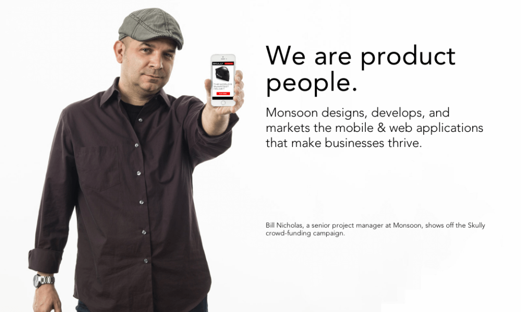
Fortunately, they include further explanation in a subheadline. And once you read that subheadline, it’s clear why they wouldn’t put all of that information in the main statement on the page.
It’s just a little too wordy for visitors to read and comprehend immediately. So they use a brief statement first to capture attention, then give more details.
Plus, the page’s clean design helps give power to the image and headline. Because there aren’t a bunch of other elements distracting from it, readers can focus their attention on the copy.
If your product or service is too complex to be summed up in 10 to 20 words, this could be an effective approach.
Our next example, from MailChimp, does a nice job of summarizing the company’s main goal, instead of a specific product or tool.

This is another effective approach for companies that offer a variety of services.
Of course, landing pages for individual services can be more specific. But if you’re aiming to create a page that sparks visitors’ interest in your company as a whole, naming a high-level goal is often the best way to do so.
In this case, MailChimp uses a simple, declarative statement to democratize its product and emphasize its importance.
2. Persuasive Subheads
The next element you need to create an effective landing page is the subheadline.
If the headline makes the visitor look, then the subheadline should make them stay. Together, these pieces of copy make up the one-two punch of a landing page’s power.
Here’s what to keep in mind as you create yours:
- Normally, the persuasive subheadline is positioned directly underneath the main headline.
- The subheadline should have some element of persuasiveness.
- The subheadline can go into slightly more depth and detail than the main headline.
For example, take a look at Slack’s homepage:
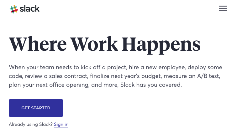
Its main headline, “Where Work Happens,” is sufficiently concise and attention-grabbing.
Then, in the subheadline, readers can learn about the platform. If their team needs to undertake any of the listed tasks, it’s clear that they benefit from using it.
And if that’s the case, they’ll be much more likely to click that “Get Started” button than they would after reading the headline alone.
It’s also worth noting that the explanation doesn’t always have to come after the page’s most compelling statement.
HelpDesk, for example, flips their headline and subheadline on the following landing page.

The page’s main headline, as indicated by the larger font and central positioning, is “A delightful customer experience.”
Although “A help desk for teams that insist on” is placed above that main headline, it’s clearly the subheadline. It’s much smaller and not featured as prominently.
Still, it elaborates on the headline’s general idea by explaining who the platform is for.
The position switch seems to be intentional. Taken together, it forms a complete idea of what HelpDesk offers.
Plus, with the way it’s presented, visitors’ attention is first directed to that emotionally loaded phrase: “delightful customer experience.”
If you try to rearrange the information on the page to place that phrase before the subheadline, the explanation doesn’t come across nearly as streamlined.
And considering that the only reason to do this would be to meet some standard idea of how a headline and subheadline should be arranged, there’s no reason to.
So as you write your landing page copy, remember that you don’t necessarily have to follow a specific formula.
Arrange your content in a way that efficiently explains what you’re offering, and you’ll be much more successful in connecting with readers.
3. Pictures
Visual content is an essential component of landing pages that work.
In fact, the brain processes images 60,000 times faster than text. This means that visitors will be affected by the images on your landing page immediately.
So as you select and place your images, remember that
- The pictures should be large.
- The pictures should be relevant to your product or service. If you are selling a physical product, it is essential that your landing page contains an image of the product.
- If you are selling a service, the primary purpose of the image should be to grab attention and demonstrate relevance to the visitor.
- The pictures need to be high-quality.
And as you determine what to include, keep the focus on high-quality, relevant visuals. This is not the place to feature stock photographs or last-minute Photoshop jobs.

After all, if your images are the first thing a visitor processes, they have the potential to shape that visitor’s impression of your brand before they even read your copy — and you need that impression to be a good one.
For example, Mixpanel uses images on the following landing page to show the functionality of their product and to help explain it.

These images are fun and attention-grabbing.
Plus, they give potential customers a sense of what using the platform is like, and highlight its user-friendliness.
For software and other tools, screenshots like this are a great choice.
Repumatic takes a similar approach and includes large screenshots on the following landing page to display the software’s functionality.
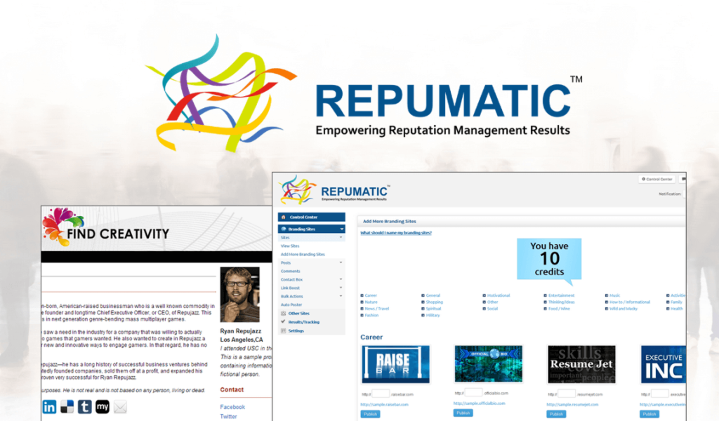
Even before someone takes the time to read about what this product does, they have a sense of what using it would be like.
This essentially gives potential customers a visual understanding of what they stand to gain. And that’s an approach that works for many service-based businesses.
For example, Shutterstock sells images — so it’s only natural that they would have a landing page with a large, high-quality photo.

After all, who would want to purchase photos for their website from a company that didn’t have a great one on their own site?
Probably not too many people.
It’s also important to remember that because many people will base their opinion of your brand on your landing page, you should view it as a chance to differentiate yourself from your competitors.
For example, PictureU, like Shutterstock, also offers photos for marketing purposes. So it makes sense that they feature large images on their landing pages, as well.

Both of these sites do a nice job with their landing page visuals. But if one of them didn’t, and potential buyer viewed both, which one do you think they’d choose for their image needs?
That’s a pretty easy call.
4. An Explanation
Your landing page needs to make what you’re offering perfectly clear.
After all, if a potential customer doesn’t understand what your product or service is about, you’ve lost them. So a straightforward explanation is crucial.
If your landing page is for a simple product or service, you might be able to get away with your headline and subheadline being the only copy.
But regardless of how you choose to approach your explanation, here’s what to keep in mind as you write it:
- Your explanation can be integrated with your headline, or completely separate.
- An explanation should be benefit-oriented. Explanations are functional, but functionality should be tilted in favor of the user.
So your explanation doesn’t necessarily need to be separate from your headline and subheadline.
In fact, if you think back to the examples in the previous sections, most of them don’t have an additional paragraph or chunk of text to elaborate on what they’re offering.
So instead of thinking of your explanation as a standalone element, consider it more of a goal that your page needs to accomplish.
Taken in isolation, each of the elements on your landing page might not explain your product or service. But if, as a composite, they create a clear picture, your page accomplishes what it needs to do.
That’s why for most landing pages, your best bet is to keep things straightforward. You might want to make your copy “fun” and “unique” — and that’s possible. But your top priority should always be clarity.
You can also rely on images to help with your explanation. For example, check out this graphic from Asana’s product page:

The headline and subheadline here are compelling but might leave readers wondering what, exactly, “everything you need” is.
Asana addresses that with a visual walkthrough of their platform.
This is much easier to understand than a text-based explanation, and for most visitors, much more interesting, too.
5. Something About Pain
Your first reaction to this subheading might be: “Something about… ? Isn’t that pretty vague?”
Yes. But this point is intentionally vague because the idea of “pain” leaves a lot of room for interpretation.
Here’s the psychology behind pain: Humans are wired to avoid pain. Every product or service can help to alleviate pain in some way.
If you can cause someone to think about their pain, they will subconsciously seek relief from that pain, and thereby be more likely to convert.
Here’s how to accomplish that on your landing page:
- Mention what someone will lose, not just what they will gain. According to the theory of loss aversion, we are more likely to anticipate the pain of losing something than we are to feel the pleasure of gaining something of equal value. In other words, it feels good to get $50, but the pain that we feel from losing $50 is twice as intense as the pleasure we received from gaining the same sum.
- Consider implementing pain references in your testimonials, as well as in the remainder of the copy. Since pain is a powerful human element, real human testimonials are often very effective at conveying this pain in a trustworthy way.
- Be sure to relieve the pain. Your product or service is provided as an antidote to the pain. Don’t present a problem without providing a solution!
Essentially, you want to illustrate a pain point your reader might be experiencing. Then, draw the conclusion that your product or service provides the answer to that pain.
For example, I have a landing page designed to persuade people not to lose out on search traffic.
To kick things off, I start off with a simple interactive element – a quiz:
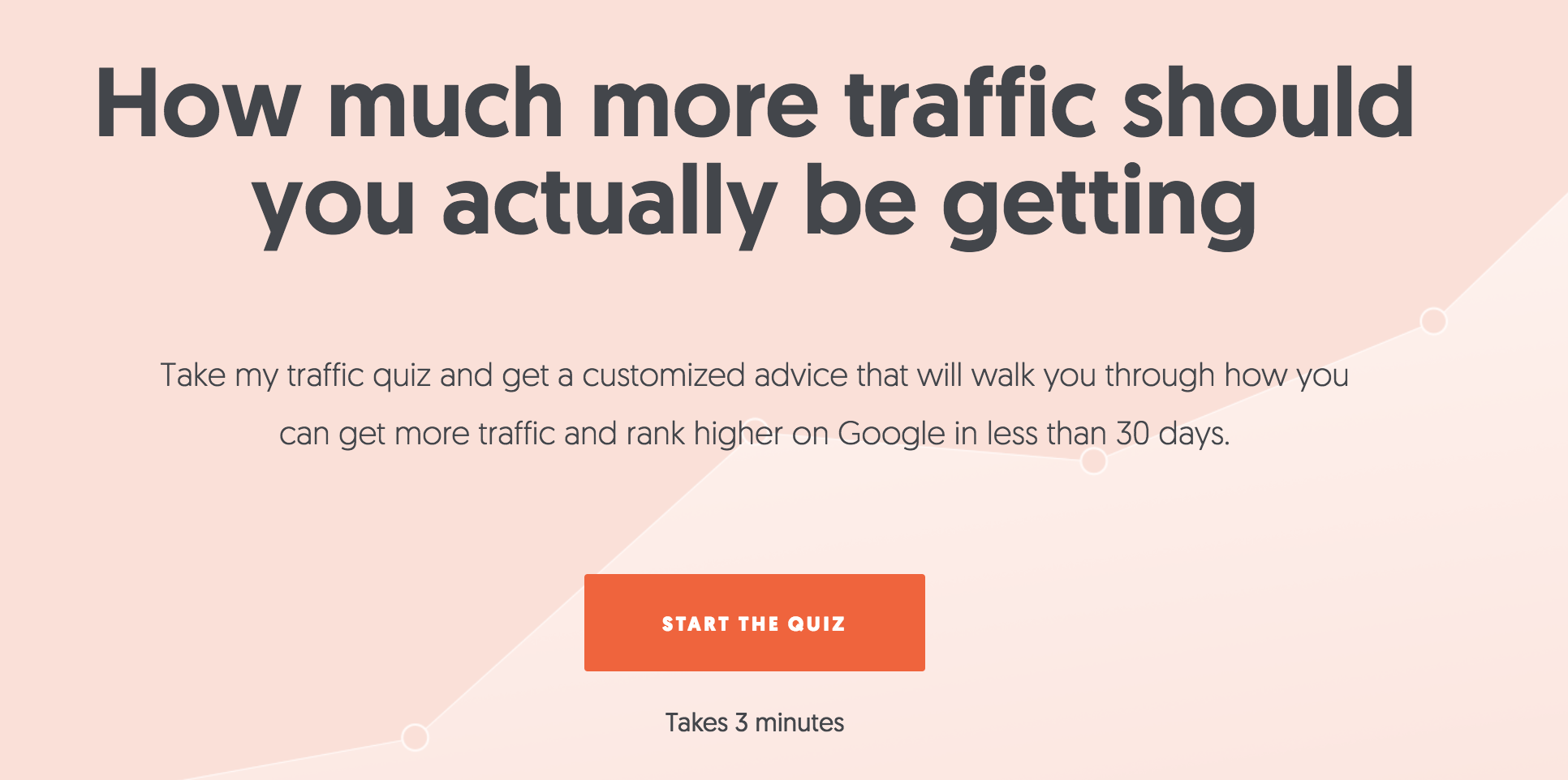
Many of us can relate to the challenge of ranking higher on Google. By highlighting that challenge and offering a fun diagnostic tool, I immediately establish a connection with my visitors.
6. Something About Pleasure
Just as humans are pain-avoiding machines, we are also pleasure-seeking animals. Every human is motivated by the desire to gain pleasure, which can have a variety of forms.
There are two main ways you can incorporate this into your landing page:
- Show how pleasure is a by-product of having your product or service.
- Show how your product meets an emotional need beyond its functional role.
To illustrate how this might work, imagine that you’re selling arthritis-relief medication. On the surface, you’re selling a pill.
But you’re not just selling a pill. You’re selling freedom, relief, and joy.
The same principle can be applied to many different products.
If you sell cross-training footwear, you’re not just selling something that goes on a customer’s foot. You’re selling respect, trendiness, security, vibrancy, and fulfillment.
The key here is to present your product in such a way that highlights how it brings emotional and psychological pleasure.
We all desire to be accepted, loved, appreciated, recognized, honored, compensated, admired, etc. Figure out which emotional craving your product or service can help to satisfy.
And if you don’t consider your product “emotional”?
You can still make this tactic work.
To illustrate this point, we’ll take a look at a landing page from Mixpanel. The company sells A/B testing services. Not all that emotionally powerful, right?
In the hands of some marketers, sure.
But they use the following effective landing page to inspire a sense of wonder and surprise.

Humans have a psychological proclivity for surprise. It scratches an emotional itch. That’s exactly why this headline is perfect for speaking to the brain’s pleasure center.
Now, take a look at this page from Reputation.com.

The company helps people gain back their reputation — and it’s easy to see the emotional connection in their headline, subheadline, and CTA.
Next, we’ll take a look at a landing page from Instapage that presents the reader with this question, “Want to get it right on your first try? Welcome to Instapage.”

This desire to get things right on the first try resonates with an emotional need that most of us can relate to.
We recognize that doing so will build our confidence, our reputation, and maybe our income — and all of these thoughts are being inspired by landing page software.
7. Methods of Contact
Is your business legit?
Then make that clear on your landing page.
Some of the most persuasive landing pages that I’ve visited have multiple methods of contact, including a phone number, a physical address, an email address, and a contact form.
Some even have popups where a customer service representative asks me if they can be of help.
These go a long way to help strengthen my trust in the company and to eliminate any friction in the conversion funnel.
Here’s what to keep in mind as you add contact information to your landing page:
- At the most basic level, provide some assurance that you are a real company. Usually, this involves a physical address and a phone number.
- Live chats featured in a popup can be helpful, but not a must-have. Using live chat is somewhat controversial. If you insist on using one, do your homework, and make sure you have some convincing reasons for keeping it there.
For example, while researching this article, I chatted with one of the representatives from Placester. She was helpful, courteous, and answered my questions.

As a result, I knew, as a customer, that the company was present and responsive. If I had any questions about their responsive websites, I knew I would be able to get answers.
Some chat tools can be personalized to send different messages depending on whether you are a first-time browser or a repeat visitor. This is a powerful way to tailor your landing page experience and boost conversions:

As another example, bra seller ThirdLove has a live chat button that follows you as you scroll down the page:

If a visitor is hesitant about converting, they can easily chat with a representative and have their concerns addressed.
But live chat isn’t the only way to make your company accessible to visitors.
For example, this large contact form on the TasksEveryDay landing page makes it easy to get in touch with the company with any questions or concerns.

It’s up to you to determine which options to give your visitors for getting in touch. The most important thing is that conversion is an easy process.
The simpler you make it for visitors to contact you, the more likely they’ll be to take action.
8. A Guarantee
Customers love guarantees. A guarantee, regardless of what it is or how it’s presented, can help people feel reassured while on your landing page.
Simply the word itself improves the likelihood of a conversion.
Here’s what to keep in mind as you create one for your landing page:
- Guarantees can take many forms. Choose a type of guarantee that works for your business type, and state this guarantee on your landing page.
- In the absence of any explicit product guarantee (e.g., satisfaction, money back, etc.), you can provide a different type of guarantee: e.g., “100% No Spam Guarantee.”
- Position your guarantee statement close to the CTA. This proximity will help the potential customer receive a final bit of assurance, and be ready to convert.
As you write your guarantee, you don’t necessarily need to delve into the legalities of it. Just say it. The point is that you have a guarantee, and the customer knows it.

Notarize.com’s money-back guarantee just underneath the CTA button is likely extremely compelling for potential customers who are on the fence about trying out an electronic notary public.
But your guarantee doesn’t necessarily need to be this extreme. For example, take a look at the reassurance Help Scout includes at the bottom of this landing page:

Although it doesn’t necessarily give an explicit guarantee, they do provide a level of comfort that’s similar to a guarantee. The award and shield icon are also reminiscent of trust badges, further enhancing this assurance.
9. A Powerful Call to Action
To create a high converting landing page, this is the most important element of all: the call to action.
No element listed in this article is as important as your call to action. After all, this is the element that the rest of the content on the page is designed to drive visitors’ attention to.
It’s what ultimately converts visitors into customers.
So With That in Mind, Here Are a Few CTA Must-Haves
Make it big. Generally speaking, the bigger, the better.
Make your copy compelling. The actual CTA copy is the most significant copy on your entire landing page. Don’t use the word “submit.” Instead, use something explosive, exciting, and persuasive.
Use a button. People have been trained to expect the CTA to be a button. Do not attempt to force back years of expectation by using something other than a button. Stick with the tried and true. People know what to do when they see a button.
Use a contrasting color. Your landing page, your company, your stylebook, and your designers all have certain colors that they like. Your landing page has a color scheme.
Now, whatever color you use on your CTA, make it different. At the most basic level, your CTA needs to possess color. And, to make it stand out, that color needs to contrast from the other colors on the screen. Contrasting colors help to attract the eye and compel the click.
Bonus points if you can incorporate graphics that draw the eye to your CTA!
For example, this CTA for Crazy Egg gets the added boost of an illustrated man pointing to it:
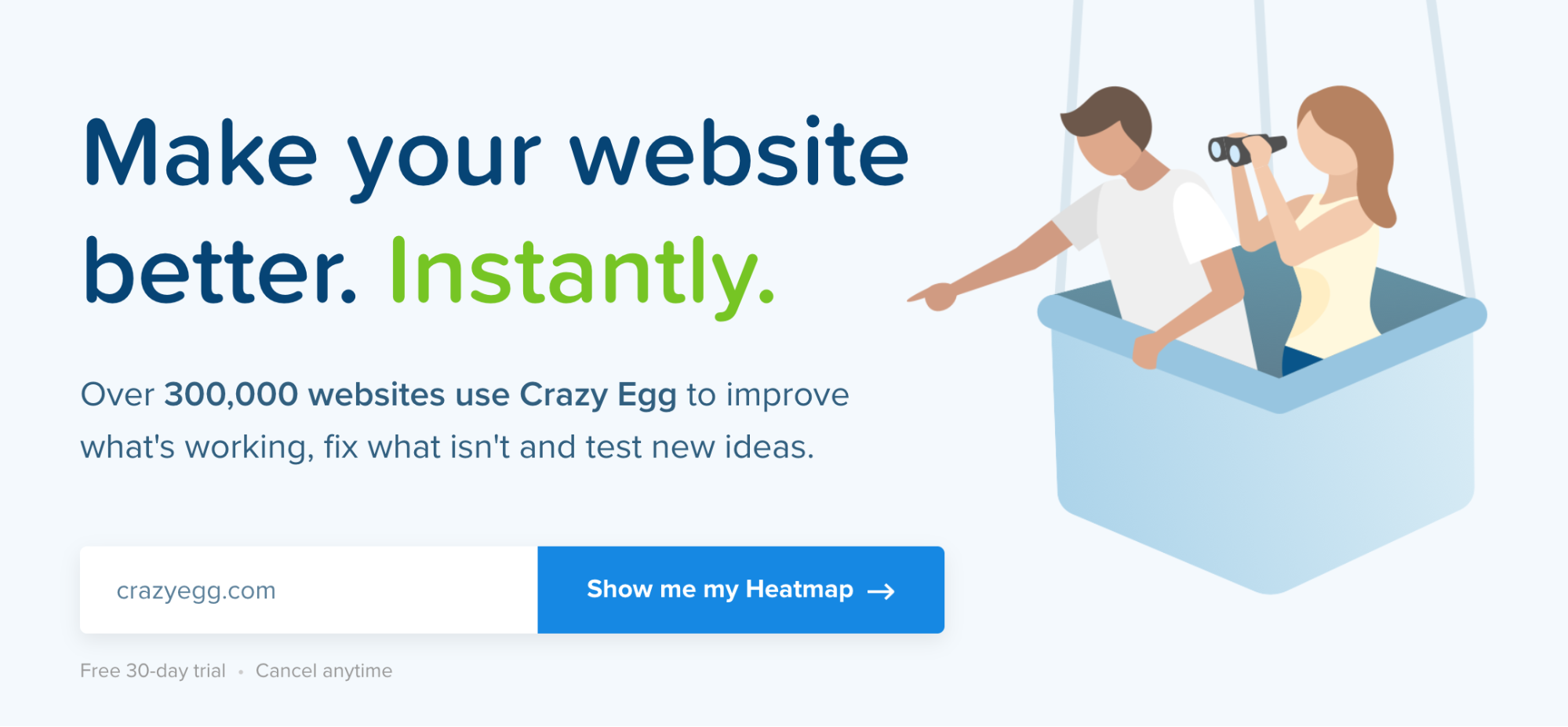
This provides a seamless and logical flow, both from a design and cognitive perspective.
Ad tech software company Nanigans takes a similar approach, positioning their CTA so it contrasts with the other sections of their page.

It’s positioned brilliantly, and the “Reimagine retargeting” button copy is simple, yet inspiring.
And positioning is an essential consideration for the CTAs on each of your landing pages. It can make or break whether someone clicks them.
For example, the high-contrast colors and hard-to-miss form placement on MeetEdgar’s landing page make their CTA extremely eye-catching.

This likely earns the page a decent conversion rate.
Sprout Social has another great example of a high-contrast CTA button.

Notice how this button is a contrasting green, which stands out from the grays and purples of its surroundings.
RocketLawyer’s CTA uses orange instead of green, but achieves the same effect.

It’s big, bold, and impossible to ignore. That’s exactly what you should aim to achieve with your CTAs.
7 Key Tips to Create High Converting Landing Pages
1. Choose the Best Landing Page Builder
There are a lot of landing page builders out there, and each one has its own bells and whistles. Which one you choose will depend on your company, your goals, and you skill level.
If you’re just starting out, choose a page builder with preloaded landing page templates. That will make it much easier to design an effective landing page.
Drag-and-drop editing will also help you place elements without much effort.
No matter your skill level, make sure you have access to analytics and A/B testing. Once you publish your landing page, you’ll want to keep track of pageviews, scroll depth, and click-thru rate, among other metrics.
A/B testing will help you hone in on the most effective landing page design to achieve your long-term conversion rate goals.
2. Go Above and Beyond With Your Value Proposition
The value proposition is defined as “an innovation, service or feature intended to make a company or product attractive to customers.”
Essentially, it answers the question, “What’s in it for me?”
And when it comes to your landing page, this answer needs to be featured prominently.
Like your explanation, your value proposition doesn’t need to be a standalone element. Instead, it can be spread among the other elements on your page.
Here’s what to keep in mind as you establish yours:
- One of the best ways to advance your value proposition is through a list of benefits. Many high converting landing pages use an unadorned bullet point list to explain the benefits of their product or service.
- Benefits should be clearly focused on the potential customer. It’s easy to drift off the mark with benefits and start talking about yourself as a company. Don’t do this! Instead, always think about the potential customer and how he or she will benefit.
The most important thing to understand about this part of your page is that it shouldn’t be a statement about your company. A value proposition is not “we are awesome.”
That might be true! But your goal isn’t to brag about your company. That’s not compelling.
Instead, you’d want to rewrite it to emphasize that the visitor will be awesome with your product or service.
For example, let’s say you are selling Web hosting, and you want to highlight your phenomenal uptime. Your first thought might be to create a value proposition that says “We have 99.98% uptime!”
But this statement focuses entirely on your company, and not your audience. You could fix this by rewriting it as “Your website will have 99.98% uptime!”
See the difference?
This is a simple shift but makes the statement much more customer-oriented. And that’s the kind of benefit you should be going for.
For example, this Instapage landing page outlines some powerful customer benefits, plus a testimonial, to really drive home the value proposition.

Paired with the “Learn More” CTA and product screenshot, this is an extremely effective marketing approach.
Repumatic takes a simplified strategy with this straightforward list of results.

By the end of this list, the reader knows exactly what the platform will help them do.
Zaius also provides a similarly simple, straightforward list of data-backed reasons why you should use their content marketing platform.

3. Keep Things Extra Simple
One of the big mistakes a lot of product sites make is to pack as much as they can into their landing pages. Sure, they get a lot of products in front of you, but it’s confusing and overwhelming.
Take a look, for example, at Carter’s landing page, which I got to from their paid Google Ad.

The colors are very nice and the design looks fairly clean, but there’s a lot going on, here. I think they’re trying to promote their new Carter’s Kids line, but the images overpower the text.
Now look at this landing page example from Boden.
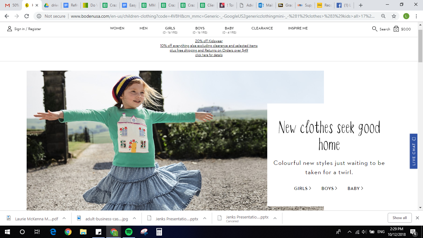
The landing page design here is much simpler, with all but the most essential text removed and one big hero image.
The simpler your landing page design, the easier it will be for your visitors to navigate, and then convert.
So, get to the point and remove the fluff. Use the landing page example above as an inspiration!
4. Show People Social Proof
Social proof refers to the number of likes, shares, subscribers, pins, tweets, etc. your company has. Display these prominently on your landing page.
Why?
According to Hubspot research, 71 percent of millennials are more likely to purchase something if it has been recommended online.
Social media and recommendations from trusted peers plays a big role in purchasing decisions. Showing potential customers that you have a big fan base will help you win them over.

If you look at the top of Mommy Blogger Kim Bongiorno’s site, you’ll see she put her social proof right into her CTA: “Join my 70K+ fans and get my weekly newsletter!”
If you don’t have a lot of social clout just yet, some well-placed testimonials from current customers can also do the trick.
Here’s how to incorporate them well:
- Use testimonials from real people. Celebrities and experts are great, but you don’t need testimonials from these people. Choose testimonials from people who are most relevant to your target audience.
- Make sure you use pictures. Pictures are the keystone of trust in testimonials. It’s important that every featured testimonial is accompanied by a photo of a real person.
- Testimonials should be specific. Glittering generalities don’t make great testimonies. The best testimonies are those that are backed by real numbers, real data, and specific applications.
For example, let’s take a look at this landing page from ecommerce company ModCloth. Rather than focus on text testimonials, the clothing brand shares real photos from real customers that have used the hashtag #modclothsquad on Instagram:

When you click in to each post, then you get a featured testimonial that has a picture, a name, a clear discussion on how ModCloth benefited them, and comments from other fans. This is an extremely effective tool to grow the company’s trust, reputation, and customer loyalty!

These authentic photo testimonials make the reviewers seem more relatable to readers.
I take a more high-level approach on NeilPatel.com, using headshots and well-known brand logos to add color to my mini case studies:

By featuring exact statistics, I take things a step beyond a generally positive review and make this much more compelling than a standard testimonial.
5. Use a Sales Pitch Video
Video is becoming the way people consumer information. In fact, by 2020, video will make up 80 percent of global internet traffic, according to Cisco. And YouTube is the second most popular search engine behind Google.
So, if you want to move people down the sales funnel (and if you want your landing page found on YouTube), you’d better include a sales video.
A sales pitch video doesn’t have to be long and involved. In fact, the best-performing videos run between 30 seconds and two minutes.
It should grab people’s attention immediately, describe everything in logical order, and contain the same elements as the landing page itself: a headline, a subheadline, an explanation, bold imagery, something about pain and pleasure, a method of contact, a guarantee, and a powerful call to action.
6. Remove Navigation Elements
The best landing page designs keep all of their elements on one page. If you start requiring your visitors to click off the page to get to, say, the explanation, you’re more likely to lose them.
By that same token, all of your elements should follow a logical flow to keep your visitors moving toward your CTA and, ultimately, completing the goal you set out for them.
Here’s how to do this well:
- Start with your explanation
- Continue with your benefits
- Include your testimonials
- End with your CTA
This is the most obvious and persuasive method of structuring a landing page.
And you don’t have to be subtle with this structure, either. It’s perfectly fine to allow your landing page design to demarcate sections.
In fact, if you augment the logical flow with corresponding design flow features, you will improve the process with visual and cognitive coherence.
This is particularly important for lengthier landing pages.
Some marketers avoid long landing pages because they don’t want to risk losing visitors’ attention. But long-form landing pages can be highlight effective, as long as they’re organized well.
Although they require a bit more hierarchical rigor than their shorter counterparts, establishing an effective flow is entirely possible.
Then, as you determine which elements to place in each space on the page, remember to use persuasive elements throughout. Don’t confine “persuasion” to a single section. These features should be present in every section of the landing page.
Finally, make sure to spend some time determining CTA placement. This is a critical component of landing page flow. You can also use multiple CTAs on a single landing page, positioning each one at the end of each discrete section.
Altogether, this might sound like creating effective flow is a complex process.
Fortunately, it doesn’t have to be.
Just check out this example page from Spotify:
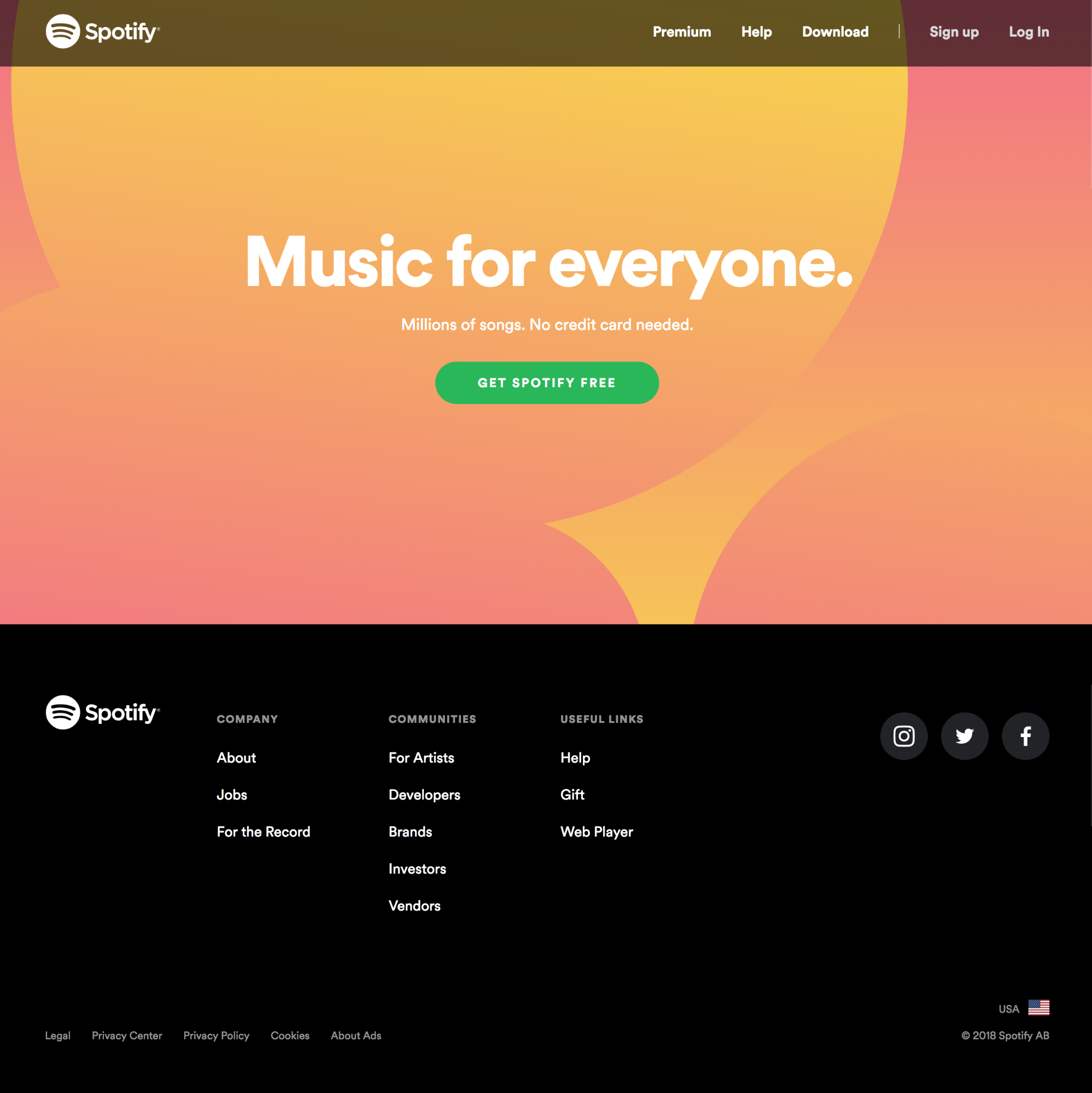
This short-form landing page has a single visual focus, and the flow from the headline to the explanation to the CTA button is dead simple.
Upwork, on the other hand, offers US-based and international freelancing services, so they use multiple CTAs via a search bar and buttons:
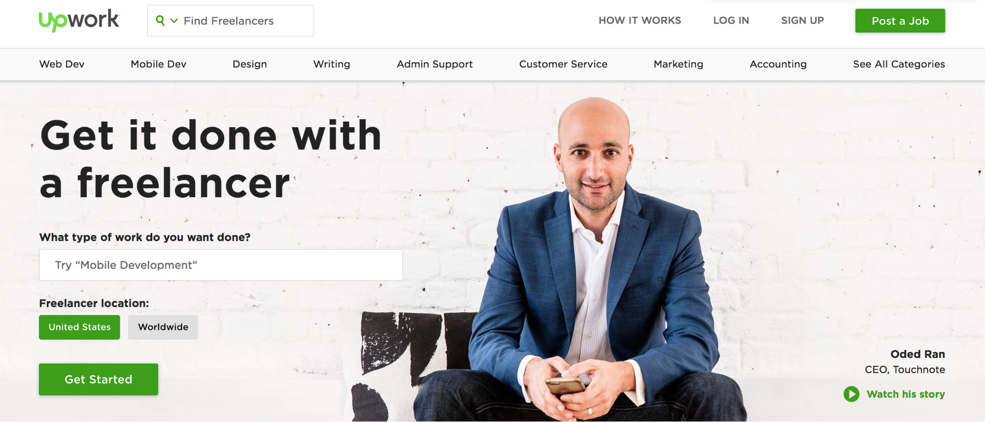
And that’s perfectly fine.
The main goal is simply to give visitors multiple opportunities to convert on the page.
7. A/B Test Your Landing Page
Once you have your landing page set up, don’t just let it sit there. Look at you metrics to see how it’s performing.
Are you seeing the number of conversions you expected? If not, where are people getting lost?
Gather information on your landing page’s performance by looking at heat maps, scrollmaps, and user recording sessions to see if there’s any room for improvement.
Then, test different design versions of your landing page against each other to see which one performs better. By A/B testing and further refining your landing pages over time, you’re making sure you get the best performance out of your traffic — and advertising dollars.
Conclusion
A high converting landing page is a place where all your efforts come to fruition. This is the place where customers click, people buy, and you earn revenue.
So don’t mess it up!
Fortunately, creating a powerful and high-converting landing page isn’t rocket science.
Start by implementing each of the 9 essentials in this post, and you’ll be well on your way to engaging your visitors and converting them into customers.


