The viral nature of the web makes it an excellent breeding ground for interesting startups.
If you have a cool idea, the web can help you spread it. That is, if you can communicate that cool idea.
A startup website has fewer seconds to make an impression than the site of an established brand. It’s critical to make those precious seconds count.
When your visitor arrives they will be asking “What’s in it for me?” With no time to waste, a hard-hitting home page will contain some, if not all of the following elements:
1. A tagline: A prominent tagline that fits within the overall brand messaging and communicates the benefit of the startup immediately.
2. Clear offering: Clearly express what you are doing, what your visitor can gain from it and how they can easily get it.
3. User-friendly interface: Consider load times, navigation, sitemap, prominent calls-to-action, and and intuitive layout.
4. A Quick Tour/Demo: Let visitors know what your product does easily and quickly through a simple video demo or diagram of your product/idea.
5. Social Proof: This isn’t your first rodeo. Prove it by displaying logos of businesses you have worked with, testimonials or evidence of press coverage for your startup.
Let’s look at 20 successful startup websites and why they work:
Votifi
Votifi is a mobile polling and analytics company that facilitates political exploration and network building through their platform and related technology. As you can see, it contains all the components one comes to expect from a viable startup website – a tagline, easy navigation, social network links, and a clean, intuitive layout.
Dojo
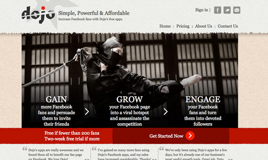
Dojo lets Fan Page admins create coupons, sweepstakes and more easily via Facebook Fan apps. Dojo launched with 6 apps and has 15 more in the roadmap. The branding of this startup is cohesive throughout the site, and fits with the Japanese theme of the company. Simple calls-to-action explain what you can expect from the service, and are placed above the fold.
Rapportive
Rapportive shows you everything about your contacts from inside your email inbox. A large screenshot placed on the left hand side of the home page allows you to easily see the product in action. A bright call-to-action inspires the visitor to take action and download the application.
DropBox
DropBox presents an easy-to-follow video presentation about the company and how you can benefit from their app.
Evernote
The Evernote family of products help you remember and act upon ideas, projects and experiences across all the computers, phones and tablets you use. Visitors are able to scan and easily digest what the application is about through images and subheadings
SquareUp
Squareup accepts credit card payments from anywhere with your iPhone, Android or iPad. Full-scale photography illustrates how easy the service is to use while a simple registration allows you to sign up on the spot.
Mint.com
This popular personal finance management software is an easy way to manage your money. A solid visual design aids in the appeal of the website and the content is easy to read.
AirBnb
A short YouTube video introduces visitors to the AirBnb concept, a global network of accommodations offered by locals. Infographics, a popular trend in showcasing data, allows you to see the global growth of AirBnb.
Zooz
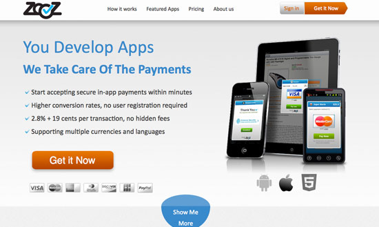
ZooZ is a complete and secure solution that makes it easier to start accepting payments in mobile applications, to build freemium apps for example. The homepage presents everything the visitor would be interested in knowing before signing up for this particular service, including checkpoints of key attributes.
Empire Avenue
Empire Avenue provides an easy way to expand, engage and evaluate your social network. The website does a great job at drawing the visitor in and getting them interested in the service. Simple, clear headlines allow you to easily understand the product and benefit you’ll receive.
Beta Punch
BetaPunch allows startups to reach out to beta testers in order to collect feedback to help improve and reward influential early adopters. Again we see the use of a slogan, as well as calls-to-action placed near product highlights, encouraging more signups.
UnPlugg
Unplugg is a web and mobile platform that allows you to manage and analyze your energy consumption online, allowing you to improve your energy efficiency easily. An illustration highlights the theme of the service and adds visual interest, while the rest of the text is broken down into digestible chunks.
Greenways
A nature-inspired backdrop paints the picture for this waste management service for your business.
GiftRocket
GiftRocket combines the thoughtfulness of a gift certificate with the flexibility of cash. Send an online gift to anyone, instantly. This is another example of solid branding carried throughout the website in illustration, diagrams, etc. Sponsor testimonials add social proof that the concept works.
Contact Me
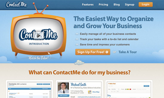
A nice visual design presents Contact Me in a professional, modern way. The slogan as a headline, attributes as bullet points, and screenshots of the product in action work in harmony to sell the product, in addition to the promotional video.
Tyreright
Tyreright makes it easy to browse their website by breaking up the content in headings and subheadings as well as images. Featuring a search bar on your site is a great way to help serve up relevant content to your users. If someone visits your site and is looking for something specific, all they have to do is a quick search and they are served up the content that matches their query.
Clock
The website for Clock allows you to instantly see the advantage of using this service through a large, centered headline and sub-heading.
Echoer
The Echoer app allows you to read minds and explore the world of thoughts around you. Built on a fun and engaging visual platform, Echoer lets you shape and explore a world of thoughts, ideas and discoveries anywhere, anytime. Colorful illustrations draw the visitor in while a demo allows the to easily understand what the product is about.
Sonar
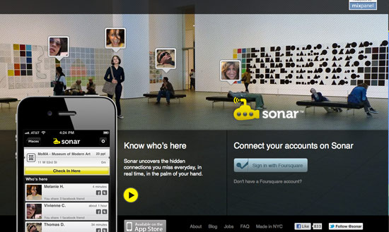
Sonar is a mobile application that leverages social network data to reveal hidden connections and interests you share with the people nearby. By providing the context for people to get to know the folks around them better – whether they’re friends, friends of friends or strangers – Sonar aims to make the world a cozier place.
Stitch Labs
The website for Stitch Labs is warm and inviting which helps in selling a complex product that much easier. A slideshow of diagrams help support this while visible call to action allows the visitor to take action.
The website for a startup is often the first and only opportunity to gain a new user.
As a startup you must make your website work extra hard to convert visitors.
What are some features that keep you interested in a startup? Let us know!


