With the exponential adoption of mobile devices and smart phones, savvy web designers are turning to responsive web design as a panacea for all things layoutf and typography related.
Not only does this save time, money and effort in the long run, but it also gives mobile users the interaction and ease of use they crave.
But if you’ve been tasked with creating a mobile responsive design and aren’t sure where to start, this checklist of must-have resources and tips is sure to give you the spark you need to create a fluid, friendly design that accommodates nearly every mobile device – past, present and future.
Layout, Wireframes and Prototyping
The first step of any good design is to sketch out your ideas and determine the placement of all the different elements on a page. These tools can help you do just that:
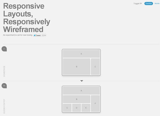
Responsive Wireframes
This is a good starting place for learning how responsive design elements “stack” in typical layouts and how to determine which areas of your layout will get the most emphasis across different devices.
Responsive Wireframes, created by James Mellers of Adobe, offers desktop and mobile varieties of common wireframe mockups, including homepage, guided entry, promo entry, product detail and comparison pages.
Clicking the “Toggle!” button in the upper right will show you an example of how different elements on that page will change according to the device they’re being viewed on.
For a more illustrative example, check out his other project, Responsive Design, Responsively Illustrated. It lets you resize your browser window to see the types of size constraints you’ll be working with.
Multi-Device Layout Patterns
If you’re trying to decide which type of responsive layout to choose according to a site’s existing content and how you want it presented, these examples should help with the decision-making process.
Designer Luke Wroblewski has combed through countless mobile-responsive designs and layouts and has managed to categorize the majority of them into five distinct layouts. His website shows these different patterns and how they work.
Wirefy
For designers and developers who focus on “content first,” Wirefy is a terrific solution.
Simple and elegant in its presentation, Wirefy lets you plan and structure your content. You can also use these fully-functional wireframes to show clients how their new responsive site will look and work.
A word of warning: You’ll need a basic code editor and a working knowledge of HTML and CSS to get the full benefit of Wirefy.
Interface Sketch
Do you yearn for the “good old days,” when you’d sketch a layout in a notebook with those archaic tools, pencil and paper? Fear not! Interface Sketch understands.
This option offers printable PDFs for a wide range of devices, from desktop browsers to generic tablets. Plus, they’re free!
CSS and Fluid Grids
Sometimes, just browsing and analyzing layouts isn’t enough. You have to get into the nitty-gritty, pushing pixels and coding core components of a site.
If that’s you, try these Photoshop-style layouts and responsive grids that update according to your changes and custom input.
Style Tiles
Clearer than a mood board but not as labor intensive as a full-on mockup, StyleTiles bridges the gap between creating a style that both the designer and client can agree on.
It does this through a Photoshop-style template where colors, basic layout and logo can be added and adjusted to fit your needs. Here’s a screenshot of this baby in action:
Bootstrap
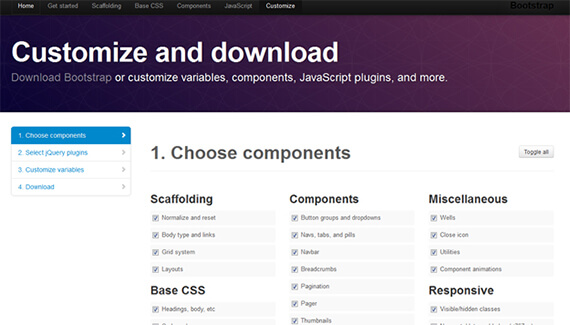
Built by designers at Twitter, Bootstrap is designed to make prototyping easy and relatively painless.
Using the Customize feature, you can pick and choose the different responsive elements that make up a page, then download a finished version with compiled and minified CSS, jQuery plugins, and other neatly packaged goodies to simplify your work.
Gridset
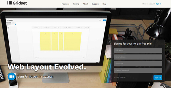
Gridset works with different content management systems, including Joomla, Drupal and WordPress, as well as working in popular graphics applications like Photoshop and Fireworks.
Grid layouts can also be shared with colleagues, making this an exceptional wireframing and prototyping tool that carries over well throughout the different production phases of your website design.
Adobe Edge Reflow
While currently still in Preview mode, expect this new tool from Adobe to quickly become a designer favorite.
Unlike Photoshop, which focuses extensively on graphics editing, Edge Reflow was created expressly to handle responsive layouts. Grid systems, handling media queries, and generating advanced CSS layouts are all in a day’s work for Reflow.
Responsive Graphics, Fonts and Videos
Responsive layouts and designs are one thing, but can graphics be made responsive? What about movies or text?
The answer is yes! Thanks to some clever programming and genius coding by these fine contributors:
Adaptive Images
Adaptive Images reads a viewer’s screen size and automatically rescales your embedded HTML images for optimum viewing. No mark-up is needed. It can be set up in three simple steps using libraries that are generally available through hosts that support PHP (Apache, GD lib and PHP 5.x).
Retina Images
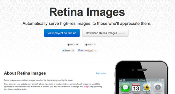
Retina Images is an easy-to-setup system that displays high resolution images as alternatives on devices that support them. Only one image is ever downloaded at a time, so there’s no excess load time on your server for images that won’t be displayed.
What’s more, as long as your images have height and width attributes, you don’t need to make any changes to them.
Blueberry
Want an image slider that was built from the ground up to work with mobile-responsive designs? Give Blueberry a try.
Many of the popular image sliders on the market aren’t exactly compatible or user-friendly when viewed on devices other than a desktop or laptop. Blueberry is an attempt to nudge them in a more mobile-friendly direction.
FitText
Fit Text is a jQuery plugin that allows text to scale according to the device it’s being viewed on. It resizes text based on ratios and is intended for use with headlines only. If you want more precise control over your typography, check out their related plugin, Lettering.js.
FitVids
Don’t let the 80s-inspired design scare you. FitVids is every bit as modern as its jQuery cousins, FitText and Lettering.js. FitVids works to make your video adapt to fluid designs using Javascript and CSS magic.
Responsive, SEO Friendly Data Tables
Mobifreaks
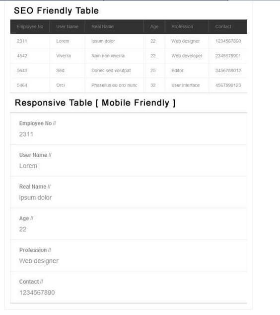
If you need a sleek, responsive way to present data-based tables, Mobifreaks has some CSS-based tables that also happen to be search-engine friendly and mobile-responsive – the best of all possible worlds!
Testing, Device Detection and Older Browsers
Now comes the moment of truth… testing. You’ve created a great layout, incorporated smart, fluid coding and now you’re ready to show off your new responsive creation to the world. But did you test it properly? Here are a few tools that can help:
Matt Kersley’s Responsive Design Testing
Matt Kersley developed one of the most popular responsive design testing tools on the web, and after one try, it’s easy to see why. It’s flexible enough to be used with any site, and can be installed on your own server for faster troubleshooting.
You can test the width for proper breaking points of your content, or test both the width and height of popular mobile devices for proper comparison.
Responsinator
The Responsinator shows you how your page loads on a variety of mobile devices. Simply enter your URL to see exactly what mobile browsers see, in both portrait and landscape views.
What are your favorites?
With these responsive design tools in your arsenal, you’ll have everything you need to create fluid, flexible designs that are optimized for search engines, mobile devices and the people who use them.
Got a tool that hasn’t been featured here? Let me know about it in the comments below!


