To see the impact color has on the overall user experience of a website, one need only strip away a hue to see how the visual flow is affected.
While color creates the mood and feel of the site by directing user attention to certain elements, there are many ways to approach the use of color. Hue, value, and saturation are all three integrated dimensions of color that, when used properly, can enhance the site’s message just as well, if not better, than using flashy colors.
In this article we’ll delve deeper into color psychology as it relates to web design, and view examples of sites that used color persuasively in their branding efforts.
A quick intro to color
For a primer on color, one should refer to the color wheel, as it presents a logically arranged sequence of pure hues. I’m sure you’re familiar with the primaries – red, yellow, and blue; and secondaries: green, orange, and purple – which are formed by mixing the primaries.
Tertiary colors are comprised of the middle colors like yellow-green and blue-green. They are created by mixing a primary color and a secondary color. We often refer to the color wheel as it can be used to create harmonious color schemes, leading to an effective visual experience.
The Power of Color
The two most popular advertising color choices in America, blue and red, are frequently used on websites globally. Blue connotes trustworthiness, loyalty, and sincerity, and is most often a business favorite due to these attributes.
But blue isn’t for everyone and the best method of determining the right color (or colors) for your brand or website is to first consider the target group you’re trying to reach.
Colors have different meanings to various age groups, cultures, and nationalities. They have the power to reach beyond just connotations and hold the viewer’s attention, communicate what the business is about, and make a sale.
When you think of the impact color has on a particular audience it’s easy to see why companies exert a lot of time and effort in choosing the right one.
5 website elements affected by color
1) Text Links
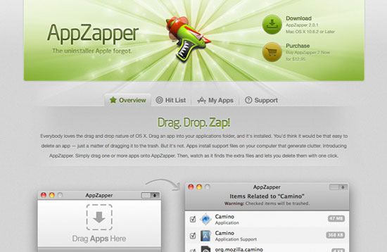
A common solution for drawing attention to monochromatic links is to give them a faint background to lift them off the page. This technique is shown in the navigation for AppZapper.
The active link on the navigation for Font Explorer is styled differently than the rest, giving the user a quick glimpse at where they are on the website.
2) Navigation
Bronto uses saturated colors to bring attention to its navigation. This balance works well with the rest of the site, which is more subdued yet takes up more screen real estate.
3) Buttons
Postbox uses red and blue on its call- to-action buttons. These highly saturated and large buttons do a great job of drawing attention to the intended action the user should take – to download or buy the software. Compare how the less-saturated button just below and to the right would fare if those buttons switched colors.
The complimentary color of blue is used on the call-to-action button on Live Resto to set it apart on the layout and add emphasis.
4) Headings
The minimal, clean website for Billings makes use of vibrant blue headings for emphasis.
5) List Items
A Small Orange makes use of its brand colors in the list of recent news posts. The color doesn’t overwhelm, as it’s used sparingly with a white background to ease its vibrancy.
Color can affect readability
If the text on your site is meant for scanning instead of reading, it’s okay to have gray text on a black background. On the website for VersionsApp, the monotony is broken up through highlighting and the use of splashes of color throughout the text.
Sometimes the best solution is to have dark text on a white background. Readability is hardly a problem with this method. When necessary, you can incorporate color into quotes or bullet points as shown above for Crazy Egg.
Color can affect accessibility
We should also think of color in terms of accessibility for color-blind users. After all, these color deficiencies affect about 8% of males and 0.5% of females.
The great thing about designing for this niche is good design judgment is really all it takes. For instance don’t use colors with similar brightness values as the base of your website. This causes the text to vibrate and can lead to watery eyes.
Also, if you’re going to use a change in background color to designate a hover state, make sure it has enough contrast and is different in its relative brightness.
It’s also a good idea to add another design element such as a stroke to a button when this hover is activated, providing further contrast.
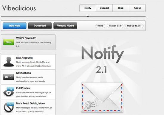
The call-to-action buttons on the website for Notify feature a contrasting outer glow stroke when the user hovers over them. Such small details add contrast to the button.
Going Monochromatic
We’re past the era of web design where we have to use as many flashy colors as possible to grab the user’s attention. Thankfully, we’ve developed insight into how we can convey a message using shades of one color.
The use of monochromatic color in layouts is a common practice for designers who want to portray a balanced interface while focusing on the overall UX instead of merely coloring things up.
As you’ll see by the following examples, it’s possible to create an engaging and informed layout by simply using one color.
The Invoice Machine uses a grayscale for the design of its invoicing software’s website. Blue, the common color for links, is used as a border around the buttons, emphasizing their importance in relation to the rest of the site. This makes the buttons stand out without resulting in a bubbly, 3-D look.
Davroc Interiors creates a soothing visual experience on its website. Hover over the photographs to reveal full-color images that add a layer of interest to the minimal website. Blue, the universal link color, is used in areas throughout the site to enhance the user experience.
Metelab also uses a monochromatic color scheme on its website. Notice the use of saturation on the top-right button. Saturated colors are effective on buttons, links, alerts and system messages because they grab the user’s attention. It’s important to use these colors sparingly, as too many can slow the user down.
When used correctly, saturation can be exciting and dynamic.
Gray is a common color used in web design these days because it doesn’t compete with saturated and desaturated colors.
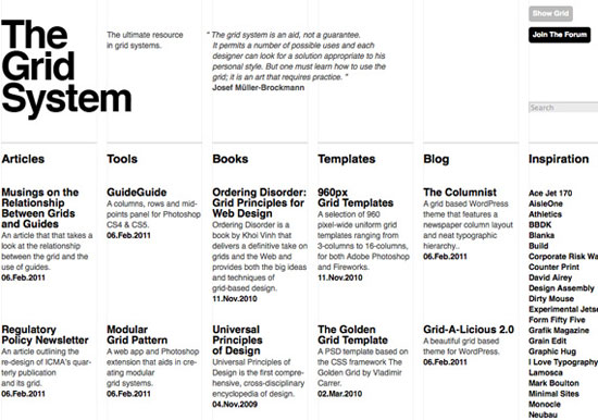
The absence of color on The Grid System site is a great opportunity to make use of white space and bold typography when necessary. Such elements help create hierarchy by grouping elements together according to importance.
There may be millions of colors out there, and as a designer my goal is to choose those that speak to my client’s business and mission.
While some companies adopt color as a tool to enhance dynamism, others are put off by it when used sporadically. Through the examples I’ve shown in this article, I hope to strike a balance between these extremes – one where color can be used in all its vibrancy but still be elegant, and alternative approaches to the use of color, such as the monochromatic color scheme.
Have you noticed a color trend that is not addressed in this article? Let me know in the comments!
Image courtesy of Viktor Hertz


