Personality in web design or web design with personality…
Whichever way you like to think about it, this concept has gained a lot of popularity and importance over the last couple of years.
The web becomes more and more important in our personal and professional lives. Not only do we spend more time online than we did a few years back, we also use the internet for a lot more things than we used to.
However, the fact that digital content is more important does not mean we care any less about interpersonal relations. If we are honest, we still prefer face-to-face communication and the richness of the information that comes with it.
When talking to someone in person, usually a verbal message is the essence of the conversation — just like online. At the same time, there are several non-verbal layers, such as the tone of voice, facial expressions, or someone’s body language that help us interpret the message correctly.
By adding personality to your website, you can bridge the gap between the technical and impersonal nature of the web and the accessible, user-friendly, and personal experience that we often miss online.
With people spending the bulk of their time online, I’d say it’s a critical part of your web strategy: To stand out, you need a sparkling personality online, and it needs to show in your website.
So how do you do that? Here are 4 ways how you can make your website more attractive and more trustworthy by adding some personality to your design.
1. A personal tone of voice
Your tone of voice matters just as much online than it does offline.
You might not be able to indicate irony through a different pitch of voice, and neither can you physically rise your volume to make a statement. What you can do is translate the intensity and sound of your voice to different fonts, font sizes, and colors.
For example you can use a bold font to make a statement and a lighter and sketchy one to make a suggestion.
Also, the words you use and language you speak affect the message that you send.
Keep it simple and personal, and address your visitors directly. Don’t brag about yourself, but find out what your visitors’ goals are when coming to your site and cater to these goals. Put your visitors to the center of your attention and talk to them like you would in person.
Keep this checklist in mind the next time you write or update content for your site:
- Know who your visitors are and what their goals are
- Start a conversation with your visitors
- Focus on your visitors (not yourself)
- Use a language your visitors can relate to
- Use fonts and colors carefully

Basecamp is a great example of how to translate your business mentality and your offline tone of voice to your online content.
They offer very little content, which shows that they know very well what their visitors are looking for.
They use different font sizes, font weight, and colors to highlight certain content. They talk to their visitors directly, using the word “you” a lot and asking questions. And they let other customers speak for them, rather than bragging about themselves.
2. Emotional design
Another way to add personality to your website is through your design. There are many different design elements you can use to make your website look appealing and less technical.
For example, you can use high quality photographs — and I’m not talking about stock imagery. Authentic pictures can help you create atmosphere on your site and draw your visitors in.
Use images to draw attention, support your content, or as full-page background image.
You can also use other design elements, such as hand-drawings to add more personality to your site.
Hand-drawn content is creative and personal. It proves that a website has been built and designed by humans (something we crave in our high-tech world, because it gives us a familiar and comforting feeling).
If you can stir your visitors’ emotions, you are able to communicate with them on an emotional, nonverbal level. This kind of communication is very valuable, because it helps you to sell your message, product, or service in a very subtle, yet effective way.

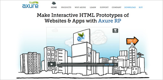
Axure does a great job when it comes to adding personality through design.
First of all, they have a mascot that welcomes you on the site and invites you to watch their video, or try out their software. Without even clicking anywhere, it seems like you are already interacting with the site.
Second, they use a lot of hand-drawn elements in their design. This works perfectly to make the site look less technical and more personal.
Third, their concept is very authentic, because the sketchy and creative style perfectly reflects their product — a software for interactive HTML prototyping.
3. Communicate with your visitors
Possibly the biggest mistake you can make online — the thing most likely to destroy your trust-building efforts — is not being open for communication.
No matter how well you design your site, how complete the information is that you offer, and how good your usability is — people who visit your website will still have questions. Or, if they don’t have questions, they will have an opinion, or want to make a suggestion, or simply say hi, because they really like your site…
Fact is, people will want to reach out to you at some point. When they do, be ready for it.
This means you need to show them that you actually want them to reach out. Offer enough contact details to make it as easy as possible for them to reach out.
And most of all: Answer them.
There is nothing as rude and creepy as not talking back to your site visitors. Be it via email, social media, or a comment on your blog, when people interact with you, they expect feedback.
Imagine you walk up to someone in the streets to ask for direction. Against all expectations, people ignore you and walk away. How does that feel? Exactly, you probably feel rejected and not taken serious. And next time you need directions, you will either ask someone else or — even more likely — buy a map.
Take your visitors serious (yes, every one of them) so they feel cherished and happy to stay.

For example, the designer Brad Candullo has chosen a very warm and personal design for his website. Also, he offers lots of different contact information and a contact form so people can get in touch with him.
The entire look and feel of the site invites his visitors to get in touch and discuss possible work opportunities.
4. Strengthen the position of your team page
What do people ask when they visit a website?
- Who are the people running this website?
- Are they trustworthy?
- Would I want to do business with them if I met them in person?
- Could I actually meet them in person if I wanted to?
The people who visit your website will look for answers to these and many more questions.
If we visit a local store, we know quite soon if we can trust the quality of the products and, maybe even more important, the customer service.
Online, this is no different.
We might not physically visit everyone we do business with, but knowing that we could is already worth a lot. Make sure you offer detailed contact information, including your phone number and email address, but also a physical address that proves you actually exist in the real world.
Also your team page (or About page) is an important part of your website — probably more important that most people realize.
This page is where your visitors will go to learn more about you. It’s your chance to make a good impression and show that you and your team are likable and trustworthy people.
Keep in mind that a personal bond and good customer relations might be even more important that your product itself.
When (re-)designing your next team page, try to be:
- Creative
- Real
- Authentic
- Professional
- Trustworthy
- Likable

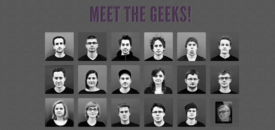
The applicake team has put together a very inspiring team page. Not only is it obvious that they put a lot of time and effort into the page, they also succeed in presenting themselves as young and creative yet professional and trustworthy company.
You get a good impression of the whole team — everyone with their own little animation (yes, it’s worth taking a quick look at the actual site). At the same time, they introduce everyone with a very nice picture, a quick description, and diverse personal links.
Now what?
Personality in web design is becoming increasingly important. While we spend more and more time online, we yearn for more interpersonal interactions and human experiences.
With a more personal tone of voice, emotional design, more interaction, and a trustworthy presentation of yourself, you can create sparkling online experiences that bridge the gap between a once-technical medium and the warm and personal web that people want today.
Are you comfortable injecting your online presence with personality? What are your challenges?


