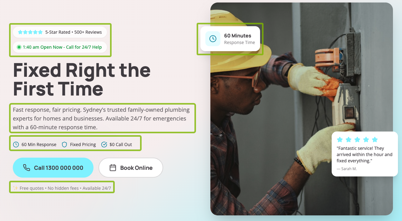
Hero images are the first images that show up right below the header once a website loads. It’s used to describe the site’s main purpose, to accompany an article, or to introduce visitors to new products or online product clearances as part of a wider digital marketing campaign.
One of the best examples of a slick, effective, and stylistically poignant hero image comes from Apple:

The hero image is beautiful..
However, it’s the website copy that steals the show.
“Wireless. Effortless. Magical” Apple positions the Aipods perfectly while differentiating them from other earbuds, and does it with only three words. No bluetooth pairing or connection issues. Take them out, start listening, and everything works flawlessly. Just like magic.
So, even if you can’t match the visuals and budget of Apple’s experienced team of designers, you can make it up in writing an effective copy that turns even your loudest opponents into loyal customers.
What Everyone Tells You to Do For Hero Images
The prevailing wisdom among website designers is that hero images play a very important role in the conversion rate of your online business, as well as the growth rate of your site. The majority of these professionals advocate for spending inordinate amounts of time getting your hero images just right before showing them to your audience.
For example, some of the most popular hero image best practices include:
- Coming up with the right size—professionals recommend keeping your hero images between 1200 and 1600 pixels wide, and between 500 and 800 pixels tall with a 16:9 aspect ratio for desktop computers
- Composing an original image—a common advice you might often hear is to avoid using stock photos and come up with original images, graphics, and animations by using services such as Canva, Adobe Photoshop, or a dedicated graphic designer
- Following your brand’s visual identity—web designers will advocate for visual and graphical consistency in how you apply fonts, font sizes, call to action (CTA) buttons, color, and composition in your hero images
- Keeping mobile in mind—people are pushing for quicker adoption of responsive and mobile-friendly web design for obvious reasons: more than 50% of the entire internet traffic is generated on mobile devices
- Producing new visuals consistently—some digital marketers may promote quantity over quality, i.e., putting out new visuals consistently and following a tight schedule while creating new content; in their mind, creating more hero images leads to better chances at capturing the right audience
While there is some truth to nailing all of this to minute detail, hero images aren’t as important as you might have thought, and here’s why.
The Honest Truth: Most Hero Images Just Need to Be Good Enough
Not everyone can afford to purchase high-quality photos, hire a graphic designer, and spend inordinate amounts of time polishing their hero images—and that’s ok! Given the Pareto principle, most hero images will end up looking bland anyway, so there’s no need to worry about coming up with the perfect hero image more than what it’s necessary.
Here are several examples of effective hero images that simply get the job done.
First up, we’re going to kick things off with Winky Lux, a makeup and skincare brand that offers premium lip balms at competitive market prices.

The hero image accentuates the company’s flagship citrine balm by drawing parallels to gold and glitter, resting against a warm, complementary background color to capture the attention of potential buyers and reinforce the uniqueness of the brand’s products.
On top of that, Winky Lux effectively uses a hero carousel to advertise its two best-selling product offers with a short and punchy website copy.
Next up, we’re taking a closer look at Herman Miller, an office furniture company that is mostly known for its highly sought-after ergonomic chairs.

Herman Miller deliberately and wisely lets one of its best-selling product lines, the Embody Chair series, take center stage. The chair’s purple upholstery, paired with the hero image’s gentle color saturation, stops the site’s visitors dead in their tracks. It then guides them to the right hand-side where the copy offers a generous 20% discount to close the deal.
Lastly, let’s examine Super Coffee, a Shark Tank-backed project that claims to have removed the equivalent of over 800 dump trucks of sugar from the American diet.

A bold typography adorns the left-hand side of Super Coffee’s strongly colored banner, inviting readers to quickly transition across the middle section onto the right-hand side area. There, three different cans complete the picture by encouraging coffee enthusiasts to indulge in the caffeinated delicacy of the brand’s most notable flavors.
The copy is subtle, short, and effective, while the imagery stimulates visitors to convert into regular patrons.
Hero Images Don’t Need to Be Perfect to Be Effective
All of the three examples above are nothing that a sophomore designer, with some help, guidance, and the right materials, couldn’t come up with in a couple of hours. In other words, these images are as simple as a hero banner can get, and they serve their purpose effectively and with style.
At Crazy Egg, we’ve done hundreds of A/B tests on homepages, and hero images don’t move the needle as much as some visual design advocates would claim. The difference in conversion rate is so small that you’ll rarely, if ever, reach statistical significance on a design element like this.
So, if you need a hero image for your new campaign, get one that’s good enough for your brand and move on to more important matters such as improving your site’s performance, speed, and copy. As long as your digital marketing strategy doesn’t cause problems and matches your overall brand design, it should be good enough.
What Matters Instead: Headlines
Generally speaking, stellar headlines are the backbone of an effective digital marketing strategy. By including witty, catchy, and urgency-inducing headlines in your upcoming articles, you can increase conversions to the next step of your funnel by 30% and more!
Good headlines and subheadlines will capture your target audience’s attention, after which they’ll become intrigued and continue browsing until they fulfill their intent—like ordering a product, subscribing to a service, or bookmarking your page for later use.
So, instead of obsessing about the perfect hero image, spend as much time as you can perfecting the headlines of your pages. Keep note of these five impactful tips to help you do just that.
1. Turn your audience’s attention span to your advantage
Nowadays, online visitors are notoriously famous for having short attention spans, so it becomes harder for copywriters both to get and keep their attention given the little time they have. All things being equal, it takes around eight seconds to get a potential buyer interested in what you’re selling, and if you can’t make a decent impression throughout an average radio jingle, you’ve probably lost them for good.
Is there an antidote to our shortened attention spans? Yes, and it might be simpler than you think.
Start by manufacturing urgency in your headlines, which will cause visitors to prioritize reading your text over the countless other options at their disposal. Words like “limited”, “expire”, and even the aptly relevant “urgent” will turn people’s focus toward your page, having them tell themselves “This might be worthy of my attention right now.”
This doesn’t mean that your bombastic titles are there to trick your audience into reading a subpar article. Your posts should offer real value and deliver on your headline’s promise. Otherwise, people will lose trust, click away, and your pages will soon end up tanking in the vastness of online searches.
2. Use statistics
Stats are composed of numbers, and articles featuring headlines with numbers almost always outperform articles with number-free headlines. Statistics and numbers anchor the headline to a tangible approximation of an event, something a reader could identify with, compare it with real-world examples, and experience its true sense of scale.
The reader can then relive that experience and satiate their ancient cravings for a good myth, and later even share your article on social media and other popular news and essay platforms.
Statistics, and especially counter-intuitive ones, serve as excellent hooks to drive more engagement and bring more eyes to your pages. Using stats with odd numbers, and odd numbers in general in your headlines can increase your click-through rates by up to 20%. That amounts to one-fifth of your existing impressions—which is a more than valid target to pursue.
3. Reverse-Engineer Your Content’s Value
Before you’re ready to create a new headline, ask yourself the following questions:
- Why should your readers care about your content?
- How valuable will your content be to a new group of readers?
- What is the one key takeaway from your newest piece?
Answering these questions will bring you one step closer to understanding your target audience and what they’re looking for in both your published and upcoming posts.
Also, don’t expect your readers to be 100% set on their intent. Often, they’ll be looking to online publications for guidance, and this is your chance to demonstrate your knowledge, value, and brand trustworthiness by leveraging the power of good headlines and valuable posts.
Additionally, more than half of online readers are inclined to share content without going through the entire article. Good writing by itself is not enough to combat this problem, and this is where a potent headline can help.
In other words, your headlines should serve as quick summaries of your upcoming content, so that readers know what they’re getting into before deciding whether they should read it or not.
Here are some examples of catchy headlines that also serve as quick summaries:
- 5 Reasons Why Aggressive Headlines Perform Better in Search
- 7 Secrets for Writing Snappy Headlines by SEO Vets
- Is Your Content Holding You Back? Poor Headlines Might Be To Blame
- Is Voice Search Ruining Legacy SEO? Yes, But Not Because of AI
- Supercharge Your Headline Game With These 11 Free Tools
A combination of odd numbers, descriptive summaries, and potent hooks makes these headlines valid contenders for the final draft.
4. Transform Existing Reviews into Headlines
If you’re running an established online store, people will be inclined to leave positive reviews for some of your products. You can take your favorite review and transform it into an article headline.
For example, a satisfied customer might say: “Business A offers premium, high-quality, and durable dining sets (at reasonable prices) that exceeded my expectations more than what I had hoped for! Next, I’ll be sure to order their stainless steel utensil set for our upcoming marriage anniversary.”
You can either:
- Use a direct quote—”Premium, high-quality, and durable dining sets at reasonable prices”
- Paraphrase—”Ogle these dining sets that exceed expectations and leave customers wanting for more”
Upcoming businesses will have a harder time implementing this strategy because it will take some time before getting their first product review. Still, it’s a great one to consider regardless of your company’s position in the ecommerce world.
5. Try the SHINE Approach
SHINE is a popular content writing acronym that stands for specificity, helpfulness, immediacy, newsworthiness, and entertainment value. It can help you brainstorm original headline ideas when you’ve hit a creative dead end.
Here are some headlines created with the SHINE approach:
- 5 Less-Known Ways to Write Enchanting Headlines + What to Avoid
- One Ancient Book Holds All the Secrets to Writing Tantalizing Headlines
- 11 Article Headlines that Break Established Marketing Conventions in Two
In short, Improving 1 sentence on your website can get you up to 30% more customers this month. So, test your headline relentlessly. Try different positioning. Obsess over it, and you’ll get a much better return on your time.
Exceptions When Hero Images Really Matter
There are a few exceptions when hero images can make a serious difference in your content’s performance. The most notable ones include product pages, announcements, and advertising banners.
Take Apple for example. Its product launches are treated like celebrations, and picking that perfect hero image carries a ton of weight. However, it’s a real product that people are going to use, hold in their hands, and scrutinize. From a marketing perspective, it makes sense to prime the audience to expect the best version of a product by utilizing a high-quality, impactful hero image—often with minimal copy to go alongside it.

Other exceptions where hero images play a larger role include:
- Action shots for hobby products
- Screenshots to demonstrate a new feature in your SaaS app
- Art covers for upcoming games, movies, and songs
Think of it like this: the more B2C-oriented you are, the more that the hero image matters. The more B2B-oriented you are, the less it does.


