Remember how the Mac fan boys used to turn their nose up and anything and everything Microsoft? Well, they are under a lot of heat right now.
Just as Apple finally became bigger than Microsoft, Microsoft has turned the tables and come back swinging.
The web has been abuzz since the new ‘Metro UI’ has been revealed as part of:
- the Windows 8 Phone,
- the Xbox 360 dashboard,
- the redesigned Microsoft website
- and the upcoming public release of Windows 8 this fall
The Metro UI has a sleek and streamlined organization, gorgeous aesthetic and ultra modern approach to digital interfaces.
It’s been a long time coming but Microsoft has finally understood the power of design in the modern age and responded with its best look yet.
For web designers, the good news is that the Metro UI looks as good on websites as it does in applications, something Microsoft intended from the get go as evidenced with its new website. Here are the 5 things we love about the Metro UI, complete with examples of websites that are using it.
1. Goodbye Skeuomorphism!
Skeuomorphism might be an unknown word to you but if you’ve ever used a graphical user interface, you have probably come face to face with it.
Skeumorphism is the common design practice of making digital entities look like their real life counterparts. For example, a digital notebook uses a real looking leather texture as its background, the recycle bin on your Desktop looks like the trash can in your office and most of your applications have instances of stitches and knobs that serve no other purpose except for invoking the look of the ‘real’ object.
Here’s a slightly more eloquent definition of skeumorphism from Wikipedia:
“an element of design or structure that serves little or no purpose in the artifact fashioned from the new material but was essential to the object made from the original material” – Wikipedia
Apple played a huge role in the skeuomorphism design movement and it’s a vital part of its design leadership. From iCal to iBooks, the Mac world is replete with cutting edge functionality hidden behind quaint appearances.
While Apple (and many other companies and designers) have often used Skeuomorphism to charming effect, its ripple effect across applications and the web has resulted in tons of cheesy and clunky creations. Frankly, designers often go out of control with Skeuomorphism, designing interfaces and elements that can be unnecessarily decorative or downright kitschy.
It’s therefore no wonder that the complete rejection of skeuomorphism is the most hotly discussed design strategy in the Metro UI.
The advent of Metro has all the potential of making skueomorphism a thing of the past. The reason behind the vehement support for stripping away the ‘real life’ appearances is simple: The new generation is growing up in the digital world.
It’s not much of a stretch to say that we are now more familiar with digital files and folders than with the real life inspiration behind them. And since establishing familiarity and easing the transition to the digital world was the biggest reason behind skeuomorphic design, it seems a little obsolete to take it into the new age of design when everyone is already comfortable with a life lived digitally (however gloomy that may sound).
The January Creative website uses a sleek modern interface that eschews all and any cheesy skeuomorphic adornments. A way to make it even better? By making the squares-filled centerpiece an interactive area. Why waste the opportunity of turning those tiles into dynamic hotspots- Metro style!
2. Hello Minimalism
What does the Metro UI replace skeuomorphic elements with? Well, mostly nothing. With lots of white padding, clean lines, simple blocks and zero gimmicks, the Metro interface succeeds because of its minimalism. Think of it as a cleanse or a sugar-free diet that cuts all the flab out of design. You don’t need to draw in screws and bolts when they serve no purpose in the digital interface.
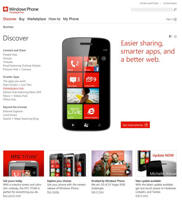
The Windows Phone website is stunning in its use of white space, clean lines and neat organization.
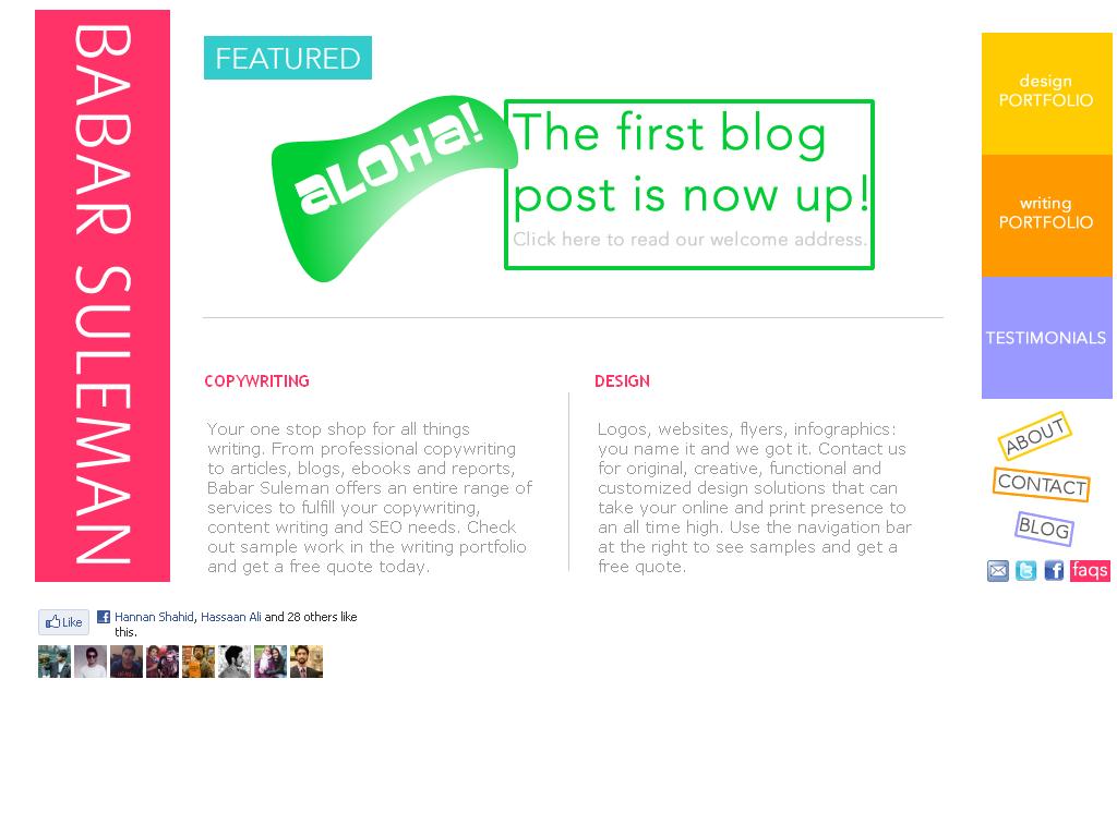
When designing websites, combine minimalism with a bright color palette and tiles to achieve the Metro look. Even though I designed the homepage of my website almost two years ago, it looks like a part of the current Metro trend because of the minimalism, blocks and vivid colors. Remember: simplicity never goes out of style.
3. The Tiles Grid and Blocks
Let’s just put it out there, unsophisticated as it may sound: tiles and blocks are the best way to organize content in web 2.0. From the revamped Facebook timeline to the gorgeous Pinterest display, text and images have never been as effective or easier to work with than they are grouped inside closely placed blocks. The Metro UI reinforces this idea.
Previously, Swiss grid design forced designers to work within rigid and tabular structures. But with the advent of web font services like Typekit and the increasing capability of javascript, the web is now more inductive to creativity than ever. The Metro UI takes full advantage of this new freedom in layout design.
Win Rumors places text, images and ads inside their own blocks for a clean and flexible layout.
4. Responsive design
The metro design language works really well with responsive design strategies.
Since there are no pesky skeuomorphic elements to reproduce across a number of mediums, you can have your website scale, resize, stretch, rotate and re-organize all the elements on your website on the fly to fit different platforms. For mobile devices, functionality, efficiency and speed are the key to a great user experience, not illusions of real world instances and decorative filler.
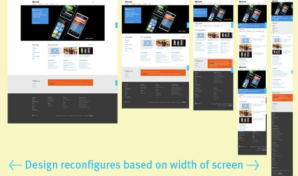
The new Microsoft website is an excellent example of not only a Metro type interface but also the flexibility with which the website adapts to different screens.
(Image from Forbes)
5. Bigger Text and Clickable Elements
As further evidence of its mobile-centric approach to design, the Metro interface uses large text and buttons for easy navigation. So whether the website is accessed on a desktop computer or a mobile/tablet device, you will not have to zoom in on the links to access them.
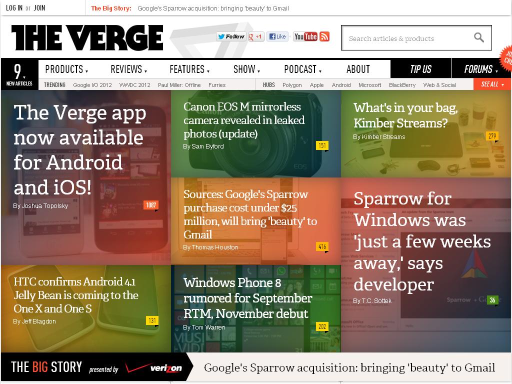
The Verge utilizes bigger fonts inside wholly clickable (and very artsy) Metro style tiles that look just as good on desktop computers as they do on mobile devices. And you won’t have to spend excessive time on finding what you are looking for.
Microsoft’s Metro UI may be hotly debated, but one thing is for certain. It has made an impact on the design community that is here to stay.
What do you think about the Metro UI and the ways it will effect web design? Let us know!


