If your website isn’t usable, you don’t have a chance.
Eye tracking studies have been important for helping website owners understand how visitors are browsing your website.
Reputable experts and brands have been conducting this type of research for decades.
Here are 5 lessons you can learn from these website eye tracking studies.
1. People are predictable
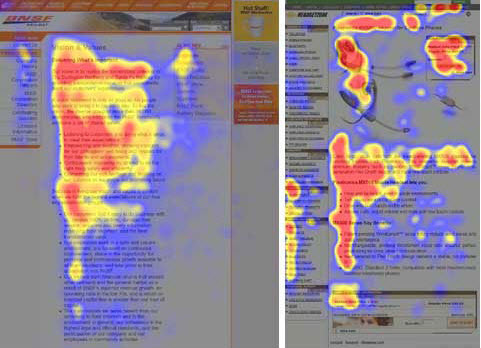
In 2006, researcher Jakob Nielsen found that on the average, we browse the web in a predictable pattern.
Website visitors absorb content in a matter of seconds, following an F-shape. First, they scan the page from left to right. After, they’ll go back to the left side of the page and scan in a downwards direction. Then, they’ll follow a second horizontal movement, return back to the left side of the page, and keeping scrolling down.
Nielsen uncovered this trend on three types of web pages – about sections, e-commerce product listings, and search engine results pages. He found that the F-pattern was a general shape “rather than a uniform, pixel-perfect behavior.”

Takeaway: Knowing that visitors will scan your page in this F-shaped pattern (and do it in a matter of seconds), ensure that your most important content and calls-to-action follow this pattern.
Notice how this landing page from 37 signals takes advantage of the F-shape. A website visitors eye might follow the track of the red arrows leading to a free trial sign up.
2. The F-pattern can break
Sav Shrestha compared patterns between two different visitor intents – concrete goals and general browsing.
According to Christi O’Connell in an article for Usability.gov:
“In the browsing condition, participants scanned each row of pictures from right to left down each row until they reached the bottom of the page. In the…search condition, their eye movements were less systematic. They seemed to jump all over the page.”
The research suggests that when people have a goal in mind, they’re likely to sacrifice their systematic yet casual viewing for speed. It could be that people have a natural urge to try to find information faster when they know exactly what they want. It’s this trend that may produce the clustering patterns in the navigation sections of your heatmaps.
Takeaway: Make a list of the concrete goals your website visitors will be trying to accomplish on your website. Use a service like UserTesting.com to do usability testing on these concrete goals because these site visitors are less predictable.
3. Visuals Matter
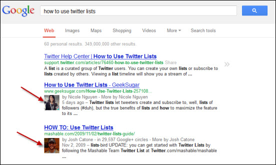
Last October, SEOmoz published a study on some of Google’s search engine results pages – focusing on local, video, and site links. What stood out on the video study was that the first thumbnail was more attention-grabbing than the second.
“Although individual results are a bit hard to separate, it does appear that subjects’ eye movements focus on the first video thumbnail, possible even at the expensive of the #1 organic result (as well as the video thumbnail right below it),” wrote Dr. Pete.

Takeaway: People care about what comes first, and if there’s a visually engaging element – it’ll win.
Can you see how this eye tracking study has particular significance when you consider the new Google Authorship available through Google +?
4. People ignore ads
In a 2007 study, Jakob Nielsen uses the term “banner blindness” to describe the trend that people have grown accustomed to ignoring advertisements. In this study, Nielsen states:
“We … confirmed for the umpteenth time that banner blindness is real. Users almost never look at anything that looks like an advertisement, whether or not it’s actually an ad,”
People respond most to plain text, faces, and cleavage or other private body parts, according to the study.
Takeaway: Online advertising can work but be sure you are checking your analytics and have the processes in place to measure the ROI of these ads.
5. Being different may be costing you
There’s a reason why blue has remained the standard color for links – the color has become an intuitive call to action for people.
“Follow conventions because when people visit a new website, the first place they look for things are in the places where they found them on most other websites; they tap into their experience to make sense of this new content,” wrote Dmitry Fedeyev in a Smashing Magazine article.
Over the last two decades or so, people have grown accustomed to certain usage patterns on the web – blue links included. And if you want to switch things up?
“Choosing a different [link] color is by no means a problem, but it may affect the speed with which users find [your content],” wrote Fedeyev.
Takeaway: This isn’t just about the color of links. Staying true to established conventions is the best way to ensure that your website is usable. Become aware of web convention — once you do, you will find successful ways to break away from them. On The Daily Egg, we use green links — because we are rebels. 🙂
Do your own research. While eye tracking studies are very expensive, you can use very affordable solutions like click maps (offered by Crazy Egg) or human usability testing from a company like User Testing.
What findings have you come across in your own research?


