Marketers have a really important job: Get people’s attention, keep people’s attention, and get those people to do something as a result of capturing their attention.
It’s a tough job. One of the major methods of winning at this job is using interactive elements. Interactive elements can get users to pay attention and do something on a website, rather than just passively drink in the information.
You need to get your users to become more actively involved with your content and website. Why? Because passive lurkers don’t convert! The way to boost your conversions is to boost your interactivity.
Interactive elements are the secret sauce of experienced conversion optimizers. They know that it’s not good enough to throw a simple call to action at the end of a page. Instead, they have to gradually coerce the user through small, subtle, and patient interactions.
Interactive elements are where it’s at, and they are becoming increasingly important in this day of fading attention spans and impatient users.
What are interactive elements?
The basic idea is this: Interactive elements turn passive users into active participants.
Thus, an interactive element is anything that the user interacts with on the web page. Think of an interactive element as something that requires the user to act.
Anyone can look at a web page. A user who merely looks at a web page might be getting the information. It could meet their needs. They might like your brand. All good, right?
Not necessarily. The user might easily hop off the page, distracted by something pinging or dinging, or simply because she has a short attention span.
Most users have poor attention span.
Let’s take the classic manifestation of content marketing — a solid 2,000 word article. If you’re reading this article, you’re doing so because you’re intelligent, engaged, interested, and you anticipate that this information will help you in your career or goals.
But what about the causal Internet user? They’re surfing freely, not deeply engaged, and not pursuing anything particular. Their attention span is limited.
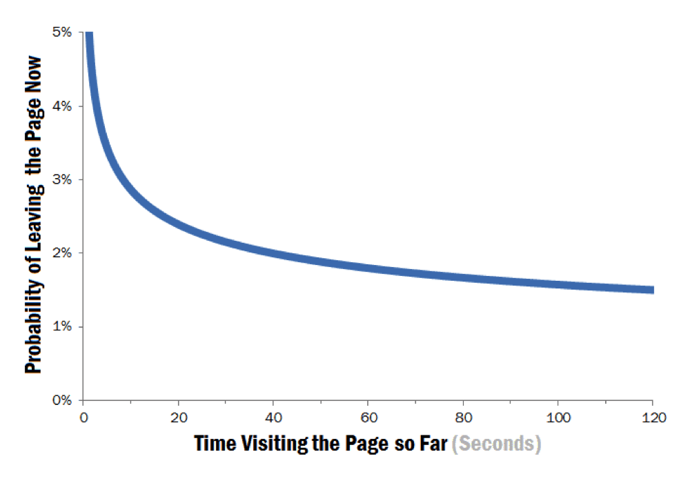
Most Internet users have an on-page attention span of less than ten seconds.
Image Source
The situation is even bleaker for below-the-fold content. Attention drops precipitously if users have to scroll down to see it.
With every second that ticks by on this page, you become more likely to leave it.
Reports have indicated that “smartphones make us stupid,” and that Internet use can lead to “cognitive failures” (source).
Unless you get a user’s attention right away, you’re going to miss out on their engagement.
Interactive elements are missing in content marketing.
With the rise of social media, Internet users are having a harder time focusing their attention on any one thing for a period of time.
This trend of social media — pinging, beeping, quickly-passing information — stands in contradistinction of content marketing. Content marketing, at least in its most common iteration of longform content, is usually not very interactive. It is often lengthy, substantial amounts of text, punctuated by a few headers or images: Ergo, this article.
There’s nothing necessarily wrong with longform content and its static existence on the web. But it is becoming less likely that users will engage with it.
In order for content marketing to be effective — to serve the business purpose of the brand — it needs to be bold about asking for conversions. It needs to drive conversions, not just deliver information free of charge.
CTAs and interactive content are missing from much of content marketing today. I’m convinced that more interactivity can lead to better content marketing.
On my website, Quicksprout.com, I’ve put interactive elements front and center. The first thing you see on my blog is this question, “Do you want more traffic?” followed by a one-field form where you can enter your website.
Completing this form leads to an entire SaaS where users can analyze their website, earn instant feedback, and get actionable tactics to improve their search marketing.
This level of interactivity allows my users to stay highly engaged, not just passively observing my content.
Interactive elements are methods of getting the user to stay, to act, to do. Not just to look.
Here’s why they help.
How do interactive elements boost conversions?
Everyone needs a little motivation. Interactive elements can motivate people to take action — complete a form, click a button, watch a video, whatever it is you want them to do.
Conversion optimization is nothing more than getting users to complete a desired action. The easier, more enjoyable, or more persuasive your website makes it for them, the more conversions you’ll get.
Here are some of the upsides of interactive elements.
Lower bounce rates.
Bounce rates are basically the percentage of visitors who leave your site without doing anything.
I wrote a whole article on how to use interactive elements to lower bounce rates. It’s powerful method. Lowering your bounce rates can dramatically boost your site’s search metrics.
Think about it. If you can get users to do something on your page, you’ve effectively eliminated a bounce. Bam. Done.
The average bounce rate is 45%. A page with interactive elements, however, should see bounce rates that are far lower.
Better SEO.
It almost goes without saying that interactive elements will improve your SEO. Search engine optimization is about more than meta tags and robots.txt, even though that’s part of it.
SEO, and CRO for that matter, is all about user experience optimization. Adding elements that enhance the user’s experience — interactive elements — will improve your SEO.
Higher engagement.
Internet researchers have found that on many websites, most people are observers, not doers.
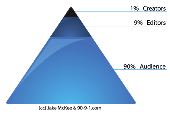
The 90-9-1 rule — also known as the 1% rule — in online communities is an example of this. In any online content community, there’s a breakdown of users. Todd Knutson explains this breakdown:
- 90% are the “audience”. They tend to read or observe, but don’t actively contribute.
- 9% are “editors”, sometimes modifying content or adding to an existing thread, but rarely create content from scratch.
- 1% are “creators”, driving large amounts of the social group’s activity. More often than not, these people are driving a vast percentage of the site’s new content, threads, and activity.
Image Source
The 90-9-1 rule seems pretty bleak. If you go to the work of creating a community, you want engagement, right? If 90% of your visitors are mere audience, you’re missing out on a huge opportunity. These “lurkers” aren’t adding anything.
Enhancing and adding more interactive elements can combat this trend.
Interactive elements should accomplish a simple goal: To get the user engaged.
But they should not stop there. The whole idea of adding interactivity is to coax the user towards a conversion. Interactivity for interactivity sake is fine, but it’s even better when it leads to a greater goal.
What are some examples of interactive elements?
So, let’s take a look at some of this interactivity. What kind of interactive features can you add to your website that will improve conversions?
Forms
Forms are a popular method of conversion, and one of the most common interactive elements on a web page.
They are a fixture of traditional landing pages, but possibly not as high-converting as they could be.
The following form created by Typeform is a great example of one of the classic interactive elements — the form. Forms are notorious for being mind-numbing, boring, and unnecessarily lengthy.
This form, however, takes the form to a new level of elegance and ease. The language is casual, the style is simple, and that little pen icon you see below? It moves!
Social Media Actions
Integrating social media into your content is a powerful method of increasing user activity. Since social media has proved its ubiquity in modern life, you’d be shortsighted not to use it in your content.
One popular way of doing so is to create tweetable snippets in your article, like this one:
[tweet_box design=”box_7″] Since social media has proved its ubiquity in modern life, you’d be shortsighted not to use it in your content. [/tweet_box]
There are plenty of ways to add social media interactivity. The key thing to remember is to keep it easy for the user to do so.
Anything Clickable
Interactivity doesn’t need to be some complicated development trick. Simply making something clickable is good enough.
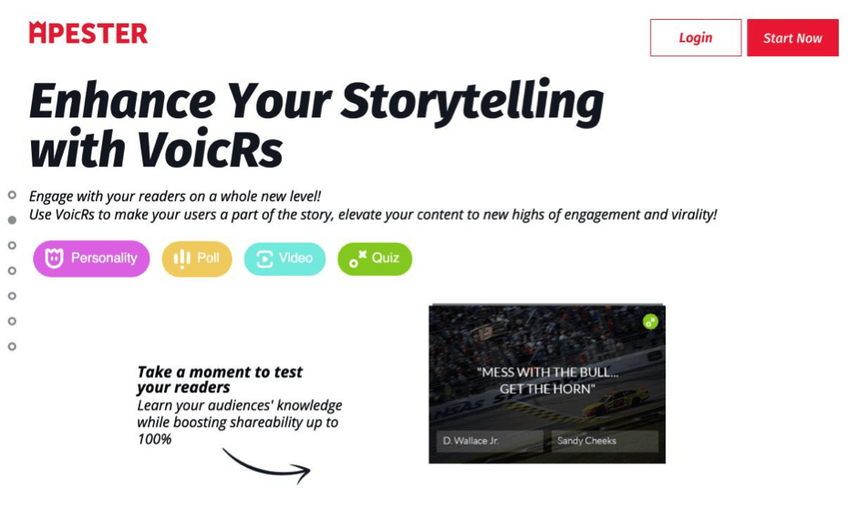
Apester’s site creates clickable pieces throughout the parallax scrolling site, making it highly interactive. Clicking “personality,” “poll,” “video,” or “quiz,” keeps users on the page and plugged into the content.
Further down on the page, you can answer a quick question about how you make your money.
Apester probably doesn’t care a great deal about your answers. What they do care about is getting you, the user, engaged in the page, their product, and taking the next step.
Videos
Adding videos to a page is a fairly common interactive technique. The level of interactivity provided through a video is often less than, say, a quiz or other activity. However, it does get the user involved in a different way — clicking on something, at least.
Microsoft uses a 1 minute, 21 second video on one of their content pages.
Quizzes or Questions
The Telegraph has brilliantly integrated interactive elements in average news articles. Some articles contain quizzes, like this one:
Buzzfeed is the master of quizzes. Their content has heaping helpings of inane quizzes. So, just in case you’ve been struggling with the nagging question of what condiment suits your personality, they’ve got a quiz for you.
Surveys
Some surveys are just plain annoying — like when you’re trying to visit a website, and a survey pops up, allegedly to “improve our customer experience.” (Don’t they realize that such a survey can ruin customer experience?)
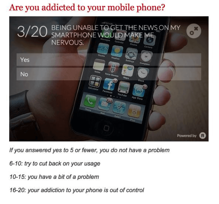
But some surveys are just plain good. This one, also from The Telegraph, lets users answer a single question, and gives them instant results.
People who take the quiz can compare their results with other users, and find out if they have a mobile device addiction problem.
These interactive elements are the standard fare, but you can go beyond.
InfinitynArt studio lets you play with design features right on the homepage — just drag around that document.
You can even create interactive emails, like Mountian Dew did with their genius newsletter.
Google has mastered interactive elements. Their Google Doodles often involve clickable features, mini games, and other features that get people to pay attention and act.
The Google Art Project is one site that’s packed with interactive features.
Conclusion
Adding interactive elements is about common sense, creativity, and a dash of inspiration. What you’re pursuing is not just some cool development tricks, but improving the experience for your user.
What interactive elements have you used? How have these elements improve your conversions?


