Figuring out the most effective ways to improve the user experience can be hard. There is tons of information out there, and it gets overwhelming fast.
We want to make it easier for you. We sorted through the noise so you don’t have to. Here are seven strategies that really work.
A/B test as much as possible
Nothing gives immediate results about what your users like (and don’t) like A/B testing. With it you can test UX design changes of any size or magnitude and get nearly instantaneous results.
If you’re new to A/B testing, here’s the nutshell explanation.
Step 1 – You identify an element on your site that might be changed to achieve a goal.
Step 2 – You create two variations of the element (Variation A and Variation B)
Step 3 – You divide page traffic between the two variations so that different site visitors see different versions at the same time.
Step 4 – You compare the results after a set timeframe to see which version was more effective.
There’s more to it than that, of course. But at a high-level, this is the general idea.
How does it look in real life? Here’s an example.
You aren’t getting the conversions you want on your home page. You think your call to action (CTA) button is the problem. Your designers give you two different color options to try out.
You roll out the two versions, then send traffic equally to both. At the end of the testing time, you have data you can compare to see which color button got a better response.
A/B testing works for bigger changes, too. You can revise anything, from a small element like your CTA button to full page layouts.
The goal with A/B testing is to make educated changes and eliminate guesswork. A/B testing gives you that data.
Your website host or builder should have instructions on how to implement A/B testing on their platform. If they don’t or you want something more robust, you can also use tools like Crazy Egg to get started.
Stick to a clean and minimalistic design
You may be in love with your lime green and hot pink color scheme, endless animations, and written content that goes on for days. Unfortunately, the majority of your website users won’t be.
When it comes to great website design, less is more.
Users want to find what they’re looking for as fast as possible. When you make that job harder with unnecessary bells and whistles (or a color scheme that is not easily readable, especially for visually-impaired visitors), users will leave as fast as they came.
A clean, minimalist design is the foundation for an elevated user experience.
It makes your site more pleasing to the eye and easy to navigate. This means you have menu structures that are simplified and require as few clicks as possible. It also means incorporating white space on every page, and choosing one or two theme colors that are subtle and non-distracting and use a font that makes reading copy a breeze.
You also want to use the same colors and fonts on every page. This ensures a cohesive user experience throughout the browsing journey. Every button and feature should be easy to locate and offer pared down designs that make them simple to use.
This is just the tip of the iceberg when it comes to designing effective websites. There are whole articles devoted to picking the right color palette for increasing engagement or boosting sales, finding the right font, and choosing an effective website layout.
Whatever path you choose, remember to keep it simple.
Use a responsive web design
Nearly 96% of people are using their mobile devices to access the web. That means there’s a really good chance somebody, somewhere is going to visit your site from their phone.
You want their experience to be as great as the person surfing your site from their desktop computer. This means you need a responsive web design.
When you design your site to be responsive for desktop, tablet, and mobile, the site’s elements–including content, layout, and images–adjust to fit every device’s screen. Users get the same experience no matter what device they use.
If you don’t make your site design responsive, it won’t display correctly and features may not work as intended. Users will have a sub-par experience, and will likely abandon your site out of frustration.
The good news is that there are some simple steps you can take right now to improve your site’s responsiveness.
Many website building tools today also have built-in responsive web design functionality. Even if the tool you use doesn’t, you can easily adjust the code yourself if you’re technically savvy. If you’re not, you can hire an experienced designer to assist.
Implement single-question UX surveys
You can design a website that you believe delivers the best user experience in the world. Without feedback from actual users, though, you’ll never know if what you believe is true.
The traditional way to get user feedback is through user experience tests like interviews or surveys. The trouble is that most users don’t want to take the time to complete either one.
Users will, however, often be willing to answer a single question–if it is asked at the right time. This is where single-question surveys come in.
With them, you can insert a pop-up window anywhere in the user’s online journey. The goal of the question is to ask one question that can be quickly answered with either yes/no or multiple choice responses.
The most typical use of this strategy is asking a question after a user completes an online purchase. Once the transaction is complete, a window appears asking something like “Did you find your shopping experience today enjoyable?” Options to respond are Yes or No.
Pop-up questions provide simple but useful feedback about the user experience. They aren’t the end of user testing, but the start.
If too many people answer the question in the above example with a No, then it can alert you to bigger issues that may need your attention. Issues you might not otherwise know about if you didn’t ask.
The key to success with these types of pop-up questions is to present them immediately after completion of a specific action. When you do, you make it easy for the user to respond quickly and get on with their day.
Make accessibility #1
It’s a sad truth, but most sites and apps ignore accessibility. A handful do the bare minimum, but the rest don’t give it a second thought.
The result is that a large portion of the world’s population can’t fully use most apps and sites, because they weren’t designed with disabilities and accessibility needs in mind. It shouldn’t be this way.
You can significantly improve your user experience when you make accessibility a top priority. Anyone can have a better experience when your site or app is built for everyone.
So how do you do it? Start by understanding the web accessibility standards set forth by the Web Accessibility Initiative. There are four principles that go into making a site or app accessible.
- Perceivable
- Operable
- Understandable
- Robust
The WAG’s Quick Start guide is a great place to begin. Go through it section by section. After you review a section, go through your site and see what’s lacking based on what you learned. Then make changes to meet the standard.
Once you’re done, you can use accessibility testing tools to see how well your site performs. There are countless free and paid options out there to help you pinpoint gaps and optimize your site.
Achieve lightning-fast load times
Load times are talked about a lot in UX conversation. The consensus is that the faster your site loads, the better the user experience. Data backs that up.
According to Google research, the probability of bounce increases 32% as page load time jumps from one to three seconds. Another survey found that even a one second delay causes customer satisfaction to plummet by 16%.
It’s clear that users want to find what they need fast. They don’t want to wait around–even for one or two extra seconds–for your page to load. Which means you need to prioritize lighting fast load times.
The good news is that optimizing your website or app to load in a mere one second can be done. It starts by running some site speed tests. There are free and paid website speed testing tools out there to help you identify the specific things slowing down your site.
Once you know what’s causing the trouble, you can get to work.
Create a short purchasing process
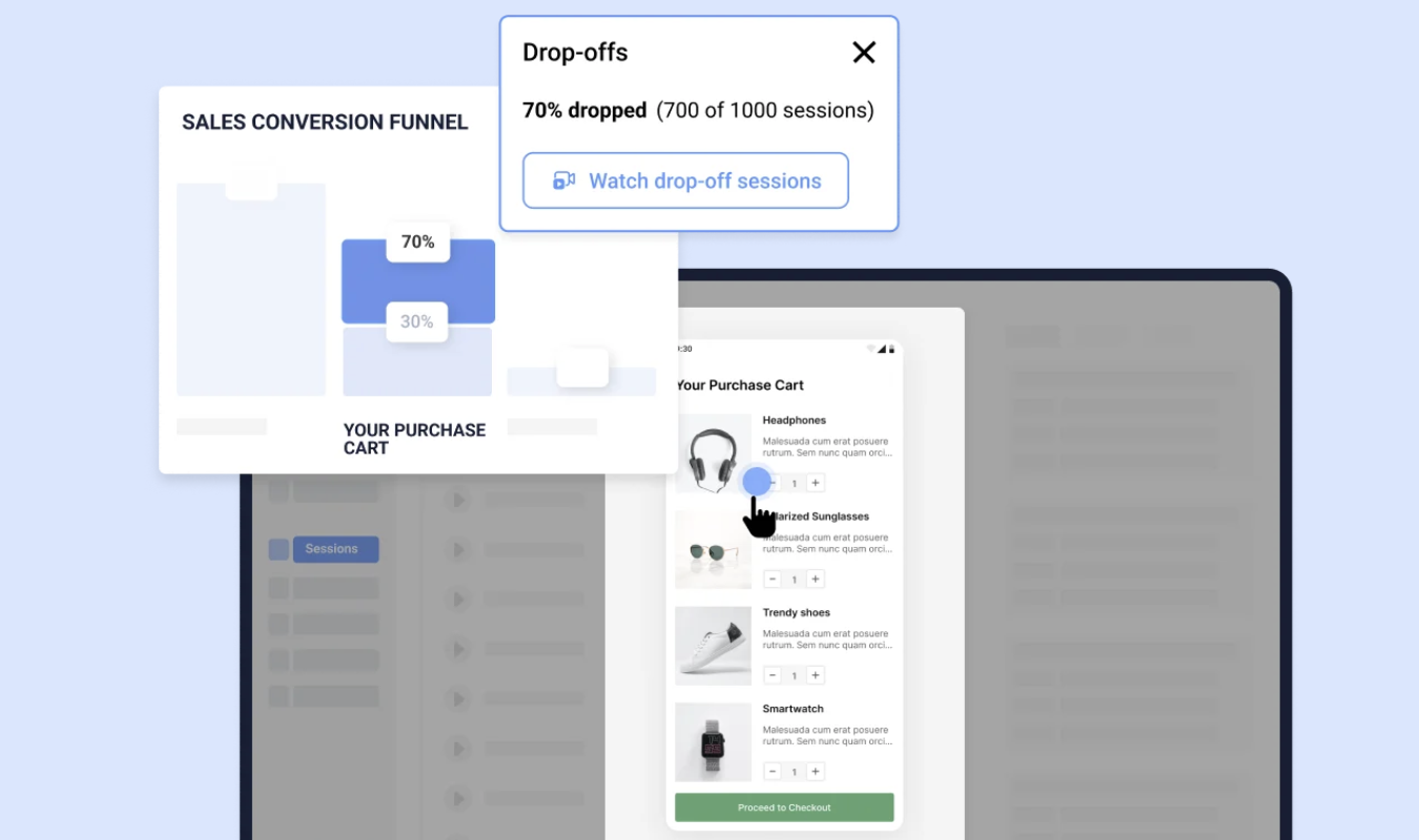
There’s nothing worse than having a user fill their shopping cart then abandon it. There are many reasons people don’t finalize ecommerce transactions. One of the biggest culprits is a drawn-out and overcomplicated checkout process, especially when they’re on a mobile device.
What users want is to complete their transaction in as few clicks as possible. What they don’t want is to have to provide unnecessary personal information, be forced to register an account to complete the transaction, and struggle to find basic information like shipping and tax information before they commit to buy.
There are many checkout pitfalls you should avoid. There are also sound strategies to incorporate right now, including some specifically to enhance the mobile shopping experience.
Some of the most important things to keep in mind include:
- Enable guest checkout
- Create a process with as few clicks as possible
- Only collect the information you really need
- Provide shipping and tax information quickly
When you give users a streamlined checkout experience, you reduce the instances of abandoned carts.


