Aside from having a site that loads quickly, it helps to know how to design a website layout that converts if you hope to find the most success online.
When it comes to layout, one that works well is more than just “pretty” or easy to use.
The average visitor will decide if they like your site or not in less than half a second. If you want an edge in your field, your layout should be based on conversion science.
Here’s what that means.
The Ins and Outs of How to Design a Website Layout That Works
Step 1: Think Simple
Hicks Law states that the more choices you give people, the longer they’ll take to decide on a selection. While longer time on site can be good for business, too many options can frustrate visitors, which is the opposite of what you’re after.
The lesson is to make your layout intuitive. The menu should include common terms, such as About or About Us, Contact or Contact Us, and Blog, FAQ, and Services, for instance.
The wrong way to list your menu is to call your blog “Musings” and your services, “Our Bread & Butter.” A cryptic site never converts well.
Instead, use menu items and overall language on your site that your visitors will quickly and easily understand.
Step 2: Utilize Negative Space
Part of making your site’s layout simple is to make heavy use of negative space.
This doesn’t just mean to leave white space between images and paragraphs, which of course is important. It also means to use negative space to drive visitors in the direction you expect, such as your call-to-action.
An apt illustration of negative space put to good use is on Google’s homepage. Here it’s very clear what visitors are expected to do, and there’s no clutter to confuse them.
You can’t get any simpler than that. By not adding more images, text, and other elements to their home page, visitors know exactly how to proceed to the next step, which of course is the conversion.
Step 3: Realize that Colors Matter
85% of shoppers cite that color majorly contributes to their buying decisions. The psychology of colors matters for marketers, particular when it comes to web design and layout.
You are encouraged to research and test the color schemes that your audience might respond to most. The right colors can evoke certain emotions. Furthermore, things like demographics can affect the way your visitors perceive your site.
To find a color scheme that works, use the color wheel and search for complementary colors (those that are opposites on the wheel) or analogous colors (those that are next to one another on the wheel).
These color schemes can give your site layout depth and make it appear more interesting, keeping people on site long enough to make a positive buying decision.
Step 4: Format Persuasive Copy Properly
As a web designer, you might prefer to leave the web copy to an actual copywriter. However, you should still know where the text should be placed for maximum conversions, even if it’s temporarily lorem ipsum.
A headline is paramount and should be placed center-stage on the home page so as to communicate the brand’s value proposition. Each subsequent page should then contain a headline that speaks to the relevance of that page’s content.
After the headline, research shows that placing text in an “F” design works best, as that tends to be the way people read content online.
If you’re going to have an abundance of text on your website, parse the content into boxes and format for skimmers to keep reading light and easy for all site visitors.
Notice how State Farm decided to break their content up into nice little sections to make finding what you want simpler on the eyes and mind.
Step 5: Be Clear About Outcome
A highly-converting web layout is one that focuses on the actions you want your visitors to take.
The best layouts actually manage to walk your visitors through the process. Your calls-to-action should be prominently displayed so that they stick out and get noticed without much effort.
Whether you want your visitors to make a phone call, complete a form, or share your content over social media, your layout should act like a road map that leads visitors from point A to point B, with point B, of course, being the ultimate conversion.
Step 6: Don’t Be Afraid to Borrow
Instead of learning all the nuances of how to design a website layout, take a look at other websites operating in the same space. This way, you can manage to take advantage of all the research and testing your competitors may have engaged in.
If you like their layouts, chances are you’re looking at fairly successful sites. Copy those designs to make your layout even more predictive and intuitive to use.
Step 7: Go Responsive
Visitors to your website are five-times more likely to bounce if your site isn’t optimized for mobile devices. With people switching between devices with regularity, it becomes important to offer a seamless experience on all Internet-based devices.
The key is to remove as much need to scroll and click and swipe as necessary. Put the most critical information about the fold but create opportunities for visitors who want to learn more.
Notice how Dropbox leaves little question as to what it expects you to do. You can either sign up on the right, click the simple two-step navigation menu, or scroll down to learn more. Even on mobile, there’s no reason to scroll or swipe. You simply make your selection.
Make sure your site offers the same experience on all devices, just as CrazyEgg does. From desktop to the tiniest of screens, visitors are offered the same simple choices and easy-on-the-eyes design.
Step 8: Feature Your Offerings & Smiling Faces
Studies show that larger and more appealing images lead to higher conversion rates.
Aside from size and quality, the images you choose to comprise your site’s layout should be purposeful. They should showcase your products or services in the best light and all people with smiling faces in warm and positive environments.
Step 9: Strategically Place Trust Emblems & Social Proof Elements
Visitors to your website want to know that your organization can be trusted, with their cookie information, as well as personal details and credit card information, for instance.
You can bolster trust by including trust emblems and social proof elements.
Trust emblems include logos of popular brands that use your services or products. Examples of social proof can include client logos, feedback from satisfied clients, links to client case studies, and client story videos.
Productivity platform Asana includes both testimonials from satisfied customers and prominent brand logos, improving the trust factor with all site visitors.
Content analyzer Grammarly is another brand that tells its visitors they’ll be in the best company by providing satisfied user testimonials right on their homepage.
Use these examples to improve the trust factor you convey to your audience, and you could see a nice boost in subs and buys.
Step 10: Keep Testing!
No matter how much research you conduct, only your audience can tell you which layout they prefer.
When you want more conversions, your task is to consistently test every element of your site. The simple act of changing your call-to-action buttons could cause a major bump in signups or buys, for example.
Hubspot found that changing a page’s CTAs from green to red resulted in a 21% conversion rate boost. Those results wouldn’t have been possible without adequate testing.
Take heed and always be testing using the latest tools and processes.
Good & Simple Website Layout Examples
Here are a couple of websites that nailed the simple and user-friendly layout design.
Unbounce uses complementary colors (orange and blue). The site uses empty space to drive the eye to the headline. And site visitors are given two primary choices. Or, they can click the clearly-marked call-to-action in the upper righthand corner.
There are other options, but they’re for those who may want to look for them. And when they search, those elements won’t be hard to find. It’s clear what visitors should do, and the site undoubtedly experiences plenty of conversions in kind.
Ecommerce platform Shopify also provides a simple menu and employs plenty of empty space to drive visitors to the conversion. The imagery is large and high-quality and the calls-to-action stick out and get noticed.
You are also encouraged to click around to your other favorite websites. All the while, think about how those sites are designed, and how you can take examples to add to your own layout.
10 Website Layout Tips and Ideas to a More Attractive Site
There’s no need to overhaul your website in order to make your site more attractive. To recap the post, here are ten simple tricks-of-the-trade for a more engaging layout that’s designed to convert.
Use Real People
Trade out any generic or stock photos with those of real individuals, especially when it comes to implementing trust emblems like testimonials and case studies.
Visitors to your site will empathize with real people more than they do with photos of a generic nature.
Simplify Your Menu
If you feel your menu is too complex, shorten it.
Add submenus to create a topic hierarchy, such as putting all of your products under a “Products” header, or services under a “Services” heading, for example. Only the most critical menu items should be visible, but even deep pages should be easy to find.
As a side note, include a search option to make it even easier for visitors to find the content they’re after.
Remove Additional Options
Never create more than one call-to-action on a page, if you can help it. The less options, the quicker and more likely your visitors are to act. If you currently offer too many options, purge some of them to make it clear what you expect your audience to do.
Remove and Enlarge Images
If you have too many images, your site may be overwhelming to the eye. Consider cutting some of them out for easier page browsing.
If you have images, make them larger to make them easier to view on any sized screen.
Change Your Color Scheme
Use the color wheel and play around with various color schemes, taking into account your visitors’ preferences and consistently testing various color schemes to find the one that works best.
Consider Visitor Intent
People visiting your website likely have a single action on their mind.
They want to learn more or buy, for example. Take those motivations into account when deciding your site’s layout. If they want information, the very details they’re searching for should be front and center the moment they click-through to that particular page.
Add Trust Emblems
Gather positive testimonials and add images and videos of those individuals to your website. Create case studies and include logos from those you do business with, and other business partners.
These can improve conversions by making people feel safe about browsing, subscribing, and buying.
Make it Clear How to Get in Touch
Visitors should never have to search for ways to contact your organization, particularly if they need help. Consider adding a chatbot to help visitors even when no one is available to answer important queries.
Drive Conversions with Content Hierarchy
Think like one of your visitors, visit your homepage, and search through your website to find what you need. Is it easy to find the information you are looking for, or are you clicking too many times to get to the deeper pages of your site?
These types of role-playing exercises will help you whittle your website’s layout down into one that drives your customers to the information they seek and then, ultimately, to the conversion.
Get Your Visitors’ Opinions
If you want to know how to design a website layout that converts, why not get the information straight from your visitors?
Here are a couple ways you can do just that.
How to Know if Visitors Like Your Website Layout
Pay attention to high-level site metrics
Google Analytics offers insights into how many new vs. repeat visitors you have, how much time they spend on any given landing page, and how frequently they bounce after visiting just one page..
Start watching your user navigation
Crazy Egg makes it simple to see how your visitors are interacting with your website as it’s happening. After signing up for the free, 30-day trial, you’ll be able to analyze your website using heatmaps.
Heatmaps show you where visitors to your site are hovering their cursors, clicking around your site, and which forms they’re filling out.
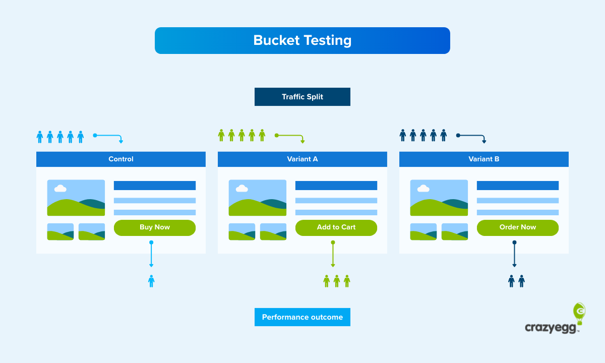
A/B test different layout elements
Based on your observations of user behavior, you can then easily test various site elements like text placement, image sizes, and headlines without having to know a lick of code.
After putting the above tips into action, keep testing your site and then retain those very elements that boost conversions.
Eventually, you’ll have on your hands a supersite that blends all the best elements together for maximum success.
Conclusion
Site designers and marketers alike should know how to design a website layout for maximum conversions.
This means learning about your audience and what they want. It means figuring out how to deliver critical information naturally and intuitively. Most of all, it means going simple without a lot of clutter.
If you feel that your website isn’t up to snuff right now, not to worry. Start making small adjustments to your site based on real customer behavior, and you can still come out ahead.
When you consider that the simple act of updating your website to reflect a more modern design can improve conversions by up to 33%, putting just one action into effect can help.
Then, keep adding and testing elements to your website’s layout to make your site even more user-friendly.
In turn, you’ll be sure to experience a nice, massive boost to your site’s conversions.


