The first step in winning over more customers is to understand the essential elements that should go into every homepage.
Draw inspiration from 31 top homepage designs so you can find out what will work best for your business and your audience.
The Benefits of a Well-Designed Homepage
A simple homepage design welcomes your audience to your site, tells them what you want them to do next, and allows them to explore your site in more depth.
You can add complexity to a simple homepage design, but you don’t want to start with a cluttered mess and have to selectively prune it. Always begin with the basics.
What do you need on your homepage? What will your audience expect? And which elements take priority?
When you can answer those questions, you’ll have the information you need for better homepage design. In web design, homepage elements have very specific purposes.
Helping your target audience get to know your business
Many of your website visitors will find your homepage first. With that in mind, you need to make a solid first impression.
Your homepage should provide a sense of your company’s values, unique selling proposition (USP), and purpose. You’re more likely to lure in potential customers if you can effectively communicate this information.
Improving the user experience on your website
Consumers visit your website with a purpose. It could be to check out your product line, read your blog posts, or find out if you sell a particular type of service.
Regardless, you want to direct that consumer to the appropriate page. Your homepage design should facilitate this transition by providing intuitive navigation and a sense of how your website flows.
Accruing more conversions
You want website visitors to convert, but they won’t if you don’t give them the necessary incentive and opportunity. Maybe you want to build an email list, but if visitors can’t find a signup form, your database will remain empty.
By making this information easily accessible on your homepage, you will see an uptick in conversions.
Another way to boost conversions is to create a strong first impression with your homepage. If visitors enjoy their experience on your website, they’ll also be more likely to remember it in the future. Maybe you won’t make a sale today, but that customer will return days or weeks later and buy from you.
Improving brand awareness
Make your company memorable by allowing your brand image and messaging to come through on every page. This is especially true when it comes to your homepage design because the homepage serves as the gateway to the rest of your website.
Your logo, tagline, and purpose need to take center stage. In fact, you might even want to add a form or statement to the very top of your homepage — preferably in a large font — that gives your visitors a sense of what you do:
What problems do you solve for your customers? How do you improve your clients’ lives — whether personal or professional?
Don’t force your website audience to have to figure out and guess what it is you do. Make it clear from the get go.
How to Design a Website Homepage
Now that you know the four goals to motivate your design principles, ask yourself three guiding questions: What do you absolutely need on your homepage? Who is your target audience and what will they expect? Which elements take priority?
Once you have the answers to these three questions, you can begin plotting out how best to improve your homepage. Remember to tie each of your design elements to one of the four goals listed above. Most importantly, don’t worry about getting it perfect. Website optimization is an ongoing process!
The Best Homepage Design Examples (And Why They Work)
There’s no better teacher than an example. I’m going to show you some of the best homepage design examples that I’ve found, and I’ll tell you exactly why they work so you can apply those same tactics on your own site.
1. Dropbox
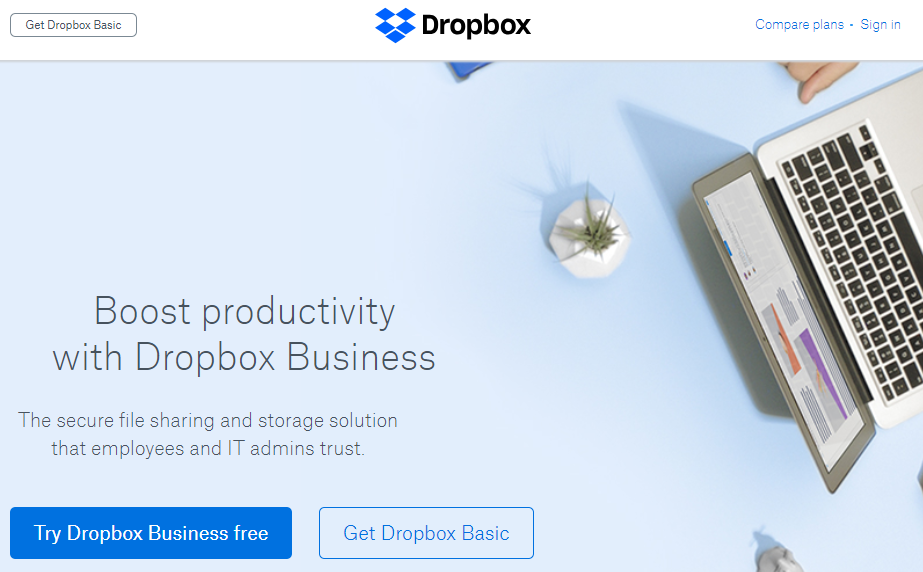
I’ve called out Dropbox before as an excellent example of good marketing all around. The company’s homepage is no different. You have a slightly askew hero image that draws the eye and two CTAs — one of which uses a dark background to draw more attention since it’s for the paid version of the tool.
The marketing copy is very simple here. Dropbox knows its target audience and drills down on pain points that affect them, including efficiency and security. Plus, the navigation is pretty stripped down, with an option to “Compare plans.”
2. Slack

I love the Slack homepage design because of its unique illustrations. You can’t go wrong with custom graphics. I also like the tagline — “Where Work Happens” — because it’s creative, but it also encapsulates the tool’s purpose.
Slack makes it clear what visitors should do. They can sign in or create an account. Here, we have more navigation options than Dropbox provides, but each contributes to helping visitors find what they want.
3. Green Mountain Energy

I’m going with another example of custom graphics. Green Mountain Energy leaves no doubt about the company’s purpose. It wants to provide clean energy at an affordable price. There are two equal CTAs — one for residential customers and one for business owners — that use contrasting colors to draw the eye.
4. CarMax

CarMax encountered a unique challenge when designing its homepage. The company both buys and sells cars, so it needed to cater to both audiences. As you can see, CarMax succeeds.
Multiple CTAs direct visitors to either find a car to buy or to sell their used car. Clean and simple. The hero image is clearly custom because you can see the CarMax logo on the vehicle’s license plate.
5. thredUP

Ecommerce homepage design can get tricky. Do you introduce the business, show off your flagship product, or overwhelm your audience with tons of products or categories?
Hopefully, you don’t do the latter.
In thredUP’s case, the homepage goes for a seasonal approach. Apparently, boho style is in (at least for women), so we see a custom graphic that advertises lots of boho fashions available. The navigation is hefty but cleanly designed, so visitors can easily find the categories that interest them.
6. StudioPress
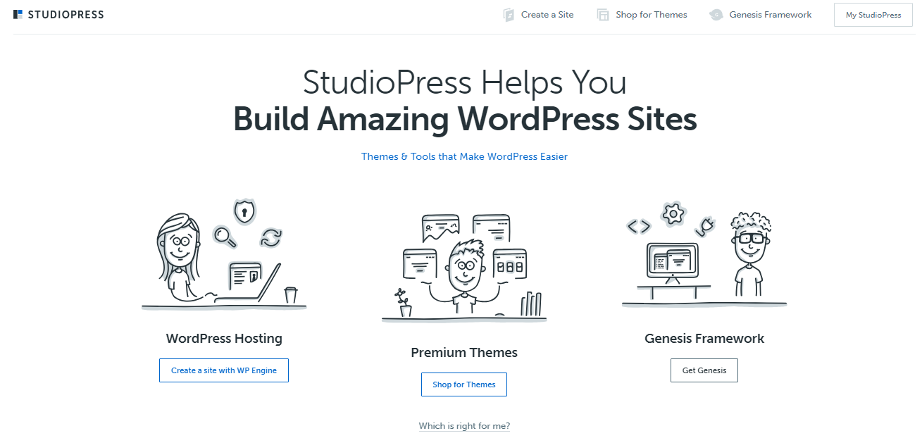
Minimal elements, flat design illustrations, and muted colors make the StudioPress homepage design shine. Thanks to the copy, you know exactly what StudioPress does for its customers: “Build Amazing WordPress Sites.” Then, you have three CTAs to choose from based on how you want to proceed.
7. Healthline

Sometimes, your approach to homepage design needs to reflect the type of website you’re building. In Healthline’s case, it’s primarily an educational publication that provides tips and insights into healthcare, nutrition, fitness, and more.
This is an example of “showing, not telling” design. Instead of a big headline that says, “We Publish Articles About Health,” Healthline demonstrates that fact with lots of article titles and excerpts above the fold. You also have access to a hamburger menu in the header, which can help you navigate to what you want, and a simple link for the site’s newsletter.
8. Crazy Egg

You didn’t think I would write this article without including Crazy Egg, did you? This website’s homepage focuses exclusively on encouraging the visitor to plug in their URL to view a heatmap. There’s also a link to start a 30-day free trial, with the trust-building “Cancel anytime” language right next to it.
You have social proof in the subhead, which tells visitors how many people trust Crazy Egg’s tools. If you scroll down, you encounter expandable content just below some more social proof.

When you click the “Learn more” link, the homepage expands to include even more information about how Crazy Egg helps website owners boost conversions.
9. Abacus Plumbing

This is a lot different from the other examples on this page, but I really love how Abacus Plumbing has structured its homepage.
It might look a bit cluttered, but this homepage includes a ton of social proof. The BBB accredited logo, the review count, and the words “You Can Count On Us” are all strategically placed.
The homepage highlights another trust-building element which is that customers will receive personal information about technicians prior to the technicians’ arrival. Customers can feel safer knowing that they’re actually opening their doors to an Abacus technician.
10. trivago

You might have heard me say once or twice that I love minimal design. You can’t get much more minimal than the trivago homepage design. It’s focused on one thing: Getting visitors to search for a destination. That’s it.
11. Century21
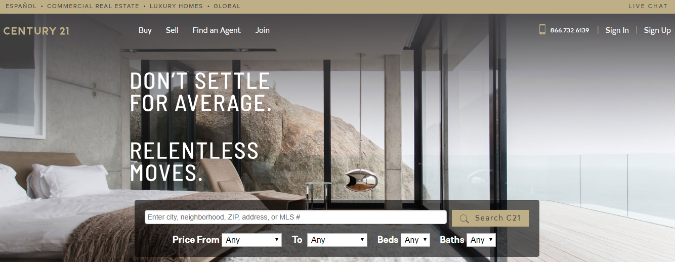
The word “relentless” caught my eye when I first saw this homepage design. If you were hiring a Realtor, wouldn’t you want him or her to be relentless? I would.
The homepage design is attractive and perfect for the Century21 audience. There’s a focus on searching for properties immediately from the homepage, but you also have access to useful navigation.
12. Marc Jacobs

Nobody would ever call me a fashion expert, but I like the overall homepage design on the Mark Jacobs site. It’s minimalist and sophisticated, which fits the target audience, and the creative copywriting captures the attention of visitors.
Additionally, consumers will immediately notice the free shipping order in the top bar and the well-spaced navigation links.
13. Laura Worthington Fonts

Laura Worthington has created a homepage design that reflects her approach to designing fonts. It’s feminine and colorful without overwhelming the senses.
At the same time, the elements don’t feel cluttered, and you know immediately what Laura Worthington sells.
14. Skype

I use Skype a lot, so I’m pretty familiar with how it works. Skype has created a homepage design that addresses its target audience perfectly. The graphic subtly communicates that the technology works on all device types, and the word “millions” shows how popular the service is.
Then you have the three things people use Skype for: talking, chatting, and collaborating. The CTA button with the blue background and white text calls attention to itself beautifully.
15. Fitness Blender

From the logo to the marketing copy, Fitnessblender has created an awesome homepage. With all the money people spend on the fitness industry, it’s refreshing — and compelling — to see a message that promises workout videos that don’t cost money. Sign me up!
You also have the male and female models, both of whom look fitness-ready, to capture attention and motivate the audience.
16. Nest

The copy and the imagery take center stage for the Nest homepage design. I see some elements of Apple’s design in this example. You have the product lined up in all its colors and the tagline “Saving energy never goes out of style.” The “Buy now” CTA tells visitors exactly what they should do next.
17. Toastmasters International

Although the Toastmasters International homepage design might seem a little dated at first, you have to remember its target audience. The organization wants to attract people — usually business leaders — and it does so well. I like the background images and the headline copy. Plus, the colors befit the tone and voice the organization wishes to express.
If it doesn’t work for your business, you don’t have to use a pale color scheme or minimalist design. Feel free to experiment and figure out how best to represent your business.
18. Bookouture

Here’s another example of a fairly minimal design. Bookouture is a digital publisher, primarily of romance and suspense novels, and its homepage targets authors who might want to publish their books here. The use of the computer image to show cover art is a smart one. In the header, you have a link for submissions, and below the homepage copy, there’s another CTA to learn more about what the company offers.
19. Ensurem

Ensurem is an example of a minimalist design that still feels cultured and fleshed out. The huge hero image helps, as does the dark color palette. You get a sense of refinement from the design.
Particularly notable is the CTA. It’s big, the background is high-contrast, and the background color recalls the colors in the Ensurem logo. All fit together seamlessly.
20. Suicide Prevention Hotline

Nonprofits have their own obstacles when it comes to homepage design. They want to help as many people as possible but they also want to solicit donations, volunteers, and other help from the public. The Suicide Prevention Hotline accomplishes each of these goals well.
It’s interesting because the primary CTA is a phone number. This might sound antithetical considering what we usually see, but it’s designed for its audience. And if you’re surfing on your smartphone, you can click that number to dial it, which makes it particularly useful.
21. L’Oursin

L’Oursin, a fantastic Seattle restaurant, totally nails the homepage design here. The photographs of food immediately tickle visitors’ taste buds, and you get a sense of the venue’s mood through its photographs and font choices.
22. The Motley Fool

Lots of people use The Motley Fool exclusively for articles on finance, but the company offers much more. You’ll notice that one element sticks out on the page — the yellow CTA button that says “Latest Stock Prices.” If you click it, you’re taken to the company’s paid services, which involve providing you with stock picks from analysts and experts.
23. FindLaw

FindLaw has two purposes: educate people about the law and connect customers with lawyers. It caters to both purposes through its homepage design. You can use the top navigation to find educational information, but the primary CTA — centered over the hero image — encourages you to find a lawyer near you.
24. UnitedHealthcare
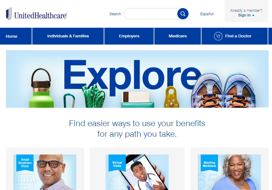
If you’re at all familiar with the psychology of color in marketing, you know that blue is often used to symbolize health and emotional healing.
That’s why UnitedHealthcare’s homepage design is so effective. Plus, it uses relevant images to help visitors feel at home, and multiple CTAs offer clear directions about how to proceed.
25. Viewership

If you watch my YouTube videos, you know Adam and I have a regular Thursday series where we answer questions from people who have left comments on previous videos. Adam’s business, Viewership.com, focuses on helping people take advantage of video marketing.
The homepage design is ideal. We see the pink/red color in just two places and the green color in just two places. That’s how Viewership draws visitors’ eyes to relevant parts of the page.
26. Lyft

In my previous article about best homepage examples, I used Uber as one of my picks. It’s only fair then that I feature Lyft here. It’s a fantastic homepage that uses a clever custom illustration to attract viewers and includes a high-contrast CTA button. It also successfully caters to both riders and drivers.
27. hubEngage

I like the hubEngage homepage design because it’s ernest and attractive. “Unleash the Power of Engaged Employees.” That’s the business’s sole purpose. Then you have the chat box in the lower right-hand corner, which is an excellent UX decision, and the topical hero image.
28. Starbucks

Why don’t we close with a bang? Starbucks is no marketing beginner. The company has set the bar high for every other coffee shop, and its homepage design changes regularly based on the products Starbucks wants to promote.
Here, you have two protein shakes that look delicious as well as simple but effective copy. The “New” icons next to the product names attract interest, too.
29. Copyblogger
The Copyblogger website uses the hero image approach to homepage design — and it works beautifully. The site is clean and minimalist, using light colors and an image that’s simultaneously inviting and unobtrusive.

You get everything you expect from a homepage, from the logo and tagline to the navigation bar at the top. There’s also the value proposition on top of the hero image, which helps cement the company’s value.
Why it works: Hero image homepages work well when you’re selling a single value proposition. It’s not ideal for e-commerce homepages — unless you sell just one product — but it’s perfect for service businesses that have a core or flagship service they provide.
Humans respond well to visual imagery. In fact, nearly 60 percent of customers surveyed in one study said they would rather engage with a beautifully designed web page than one that was simply designed. Consumers are judging your business based on homepage aesthetics.
30. Uber
Anyone who knows me will tell you I hate to drive. I’m always calling Ubers to pick me up.
I’m also a big fan of Uber’s website. It offers one of the best homepage designs I’ve seen in a long time.

It’s a great example of seamlessly combining two value propositions: Get a safe, inexpensive ride or become a driver and make money.
That’s no easy feat, especially with so few words on the page.
Why it works: If you look at each individual element on Uber’s homepage, you’ll notice that it’s all designed to funnel website visitors toward one action or another. They want you to sign up for an account so you can order Uber rides or sign up as a driver and earn cash.
Those are two entirely different segments of the market. Yet it somehow works.
Notice the image choice. The guy behind the wheel is clearly an Uber driver, but he’s staring right at the camera — at you. If you wanted to order an Uber, he’s someone you’d feel comfortable getting in the car with. Or, if you wanted a part-time hustle, he’s someone whose success you’d want to emulate.
The rest of the homepage provides tons more information, from a map and quoting form for getting from one place to another to blurbs about the company’s value proposition.
31. Rosetta Stone
If you’re not familiar with Rosetta Stone, it’s a suite of tools designed to help you learn a foreign language. It’s on the high end of the pricing spectrum, but it’s still hugely popular.
Also, it’s one of the best homepage examples I’ve seen for an e-commerce site.

We’re dealing with a hero image again, this time of a worldly traveler who’s using his phone — ostensibly to access the Rosetta Stone app.
Why it works: Rosetta Stone leads with its primary USP: TruAccent technology. The value-added benefits of the technology set it apart from its competitors and make it seem more effective at helping people learn language skills.
Then you have another value proposition: The company has been in operation for 25 years. There’s also social proof: “The most trusted language solution…”
Rosetta Stone might benefit from some hard numbers here. How many customers does it serve? That might be more impressive. But it’s the only fault I find with this homepage.
There’s a major call to action for launching an interactive demo, but users can also find out about specific solutions for different customer segments: individuals, educators, and businesses.
This homepage does an excellent job of capturing the visitor’s attention and providing plenty of places to explore without distracting the visitor from the primary CTA.
Homepage Optimization Checklist
You’ve seen three real-life examples of some of the best homepage designs on the Internet, but what can you take away from them? And how do you design the best homepage for your business?
Believe it or not, homepage design boils down to five simple elements. You have lots of room to play with creativity, but make sure you’re presenting your offer clearly and without distraction.
Here’s a handy checklist of things to include on your own homepage to improve it and boost conversions.
1. Write a strong and clear headline
Each of the three examples I mentioned above has a clear, specific headline to anchor the page. Let’s look at each headline here:
- Build Your Online Authority With Powerfully Effective Content Marketing
- Get There — Your Day Belongs to You
- The only language software with TruAccent™ — the world’s best speech recognition technology.
They’re obviously very different, but they have several things in common.
First, they use power words. These are words that immediately evoke an emotion or connect with the reader.
Copyblogger focuses on words like “authority” and “powerfully effective.” They’re not impressive on their own, but when built into a concise headline, they help send a stronger message.
Uber takes a more emotive approach. Instead of stating its value proposition outright, Uber appeals to what their target customers want: freedom, efficiency, and a destination.
Then you have Rosetta Stone, which uses words like “only” and “world’s best” to convey credibility and authority. Those words imply that Rosetta Stone is all you need to accomplish your goals.
Write strong headlines (we have a ton of great headline examples here) by putting yourself in the customer’s shoes. What would impress him or her? What would connect with that person enough to convince him or her to explore the rest of your site? Or to fill out a form?
2. Don’t confuse your users
One of the most common issues I notice on homepages is conflicting CTAs.
Avoid conflicting CTAs as much as possible. You can have more than one option, but make clear that there’s a single CTA you want your visitors to follow through on specifically. You can see how both Uber and Rosetta Stone did this in the examples above by making the alternate CTAs smaller and less obvious.
More importantly, you want to avoid visual clutter. Just like you pick up toys, clothes, scattered magazines, and other detritus at home, you want to remove any confusing visual elements from your homepage.
In other words, keep it simple.
You want enough on the page to attract attention, but not so much that readers don’t know where to look.
3. Add a direct and big CTA button for the offer
Your CTA is where you want your visitors to focus their attention. It’s an invitation: Here’s what to do next!
The CTA button shouldn’t take over your entire screen, but it should get the visitor’s attention. Consider using a unique font if you don’t think it’s captivating enough.
Additionally, make sure you use a call-to-action phrase that makes sense and conveys value. A CTA like “Subscribe Now” doesn’t thrill me. Change it to: “Subscribe Now to Get a Free Case Study.” Now I’m interested.
4. Use contrasting colors
I’m a big fan of contrast when it comes to my sites. You’ll see my signature orange color on NeilPatel.com and Neil Patel Digital.
Contrast doesn’t mean a loud or obnoxious color. You can create contrast in numerous ways.
For instance, a bold color for the background and a neutral color for the text on a CTA will work well. You don’t want lime green on electric blue — that’s hard on the eyes.
In a CTA, you can also use a color that isn’t found elsewhere on the page. Just make sure it doesn’t strike too much visual discord. Learning the color wheel and how colors complement one another will make you a better designer.
5. Keep the offer above the fold
Your website visitors might never scroll beyond the fold. That’s just a fact. If you bury your offer underneath the fold, many of your visitors will never see it.

As you can see from the best homepage examples I mentioned above, every one includes the offer or USP (unique selling proposition) above the fold. It’s obvious from the moment the visitor arrives.
Why is it important to optimize a homepage for mobile devices?
How Important is the Mobile Version of the Homepage?
We just checked our homepage stats: 1/3 of all our visitors to our homepage are on mobile devices.
And it’s a much larger percentage of prospects. Many of your desktop visitors will already be customers, using our homepage to log into their Crazy Egg accounts. But the mobile visitors? All of them will be prospects.
These days, you should design the mobile version first. At the very least, spend just as much time on your mobile homepage as your desktop homepage.
The ROI of Homepage Design: Double Your Total Funnel
In our years of testing, getting the right homepage design can easily double the conversion rate into your marketing funnel.
Take the total number of signups, leads, or purchases that currently go through your homepage. Don’t worry about fancy waterfall click analysis, just look at the total number of conversions going through your main funnel.
- What would the ROI be to your business if that conversion count doubled?
- And if your funnel is already really strong, would would the losses be if the funnel got cut in half after your launch your homepage redesign?
That’s what’s at stake with a homepage redesign: half your marketing funnel.
When you’re designing your homepage, find the best marketer you can possibly get. Then have them drive the project. Don’t cut corners.
How to Find Out What’s Working and What’s Not on Your Homepage
Web design is extremely subjective. I might love a site’s design, while you might hate it. There’s no way to please everyone.
However, you can please most of the people who visit your site. How? You figure out what’s working and what’s not, based on what the majority of your site visitors respond to positively.
Crazy Egg lets you run user behavior reports on your site. You’ll see where people click, scroll, and otherwise react to design elements.
A heatmap, for instance, lets you see what people care about on a web page, and what they don’t even notice (even when they should). On the other hand, a confetti report shows you granular information about referral sites and how people who come from different places engage with your site.

Do people tend to skip over your CTA when they come from Facebook? Maybe your Facebook posts aren’t aligning with the design of your site.
Other user behavior reports allow you to view visitor patterns in different ways. For instance, a standard heatmap shows areas of “hot” activity and “cold” inactivity. Positioning your homepage elements to align with eye tracking can make it more effective.
After you collect this information, create two versions of your website. Present one version to half your visitors and the other to the remainder. This process of A/B testing individual elements will help you refine your site so it’s ideal for your target audience.


