You can make a landing page within a few minutes.
Creating one that actually converts people into customers?
That takes a bit longer, but it is 100% within reach for someone with no prior experience.
What Is a Landing Page?
A landing page is a single-purpose webpage designed to get people who arrive to take a desired action, such as:
- Make a purchase
- Subscribe to a newsletter
- Register for a demo
- Schedule a call
- Apply for a quote
- Take a free trial
The job of a landing page is to convert anonymous users on your website into leads (like new subscribers, webinar attendees, or sales demos) or directly into new sales.
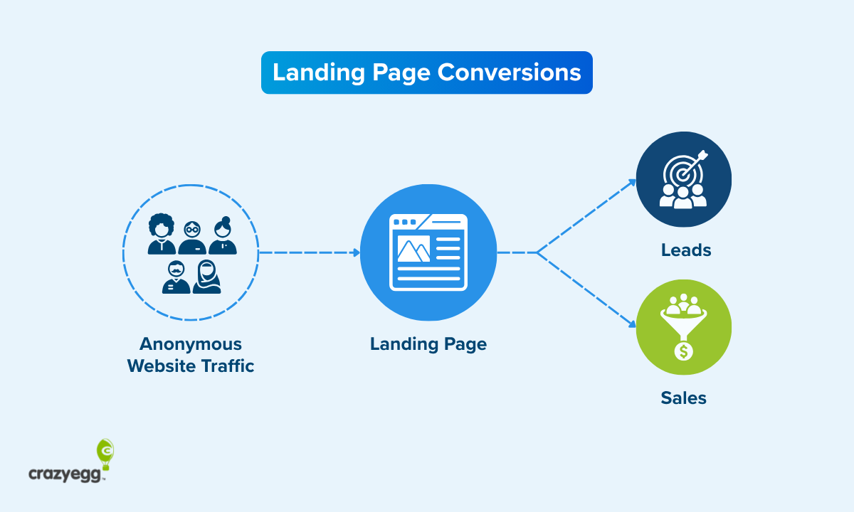
There are no other responsibilities for a landing page. Whatever its singular goal — that is all it must do.
It’s not like other web pages which need to speak to your target market generally, link to other pages on your site, or otherwise help users. Traffic on your website could be from anywhere, and you want to try and serve a diverse range of possible needs as well as possible.
With a landing page, you don’t have to worry about any big picture goals.
In fact, you can’t.
The basic economics of running a landing page force you to narrow your focus and concentrate on converting more internet traffic into potential sales.
Good landing page traffic is expensive (for a reason)
Random traffic is not valuable. You need to get in front of viable customers, and that takes time, money, or both.
Many brands pay advertisers to get traffic to a landing page. They choose where the ads run (TV, social media, search, etc.), who sees the ad (in terms of things like age, location, income, interests, etc.), and the creative content of that ad (headlines, images, etc.).
Paid ads are effective for attracting a very specific target audience. The brand knows that the clicks they pay for come from people with relevant demographics, psychographics, and some degree of interest in the ad they clicked.
When landing pages rely on organic traffic from SEO instead of buying it, brands are still spending money — it’s just on writers, editors, and designers to create high quality content.
The benefit of organic traffic is that, in many cases, it converts at a higher rate than traffic from other sources. Many users skip the “sponsored ads” in Google search and will never click through a video ad in YouTube — but they will happily click the top ranking organic results, and have a much higher degree of trust in the content they find.
Even if most of your traffic is from email, you are still spending money to build that subscriber list, manage your email service, and create email copy that actually gets people to click through (never easy).
Good, qualified traffic is not going to arrive on your landing page by accident. It’s not free.
But if your strategy is on point, you are going to attract website visitors that have a high-probability of being interested in your offer.
A landing page must convert
Since you are going to pay for qualified traffic one way or another, you need to figure out how to hit a profitable conversion rate.
The conversion rate is a simple ratio that compares the number of conversions to the total amount of traffic. For example, a landing page with a 2% conversion rate needs twice as much traffic to convert the same amount of users as one with a 4% conversion rate.
I’m not going to do the math out, but if you spend more on the traffic than you make in sales, the landing page is costing you money.
Depending on what you offer, costs could include product returns, cancellations, marketing & sales expenses — and all of this is on top of whatever the traffic costs.
If you stay organized, you can find a baseline conversion rate that you need to hit to stay profitable, and then work to improve it from there.
It’s a solvable problem. There are plenty of conversion rate experts to follow, and soon enough you’ll start to see a really nice lead volume or sales numbers coming out of your landing page.
What Do I Need To Create a Landing Page?
Not much.
If you already have a website builder, email marketing service, CRM software, or ecommerce platform, I would look to see if they include a way to build a landing page. It’s very common to see a landing page builder offered as built-in or add-on service for those types of tools.
For example, the popular email marketing service, GetResponse (pictured below), offers more than 200 different templates as part of their Landing Page Creator add-on service.

If one of the tools you are already using has this type of option, I would start there. This is likely the lowest cost and effort way to set up a working landing page as fast as possible.
If you are starting from scratch, I recommend using a landing page builder. It has everything you need: templates, drag-and-drop editors, and built-in analytics for conversion tracking.
I recommend using a landing page builder that:
- Has templates that fit with your business
- Has been around awhile
- Maintains a good reputation
- Integrates with your other tools
- Looks good on desktop and mobile
If you can hit all of these requirements, the backend part of setting up a landing page is going to take no time at all.
How To Build a Landing Page Using a Template
Unless you want to start with a blank page, use a landing page template. Whatever platform you are using will have at least few different landing page templates available.
Pick a landing page template that you feel will showcase your offer well and resonate with your target audience. It should have room for everything you need to say or show, and it should fit within the expectations of a potential buyer in your industry.
Ideally, you can select a template that requires minimal changes in order to make it yours.
I have nothing against originality, it’s just that these templates work best when you “color inside the lines” and use them as their designers intended. Change too much and you could break the tracking, make the page look weird on mobile, or something else.
Another nice benefit of sticking to the template is that you don’t need to reverse engineer a wireframe — you can just start filling it in and see how it looks.
To fill out a landing page template, you will need some or all of the following:
- Headline: The big text people read first. Writing good headlines is crucial.
- Subhead: The text just below the headline that is slightly smaller, but larger than the copy. Typically a single phrase or sentence. Not all templates call for subheads.
- Copywriting: All the text you use to convince people to take the desired action.
- CTA text: The “call to action” text is the specific words or phrase that people click to convert. “Submit” is “Sign up today” are common, but sometimes unique CTA text is better.
- Assets: Refers to images, videos, GIFs, icons, and other visual or interactive elements.
- Social proof: Refers to crowd-sourced, third-party evidence that your brand is credible and trustworthy, such as testimonials, reviews, or star ratings.
- Trust signals: Visual and copy elements that associate your brand with trust, safety, or longevity. Common trust signals include industry certifications and security badges.
- Color scheme: Where you have the option and it makes sense, apply your brand’s colors to provide a more consistent experience to users who have interacted with your brand before (and ideally will again).
With all of this uploaded, you are almost complete. It should be little stuff at this point: the CTA text is too long, one of the images doesn’t seem right, things of that order.
Once you clean everything up, the landing page should be fully staged and ready for publication.
Test before you publish the landing page
Have someone run through and complete the form or make a purchase. Confirm that all the links work and that all metrics are being tracked correctly.
Then take a hard look at how the landing page feels as a whole. Does it look good at-a-glance? Does it feel like something you would want to click through? Would you trust this site if you didn’t know the brand?
Pre-launch, you’re just trying to make sure there are no obvious UX or design issues that are going to prevent people from completing the desired action on the landing page.
You’ll be able to really improve this page once you go live and get data on what users do, so don’t worry about perfecting things now.
Once you are ready to publish and everyone feels good about it, check the links one more time.
Then publish.
How To Audit A Landing Page: 2 Methods
Here are two methods that cover 95% of the reasons you would need to audit a landing page.
Checkup audits
A checkup audit is a simple, 10-minute, 4-point check that confirms everything on the landing page is working properly. It’s a simple battery of tests that will detect most potential issues.
I would run it at least once per month on a high-value landing page. At least.
Here’s what to do:
- Visit the site on both desktop and mobile. Make sure you can navigate comfortably in both, tap buttons, and that images look sharp. Test all interactive elements, like FAQ dropdowns, cost calculators, etc.
- Test all links. They should go where they are supposed to go (i.e. not the wrong page or a 404 page). Any content on the linked pages or checkout flows should align with the landing page. For example, if the offer/promotion on the landing page conflicts with what readers find after clicking through, that’s bad. If using the “nofollow” attribute for links is important, make sure it’s being used appropriately.
- Check site performance: Run a speedtest and make sure the page loads quickly and Core Web Vitals look good. As long as website performance is on par with what you expect, I wouldn’t dig too deep, but if there’s an issue, look for large images, unused scripts, and other common culprits of slow load times.
- Verify quality standards: You don’t have time to assess quality in a deep editorial or strategic way, but you should note whether or not the page meets expectations. Base your judgement on SOPs or how it compares to the average similar page on your site. This is just a quick yes/no: is this page meeting the basic quality bar? Or is it likely that the page’s quality is negatively affecting performance?
By the end of the audit, you know what the next steps are. Either the page is good, or you have some clear issues that need to be addressed.
You can certainly add/subtract from those steps, but I would aim to keep the checklist really concise. When someone is up-to-speed with this process, it should take less than 10 minutes if there isn’t a problem, giving them a bit of extra time to diagnose what’s wrong when there is one.
Troubleshooting audits
Run a troubleshooting audit when you see a problem in the website analytics and you need to assess what’s wrong. Conversions have dropped, clickthrough rate has plummeted — it could be a lot of different things, but you need to fix it quickly.
Start by running the basic checkup audit. A lot of really awful problems are simply a broken link, a faulty redirect, or an attribution error, rather than some calamity with your landing page strategy.
Much of the time, the issue is going to be picked up in the checkup audit. If it’s not, your best move depends on what the issue is.
Conversion issues
If the conversion rate is trending down and there does not appear to be a technical issue, it could be a few different things. On the landing page, I would look for any obvious signs of friction that are getting between users and converting.
You can look at the page edit history to see if anyone made a recent change that tanked conversions.
When there doesn’t seem to be an issue with the content or design of the landing page, I’d work backwards to content that pulled traffic to your page. Are your ad headlines and descriptions aligned with your message and offer on the landing page?
If none of that helps you find the issue, there are longer-term tactics you can use to diagnose issues and increase your conversion rate to a profitable level.
Sales issues
If you see the purchase rate trending down, and there does not appear to be a technical issue, the offer itself may need some work.
Potentially the content supporting the offer (images, copy, design) needs a refresh because it’s outdated or no longer aligns with your current pricing, policies, etc.
You might take a look at what your competitors are doing and see if you have fallen behind. Are there concerns you aren’t speaking to? Are there trends you aren’t capitalizing on? Are there critical forms of social proof or expected trust signals that you are not displaying?
Another thing to investigate is your ad targeting. Are you still bringing in the most relevant, interested, and qualified traffic? Consider refreshing your keyword, demographic, or psychographic targeting strategy.
How To Improve Landing Page Performance
Improving a landing page means improving the conversion rate. It means getting more leads, sales, registrations — whatever it is — from the same amount of traffic.
This incredibly valuable work falls into three basic categories:
Conversion rate optimization (CRO)
CRO refers to small-scale changes that make the experience of using a site faster and more enjoyable. Most CRO tactics are grounded in UX research and psychology — they help you make the signup process easier to navigate, more persuasive, more enticing to complete.
Almost any landing page can benefit from running through a complete conversion optimization checklist. Some of the most important things I’d verify are that:
- The CTA is visually distinct from other elements on the page
- All copywriting supports and intensifies the value of the offer
- Social proof is close to the CTA (small signs at least)
- Typography elements draw visitors to the CTA
- The messaging on the landing page aligns with traffic sources
Redesigns
Sometimes, the marginal wins you can get from CRO don’t add up to enough to really move the needle. To improve a page, sometimes you have to rewrite major sections, create a new lead magnet, or redesign the whole page.
I can’t tell you what to do, but I can highly recommend testing before you make a big change.
Most brands run small-scale experiments before rolling big changes to the public. This can include:
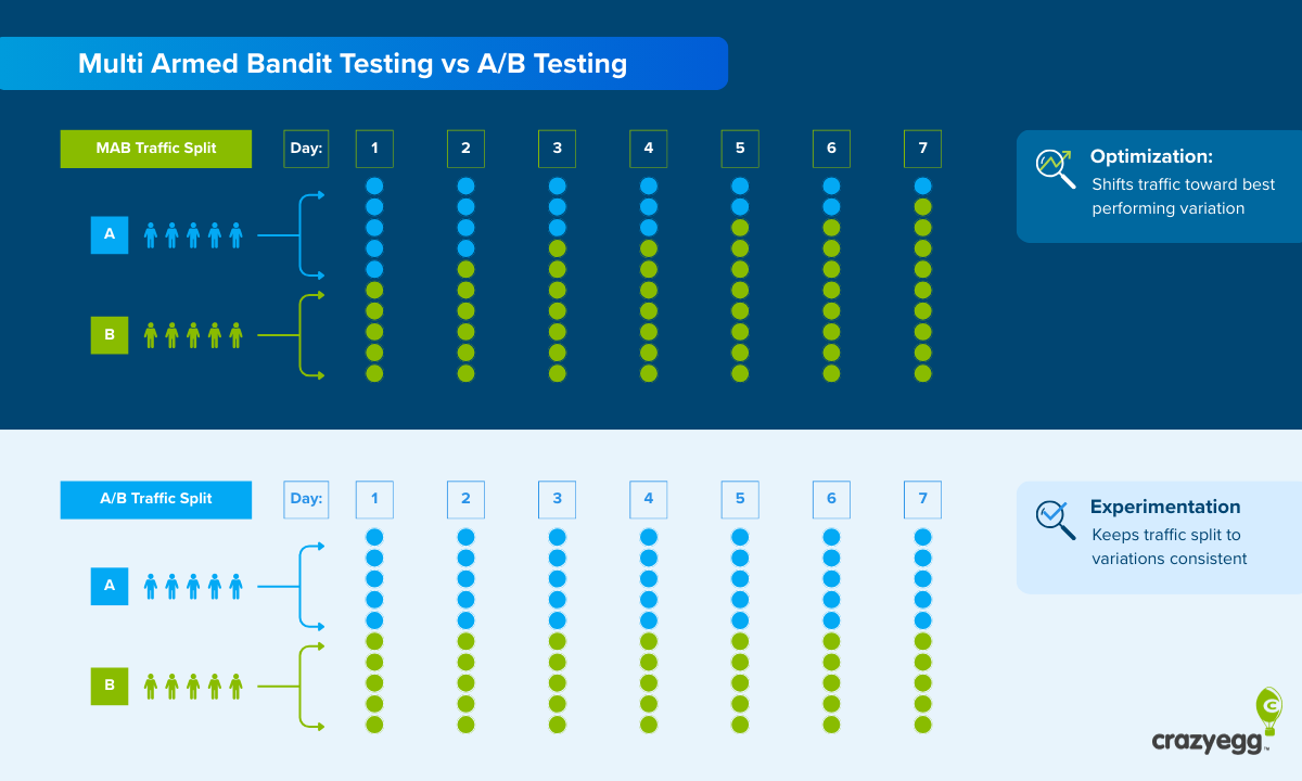
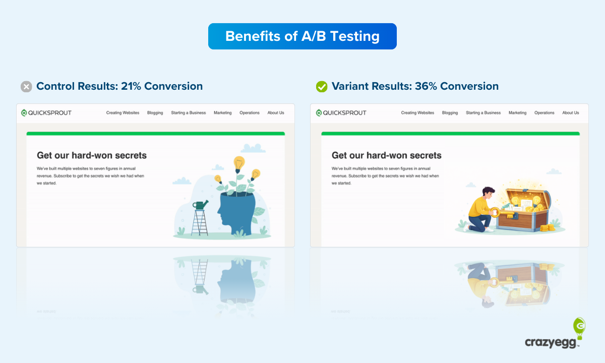
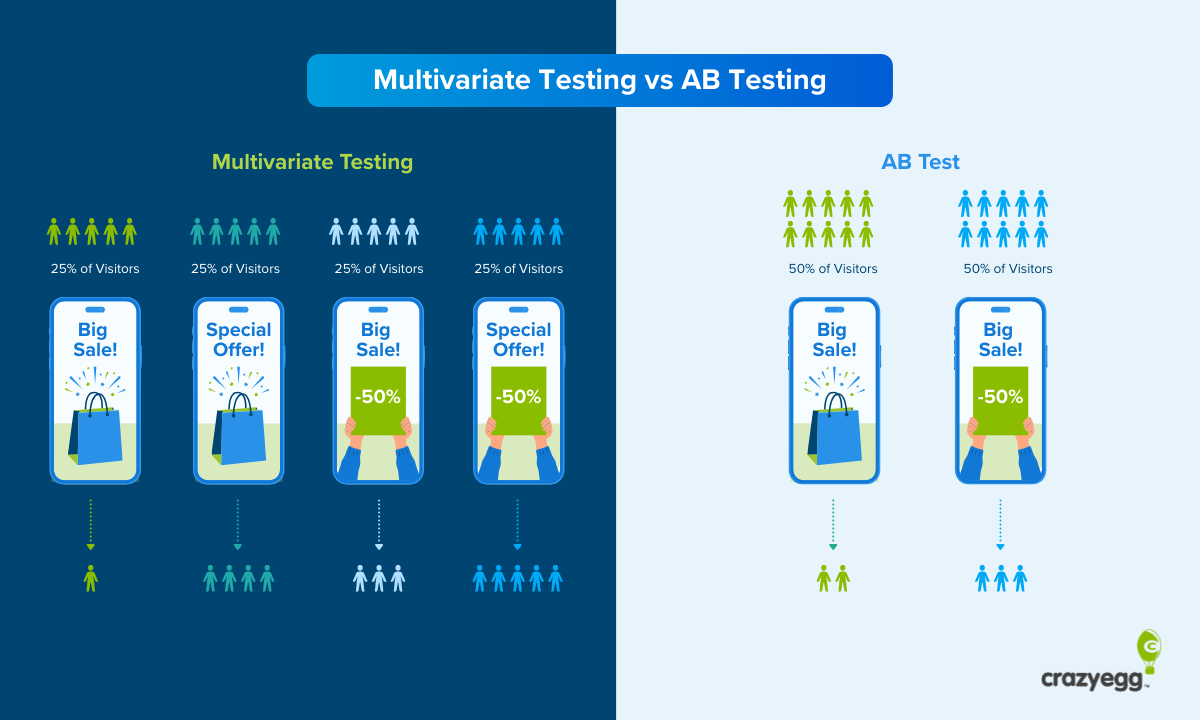
- A/B testing for assessing the impact of a single change.
- Multivariate testing for assessing the impact of design, copy, and image variations.
- Split URL testing for completely different landing page experiences.
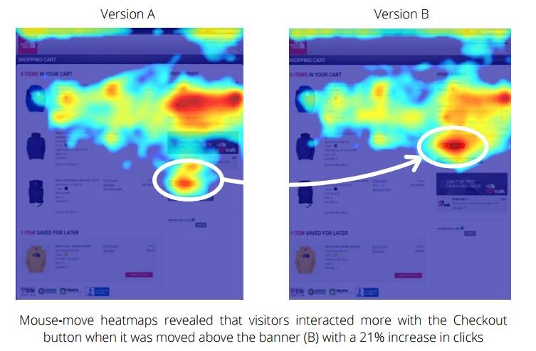
- Heatmaps to visualize what users care about and what they ignore.
- Eye tracking to visualize user gaze, and see what holds attention or provokes emotion.
- Usability testing to find out where users struggle and how they interact with flows/forms.
The goal is to get real-world data on what users are actually doing on your site beyond the customer engagement metrics provided by websites. What are people doing between clicks? What motivates them? What captures their attention?
All of these research methods give you more data to make decisions about what to revamp and where to invest your time.
Increasing traffic quality
This is the best lever to pull as it has a positive impact at every later touchpoint in the customer journey.
First, you want to understand what your best traffic is. Google Analytics is a good starting point, though it can be a little frustrating.
Tools like Crazy Egg make it very easy to visualize the different segments of traffic on your page and how they are interacting with it. In the following Overlay Report, for example, you can see the traffic broken down by new vs returning visitors.

You can filter traffic based on source, referrer, and custom parameters — however you want to slice it.
Typically, you’ll find some trends. For example, people coming from search have a higher conversion rate than those coming from social media, or people coming directly from marketplaces (like eBay or Etsy) have the highest purchase rate.
From there, you can prioritize driving traffic from particular channels or referrers using paid ads, keyword targeting, etc. You can also tweak the content of your landing page to better serve this segment of traffic.
Example landing pages
For inspiration, I recommend looking at live landing pages in highly competitive categories, like credit cards, mattresses, payroll software, or any term where you see a lot of pay-per-click ads in search results.
For example, I searched for “best website builder” and got 4 sponsored results, one of which was an ad from Wix, a very popular brand in the space:

The ad touted an easy to use platform with an aspirational call to action of “Build Your Future Today”.
I figured Wix knows a thing or two about good website design, so I clicked through and arrived on the following landing page:

Immediately, I’m greeted by an offer that harmonizes with the ad copy I clicked through to get here. The headline reads: “It’s more than a website, it’s your future.”
The offer is a free forever trial of Wix. All I have to do is enter my email address and click a large green button that says “Start Now.”
Scrolling down, I found a run down of the benefits, additional calls to action to “Start Now,” and little trust signals, such as the small bit of copywriting that assures people “Yes, it’s free. Upgrade anytime.”
This is a very minimalist, effective page for getting people to sign up. The emphasis is on speed, and ease. There is not a ton of detail about what you can do with Wix. There’s not even any social proof (like, “Trusted by millions of users” or customer testimonials), which is usually a good element to have on a landing page.
My guess is that their target audience for this landing page is not developers or enthusiasts who want to look under the hood. It’s people who need a website for business or personal reasons, right now. They’re not looking to become a website guru, just accomplish a goal.
I wouldn’t borrow the strategy here unless you have a real strong reason to. I would have more social proof, more trust signals.
To figure out what should work for you, take a look at the keywords your competitors are targeting with ads and landing pages. Visit a few of them. What do they think works? How can you differentiate your offer from them?
I’d also just scout out landing pages in highly-competitive categories. You’ll find the most cutting-edge and inventive landing page design in places where it costs money to get traffic.
Example lead capture landing page
Let’s take a close look at a landing page designed to capture new leads. The goal is to get people to enter their contact information into a form on the landing page, usually in exchange for something of value like a discount, free trial, or exclusive offers (often called a lead magnet).
Once they enter their contact info, you have a lead, which is the contact information of someone who has shown some degree of interest in your company. Now this person is in your funnel, they can be marketed to, warmed up, and eventually sold to.
Here’s an example from Qualtrics, the business communications software provider, with a landing page targeting people looking to use AI in omnichannel call centers.

There’s nothing next-level going on here, but you can see the social proof showcasing the logos of major companies that “choose Qualitrics” in the heavy black banner at the bottom. In such an otherwise colorful setting, the dark box really draws your attention.
These types of social proof play an important role at the top and middle of the funnel (where these types of landing pages live) in helping to make a brand seem trustworthy. Even Qualtrics, which has been around for 20 years, is using the brand recognition of Volkswagen and Hilton to build trust by association.
Example landing page for sales
When you are trying to get someone to pull out their credit card and make a purchase (as opposed to sign up for a free newsletter, for example), the landing page works a little bit differently.
These are sometimes called clickthrough landing pages because the sale isn’t going to happen on the page itself. Users click “Buy” and go through to a checkout flow, or click “Register” and then go to a scheduling page for a webinar, demo, etc.
The goal here is to get someone to complete the entire process. The landing page has to put someone in the confident, determined, hopeful state of mind required to buy.
Here’s a landing page example from Apple that I found searching for “best points credit card”.

All of the text is really direct and assumes people understand the basics of how credit cards work. It jumps into cashback percentages and high-yield savings accounts without much context.
This is all typical of landing pages for sales, which target bottom of the funnel traffic that tends to be more aware of their options and eager to see evidence.
Further down the page, there’s a cost calculator that can help people visualize exactly how much cash they can earn based on what they anticipate spending.

The rest of the page is full of similar infographic evidence that’s all in service of showing people how much more value Apple’s card delivers compared to others.
Can my home page be a landing page?
Of course. Visit Crazy Egg and the home page is basically a landing page.

Sure, there’s a navigation menu and links to learn more, so it’s not a true single-purpose landing page. But the whole design is focused on getting people to sign up for a free trial.
Not everyone should use this technique. I don’t think there is a hard fast rule about it. Crazy Egg tested their way into the design, and something similar could certainly be worth trying.
The only thing I will say for sure is that there should be an opportunity to convert users somewhere above the fold on your home page.
Everyone does this because it’s important, even if it is just a simple, generic “Contact” button. You should also consider using an opt in popup, if the static calls to action on your site aren’t netting new leads.


