There are a ton of generic hero image best practices out there, but we’re not going to subject you to these trivial guidelines since they don’t do anything. Instead, we’re going straight to the good stuff—hero image best practices that DO matter.
1. Start With Your Headline
Hero images add a unique visual flair to your page, making it easier for visitors to notice your featured product or service once they discover your site.
However, hero images are only as impactful as the headline that accompanies them, so make sure to start working on your headline first and then move on to the visual parts of your hero section. Getting the headline right can result in up to 30% more customers for your business, which makes prioritizing your copywriting efforts the right thing to do.
During the process of creating a new headline, you’ll also uncover the underlying key principles behind the message you’re trying to convey. These principles will help you in the later stage to produce a visually striking hero image that emphasizes and reinforces your headline’s main ideas.
A world-class headline supported by an exceptional hero image is a winning combination. This headline-first approach will grow your online store, expand your customer base, and turn your leads into loyal brand ambassadors.
Textbook hero image headline examples
Runway, an all-in-one finance management SaaS platform, makes a long-lasting first impression:

We love it because:
- A bold and sizable typeface dominates the hero section and greets visitors with an emotionally charged headline that turns heads: “The finance platform you don’t hate.”
- The contrast between static, non-interactable areas and clickable call-to-action (CTA) buttons on the page makes it very easy for new users to navigate the site
- The hero image almost takes a backseat to a concise headline that is further complemented by a descriptive copy right below it, emphasizing Runway’s openness to educate and help new users become proficient with its platform
Basecamp, a tool for general productivity and communication, features an even simpler approach:

We love it because:
- A short headline explains everything there is to know about using Basecamp in a single, easily understandable sentence: “Refreshingly simple project management.”
- The hero shot is represented by a simple, comic-like stick figure drawing, where two characters have a conversation about common project management problems and how Basecamp can help them overcome these hurdles in an efficient way
- Every element on the landing page serves a specific purpose, which results in a clutter-free, extremely satisfying user experience (UX) for everyone willing to give the tool a try
Technology and computing giant Nvidia is more colorful in its hero image presentation but equally as effective:

We love it because:
- Nvidia’s headline summarizes what’s arguably the most important technological paradigm of the 21st century in two lines of text: “NVIDIA powers the World’s AI. And yours.”
- Its hero image is designed to showcase a positive sentiment associated with using the company’s products, which is easier to understand from a new user’s perspective compared to something like listing its products’ features and capabilities
- A descriptive paragraph below the main headline adds an additional layer of explanation to drive the point home and urge interested parties to learn more
2. Get the Visual Weight Right
In professional photography and image design, visual weight refers to how much one element in the image pulls your attention compared to other visual elements in that same image. For example, a red square set against a green background will carry a lot of visual weight. Upon looking, you’ll be immediately drawn to the square thanks to the striking contrast in the image’s composition and the lack of other elements in the image.
Hero images aren’t exceptions to this rule.
Throughout their work, some designers will be tempted to go ALL IN on your hero image and make it the star of the show. But then you run the risk of producing a hero image that is simply TOO visually striking for its own good. You want your hero image to differentiate itself from other elements on the page, but you don’t want it to compete with the headline and overshadow your CTA.
To achieve the ideal customer journey, a visitor’s eyes should naturally hit the headline first, absorb it, and then look at the hero image to hammer that same idea again. You can use a heat map to analyze the users’ behavior on your site, which is closely correlated to the web elements they’re paying the most attention to when browsing through your content.
This will give you a rough estimate of whether your hero image is drawing too much attention and needs to be toned down, or if it’s underdeveloped and needs additional retouches to make it stand out.
Hero image examples with the perfect visual weight
Merrick, one of the most popular pet care brands in the United States, uses a simple image composition to promote its main mission statement and reassure pet owners of the quality of its blends:

We love it because:
- The copywriting in the headline contains the same starting word as the copywriting in the hero image’s featured product, which further strengthens the main idea behind Merrick’s promotional campaign: “Real is our recipe”
- The headline is wisely placed in a small rectangular box with a contrasting background, making it easier to notice, read, and understand the text
- Several healthy foods surround the product’s brightly colored packaging, signaling keywords such as health, vitality, and longevity to prospective buyers
Renowned coffee brand Maxwell House utilizes the power of good copy to get its point across:

We love it because:
- A weighty, bold, and imposing typeface announces a genius-level headline that’s all but guaranteed to get coffee enthusiasts excited about the brand: “Good to the Last Drop”
- A stylistic shot of the product in action serves as a complementary addition to the main copy without eclipsing the underlying message that Maxwell House is trying to convey, i.e., the tastiness and richness of its brew
- The hero shot is deliberately made simple to avoid confusing and overwhelming incoming visitors—especially those who are new to the site
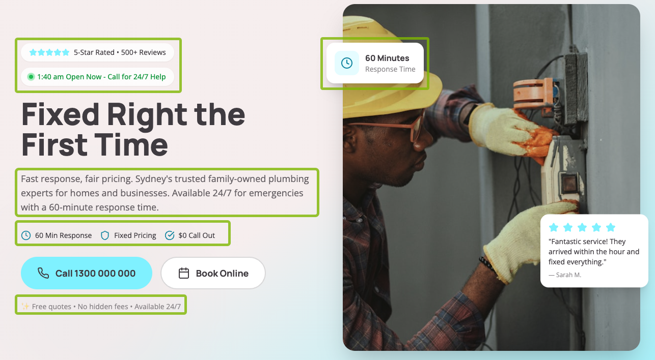
Counsel for Creators offers legal services in Pasadena, CA, and their hero section speaks volumes about their juridical expertise:

We love it because:
- The two far ends of the landing page house visually descriptive hero images that drive the users’ attention to the main headline in the middle section; both the headline and the collection of hero images describe a firm that caters to helping individuals and businesses in the creative space
- Despite the large number of visual elements on the page, it never feels cluttered or overstimulating for the eye; all of the items and colors serve a very important purpose—to grab the attention of artists, designers, and other ambitious creatives who are looking to get legal assistance
- The visual weight is tugging at its strongest in the middle section, influencing leads to follow the headline and eventually convert at the bottom of the page below the secondary copy
3. Clarity Over Cuteness
Hero images should be interesting to look at, but not to a point where their visual configuration overrides the brand’s message because of confusing shapes, overbearing colors, or cryptic copy. The perfect hero image strikes a delicate balance between presentation, uniqueness, and clarity, working together with the page’s layout in a way that’s inviting to users.
Still, there are some exceptions to this rule. If you’re managing something like a cutting-edge fintech startup, or an avant-garde fashion and accessories brand, there’s more room to experiment with the look and feel of your hero image compared to running a traditional ecommerce shop.
Ultimately, the safest bet is to communicate your message as clearly as you can by leveraging a straightforward visual design and sticking to the basics.
Examples of hero images with the perfect clarity
Gabe’s Spotless Window Cleaning features a clear and effective messaging:

We love it because:
- A perfectly aligned hero shot of the company’s team displays professionalism, expertise, and trustworthiness to future clients
- All the necessary information to contact a window cleaning expert is clearly shown in the top navigation menu, headline, and CTA, which contributes to an enjoyable UX across the entire site
- Several accolades and awards are promptly included in the copy below the main headline, adding an additional level of trust to an already spotless presentation
T&E Auto Repair & Sales is following in the same footsteps:

We love it because:
- A succinct headline, paired with an effective hero close-up of one of T&E’s auto mechanics in action, indicates a service that’s ready to answer your call in a prompt fashion
- The simple layout of the page’s above-the-fold area makes it easy to locate the CTA and easily contact the business to get a quote
- Overall, the hero section is pleasing to look at and it serves its function very well
Salthouse Catering has moved the headline below the hero image for an impactful yet minimalistic website aesthetic:

We love it because:
- The unique dish presentations integrated with the image slider add a special touch to the brand’s online presence
- The clever use of orange accents in the menu items and CTA buttons evokes interest and excitement in users, making it more likely for promising leads to convert on the spot
- A descriptive headline communicates the firm’s main geographical coverage for people in the vicinity who are ready to buy
4. Interweave the Image With Your Brand
If your marketing budget isn’t at the level that you’d want it to be, sometimes it’s okay to use stock images as hero image stand-ins. Stock images can get the job done, but customers will notice that your hero images aren’t original creations and weren’t put together specifically for your business.
And that’s perfectly fine! Founders who run smaller businesses are allowed to use repurposed stock images for as long as the image fits within the objectives of their brand.
When your business grows to the point of becoming a serious contender in your niche, we recommend upgrading your images from stock photos into properly shot, formatted, and optimized hero images. This action will communicate your readiness to innovate and to keep up with the demanding nature of a competitive marketplace, which customers love.
5. Don’t Worry About A/B Testing Your Hero Image
Generally speaking, testing individual elements on your site is a good way to filter out the things that don’t work and focus on the actions that matter in growing your online business. But in this case, A/B testing your hero image simply won’t have a big enough impact to justify its part in your digital marketing plans.
We’ve run hundreds of A/B tests over the years, and we’ve never experienced a significant change in our hero image conversion rates—be it on the positive or the negative side of things.
Ultimately, it all boils down to using your personal experience, taste, and judgment to come up with the best hero image for your brand. Once you’re happy with it, publish the hero image and move on to your next project.