There are hundreds of thousands of musicians in the world. And at least half of them created a website for fans to keep up with them. You’ve probably browsed a lot of these websites if you’re a musician looking to design your own website.
How about I make it easy for you? Out of the long lists of musician websites, the only five you need to take inspiration from are SZA, Chris Stapleton, Bruno Mars, Devotchka, and Teddy Swims.
SZA

SZA is a Grammy award-winning singer-songwriter known for her soulful vocals and writing about things we can all relate to, like relationship troubles and mental health. She’s so vibrant and creative and it comes out on her website.
First and foremost, the animation is crazy. The first thing you see is a white background and a tire rolling out from the right side of the screen. It bounces a few times and then shoots down to the bottom of the screen and up comes this crazy blue background and her logo made of logs.
You’re kind of confused at first because there aren’t any buttons to press. You’ll probably do like me and just click on the screen, and that’s when the magic happens. One click and you’re hit with a photo. Keep clicking and more photos and doodles pop up, overlapping each other like a scrapbook. You’ll hear sounds too.
You can also click on the tire from earlier and you’ll be transported to another version of her site, with the traditional stuff on it, like merch, videos, music, and a photo diary. As you scroll down, you’ll see more pictures. But the menu options are in the corners, which I think supports her creative brand even more.
At the end of the day, SZA isn’t afraid to be herself completely and tell her story. That’s her brand. And relying on her unique personal brand did wonders for her website.
I suggest the same for you. Make sure who you are and what your brand represents translates to your website design. I don’t care how crazy or different it seems compared to other websites. Your fans know and love you for who you are, so they won’t mind that being a part of your site.
Chris Stapleton

Chris Stapleton is one of, if not the biggest name in country music. He’s a Kentucky-born singer-songwriter and guitarist who’s captured people’s hearts with his powerful vocals and stories. His website gives off the same vibes as him, smooth and professional.
He gives us a really well-put-together, timeless website that has exactly what fans are looking for when they come to a musician’s website: news about them, tour dates, music, videos, photos, and a store.
I also appreciate that he offers a bit more on his menu than other musicians’ websites. You can get the lyrics to songs on his albums. He has a link to his charity, Outlaw State of Kind. He has a fan club. And I can’t forget the news feed that shares recent articles written about him.
As far as visual design, the black, taupe/tan, and white color scheme give me that sitting in a saloon country feel. I like the social media icons sitting subtly in the top left corner and the link to his new album falling right under “Chris Stapleton” at the top of the page.
If you take anything from this website, it should be professionalism. It’s polished and organized so well, giving visitors all the information they’re looking for, plus some.
Bruno Mars

Bruno Mars is a jack of all trades in the music industry. He’s a singer-songwriter, musician, and producer that artists from all over are jumping at the chance to work with. Like his website, he’s soulful and funky.
The color scheme is bold, comprised mostly of black, red, and white. His site uses a simple grid-based layout and intuitive navigation that allows visitors to easily find their way around the site without a whole lot of explanation. The menu bar is super simple as well, with four options (music + video, store, tour, subscribe).
What I love most about this site is how heavily it relies on visuals. The images are crisp and use borders to help them stand out. They also use color really well to tie into the overall color scheme of the website. The grid layout, especially on the music + video page, helps the visuals pop even more.
Take inspiration from how simple the site is, and how it being very visual makes simple not so boring.
Devotchka

Devotchka takes its name from the Russian word devochka (девочка), meaning “girl”. That’s just the start of their uniqueness. They’re a quartet with some of the dopest vocals and musical instrument-playing abilities I’ve ever seen.
Weird music, style, symbolism, visual spectacle, and theatrics are what fans are calling the Devotchka experience, and it’s made its way to their website.
If want to feel like you’re somewhere without actually being there, head to their home page. You’ll see this background image that spans across the entire page of them playing a show. Their backs are facing you, so you feel like you’re on stage with them, looking out to the crowd and landscape. It’s captivating and full of energy, to say the least.
As busy as the background image is, the menu and “Devotchka,” still stand out on the page. So, you know whose site you’re on and can find the typical information, like tour dates, music, merch, and contact information. You also see their social media platform icons when you first get on the homepage without scrolling.
When you do scroll, the site keeps it simple, only giving you a section with tour dates, a link for past shows, and their email address. They guide you to the most important information and don’t overwhelm you with lots of things on the page.
All of their pages are straight to the point, giving you exactly what you expect or need on each page. The classic black-and-white color scheme works too.
If you want to create a sort of immersive experience with your website, take note from Devotchka. Yes, it’s a still image. But you can’t tell me it doesn’t suck you in, make you feel like you’re there, and want to explore more.
Teddy Swims
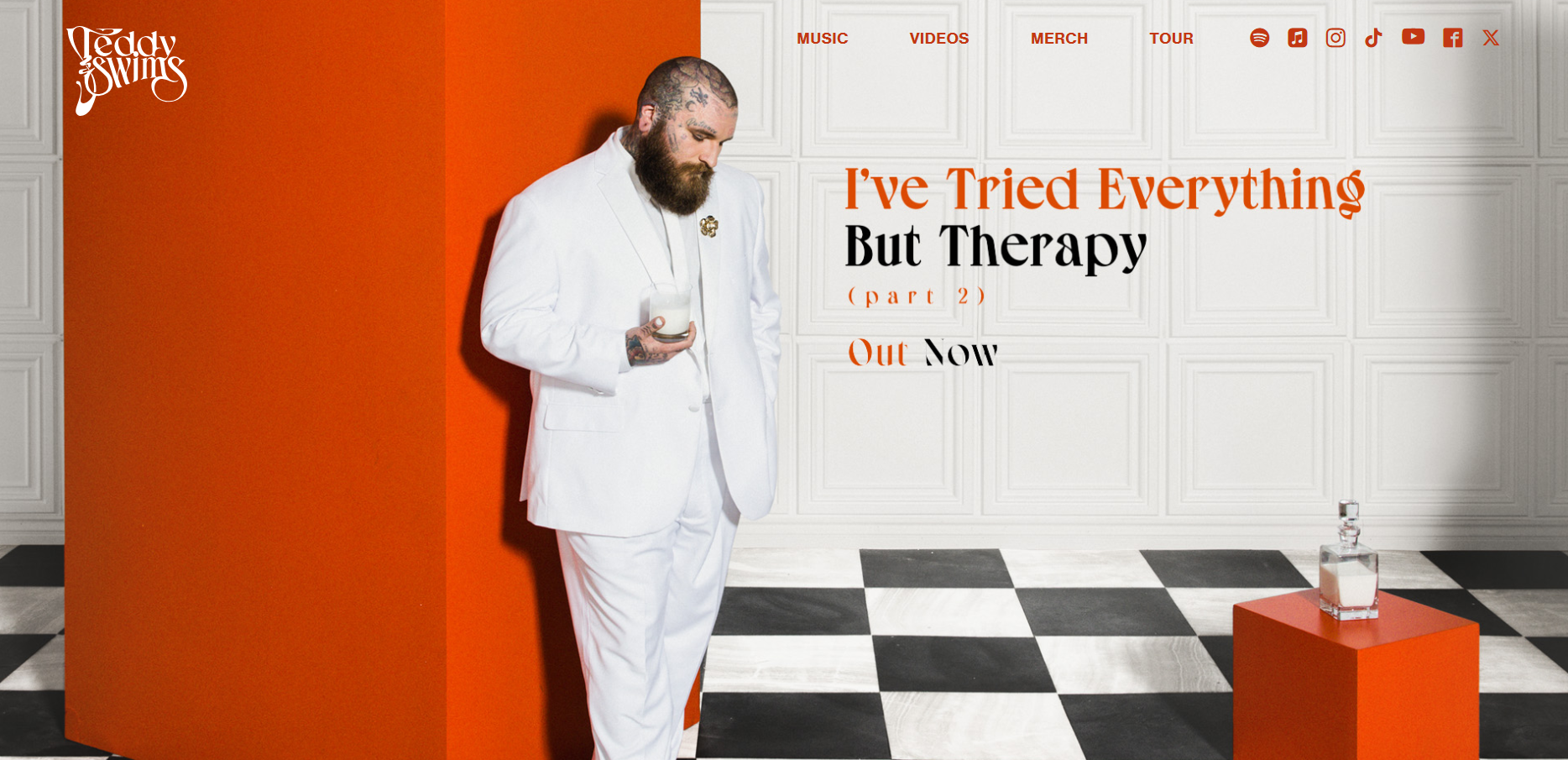
Teddy Swims is a singer-songwriter from Atlanta, Georgia who came onto the music scene strong in 2019 and has continued to grow a huge following. His ability to blend genres like soul, R&B, country, and pop into his music set him apart from other artists and gave him a name all his own.
He’s managed to take his edge and apply it to his website, helping that stand out too. Not a lot of people would attempt an orange-dominant color scheme on their website, but Teddy showed us why we should. It’s matched perfectly with white and black accents.
I also love the background image of him on the homepage. I’m not sure if they did the website colors based on what he’s wearing and what’s in the photo or if they already had the website and did a photo shoot for it, but everything blends so well.
You’ll notice that when you click on a menu option it takes you down to that section on the homepage rather than taking you to a new page. But once you get to the section, you can click on the link in that section (i.e. “shop all”) and it takes you to the new page. It’s just clean navigation.
I also cannot get enough of the map at the bottom of the homepage, “Where’s Teddy Now?”, that shows fans where he is in the world.
If Teddy Swim’s website teaches you anything it’s to go for it, whether it’s the color scheme, the out-of-bounds logo, or the unique navigation structure. Don’t be afraid to try what others won’t.
Do Musicians Need Websites?
The only answer to this question is yes. While so many musicians depend on social media to keep fans up-to-date with what they’re doing, build their brand, and make connections in the industry, I think all artists need a home base.
For one, it makes you look more professional. You’re not just a “TikTok artist.” You’re a professional musician with a lot more going on than social media. And a well-put-together website communicates this.
Also, you need a platform that you essentially own. TikTok was almost shut down and is still supposed to be. Imagine if that’s the only platform you’ve built your brand on. You’d have to start all over. But if you were to grow your own website in addition to social media, you’re protected.
What Can I Put on My Musician Website That’s Out-of-the-Box?
The last thing you want is for your website to look and feel the same as other artists in your genre or just in the music industry generally. Yes, you want to give visitors what they expect, like tour dates, music, merch, and videos.
But what you provide outside of that is how you’re going to get consistent traffic to your website. After all, you don’t want your site to just be online just to be there. You want people to actually visit it, and often.
Here are a few outside-of-the-box options for your website:
- Your social media feed- You can have your feed from one of your social media platforms scrolling across your homepage. I think it ties your online presence together and helps you cross-promote.
- Recent news you’re in- I thought this was so thoughtful on Chris Stapleton’s website. Fans get to see where else you’re being talked and written about.
- Photo diary- SZA’s photo diary inspired me. You can learn a lot about a person through photos. And it’s fun to look back at all the shows and experiences the artist’s been a part of.
- Lyrics- I liked this on Chris Stapleton’s website too. I can’t tell you how many times I’ve gone to Google to look up lyrics. Having them on your website can generate even more traffic.
- A map like Teddy Swims- Remember that map that said “Where’s Teddy Now?” If you can integrate a map like this on your site, do it. Giving fans tour dates is one thing. Showing them exactly where you’re at is a more immersive experience that they aren’t going to get with too many other artists.
- A blog- If you like to write as much as you like to make music, consider a blog. But not like a blog of how-to articles. More like a personal diary that fans can read and really get to know who you are and what you go through as an artist.