With organic traffic dipping and PPC costs on the rise, email opt-ins may actually be on the decline. But all is not lost—if you take the time to make your opt-in page convert better.
An opt-in page is the page tasked with convincing visitors to give you their email address. A very real problem with many opt-in pages is distraction.
A decade ago, the average attention span was 12 minutes. Today there’s so much of distraction that people forget the names of their friends and relatives—even their own from time to time.
Today, the average attention span is a not-so-surprising 5 seconds.
That being the case, your number-one priority in designing an opt-in page is to immediately let reader’s know its purpose.
Why? We feel first and think later. Emotions process sensory input in one-fifth the time it takes the conscious brain to do the same.
The key, then, is to capture visitors on an emotional, as well as logical, level. Let’s look at four ways you can do that.
1. Tweak the design elements for more opt-ins
By design elements I am specifically referring to
1. Attention Ratio
2. Images
3. Headline
How to have a better attention ratio
Recently, Unbounce and ConversionXL jointly conducted page fights to see who can design the best landing page, Oli Gardner or Peep Laja.
One of the key issues both Oli and Peep saw was the lack of coherency in the landing pages.
There were too many elements asking for attention.
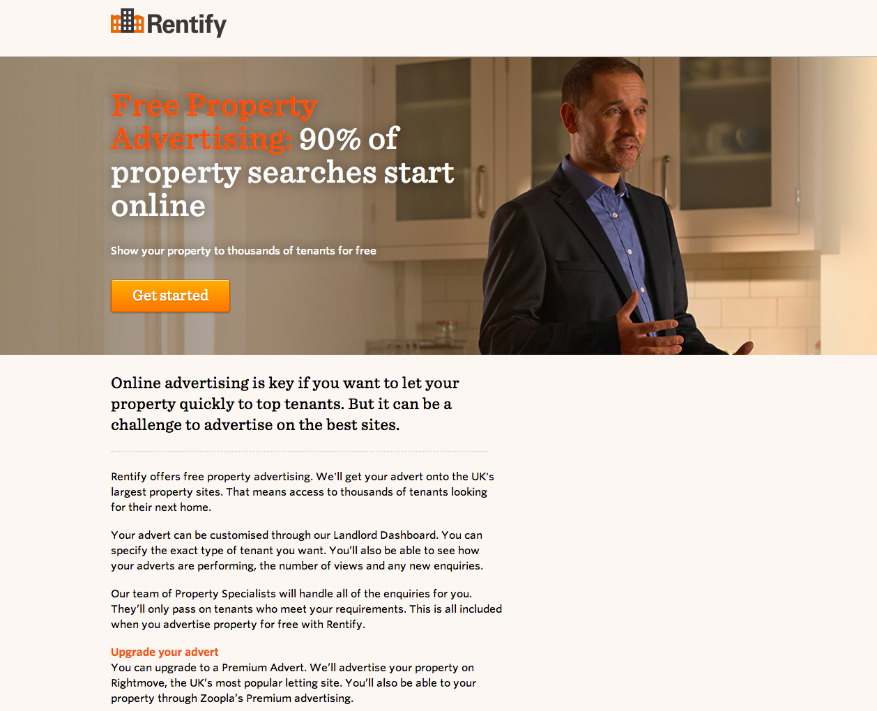
For example, this one from Rentify has two CTAs in orange that both compete for attention. At top, they ask you to “get started.” Below, they ask you to upgrade.
“Get started” is the primary call to action here. Yet there are 6 distracting actions (outlined in blue above), giving it a poor attention ratio of 6:1.
Look what removing the secondary orange CTA does to the page.
It seems as if the CTA is breathing now.
An additional suggestion is to make the man face the CTA.
Why?
Heatmap studies show that when direction cues are used, more people tend to see the CTA.
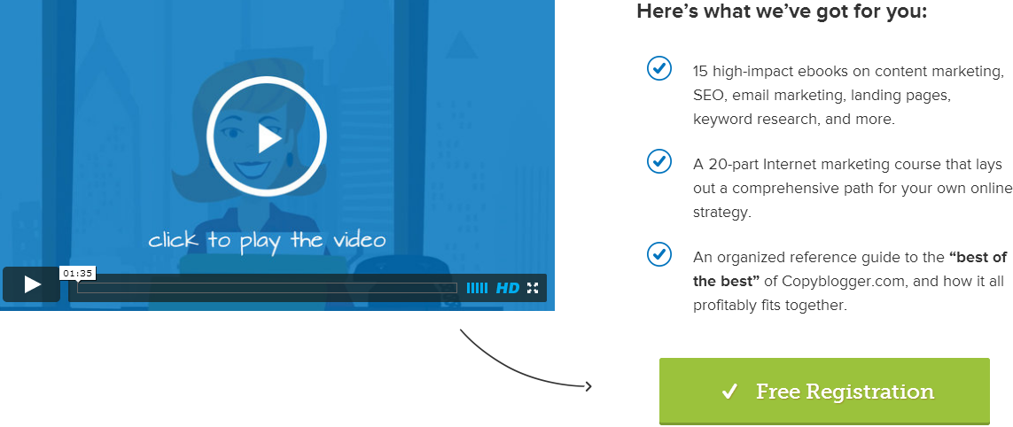
You can see the Copyblogger landing page as an example. At the lower right of the video you will find an arrow leading to the signup form.
How to use images for more opt-ins
A call center ad with model in it on the phone may be a good picture technically, but it will more likely be ignored, as per Jakob Nielsen.
Avoid cheesy stock photos.
Using human faces on the landing page improves conversions. The face has to be the right one. It has to be cheerful if the situation so demands.
A study by GetElastic showed that using photos decreased conversions, but I am not surprised since they used a cheesy photo.
“As aesthetically orientated humans, we’re psychologically hardwired to trust beautiful people, and the same goes for websites. Our offline behavior and inclinations translate to our online existence.” Dr Bent Coker
How to write compelling headlines
“On the average, five times as many people read the headline as read the body copy. When you have written your headline, you have spent eighty cents out of your dollar.” David Ogilvy
A successful headline should
- tell the reader what the product can do for him/her or else summarize the rest of the copy
- be bold, stand out
- compel the user to take an action
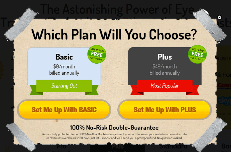
For example, let’s review the popup on CrazyEgg’s landing page:
It directly asks the reader if he/she would take an action.
The headline is bold and stands out but also has an amazing harmony with the rest of the page.
The copy feels like a natural extension to the headline. There is no disconnect between the headline and the copy.
The secondary headline assures the reader that there is a 100% money-back guarantee.
These elements combined persuade and overcome common objections. They’re likely to make the user take an action. Here are 3 proven headline formulas for you.
2. Give away compelling products for higher opt-ins
Rob Cornish found that making an opt-in page that highlighted the benefits of the freebie doubled his email opt-in conversions. His book was titled “101 profitable niches analyzed.” I feel that one of the reasons that led to the increase in conversions is because the product seemed actionable.
People love niche site case studies because it takes the experimentation and risk of failure out of the equation in building something profitable.
Let’s analyze the mind of the average blogger. He has little money to invest. Hosting and domain name would alone cost $15 to $20. There are link building costs which can run up to 100s or 1000s before he can see any profits, and he wouldn’t want to waste that money.
If you want to drive conversions, make a compelling offer.
In Rob’s case the opt-ins went from 5.6% to 11.3% with this simple change.
Glen Allsopp of Viperchill achieved a remarkable 64% conversion to opt-in pages by giving away free niche site ideas. He gave his readers something so valuable that people wanted him to mail them.
It was money in the inbox every day for the readers.
Kayse of Allume.com found that converting a series of popular blog posts into an eBook and offering it to new subscribers made 3500 people sign up.
Instead of giving away something just for the sake of doing it, think about it—and create something awesome.
Now let’s see how to get more subscribers by giving away some more.
3. Apply the Grocery Store Formula
Grocery store formula is named so because it uses the same technique of giving away free samples to the crowd. By giving away samples, you can sell more.
Leadpages employed this strategy successfully to increase opt-ins by over 10% from a mere .5%.
It takes 3 steps to employ the grocery store formula to get more opt-ins.
- Write a quality piece of content, be it a case study, a success story, an interview or something else.
- Create a bonus that supplements the post. It can something as simple as printable pdf of the blog post or swipe files.
- Give the bonus away in exchange for the email address of the reader.
Blogger Matthew Woodward reduces this formula to an exact science by creating bonuses that the reader can’t do without. He uses them to get more social votes, though, rather than email opt-ins.
He creates SEO video tutorials and, at the end of the post, includes swipe files that makes the work easy for an SEO. Things like footprints, sites to post to, etc.
Here are his social shares from April 2014:
- Google+ – 10,509 (9,512 last month)
- Twitter – 18,480 (17,613 last month)
- Facebook – 12,269 (11,717 last month)
Source
The results speak for themselves.
4. Color of the button
WiderFunnel found the Big Orange button led to a 32.5% increase in lead generation.
Even Unbouce uses a big orange button for its CTA.
Different colors have different meaning. While Green shows represent jealousy in the US, people living in South East Asia associate it with growth.
In another study by Hubspot, the Red button beat the Green by 21% more clicks. CareLogger too boosted conversions by 34% doing the same thing.
While Unbounce has consistently found that the Big Orange button is best for conversions, Peep Laja feels that it’s not the color of the button but the color that stands out the most.
In other words:
“Yes sure – sometimes the color affects results – especially when it affects visual hierarchy, makes the call to action stand out better and so on. But “green vs orange” is not the essence of A/B testing. It’s about understanding the target audience. Doing research and analysis can be tedious and it’s definitely hard work, but it’s something you need to do.”Peep Laja
For example, James Schramko of SuperFastBusiness changed the color of the CTA from yellow to purple and used a shorter headline to witness a 50% increase in signups.
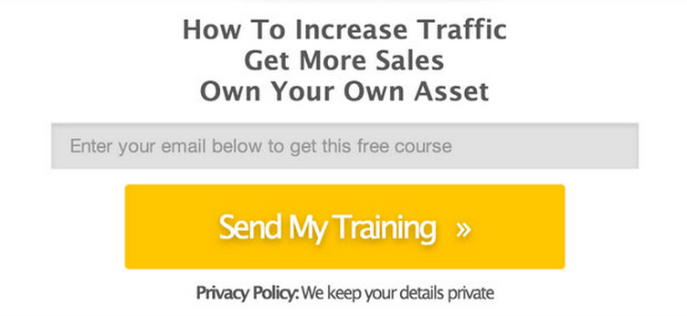
So, does it mean that purple is the best color for conversions?
There are a few things that we need to know about James’s traffic.
First off, the split test was conducted on James’s website with 65% of repeat traffic.
The second important thing was that James felt the color yellow blended in too much with the website. With over 65% of repeat visitors and a CTA that stood out, there was a Purple Cow on the page.
People noticed and signups soared.
Also read how you can use colors for more effective landing pages.
Bonus tip
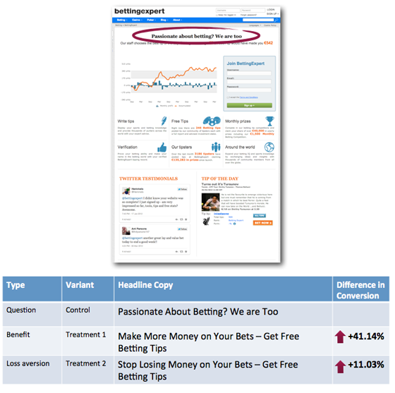
I would also suggest using trigger words according to the audience type.
Instead of saying Submit, tell them to subscribe. Call it what it does.
Using verbs which have their essence in action have increased the click through rates by over 32% to 40% in different studies.
Here’s another example.
Changing the CTA to something that inspires action and conveys the benefit directly leads to 40% increase in opt-ins.
Now you
As you can see, there are many tactics, tools and techniques that you can use to get more out of every visitor who comes to your site.
Start by using the fivesecondtest.com to find out if random users are able to find what the site is about in 5 seconds.
Then use the four tips listed above… and start growing your list on steroids.
Read other Crazy Egg articles by George Mathew.


