Crafting the perfect website header is critical.
It’s the first place your website visitor will likely look to determine if your website can meet their needs.
With this in mind, the design of the header should be appealing while allowing the user to navigate through the site seamlessly. Skipping the step of making a professional header that speaks to your brand may result in visitors not bothering to read your content or worse, not returning. Whether designing a blog or website, this post will uncover three elements to consider when designing a header image that makes the most impact. Read on!
1. Branding
Start by creating graphic, image, and other visual concepts that encapsulate the essence of your unique product or service.
Ensure that the headeris truly indicative of your business and its story. To solidify brand awareness, include your logo in the header as well. As the header is the first element you should consider in your website design, take the time to get it right as this image will often dictate the style and color scheme of the rest of your site.
This highly artistic header is a nod to the imagination of the professional. It’s exploding patterns and objects is memorable and inspires the viewer to learn more about this professor’s work.

This website lists summer activities available within the organization which are geared towards children. The stylized vector header works well with their brand and speaks to the primary target audience of children and the parents of children.
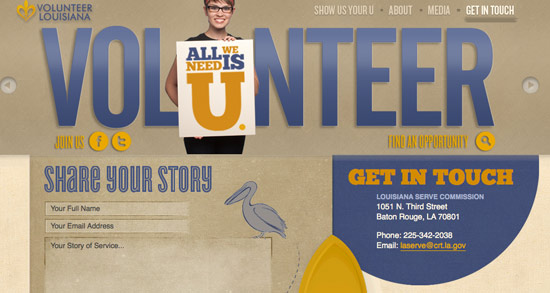
Service and citizenship is among the goals of the Louisiana Serve Commission. Individuals holding up posters to emphasize this point through an animated slideshow makes the header much more impactful and memorable.
Non-profits are usually faced with tight budgets in terms of web design. This example, for Cups Health and Education Centres, demonstrates how creative one can get with limited resources.
A clever log, tagline, and character design make up this professional header for Vectips. Illustrated vector characters are another popular trend in header design as they add a sense of personality, character, and friendliness to the design.
2. Size
Your header image shouldn’t be obtrusive and many times a small, succinct header will suffice for content-heavy websites.
For product-centered sites, large headers allow you to engage your visitors visually and entice them to take a tour or test run. Other times, content needs to be included in the header to explain a product or service in more detail.
![]()
A creative agency has plenty of freedom in the design of their header. In the case of The Pixel, their illustrated header fits into the overall theme of their website. The top of the treehouse serves as the header, while the rest of the tree forms the basis for the remainder of the website. The navigation, logo, and tagline are also placed prominently here.

With products or services that aren’t easily explained, real estate in the header may be required to illustrate the point. This is the case for UFeedMeBack, a service that allows designers to receive feedback from established designers, who place this info in their header.
Conversely, the content-rich website Abduzeedo maintains a small header, allowing the content underneath to dominate. This is typical of magazine-style websites with large amounts of content.
3. Content
The third element to consider is the content you will use to immediately communicate to site visitors. The header is where your site visitors will look to immediately determine the purpose of the website.
For example, if you offer a specific service, customers are going to want to see proof of previous work. This usually means including the work in your header for easy accessibility. Various methods exist in organizing your prior work in an engaging way.
The image carousel is a popular option if you wish to fit multiple images into your header. If your website has many features, or you wish to show off your portfolio, this may be your best bet.
This icon designer utilizes a carousel in the presentation of his work. This slick interface device is a professional way of showcasing samples of your work to the world upon entering your site.

The traffik CMS makes use of two carousels in showcasing the info and screenshots of their product. Doing so allows the visitor to read the various benefits of the product in shorter bursts.
Theme sites are another example of websites that can benefit from a carousel in showcasing their portfolio.
Screenshots are another popular option for showing off your work. Best of all they don’t require Javascript libraries.
A screenshot of the CMS is presented on ekklesia 360. It’s also custom for web application services to include a call to action button in the header to elicit the viewer to try the demo or buy now.
Wufoo makes use of screenshots in showcasing how easy it is to make one of their online forms.
In product oriented websites, a call to action button is usually mandatory in a header. In the case of Wufoo two have been placed under the logo and tagline, encouraging viewer participation.
The REI website clearly features products and promotions with a clear call-to-action.
The header is often first impression a visitor has of your website. Create something memorable and eye-catching that immediately communicates your brand and the purpose of the website.
Are there any other elements to consider when designing a header? Let us know in the comments!


