Form design matters more than you might think.
A poorly designed form can turn off prospects, whether you’re asking them to sign up for your email list or buy your latest product.
Web forms are used on nearly every website on the Internet, but some feature extremely poor design. If you don’t want to fall into that trap, this article will teach you how to design forms that boost conversion rates.
Feel free to jump around if you’re interested in a single a particular topic covered in this article:
- What’s a web form?
- Why do you need a web form?
- What are the web form design best practices in 2018?
- How to design a form for mobile conversions?
- What are the best form design examples?
What Exactly is a Web Form?
A web form is an HTML element on a website that collects information from users, transmits that information to the appropriate servers, and initiates any related follow-up. Web forms use text fields, radio buttons, checkboxes, and other elements to engage with users.
There’s a web form on Crazy Egg’s home page. It asks visitors to insert their website URLs.
This web form only has one form field — a text field — but many forms have multiple fields for the user to fill in.
Why is it Important to Have a Good Form on Your Website?
You use forms to collect information, right? For instance, you might collect users’ email addresses so you can send them marketing emails in the future.
According to Sumo, fewer than 2 percent of website visitors actually opt in to email lists. The rest ignore your form.
We also know that people form first impressions in just 50 milliseconds. That’s way too fast to read your copy or take in your message.
Those first impressions are based on design and layout. It stands to reason that good form design can influence conversions.
The 19 Form Design Best Practices to Convert More in 2018
Knowing that form design can hurt or help your conversion rate, how do you design better forms?
Check out these 19 best practices that you can follow to convert more prospects into leads and more leads into customers.
1. Reduce friction
Friction leads to poor conversion rates. The more obstacles you put in front of your prospect or lead, the less chance he or she will convert.
Consumers lead busy lives, so they won’t take time to figure out a confusing form or to answer more questions than they think is necessary.
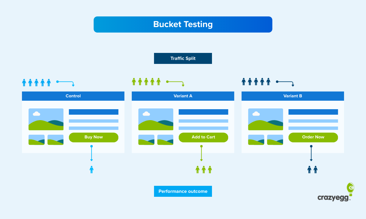
You need to know what causes friction for your specific audience. That’s where A/B testing comes in handy. Create two versions of your form, changing one variable, and review the results. Keep testing until you know the ideal form length and format.
Some common sources of friction include forms that:
- Fail to load
- Fail to send
- Refuse to accept certain formatting
- Contain unclear instructions
- Complicate the process of selecting dates (such as from a calendar)
2. Create a simply designed form
Aesthetic appeal can influence your conversion rates. An unattractive or outdated form might give your visitors pause.
Everyone has a different idea of what beauty constitutes, but use your best judgment. On my own websites, I’ve found that simple, clean forms with large fonts and few fields tend to work best.
Again, though, A/B test different designs with your own audience to see what works best for your target consumer.
3. Only add fields you need
Web forms that include unnecessary data collection can frustrate consumers. This is especially true after the GDPR launch. Consumers don’t want to provide more data than absolutely necessary.
When designing your forms, ask yourself whether you really need a specific field. For instance, when collecting email addresses, do you need the subscriber’s name? Do you need to know where he or she lives or what he or she does for a living?
If not, leave it out.
4. Test multi-step forms against single-step forms
I love multi-step forms because they give the impression of simplicity. The same goes for multi-step checkout processes.
On my SEO Analyzer form, pictured above, the user fills out his or her URL. Then they’re taken to another page where they can enter other information.
Here, they can enter up to three competitors for a competitive analysis. The process feels less overwhelming, though, because of the multi-step form.
5. Use a single-column design to increase readability
Many people now use mobile devices to fill out forms. Since mobile devices, such as smartphones and tablets, have less screen space, it makes sense to use a single-column design.
If users have to scroll left or right to fill out the form, they might abandon it entirely.
6. Position your copy in the right places
On-page placement matters when it comes to form design. Where do your users most often click on the page? When do they stop scrolling?
You can learn this information by getting scroll maps and heatmaps from Crazy Egg.
Using the data, you can decide where your form’s headline and CTA should go. From there, designing the form becomes far easier.
7. Start with the easy questions
There’s something to be said for investment. Once someone starts filling out your form, they’ve mentally committed to it. They’ve invested their time and effort.
Therefore, it makes sense to start with the easy stuff: Name, email address, phone number, etc. These are questions that require little thought. The answers might already be stored by the user’s browser.
You can then add more complicated questions.
8. Add auto-format
Speaking of auto fill, you can also add auto-format to your forms. That way, if the user has information stored in his or her browser, the form automatically populates with the stored information.
This can even work for forms during the checkout process. These days, many consumers save their credit card information with Google. That way, they don’t have to dig out the plastic every time they want to buy something.
9. Allow copy and paste
Some forms prohibit the user from copying and pasting information. That’s not a great strategy if you want to boost your conversion rate.
The user might want to copy and paste information to avoid spelling errors and other issues. If you deny them that ability, they’ll likely abandon the form.
10. Add a clear call to action message
The CTA is essential. It can mean the difference between conversion and abandonment.
Your call to action should appear on a button in the form. Instead of using the lackluster “Submit,” consider getting more creative.
Conduct A/B tests until you find the perfect CTA.
11. The call to action button must have a contrasting color
CTA button color matters. No, a single color doesn’t work better than every other color for every website, but it needs to contrast with everything else on the page.
In other words, it should draw attention to itself. You don’t want your visitors to miss it. You can see this theory in action at clothing store lululemon.
The blue color calls attention to itself and contrasts with the rest of the page.
12. A/B test the call-to-action buttons
A/B tests are your best friend when it comes to form design. You’ll never know what will work with your audience until you test.
Crazy Egg and other tools, such as Hello Bar, allow you to run A/B tests. They also automatically give you the results so you don’t have to sift through reams of mind-numbing data.
13. Indicate when a field is optional
In most cases, if a form field has an asterisk (*) next to it, it’s required to submit the form. Without the asterisk, the user can decide whether or not to provide the answer.
Let people know in a bold way whether a field is required. Make the asterisk larger than the surrounding font size, for instance, or code it in another color.
14. Don’t slice fields
It’s happened to all of us. You’re asked for your birthdate, phone number, social security number, address, or some other information with multiple elements. You have to put each element into its own box.
The user has to click, tap, or tab to get to the next field. It wastes precious time and energy — and it can irritate your prospects.
15. Avoid captchas
Captcha emerged because of web form spam, which still exists today. However, you have to weigh the cons of spam against the benefits of keeping your prospects happy.
A Captcha adds another layer of effort to the form. If you ask me, more often than not, the Captcha isn’t even legible.
Which results in multiple failed attempts.
16. Guide your user to the right answer
Your CTA can do more than attract attention. It can also steer your user toward the desired answer.
If you write your CTA copy in first person, your prospect reads it that way. He or she might think, “Why, yes, I do want to join,” then fill out the form.
17. Add contact information or a chat
People often have questions before they fill out a form. If you offer alternate contact information or the opportunity to chat, you might pick up conversions you’d otherwise have missed.
Here at Crazy Egg, we use EggBot. He’s very useful — not to mention interactive.
See? He wants to help. Show your prospects that your form isn’t the only way to get in touch.
18. Use a progress bar when there are too many fields
When you have no choice but to use a long form, you can break it up into multiple sections and add a progress bar. Amazon does this on a form where people can sign up to become Amazon Associates.
Users can track their progress and know when they’re almost done.
This is more a psychological ploy than anything else. If users think the form might be never-ending, they’ll likely click away before they can finish.
19. Never use a “Reset Form” button
Back in 2015, Time published an article that made a bold claim: “You Now Have a Shorter Attention Span Than a Goldfish.”
It’s since been hotly debated, but there’s no denying that our attention spans are pretty short.
During form design, strive to remove as many distractions as possible. A reset button, which deletes all filled-in fields, provides visual clutter. It might even be confusing for users who aren’t used to filling out web forms.
Initially, reset buttons were thought to provide users with comfort. Clicking that button sent a psychological signal that their information had definitely been deleted.
These days, however, users can manually delete their information quickly. It’s also widely known that exiting from a form results in information never being sent.
Form Design Best Practices for Mobile
I have a few bonus tips for you today. Now that people use mobile devices to access the Internet more than 60 percent of the time, we need to optimize our forms for mobile in particular.
So, take a look at these mobile form best practices:
Don’t leave your user confused
Forms aren’t as obvious on mobile. Use a large font for the headline as well as the CTA. Make sure the text on the page contrasts with the background so users can see it clearly.
Reduce the number of taps
Taps can be just as annoying as clicks. Reducing the number of taps reduces friction.
Ideally, you want one tap per form field, then a final tap to submit the form. Any further taps can irritate your audience.
Don’t use popups
Popups don’t work well on mobile. They’re often oversized, so users have to swipe right or left to read all the text. Plus, they distract the visitor.
Instead, incorporate forms into the actual page design. If your web design allows it, you can use a separate form setup just for mobile devices.
Use predictive search
Forms aren’t just for transmitting information. They also allow users to find information. Predictive search helps with internal search just like it does on Google.
Use search functionality on your website that supports predictive search. That way, mobile users don’t have to tap as many letters to get to the search query they want to make.
Speed up your page
Fast page speed matters when it comes to mobile UX. If anything, users have an even shorter attention span because they’re often out and about.
If your form doesn’t load or send quickly, users will often give up. You can run page speed tests to learn where you currently stand.
If you get a low score, consider reducing image sizes and removing elements that might slow down your site.
Don’t ask users to confirm their passwords
Password confirmations are particularly annoying on mobile. Users have to go into their email accounts after exiting out of the browser. They might not even bother.
Great UX Form Design Examples
Now that we’ve covered form design best practices, let’s look at some forms in action.
First, I really love the form at the bottom of Bouncex’s home page.
The contrasting colors are particularly engaging. Blue and orange complement each other, so they play nicely, but the orange stands out against everything else on the page.
The headline also stands out and highlights an excellent value proposition. The form isn’t too long, and it uses autofill.
I also like the form on the Kajabi pricing page. Kajabi offers a platform that allows entrepreneurs to create online courses.
The headline tells the user exactly what to expect. It’s specifically related to the business’s industry. Then you have a contrasting call to action that incorporates a value-added benefit. Plus, if you click on the sole field — email address — it autofills.
Next, we have the checkout form for one of Digital Photography School’s photography courses.
It has the progress bar at the top, which can allay anxiety, and if you continue through the process, the fields autofill. Plus, you have high-contrast CTAs, easy directions, and good use of headlines and copy.
Lastly, I want to take a look at a long web form. While they’re not ideal, they can work if you use the best practices I listed above.
Pillow, a short-term rentals website, has to use a long form to capture information about prospective landlords. It’s very tastefully done.
The form is attractive and uses large fields. There’s a high-contrast CTA button as well as the autofill option.
Conclusion
Form design isn’t something you should take lightly.
With an extremely low conversion rate on forms like email opt-ins, you need all the ammunition you can get.
The best form designs are attractive, easy to use, and low on friction. They offer progress bars if they’re on the long side, and they use compelling, high-contrast CTAs.
You need to take other things into consideration when creating a form for mobile devices. Don’t make your users swipe around the screen, confirm their passwords, or tap 100 times before they reach the end.
You can take inspiration from the four UX form design examples I detailed here. They’ll help you boost conversions and maximize your website traffic.


