In this tutorial I’ll walk you through the steps necessary to design a portfolio website to showcase your design services.
We will be using Photoshop and the 960 Grid System.
With some subtle textures and layer styles, you’ll see how the smallest details can work to give your portfolio website that polished look.
Here’s a preview of what we will be creating:
Tutorial Resources
Twitter icon created by mfayaz
960 Grid System Introduction
In this tutorial we will use the 960 Grid System to organize and arrange the elements of our web layout. Before we begin, download the grid system on your computer.
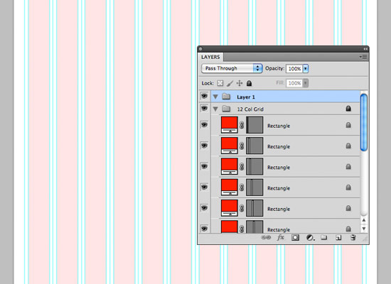
Unzip the archive file you downloaded, go to the “templates” folder and then go to the “photoshop” folder. You will find three .PSD files. Each of these files contains a grid with 12, 16 and 24 columns.
The .PSD files have some guides already set up, which will be very useful. To activate the guides, go to View > Show > Guides, or use the shortcut Ctrl/Cmd + ;.
During this tutorial you will need to create shapes with specific dimensions. To see the exact size of a shape or selection while you are creating it, open the Info Panel by going to Window > Info. The width and the height of your shapes and selections will be displayed in this panel.
Step 1: Set Up The Document
Open the “960_grid_12_col.psd” file in Photoshop. Then go to Edit > Canvas Size and set the width to 1200px and the height to around 1600px. You can adjust the height later on so that your web layout fits within your document.
Step 2: Create the Background
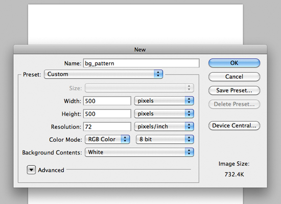
To add a sense of depth, we’re going to give the layout a subtly textured background. Instead of copying and pasting a full resolution texture into the main document, we’ll cut down the file size by creating a pattern that can be implemented both horizontally and vertically into the layout. So let’s start creating a new 500×500 pixels document in Photoshop. Make sure to set 72 pixels/inch as resolution since it’s the ideal resolution for images destined to web.
Fill the background with the lighter blue from the color palette (#d5e2e7)
I’ve chosen this aged paper texture by stock.xchng for the tutorial. Paste the texture into the bg_texture document and do the following steps:
- Make the texture smaller and apply a sharpen filter to bring out detail.
- Desaturate the texture (shift+ctrl+U)
- Switch the layer blending mode to multiply and reduce opacity to around 20%. The result should be something like this:
The result is subtle, but just enough to give that added sense of character to the design. You can now go to Edit>Define Pattern and give it an appropriate title.
On our main document, we will apply this pattern. Select the background layer and go to Edit>Fill and chose the background pattern.
Step 3: Create the Header
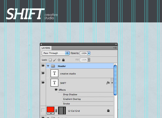
Create a new group and name it “Header”. Select the Rectangle Tool (U) and create a rectangle with the dimensions 1200px by 150px and the color #404448. Name this layer “header bg”. Right-click on this layer and select Convert to Smart Object. Then go to Filter > Noise > Add Noise and use the settings from the following image.
Add the name of your design studio using the Type Tool (T) on the left side of the header. I’ve used the font Steinem Bold Italic with the size of 90pt. Activate the guides (Ctrl/Cmd + 😉 to help you position this layer as you see in the image below.
Once finished placing the logo, we can add a menu on the top right. I used Myriad Pro and font size of 15pt. I also gave each link a slight drop shadow to set it off against the background.
I draw a rectangle to give ‘Home’ it’s own selection. To highlight the selected page, I apply a button style to the current selection. Apply the style below by double clicking the button shape on the layers panel to bring up the layer style dialog box. Apply these styles to the Inner Shadow, as well as 1px Stroke (#42454a) to the outside of the rectangle.
To add subtle dimension, I included a 1px #fffff border underneath the header using the Line tool.
Step 4: Create the Tagline
Now it’s time for the tagline. Since the tagline is one of the first things a visitor will see, it’s in your best interest to include important information about your site and services.
I used both Chunk Five (upper text) and Gibson( lower text) for the tagline. Making the grid visible will help with placement.
Step 5: Add a Separator
To separate the tagline from the portfolio section, we will create a separator. Create a new group and name it “separators”. Select the Line Tool (U) and create a vertical line from the top of the rounded rectangle to the bottom. Set the color to #ffffff and name this layer “1px line”.
Duplicate this layer (right-click on it and select Duplicate). Change the color of the new line to #abb0b3. Select the Move Tool (V) and move this layer one pixel to the bottom.
Add a mask to the “separators” group (Layer > Layer Mask > Reveal All). Then select the Gradient Tool (G), hold down the Shift key and drag a black to transparent gradient at the left hand side of your separator to make it fade away. Repeat on the right side. You should end up with something like this:
Congrats! You are half way there!
Click here for Part 2 of this tutorial


