When it comes to your website, and particularly your landing pages – less is more.
Even as far back as 1997, usability guru Jakob Nielsen advised us to design for “scanners” – people who read the web in chunks (79%) rather than every word on a page (16%). But reading is only part of the story. Websites were designed to be interactive – so how are your users interacting with your pages?
One of the best ways to increase that interaction and turn them from sideline readers into active participants is to de-clutter your pages. That means more than just removing annoying ads. It means taking a hard look at what design elements, navigation menus and other parts of your site are “nice but not necessary”. Here are five ways to de-clutter your website without making it lose its appeal and creativity.
It’s time for some Spring Cleaning! Let’s get started.
1 – Plan Your Website Backwards
If you already have a website, planning seems more like one of those things you did “way back when” rather than something you should do periodically.
Just like a good spring cleaning is a way to freshen up a home, taking the time to better organize your website and content can help lower your bounce rate and keep customers on your site longer.
To achieve this, plan your website around the result you want to achieve, rather than throwing text and images on the page without a concrete idea of the end goal. One tool that can help with this process is wire-framing software. Although typically used by web designers to lay out and determine the functionality of a site before a single pixel is pushed, wire-framing programs can help you easily determine what “must have” elements of your site go first, and can help you eliminate clutter.
Free wireframing software like JustInMind lets you create wireframe mockups without codin
Have a Clear Linking Strategy
With every link you place into and outside your site, you’re running the risk of distracting your customer to the point that they forget what they were originally there for. On the other hand, you need those links to not only pass on valuable “search engine juice” but to help introduce your products, share news on your blog, connect over social media and so forth.
But beware. Links, particularly those that take the visitor off your site, can be a problem. Ensure that each link you place on the page brings you closer to your goal.
Check Your Ad to Content Ratio
If you have advertising on your site, you’ll want to pay careful attention to the ad-to-content ratio, because Google certainly is. Not only do too many ads lead to a cluttered site, they can also bury the very information the customer is searching for and lead visitors off your site.
And, while Google doesn’t hate ads, it does factor user experience into the mix. Unfortunately, there’s no “golden rule” as to what constitutes “too much” advertising and too little content. Still, if you’re focused on that, you’re not seeing the big picture. Clean, straightforward designs and compelling call-to-action buttons along with fresh, interesting content is the best possible formula to keep users and search engines coming back.
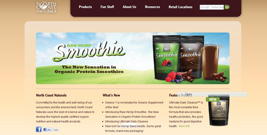
North Coast Organics’ site weaves in their best keywords while encouraging users to try new products.
Improve Your Content and Site Readability
How easy is it for visitors to read the information you’re sharing? Once they get to the end of an article or post, is there something else for them to do? Spend the extra time researching the best keywords for your topic, crafting a solid search engine optimized title and inter-linking your post with links to other articles on your site that customers may find useful.
One such WordPress widget that makes featuring related stories easy and attractive is LinkWithin. It displays graphic thumbnails along with links to related pages on your own blog, and it’s free. Although I should warn you that if you’ve recently moved your blog or deleted articles, LinkWithin may still link to them. That’s because it draws from Google’s index – and if the old articles are still there, they’ll lead to 404 Not Found pages on your own site.
Buses at the Brewery answers the what/where/when/why of an event above the fold.
Are You Selling, Educating or Engaging?
What’s the core purpose of your site, and are your content and images living up to that purpose? Or are they just “window dressing” that the web designer thought would look good? Most of the time, a website is purposefully designed to either sell, educate, or engage.
You might even say “my website does all three!” and that could be true, but you’ll need a single motivator that acts as the under-current for every piece of content you write and every promotion you do. Websites that are made to “sell” have already assumed that the user is interested in making a purchase, the site itself is there to help them get the best deal on whatever that item is.
Those designed to educate are helping the user along in some stage of the buying process – showing the pros and cons of different products, for example. Everything they do is geared toward helping the consumer learn more. Finally, engaging sites are designed to elicit a response – download a free trial, tell a friend, etc. These sites primarily have social media as their main marketing vehicle.
Once you understand which one of the three your site fits into, you’ll be able to craft better content that’s in line with your business plan — and remove the rest.
Bzzy is able to engage, educate and sell in one simple, easy-to-scan landing page. Its core goal is to engage customers to download the app.
Action Steps
- If you’re considering a website redesign, or creating a new site, plan for the end goal first. Consider all the ways a customer could land on your page: via search engine, word of mouth, direct link or social campaign. How easy is it for them to take the action you want them to take?
- If you employ advertising on your site, make sure that it isn’t overwhelming your users and preventing them from performing the action you want them to take. After last year’s Panda update, Google is starting to keep a closer eye on ad-ridden sites and may give sites with too much advertising a lower quality score and hence, a lower ranking.
- Take the time to thoroughly research keywords and plan out your content strategy around those terms. Make sure to optimize your title, keywords and description – even though Google hasn’t paid attention to meta-keywords for some time, that doesn’t mean they’re useless. Oftentimes, they’re used for social descriptions on Facebook and Google+.
- Determine if your site’s core purpose is to educate, engage or sell and make that your main focus. It’s fine to supplement it with the other two, but if you’re not clear on what your site’s purpose is, how will your customers interact with it?


