You’ll find value propositions everywhere — some are good, some are bad.
Essentially a value proposition is a statement (a quick summary) of what your company does best. The problem is that many people struggle to communicate that in a simple, easy-to-understand way.
Have you ever been on a business website and, after browsing for a couple minutes, have no idea what the company does? Not good!
Let’s assume that you have indeed explained what you do, simply and concisely. Clarity alone doesn’t cut it. Does your value proposition matter to the end user? Do they even care about what you have on offer?
There are several other questions you’ll need to tackle before you can nail your value proposition.
Today we’ll be walking through that process so you can craft a better value proposition.
[tweet_box inject=”@crazyegg” design=”box_4″]#AmReading: 5 Tips to Craft a Better Value Proposition[/tweet_box]
Firstly … Understand what is value proposition (VP)
A value proposition explains:
- What problem the product solves and how
- The benefits associated with using the product
- Why and how the product is better than the competitor’s
Value proposition examples
Have you heard of Red John? He’s a fictional character in the TV series The Mentalist. Red John is a serial killer, a bona fide psychopath.
After every murder, he leaves his signature, a smiley on the wall, drawn with the victim’s blood. Eeek!! He draws it and arranges the lights in the room so that the smiley is the first thing someone entering the crime scene notices.
[tweet_dis]The value proposition on your site is Red John’s smiley.[/tweet_dis] It has to be the first thing that visitors notice about your site.
Why? People have incredibly short attention spans and you likely have a growing number of competitors.
I’m not making this up. You lose conversions if your site takes more time to load. You lose conversions if you don’t make a good first impression. And it doesn’t stop there.
An article on the UK edition of The Telegraph is titled, “Humans have shorter attention span than goldfish thanks to smartphones.” Regardless of whether you think it’s good or bad, humans are increasingly becoming more distracted.
CREDIT: @esmith_images/Instagram
In the picture above, a whale causally swims by, but the man doesn’t seem to notice. Did you?
This isn’t exactly good news for those of us wanting to improve our conversions. But … fortunately …
The article also states that, “While digital lifestyles decrease sustained attention overall, it’s only true in the long-term … They’re better at identifying what they want/don’t want to engage with and need less to process and commit things to memory.”
So, if your value proposition resonates with your visitors, they will pay attention. And, you can train your visitors to pay attention.
Let’s look at some brands that are doing just that, and learn a few tips in the process.
Make your value proposition stand out
Heatmaps taken from Attensee’s original landing page indicated that, while visitors were spending time on the headline, they were quickly becoming disinterested.
Looking at the heatmap, most areas were in the blue or green zone — indicating low interest with what’s on the page. The interest dropped almost to zero as visitors reached the end of the page. Clearly something was amiss.
Attensee believed their value proposition was hitting the mark, so they hypothesized that it wasn’t standing out enough. They conducted an A/B test to find out for sure. They placed a yellow background behind their value proposition in the test version.
It worked. This is the heatmap of the new landing page. As you can see, the value proposition is indicating more views and more interest.
But wait, there’s more. This little change did another thing. It increased conversions by 12%. Not too bad for a simple yellow background, is it?
The lesson is clear. Not only do you need to clearly verbalize your value proposition, you also need to make it stand out as well.
[fancy_box id=2]Let Crazy Egg heatmaps show you what visitors are paying attention to, so you can easily optimize your site.[/fancy_box]
Convey the value proposition benefits that matter most to your customer
Many websites place their value proposition in the headline. This ensures that it’s one of the first things a user sees. But does it highlight the value people are looking for?
In this case study from MarketingExperiments, a gasket-repair site tweaks their headline to find the optimal message for their visitors.
This was the original headline: “Simple Fix for Blown Head Gaskets”
For the test, it was changed to: “Repairs Blown Head Gaskets in Just One Hour”
This simple headline change led to a 58% increase in conversions. The key change? Conveying that the website would repair gaskets in an hour.
Time must be very important to those needing gasket repair — you could speculate that a lot of gasket repair is an emergency. And that might be why people responded so well to the new headline.
It mattered to them. Take note — your value proposition need to matter to people.
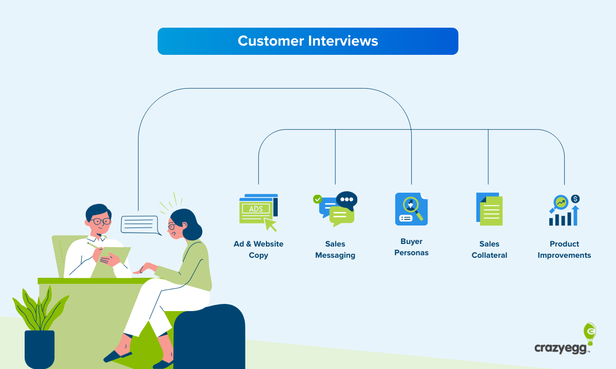
[tweet_dis]To discover what matters most to your customers, start by asking them[/tweet_dis] what they hoped to find on the website when they visited. You can do this with tools like Qualaroo that can survey your users without much pain.
Once you know the purpose of their visit, or the specific information they’re looking for, you will be able to better craft a value proposition that makes sense to them.
Use the words your visitors use, not industry jargon
Prior to SEOMoz rebranding itself as Moz, they asked existing clients how they would describe SEOmoz to a friend.
Using the findings from the data, they went to work and modified their copy. Guess what? As a result of this change, they added an additional $1 million in annual revenue. Crazy, huh?
Take a look at Uber’s landing page for drivers, which is pretty clear about which program drivers should sign up for.
They know their audience very well and have identified their needs as a result.
Basecamp is a true master at A/B testing and they continually improve their messaging. Their landing page showcases them as an app for everyone.
They also convey the software’s strongest benefit in the clearest of terms: “Chaos, Organized.” It’s almost reminiscent of the Biblical creation story.
Visual elements like the green arrow guide site visitors to the sign-up link. By connecting with customers’ core problems and clearly telling them what to do next, Basecamp is able to easily drive conversions.
You can get the same results by crafting a value proposition that addresses your customers’ core needs.
Augment your value proposition with social proof and testimonials
A mirror neuron is a neuron that fires both when we act, and when we see someone else performing the same action.
It was born from an experiment where monkeys were observed reaching for food. Electrodes were placed on their skulls to record brain activity. The researchers were astounded to find that the same neural regions became active when the monkeys saw other monkeys or humans reaching for food.
Social proof works in the same way. Seeing an image of someone reaching for a cup of tea or a happy smiling face on an eCommerce site, [tweet_dis]positive social proof works in your favor. Our brains our wired to trust other people.[/tweet_dis]
You can show people with happy faces, enumerate the number of customers you serve, or use a video testimonial. The key here is that people should be able to relate to your message — and it needs to support your value proposition.
Qualaroo does that with a video.
Here’s how Basecamp uses the sheer power of numbers to prove that they are the best.
Conclusion
It’s always possible that you have a big competitor who has figured it all out. They have more sales, a really good landing page and better search rankings. It’s not a bad idea to look over their shoulder and take some inspiration.
But in many cases, refining your value proposition — including how you present it — will make all the difference in the world.
To recap,
- make your value proposition prominent on your landing page
- use language that your customers will understand
- support your strongest benefits with social proof
Happy conversions!
Read other Crazy Egg articles by George Mathew.


