The best conversion rate optimization (CRO) case studies are rich with detail about the research and strategy.
The least useful studies are beyond belief, no more than puff-pieces written by companies trying to sell you their services.
What A Good Conversion Optimization Rate Case Study Looks Like
To research this post, I read somewhere in the neighborhood of 150 case studies focused on CRO specifically.
There’s at least 100 more where I didn’t buy the results, or couldn’t understand where they came from. These case studies didn’t “show their work,” and I was left guessing at the tactics they used to improve conversion rates so significantly.
But in the better-quality CRO case studies, you can find:
- A clear through line that explains the authors’ analysis of the problem and how they formed a solution.
- Channel-specific tactics that directly impact key customer engagement metrics
- New testing ideas for investigating user behavior
- New research questions that other firms find important
- Before/After images to show examples of the concrete changes they made on the site.
You’re never going to be able to see the data that underpins a CRO case study. You may get a screenshot of a metrics dashboard, but don’t expect to see much.
Sadly, you have to just take the reported headline numbers as they come. No brand is willing to share that information publicly (with good reason).
And since you are taking the data on faith, I would do a little due diligence on the brand behind any CRO case study. Are they legit? Have they been around awhile?
When are CRO case studies useful?
If you are just starting out and you want to get a sense of what all this looks like in action, case studies are a fine.
I guess. There is a limit to what you can learn without doing it yourself, or learning from someone who has made a career out of boosting conversions for different brands.
If you have the means and authority to do so, I would just start working through a basic CRO checklist on your site. You will get a 1000x better experience than if you spent the time digging into the literature.
But if you are already actively testing and working on a site, CRO case studies can be helpful to consult:
- Ahead of major website overhauls
- For seeing what worked (and didn’t) on landing pages
- To prepare for CRO at a large organization
- For understanding omnichannel CRO
- To compare different enterprise CRO tools
The case studies I collected in this post hit on these and other topics, which tend to skew more towards the challenges faced by large established brands.
I wouldn’t worry if you are reading this as a small business owner or doing sales at a startup. The challenges are the same, as are many of the solutions. Watching them play out at scale is still useful.
5 CRO Case Studies + Key Takeaways
In each case study, I’ve listed the name of the brand that owned the site, as well as the agency they worked with. In some instances, brands handled the CRO in-house, and there I have instead listed the tools they used to get the job done.
Each case study summary is broken down into three sections:
- Context: Background on the brand and the challenges they faced
- CRO strategy: Guiding principles and specific actions taken to improve conversion rates
- Results: Web analytics and revenue numbers that capture the impact of CRO testing
- Key takeaway: Useful, portable insight from the case study.
Let’s jump right in.
1. Landing page revamp sees 4% uptick in conversion rates
Brand: Confidential
Agency: Portent
Context
A nationwide moving and logistics company had plenty of traffic coming to their site, but it wasn’t converting. People arrived at their landing page, but left before filling out the form. Because they paid for traffic, they needed to fix this issue quickly.
Moving is a wildly competitive business category. They don’t give the numbers in the case study, but at the time of writing this post, the cost-per-click for the keyword “moving company” was $19.79. You will go broke with a low conversion rate if that’s your CPC.
CRO strategy
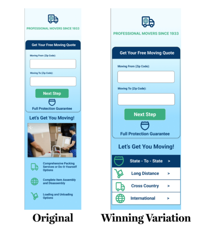
Compared to a typical high-performing landing page, the agency felt like the brand’s existing page wasn’t doing enough to convince people to take the next step. It needed more content. Not miles of writing, but a little bit of ad copy to clarify their specific services and highlight their unique benefits.
- Set up A/B testing for landing pages
- Experimented with different layouts to accommodate new ad copy
- Added trust signals and social proof to reduce hesitation
- Analyzed performance across desktop, tablet, and mobile
When someone arrives at a landing page by clicking on an ad, there’s a good chance it’s the first time they’ve ever heard of your brand. In this case, the agency aimed to ensure that every user could easily access content that improved brand perception and handled common objections.
On both desktop and mobile, they set up a simple “tabbed” experience where users could click through and read more about the company’s specific Long Distance, Cross Country, and International moving services.
The Results
After perfecting each element, the new variation of the landing page with richer content was outperforming the existing page considerably. They brand saw:
- Conversion rate: 4% increase
- Form abandonment: 6.7% decrease
Read the full case study from Portent.
Key takeaway
Giving people more reasons to trust your brand is always a good idea, especially on parts of your site where you want them to take action.
2. GetFPV Unlocks $3.4M in New Revenue
Brand: GetFPV
Agency: None, done in-house with Convertcart
Context
GetFPV is one of the largest online retailers for first person view (FPV) drones and accessories. It’s a competitive market with a huge percentage of first-time buyers and tons of equipment.
The company knew that the GetFPV website had to be easy to understand, instantly. A high bounce rate would lead users to a competitor page. They needed to create a website experience that allowed people to explore, learn, and discover products while building trust with a new-to-them brand.
CRO strategy
Without having done much dedicated CRO at this point, GetFPV was able to focus on testing simple ecommerce conversion tactics. With Convertcart, these changes were easy to test and deploy across their online store. Some of the key tactics they used:
- Created urgency on product pages
- Increased visibility of key CTA buttons
- Crafted a more compelling unique selling proposition
- Added opt in popups to blog posts
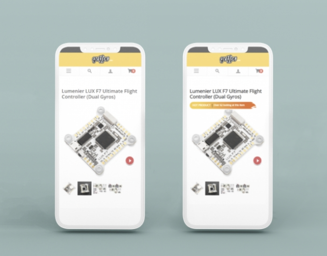
None of these changes were novel or “outside the box,” but GetFPV executed well. For example, they added a small but prominently displayed message “Hot Product! 42 people also viewing,” which is a nice spin on a classic product page persuasion technique.
The Results
In the last few years, GetFPV has seen huge improvements across their site.
The brand attributes 36,000 additional transactions and $3.4 million in new revenue to the on-site changes they made.
Read the full GetFPV CRO case study.
Key takeaway
You don’t always have to spend time dreaming up a new and creative angle to convert customers. Sometimes simply enforcing best practices for website navigation and CRO is all it takes to make customers happy to stay and shop.
3. Coca-Cola Increased Clicks By 117% and Revenue By 35%
Brand: Coca-Cola en tu Hogar, the Latin American brand of the famous soft-drink maker
Agency: Bounteous, + in-house team using Adobe products
Context
In order to appeal to a younger generation, The Coca-Cola Company needed to revamp their website to serve shorter attention spans of Gen Z and Millennial users. The goal was to create a more personalized experience to serve the right content to the right users.
CRO strategy:
They piloted their strategy in Latin America, working with Coca-Cola en tu Hogar (CCETH), the company’s largest B2C brand in the region. CCETH had lots of website traffic and customer data, but that data was not yet centralized. Working with Bounteous, the team at CCETH:
- Created unified customer profiles, bringing together data from their CRM, ERP, and Adobe Commerce.
- Orchestrated a true omnichannel customer experience, integrating push notifications, SMS, and other channels based on individual customer behavior
- Monitored performance to ensure personalization strategies like product recommendations and bundling options actually drove revenue.
Results
Both the agency and the brand were aware of how difficult this type of campaign is to pull off. Scaling marketing personalization without losing authenticity is a monumental challenge.
But at the end of two years, CCETH saw some really impressive results:
- Clicks: 117% increase
- Revenue: 36% increase
- Conversion rate among re-engaged shoppers: 89%
- Conversion rate from on-site search: 19% increase
- Email open rates: 36% increase
I wish they shared more of the gritty tactics and the data. It would have been nice. Check out the full Coca-Cola CRO case study.
Key takeaways
Airtight processes for data integration and well-defined team collaboration is the only way to create the rich customer profiles that are central to successful personalization strategies.
Without a full view of the customer journey, it’s impossible to optimize their conversion path. If you are at a massive organization, it might take two years to put this together.
4. Optimized Google Ads Strategy Improves Cost-per-Customer by 21%
Brand: Vectorworks
Agency: Level
Context
Vectorworks, 3D design software for BIM CAD & modeling, had two very expensive problems. One, their cost per sales-qualified-lead (SQL) was going through the roof, and a huge number of marketing-qualified-leads (MQLs) failed to progress any further in their sales funnel. When every lead starts costing $1,000 or more, it’s hard to stay profitable.
CRO strategy:
The agency researched Vectorworks target audience to figure out where the disconnect was happening. If their funnel was qualifying the bad-fit customers, increasing the conversion rate would only make things worse.
Once they understood the ideal customer profile was architecture professionals rather than DIY hobbyist users, the agency:
- Drafted new ad copy that would resonate with their best-fit users
- Revised Google Ads keyword strategy to increase discoverability within the specific vertical
- Imported SQL data from CRM into Google Ads
- Moved to an automated bidding strategy vs manual cost-per-click (CPC)
Looking at this list of action items, you don’t see anything too revolutionary. It’s the type of marketing work that needs to be done on a recurring basis.
Even niche markets evolve. Without continual upkeep, a costly distance builds up between the people you are advertising to, and the people who are actually your buyers.
Results
Within a year, Vectorworks customer acquisition costs shrank significantly as lead volume went up. Some highlights:
- SQL volume: 139% increase
- Customer volume: 118% increase
- Cost per SQL: 54% decrease
- Cost per customer: 21% decrease
Read the full Vectorworks CRO case study.
Key takeaway
If you can improve the quality of leads entering your sales funnel, it will have a positive impact on conversions every step of the way, and a nice impact on your bottom line. Routinely refreshing your ideal customer profile ensures it aligns with late latest internal/market data is a healthy way to make sure you are still targeting the right people.
5. 3M Boosts Website Conversion Rate by 50%
Brand: 3M
Agency: Invesp
Context
3M is a global company with more than 60,000 employees working across healthcare, worker safety, and consumer goods. At such a large and complex organization, prior attempts at CRO testing had failed or stalled. There were multiple marketing teams with sometimes conflicting goals and audiences.
The goal was to drive lead generation efforts on several landing pages used by internal sales teams. Even a small increase to the conversion rate on these pages would result in a significant influx of new, high-quality leads.
CRO Strategy
To deal with so many different stakeholders and such a large set of web properties, Invesp deployed a cross-functional team with strategic lead, CRO specialist, UX designer, analytics specialist, and developer. They began with a thorough assessment of 3M’s website architecture and existing customer experience.
At the same time, they had to work across multiple business units in order to understand how each one defined lead quality. Selling into automotive, healthcare, and worker safety meant that content had to successfully communicate with multiple audiences. Key actions they took:
- Established clear criteria for MQLs that worked across the company’s diverse verticals.
- Ran a comprehensive CRO audit that covered website and marketing efforts to identify barriers to conversion.
- Conducted user behavior research and gathered customer feedback to understand what motivated buyers on their site.
- Used A/B testing to discover incremental improvements in conversion rates, average order value, and revenue.
Results
The goal was a 30% lift in conversion rates, but after 12 months, 3M ended up seeing closer to a 50% improvement. Read the full 3M case study to hear more from the Chief Product Officer – B2B at 3M, who oversaw this period of growth.
The big takeaway
The practical lesson for smaller businesses is to do what 3M did on a scaled-down level: centralize data, set clear testing priorities, and focus experiments on the specific touchpoints where customers are already engaging. That’s where you can learn the most the fastest.
What Internal Data Do You Need for CRO?
You probably noticed that in every case study, centralizing customer data was step one. There is no way to improve the customer journey when it’s fragmented across platforms. You can’t tell whether customers are dropping off because of a marketing, sales, or IT issue.
At the very least, any CRO effort should include:
- Your website analytics: You need clear visibility into where people drop off and which traffic sources actually convert, whether it’s GA4 or a popular alternative.
- Your sales pipeline: Connect website behavior to actual revenue by tracking leads through your CRM software
- Customer feedback: You want to be able to get insight from support tickets and chat transcripts, so that sales and marketing are aware of the biggest sticking points, latest questions, most pressing concerns, etc.
- Technical performance data: You need to know when page speed, uptime, and or other website performance issues are the cause of sudden conversion drops.
The goal is to be able to connect the dots across the entire customer journey, which isn’t an easy task. In this post, we saw multiple examples where companies had to map a complex, multichannel customer experience in order to improve a seemingly simple landing page.
The more gaps you have in your data, the more difficult it is going to be to really understand who users are, why they are on your site, and what they really want.
Bonus: 6 More Conversion Rate Optimization Case Studies
Over the years CrazyEgg has gotten to work with some incredible brands, and six of those stories have been captured on our Case Studies page.
You can see how the online retailer WallMonkeys increased their conversion rate by 550%. Or how Intuit used heatmaps to optimize the pricing page for one of the major brands.
The more you can learn about users on your site, the easier it is to identify and lower the barriers that prevent them from becoming customers. Case studies like these are helpful in that they show you where other companies found success. They can get you asking the right questions or looking in the right areas.


