If you’ve launched your website and are steadily getting traffic, you may feel like the hardest part is over. The truth is, the real work has just begun.
Now your focus shifts from a design/development perspective to a relationship-building, client-centered one. You’re now an inspector, looking for all the little “leaks” in your website that are causing customers not to buy.
There are about as many reasons people don’t buy as there are stars in the sky, so rather than focusing on those, we’re going to look at how to remedy as many of them as possible through a series of steps—a task known as a conversion audit.
 Source: Placeit.net
What’s a Conversion Audit?
Also known as a website review, a conversion audit looks at your site from your customers’ shoes—pinpointing areas where improvements could be made that would strengthen your conversion rate.
Typical areas of focus include design and layout, search engine optimization, social media optimization, checkout process, and content.
Why Should You Perform A Conversion Optimization Audit?
Audits do not give you immediate increases in conversion. They simply give you the data to go and make the changes you need to increase conversion rate. A conversion optimization audit discovers where your prospects are falling by the wayside and why.
As an example, when selling college textbooks, one website discovered that all their best practices were actually a turn off for extremely value focused customers. In the first study on that page, you can see how removing information actually boosted conversion rates.
So, to start a conversion audit, you need two things:
- An Minimum Viable Product (MVP) or landing page that you are promoting.
- Traffic. Specifically targeted traffic being driven to a specific page or pages.
And when it comes to conversion rate, there’s no such thing as too much.
[tweet_box design=”default”]So even if you’re happy with your conversion rate, it’s worth having a look to see where you can improve it. Which is where a conversion audit comes in.[/tweet_box]
Catch simple conversion black holes
If your site is not converting as you would like it, there’s going to be a good reason for that.
In fact, even two sites selling extremely similar products aimed at two different audiences can have different conversion black holes.
What do we mean by black holes? Little things that stop a click. Your button may be in the wrong place. Your copy may have holes in it. Your traffic may be badly targeted. There are many reasons for poor conversion rates, and that is what an audit hopes to find.
What Do You Need to Run a Conversion Audit?
A conversion audit cannot be done without certain information, and without meeting certain criteria. As mentioned above, a conversion audit when there is no traffic is not useful.
But on top of traffic, what do you need?
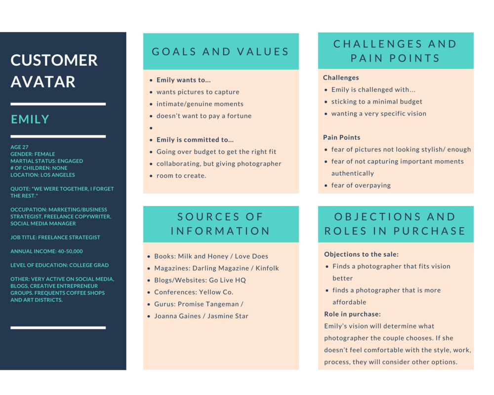
A complete, realistic customer avatar
When you started your online marketing activities, you should have put together a description of your perfect customer. This customer avatar is essential to all your marketing activities, including conversion rate optimization.
Image Source: Dubsado.com
By knowing your perfect customer, you can tailor your landing page to concentrate on them. Remember the college textbooks example before? This is a prime example of tailoring for a defined customer. Which is one reason why segmentation is so powerful.
By sending each potential customer group to a different landing page, you increase the chances of converting them and as Hubspot points out, the more landing pages, the better. With tools like the Facebook pixel, it’s easier than ever before.
Who is your actual customer?
No matter how well you think you’ve defined your perfect customer and how well you’ve targeted them, it’s likely that your actual visitors are different. Especially if this is an MVP.
Because of the focus on speed and agility, many startups focus their attention on Minimal rather than Viable, when they should be spending more time making sure the product fits their perfect customer. Which means more time spent on identifying the perfect customer.
Customer avatars are not an exact science.
And most of us get them wrong first time round. Which is actually the best place to start with a conversion audit:
Are your perfect customers who you think they are?
If your target audience and your real audience are not the same, then your landing page is not going to be optimized to convert your traffic. So you either have to find out why the wrong audience is arriving, or redo the landing page to focus on the new audience.
What do you want them to do when they arrive?
You also have to know your aim. What do you want those visitors to actually do when they hit your page.
If you’re trying to get their email, but are sending them directly to an expensive product, you’re not going to be converting as well as you would like.
So keep this in mind.
In fact, understanding the exact purpose of a landing page is the first step you should take. What do you want them to do, how are you going to get them to do it, and what is the path you’re going to lead them down?
What do they currently do when they arrive?
Most likely, the reason you’re not converting is simply that your audience is not taking the action you want them to. If they’re not filling out that form, they could be doing a few things.
- Immediately clicking away
- Clicking through to another page of your site
- Scrolling through the entire page before clicking away
- Scrolling through the entire page before moving to another page of your site
All of these are because the action you want them to take does not appear to be the best option for them. Knowing these details can really help you optimize better after performing your conversion audit.
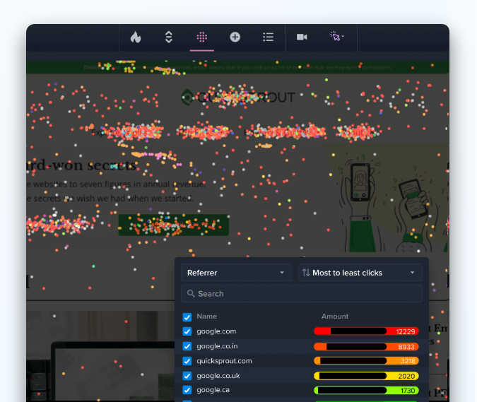
One of the best tools for this is a heatmap. With the information from the heatmap, you can see where your visitors are giving attention, and where they’re not. Which means you can then adapt.
If your button is not getting any attention, it may not jump off the screen, so you can try changing the color or positioning. Likewise, if your value proposition is hidden, try moving the copy to somewhere the eyes naturally go.
Image Source: socialmarketingfella.com
Where are they coming from?
Another piece of information that’s easy to take from Google Analytics, the source of your traffic is an essential part of any conversion audit. If one type, source or medium of traffic is converting better than another, it can help point the way forward.
But narrow it down further. Take a look at the demographics and audience groupings of your visitors, and how each group of visitors acts differently. This information can be extremely useful to narrowing down your target market.
What is in a conversion audit?
These important pieces of information feed into a good conversion rate audit. But what else is there included? And how do they all tie together to give you real, actionable insights you can use to improve your conversion rate?
There are basically 3 essential parts of any conversion audit.
- A technical audit
- A design/UX audit
- A copy audit
What is a technical audit?
A technical audit covers everything that could impact how your visitor sees your site. This covers both SEO and on-page technical fixes.
One of the most important factors when it comes to converting traffic is load speed. If a website takes too long to load, the visitor may simply click away.
If your load speed is too long, use PageSpeed insights and try the following:
- Optimize your images
- Check your Javascript and CSS
- Reduce server response time
- Enable compression
- Leverage Browser Caching
- And a lot more
Image Source: PageSpeed Insights
SEO also comes under the technical audit. Here, it is most important to ensure that the right keywords are being promoted. If a potential customer searches for “Designer Dog Collars”, you want to show them quickly and obviously that the page is about “Designer Dog Collars”.
Other essential parts of a technical audit are browser compatibility and device optimization. These ensure that your user sees your page in the way you intended no matter their device, browser or operating system.
What is a Design Audit?
Design audit is about what colors you use, what images the user see, what font you use on your landing page, and so on.
Not only do different groups of potential customers prefer different colors, they react differently to different colors. And each color gives off a different feeling.
Image Source: blog.resellerclub.com
What to do:
Test base color choices, background color, font color, button color, image color and so on.
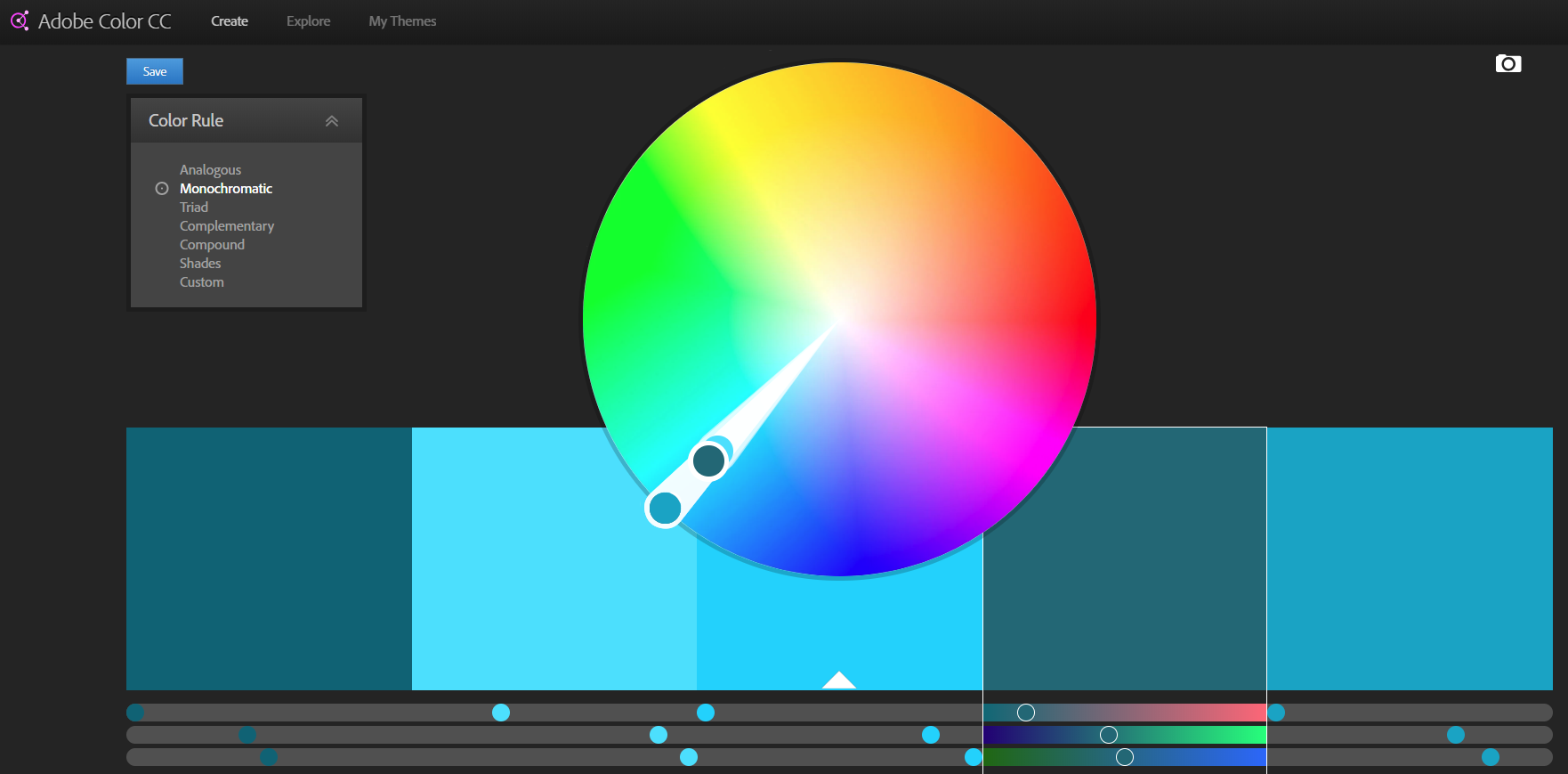
If you don’t know what colors you should choose, do A/B testing. Change colors from one color scheme to another for a period of time. After the test period, check your analytics to view your results.
Use different color rules in Adobe’s Color Wheel tool to choose a new color scheme.
Image Source: color.adobe.com
Layout is also essential for conversion.
When a potential customer lands on that page, you want them to take the shortest possible route to clicking your Big Orange Button.
What to do:
Make sure there is just one call to action and therefore one route your prospects can take. Ensure that it is visible and contrasts with the rest of your page. And definitely match it not just to your brand, but to the feeling you want to give off.
What is a Copy Audit?
While a quick loading site designed just for your audience can have a big impact on whether they stick around or not, if the copy doesn’t work they will not buy.
There are a few pointers that can come in handy.
You should position your product or service between where your customer is and where they want to be. Or instantly show how you solve their problem.
That opening headline is vital to turning those potential leads into potential customers.
And next comes the CTA. The perfect CTA is highly visible, uses very active language to really draw the visitor towards the button, and should use the language of the prospect. Hubspot again nail some great CTA examples
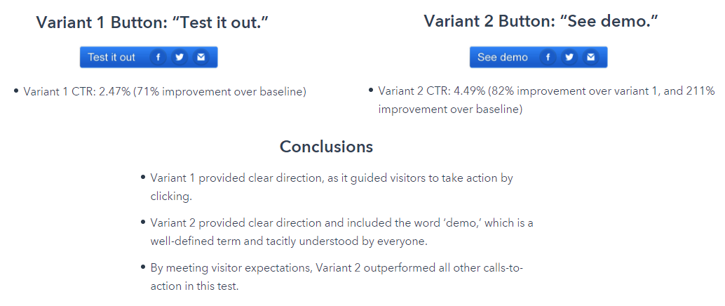
But we’re still not there. The button comes next, and it’s not as simple as just putting “Buy Now”, or “Download”. It should be qualified and tested. Split test two different button texts to see which performs better just like Hubspot did.
Text Source: blog.hubspot.com
What to do:
Make sure your CTA actually calls out, test it and match it to your button copy. Ensure your headlines are snappy and relatable, and make sure to include all the information your perfect customer wants and needs to make a buying decision.
Your conversion rate audit should cover all of these things, giving you a real feel for whether you’ve nailed your copy or not.
Who Should Perform a Conversion Optimization Audit?
When you want an audit done, you basically have three choices.
- Do it yourself.
- Bring in an agency.
- Hire an individual contractor.
Which one you choose is up to you, but there are some things to bear in mind.
If you do it yourself, in-house, it’s likely to be your first ever conversion audit. There is a chance that you’ll get it spot on first time, but there’s also a good chance that you’ll miss something out. And that might be something important.
If you hire an individual, it’s likely that they came to the job from a specialization. And that means they’re likely to give more weight to one part of the process than the others.
As you may see on upwork.com people ask different rates per hour. On average the cost is about $80/hour.
Image Source: upwork.com
An agency can put multiple specialists onto your audit, each one doing what they are best at. But they’re also likely to be the most expensive. Some agencies ask about $1.000 for an audit.
What to Look For During an Audit
Remember that customers arrive at your website from various different points, and with a wide range of experiences.
A conversion audit professional takes all of these routes into consideration when analyzing your site.
With that in mind, here’s what we look for:
Design and Layout (Both Desktop and Responsive)
Even great looking websites’ conversion rates can flounder. What’s attractive on the surface may not be compelling enough to the end user. With that being said, conversion optimization professionals typically look at things that make it easier for the audience to visually scan the page, including:
- Proper use of white space
- A single, large call-to-action button
- Easy-to-read typography and fonts
- Consistent division of main and sub-sections
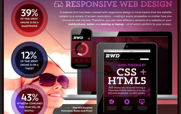
Of course, it’s not enough to go on common conversion practices alone. We also look at how the site performs on mobile devices. Since mobile traffic currently accounts for over one third of all web traffic (and is inching closer to the 50% mark), not having a responsive, device-optimized design is just flushing potential revenue away.
With the advent of technologies like HTML5 and CSS3, there’s no longer any need to develop a separate mobile site. One site can conform to all resolutions and devices. Just go easy on the load time for smartphones!
Search and Social Optimization
You might not think search and social optimization would go together in the same sentence. They produce vastly different conversion results, it’s true. But since customers can enter your website from any number of channels, from an optimization perspective, we typically put these two together.
After all, there are dozens of factors that go into making your site perform well in search, why should those not bleed over into social?
Moz.com’s graphic on the elements of an optimized page. View full image here
Many people take great pains to optimize their search results, but social seems more like an afterthought, because the traffic is viewed as not as valuable. Let’s face it, how many times have you gone on Facebook to buy something? (Um, never!) But just because the intent isn’t there, doesn’t mean we should be dismissive of these visitors.
A good conversion optimization audit looks at how well your social efforts flow into each other and back to your original website. Because social results can also impact your search engine ranking, you want to have a fluid, seamless flow from each channel. That means doing things like:
- Customizing your Facebook, Twitter and Google+ pages to incorporate the same style and tone used on your website.
- Include branding and graphics from your website on your social properties
- Promote the same friendly customer service and open discussion on your social channels as you do on your website
- Give customers on social networks a more engaging reason to interact with you. Surveys, contests and quizzes are all great portals to encourage interaction.
Starbucks has done a phenomenal job of not only responding to customer issues, but also providing a consistent voice, tone and engagement level for all its fans.
Notice how they invite users to participate by submitting their own photos, as well as voting on a contest for the best artistic cup design through Pinterest. It’s this kind of cross-channel communication that gets people to recommend, discuss and otherwise involve themselves in your offer.
E-Commerce Product Pages and Checkout Process
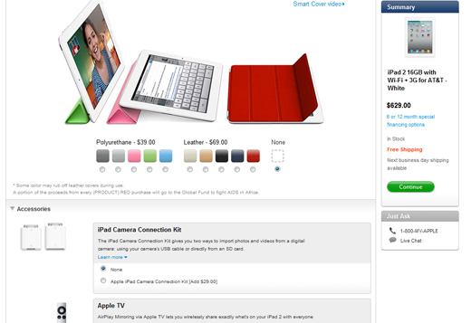
Apple knows exactly how to design an engaging, beautiful and high performing product page. Click here to see more examples of best practices in e-commerce
A good conversion audit wouldn’t be complete without a closer look at the e-commerce process. This can sound overwhelming, but there are a few key points to consider when auditing your product pages and checkout, including:
- Always-visible shopping cart, complete with an image of the item added, and the price (along with any discounts)
- Customization or personalization options (if available)
- Showing the number of steps to order completion
- Incorporating free shipping (by far the biggest conversion-producer for e-commerce websites)
- Use of security and trust seals where appropriate
- Forms with easy-to-understand errors to let the customer know if they missed or forgot to enter something.
Of course, these are just a few of the many points to consider, but a good conversion audit will take them all into consideration and then make adjustments and test depending on one’s own audience and their expectations.
Content Writing
Browse the Web for any length of time, and you’ll see that for many sites, the content seems more like an afterthought than an integral part of the conversion strategy.
While the tone and voice of the content will differ depending on the audience and brand (you wouldn’t be conversational if you’re selling high-grade technical parts and components), but for most consumer-facing brands, an open dialogue can make a big difference.
ChalkFly, an office and school supply store, uses their content to reinforce that they’re a company you’ll love to do business with.
While every business is different, notable points include reinforcing free shipping, noting the return/exchange policy in plain English, demonstrating your differences in a way the customer can understand, and much more.
Good website content is an art as much as a science, and understanding what compels your users to action is all part of the visitor psychology process.
A 45 Point Checklist for Optimizing Conversions
There’s a lot to keep track of when optimizing conversions – and you need to cover everything if you want to improve your chances of success. That’s the reason for this checklist. It covers everything from your headline to the call to action, and recommends some useful tools too.
“Let’s start at the very beginning,” sings Julie Andrews in The Sound of Music. And the beginning, in terms of conversion rate optimization (CRO) is creating the context for your CRO efforts.
- Set goals so you know what you want people to do on each key page.
- Understand the conversion funnel – how will people move through your site and pages so they eventually become customers?
Headlines, Titles and Subject Lines
Your headline, title or subject line is your first chance to grab your audience. Here are some tips on improving your headline writing process.
- Write a headline that shows people what to expect from the copy on your page. Keep it relatively short and search engine-friendly, while creating a sense of urgency. Make it specific to your offer and highlight benefits if you can. Use action verbs.
- Write another headline. Check both headlines using CoSchedule’s headline analyzer to see how they will appear to visitors (most people only read the beginning and end of any headline). Check for emotional and power words, too.
- Test both (or multiple versions of your headline to see which results in the best conversion rate.
Page Copy
If the headline is what gets people interested, the copy is what makes them stick around to check out your offer and complete the desired action. Here are some steps to include.
- Ensure that the copy meets your customers’ needs for information or a solution to a problem.
- Grab interest with a statistic, anecdote, quote or question and tell a story with a beginning, middle and happy ending.
- Address pain points to reduce buying resistance.
- Highlight features and benefits and distinguish between them. Features are characteristics of a product or service while benefits are what the product can do for your customer.
- Look after writing style: get familiar with words that convert; use the first person where it makes sense; and avoid wasted words and jargon.
- Look after SEO by including (NOT stuffing) terms your audience will be searching for.
- Make copy more readable with subheads and bullets.
- Proofread to eliminate errors that would undermine your credibility and authority.
- Make your audience care by evoking emotion.
- Don’t assume your readers are experts. Tell them what they need to know.
- Test your copy, by using A/B testing, heatmaps and analytics to see if there are areas you could improve.
Building Trust
No one’s going to buy from you if they don’t trust you. Here’s how you can make your page more trustworthy,
- Highlight the experiences of real customers, including on video.
- Include product videos so people can see exactly what they are getting.
- Publish customer reviews – it works for Amazon.
- Use social proof – it’s a powerful persuader.
- Support your sales points with data.
- Use incentives like guarantees and free shipping.
- Create an ongoing customer relationship instead of going straight for the hard sell.
The Offer
The offer is an important part of your landing page. Here’s how you tweak it.
- Ensure that you have matched your offer to your potential buyer. The wrong offer is just as bad as no offer at all. Use personas and avatars to get this right.
- Make sure what you are offering is valuable to your customer.
- Be clear about what your offer is and how people can get it.
Calls to Action
The call to action (CTA) is where the pedal hits the metal or, to put it another way, where you find out whether everything else you have done has worked to make people take the desired action. Here are some conversion optimization tips for your CTAs:
- Include multiple CTAs on your page to cater for different audiences at different points in the funnel.
- Make your CTAs specific to the page copy, rather than generic.
- Make your buttons look like buttons for better conversions.
- Test CTA placement to find the most effective positions. Test size, color and CTA copy too.
- Use action words to inspire action.
- Create urgency with CTA copy.
- Avoid distracting your audience – keep the CTA area uncluttered.
- Ensure that button text is legible.
Design
How your page looks is as important as the copy itself. Here are some tips:
- Avoid clutter on landing pages as this distracts from your copy and offer. For other pages, make it easy for people to find the information they need.
- Create multiple options for people to move through your page so they can take action at different points.
- Use images to draw the eye, build trust and keep people interested. Use high quality images for best results, but don’t let them obscure your message.
- Don’t focus on design over user experience.
- Put the most important elements on the page where people are most likely to see them.
- Use color effectively.
- Choose the right fonts.
- Keep navigation simple. Remember, every link is another distraction from your conversion goal. Think about how to simplify your navigation for conversion optimization.
- Keep your pages and sites simple, too.
- Don’t be afraid to experiment. Actually, it’s the only way to improve! You must try, fail and learn in order to grow. Another way to put it is: “get busy growing or get busy dying.”
- Test and measure until you get the conversion rate you want.
What to do with your Conversion Audit results?
So your audit has revealed a few different areas where your prospects are falling by the wayside. So what’s next?
EXECUTE!
Some of the small tips can be done right away, such as sorting out your images so your website loads faster. But some of them require a bit more work.
At this point, you can tweak your current page to boost conversions, or you can test. And this is where you can make true evaluations based upon real data.
Keep your current landing page, but set up a copy where you make slight changes based upon the actions recommended in the audit. Split test the two landing pages and see which one performs better.
Continue this for each changed feature to see which work best with each other, which small changes give the best RoI and which should be discarded. Then, the next time you build a landing page from scratch, you have a lot of data from which to work.
Have I covered everything? Share your favorite conversion optimization tips in the comments.


