In design, color is as important as words for conveying your brand’s style and personality.
But there’s more to choosing a color palette than simply picking your favorites or trying to stand out from the competition.
Consumers have different expectations for different industries. Sway too far off that beaten path, and you may lose people because you don’t “look” like they expect you to look.
Or will you?
In today’s article, we evaluate color palettes of some of the top financial blogs, as determined by Technorati’s Financial Authority rank.
Our quest? To see how color can help you communicate trust and authority in a traditional, highly-regulated industry.
1. Frugal Rules
Technorati Authority: 633
Finance Authority: 910
This palette relies on the traditional green that you’re used to seeing with financial institutions. But it changes things up a bit by including gold, which is also associated with riches. A touch of black grounds the color palette by creating a foundation of strength and authority.
This is a good color combination for a financial brand because it goes beyond the obvious association with money (green). By adding gold and black, it reinforces the concept of wealth (gold) and introduces a strong sense of stability (black).
2. Gajizmo.com – Personal Finance
Technorati Authority: 590
Finance Authority: 910
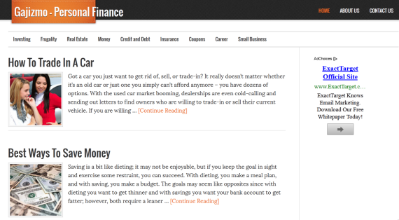
Gajizmo doesn’t try to fit consumer’s expectations of financial brands. It has a simple palette: black, which is associated with authority and solidity, and a warm rust, which suggests down-to-earth values.
The only color on this page is the rust in the banner and links. Everything else is black and white, with lots of white space providing room to breathe.
It brings to mind a newspaper, which adds to the feeling that you can trust the information given here.
3. Money Life & More
Technorati Authority: 579
Finance Authority: 894
This is a cool color palette that looks “financial” even at first glance. Green, because it’s the color of U.S. greenbacks, is often associated with money. And blue is associated with trust.
By using these traditional colors in lighter, brighter values, the brand not only associates itself with the finance world, but does it in a way that looks modern and youthful rather than heavy and uninteresting.
This site makes ample use of white space, giving it a clean, light feel. This is especially valuable in a financial site, because research has shown that more white space increases trust.
4. Narrow Bridge Finance
Technorati Authority: 593
Finance Authority: 837
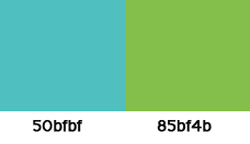
This minimalist design stays in the green family, leaning to a blue-green and to a yellow-green for variety. The addition of black as an accent color adds stability and strength, particularly in the logo and banner, where black literally provides a foundation for the greens above it.
5. Reach Financial Independence
Technorati Authority: 617
Finance Authority: 773
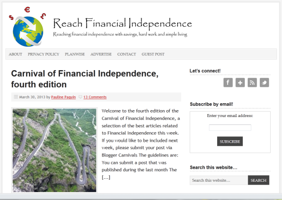
This site is designed more as a blog than a business, so it stays well within traditional expectations of a financial brand. Colors are blue and green, with red accents.
Clearly, there’s nothing wrong with meeting expectations, because it ranks well in Financial Authority.
6. Thirty Six Months
Technorati Authority: 580
Finance Authority: 770
Personally, I’d have never chosen this palette for a financial blog, simply because it breaks from all associations with the niche. Pink and brown make me think of cupcakes, not money.
But with a Finance Authority of 770, it obviously works.
This brings up an interesting trend. Traditionally, finance has been a man’s world, but times are changing. Women are taking charge of their own finances and want to share their own experience and knowledge.
So we may see more financial blogs (personal and/or profession) with a feminine twist.
In the banner, muted background colors provide good contrast to the mossy green lettering. The overall design is simple and elegant.
7. Master the Art of Saving
Technorati Authority: 584
Finance Authority: 737
Here’s another unusual color scheme for a financial blog. Like Thirty Six Months (above) this is a personal blog run by a woman.
You don’t need to check the About page to know this blog is aimed at women. The palette is soft and romantic, which belies the Finance Authority rank of 737.
Perhaps the lesson here is that you can pick color palettes for your audience rather than your niche.
8. Hull Financial Planning
Technorati Authority: 581
Finance Authority: 644
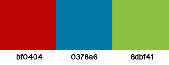
Hull’s palette is a cool blue and gray, with a dash of red accents. This creates an impression of trust and strength, which is supported by the design of the page.
Notice the simplicity of the logo and layout. The brand promises a simple, traditional user experience.
9. The Reformed Broker
Technorati Authority: 670
Business Authority: 616
This warm palette is an unusual color combination for a financial company. But browns and oranges are associated with the earth. And The Reformed Broker’s logo, a skyline, reinforces this suggestion.
It’s a surprisingly powerful color scheme because these colors are associated with home, hearth, and stability — inspiring feelings that this brand is a haven from the storms of life.
10. Good Financial Cents
Technorati Authority: 555
Finance Authority: 120
This warm palette communicates power and wealth with its red and gold combination. Rather than relying on green as the primary color, this brand only uses green in a back-up role.
This site has the opposite appeal to the palette of Money, Life & More (above). As opposed to the bright, youthful blue and green, it’s gone with heavier, more mature colors that evoke feelings of stability and strength.
This is a great example of how color can help communicate your core message. Red suggests power and authority. And because it’s the predominant color, you get the feeling that this site will help you gain control of your financial situation, not simply tell you how to make money.
5 other financial brands
24/7 Wallstreet
Technorati Authority: 627
Finance Authority: 1
Bespoke Investment Group
Technorati Authority: 628
Finance Authority: 1
ValueWalk
Technorati Authority: 664
Finance Authority: 1
Business Authority: 683
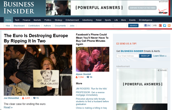
Business Insider
Technorati Authority: 841
Finance Authority: not listed
The Financial Brand
Technorati Authority: 607
Finance Authority: not listed
Observations
I’m going to be honest. My first draft of this article didn’t include a third of the sites you see above.
That’s because I chose sites that “looked” financial (see the “other” sites above). In other words, I fell into the trap of assuming all well-respected sites in an industry should have a particular look and feel.
But when I went back to evaluate their Technorati rank, I found that many of the most traditional looking sites had the lowest Financial Authority rank with Technorati.
Obviously, you don’t have to follow the leader when deciding on your brand’s color palette. While it’s a good idea to choose a look and feel that makes you appear authoritative in your niche, you can deviate from the norm and still do well.
Even so, the top-ranking financial websites tend toward:
- Trust-building colors: green and blue.
- High-energy colors that suggest power and authority: red and black.
- Colors associated with wealth: green and gold.
Half of the sites we’ve looked at use at least some green in their palette. Clearly, the belief within the industry is that users expect to see green in a financial brand.
However, there is a growing trend to break from tradition and use other colors. Financial sites aimed at women are the most obvious. They don’t make any associations with wealth or power, instead choosing soft, romantic colors such as pink and lavender.
My recommendation?
Keep the industry’s primary color scheme in mind. But don’t feel compelled to follow the pack when branding your own financial business.
As long as your design communicates trust and authority, a little originality can still build a powerful brand.


