If you’re running an online business, you’re probably asking people to hand over their credit card details, their name, email address and maybe their phone number.
Why would anyone do that if they don’t trust your site?
Trust is the first step towards conversions.
It isn’t very difficult to get people to start trusting your website — a good design, secure webpages, excellent content and the right security badges are some of the best ways to start building trust.
Shall we get into the nuances?
1. Switch To Https

AAIEEEE!
The screenshot above is certainly something that you don’t want your online customers seeing. Of course, what’s being shown there is an instance where a secure connection has an insecure element on the page. It’s usually not a big deal, but you still don’t want customers seeing that.
Make sure your site is secure on every page. This includes images and other elements you embed within your webpages. Also, try to link to only other secure websites if you need to. Otherwise, that ugly crossed out padlock will appear!
On August 6, 2014 Google made the announcement regarding making https a ranking signal. So there’s a little boost for being completely https. So, not only are you boosting your rankings with a secured site, but also you’re doing a favor for your site visitors by providing them a secure environment to do their transactions.
If you run a store, leaving nails and ladders around your space probably wouldn’t be a good idea. You wouldn’t anyone tripping over, right?
What about your website?
How to Check Your Site for Secure Connections
Firefox does a particularly good job at checking if a particular url that starts with https is really secure.
The padlock on the top left hand corner shows if the website is secure. See the example below:

green padlock shows secure site
This website below seems to have an expired security certificate.

insecure site

technical details of security breach
Firefox displays a warning telling me of the dangers of visiting the particular site.
In most other cases the issue could be fairly simple — it could be that everything on the page is secure EXCEPT the images, which is an easy fix usually.
By checking whether this certificate is valid, Firefox ensures that the connection is really encrypted.
For all of you that are still on http, here’s a guide that shows how to switch your site to https.
2. Have A Great Web Design
A study by Dr. Brent Coker of the University of Melbourne found that we behave the same way online as we do offline. We are wired to trust beautiful websites, just like we trust beautiful people.
A study by Stanford University researcher and Ph.D. BJ Fogg found that:
“People quickly evaluate a site by visual design alone. When designing your site, pay attention to layout, typography, images, consistency issues and more. The visual design should match the site’s purpose.”
And to really drive the point home, another study found that 46.1% people in a sample group judged the website’s credibility based on its design.
Great web design is about telling a story with a consistent theme. Each element works with the other to reveal a great site that helps and educates the visitor.
One of the core things in web design are images. Most people settle for stock photography. But a study at Marketing Experiments reveals that 35% of visitors were more likely to sign up when presented with a real photo than a stock image.
Unbounce does a great job when it comes to design
There are a few things that I particularly like about Unbounce’s landing page.
First is that they use a very trustworthy, the guy next door kind of face on the page.
Visitors can easily relate to that image. It builds up trust in them and they feel that if Unbounce has worked for that guy it should work for them as well.
The second thing is that they describe all their features particularly well with rich imagery. Also testimonials from real people are sprinkled all over the landing page.
Let’s look at another example.
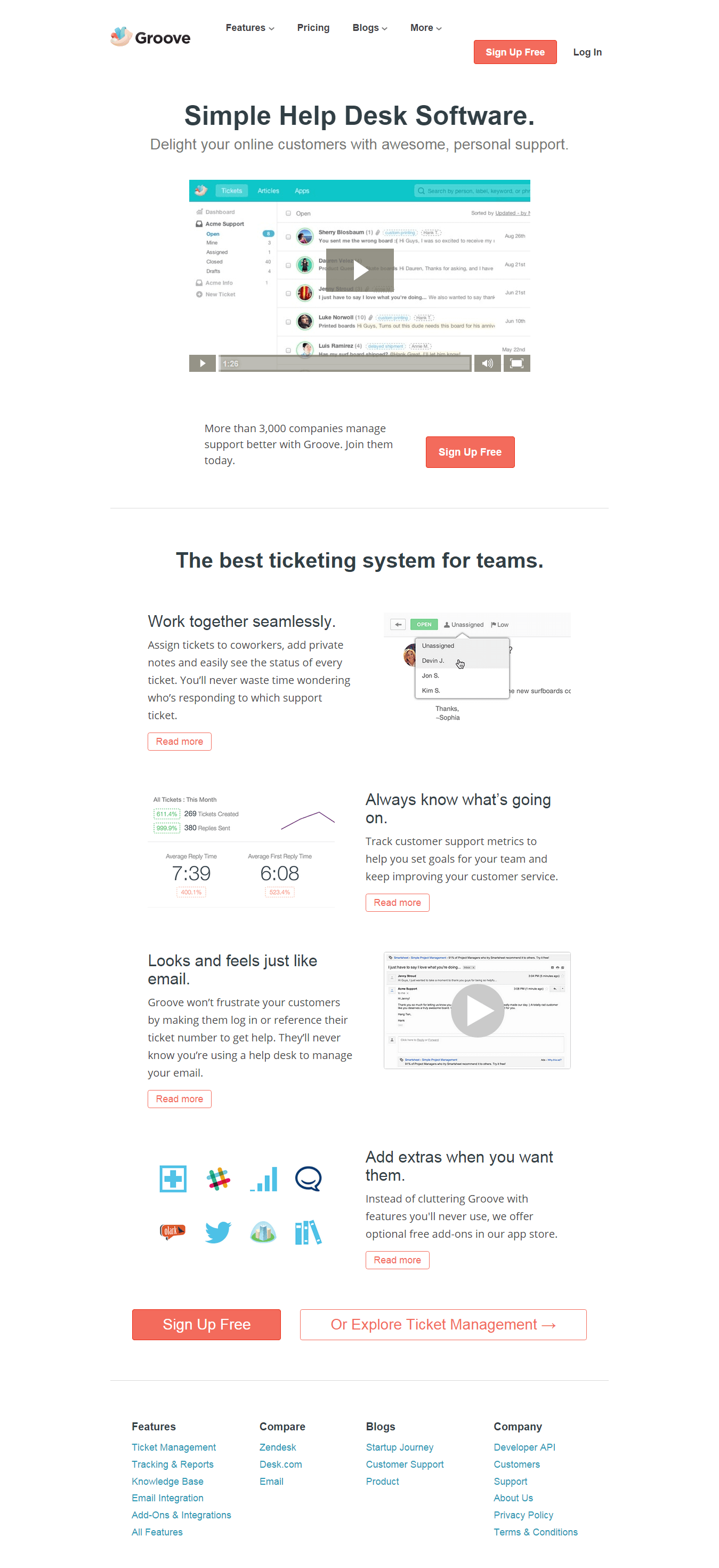
GrooveHq has a clean design with a great call-to-action supported by a video on the homepage.
A nice clean design simply instills trust.
A Note On HomePage Videos and Video Effects
A video doesn’t always help increase conversions. On BrookDale Living, a video on the homepage actually decreased conversions. The reason may actually surprise you.
chart showing the demographics of visitors on Brookdaleliving
If you’re planning on using video, you need to test to see if videos are going to help or hurt your conversions.
Another thing that comes to my mind is that a trend these days is to just add a video on the homepage as the background. If you are looking for conversions then such random videos can only act as a distraction that takes the mind of the visitor away from the intended goal.
Just look at the example below of a site with a video running in the background.
this particular website uses video as a background effect
A video is not only a distraction, but also a time-suck for your visitors. And since the average web visitor only spend seconds looking for what they need on your webpage (usually), it’s very important that your video concept comes from a testing hypothesis.
3. Show How You Served Customers and The Value Provided
The number of customers served can be a good way to show your presence in your industry. There are a couple of ways to do this.
- Show client logos or images
- Show the value that you have provided to your customer
Client logos
Displaying the logos of clients you have worked with helps you be seen as an authority. The reputed your client the more rapport you build with visitors coming to your site.
When these visitors see that other important visitors have been successful because of your service, they too won’t think twice about ordering.
For example, ConversionRateExperts shows client logos on their homepage. Their clientele include big names like Apple, Facebook and Amazon.
What better way to gain trust?
However, there’s a caveat here. Some companies do not display client logos for fear that their competitors may poach their clients. So displaying client logos doesn’t go down all too well in every industry, especially the SEO industry.
You also have to consider that adding logos to a webpage is yet another distraction. Again, always test your hypothesis to see if it in fact improves your conversions.
Show the value provided
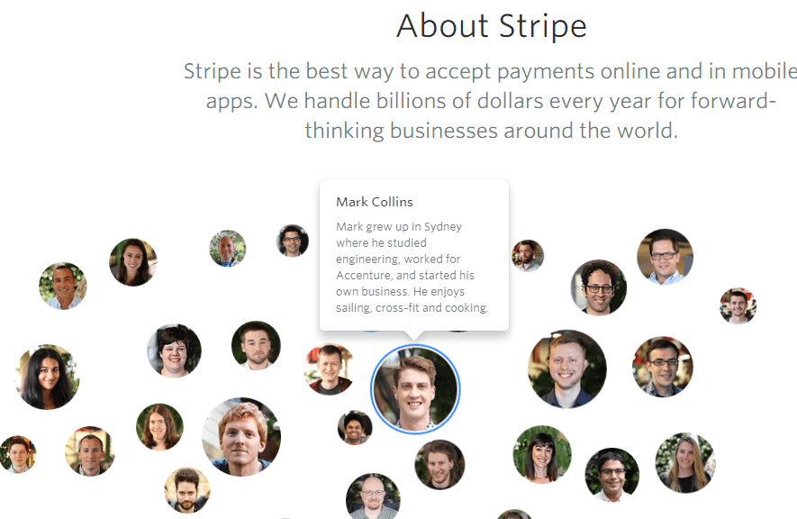
Stripe is a payment processor and most of its clients consist of small businesses and startups. Stripe shows the pictures of people who use the service for payment processing.
Hovering over an image shows you more details about the particular person and how Stripe has helped the person.
Stripe shows how they are changing small businesses
Instead of just showing customer numbers these companies below show how they benefited their customers, the value their provided and the difference they made to the client’s business.
Clarity too follows a similar approach. Clarity’s business model works on connecting advice seekers with experts. As such everyone needs a different solution. They have a dedicated page showing different customer success stories. Visitors can see how Clarity helped others and proceed with registering on the site.
Webpagefx effectively shows how much revenue they added to their clients’ bank accounts in the last 12 months.
Webpagefx displays phone number on top
They also have a visible phone number on the left corner through which customers can easily contact them and make sure of everything before committing to a retainer.
However, do remember that each additional element on the homepage divides the attention ratio and can kill conversions. Including your phone number and client revenues is a great idea but don’t forget to split test and see if it increase or decreases conversions.
4. Offer Content That Shows You To Be A Thought Leader and Trendsetter
When Peep Laja started ConversionXl the goal was to provide in-depth posts on a topic backing all claims with proof. In his interview on Mixergy he says,
“And then conclusion was that I need to write long form posts, two to three thousand words. Lots of pictures, well structured, meaning that sub headlines, bullet points, so it’s interesting easy on the eye.
Every claim backed up by a source. I’m not saying ‘do this, this works’. And then I link to a study the study found that this works. And finally to publish as frequently as possible because publishing schedule matters.”
Today ConversionXl is one of the best CRO blogs.
Neil Patel has grown two companies Kissmetrics and Crazy Egg through content marketing.
He writes excellent long form content publishing 3 times a week on Quicksprout, several times a month on Crazy Egg and also guest posts on other blogs. In fact personal branding through blogging helps him generate over $500,000 in revenue each month.
5. Be Transparent
Transparency can go a long way in helping build trust on your site.
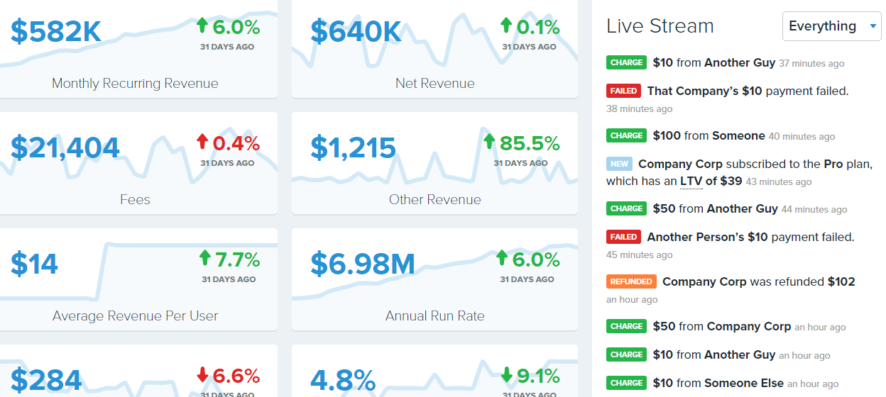
For example, Buffer publicly shares its revenue numbers in an attempt to provide complete transparency.
They even show their salary stats.
Salary table at Buffer
GrooveHq shares everything they are doing to grow their business to $500k a month on their blog.
Yellow Leaf Hammocks shares an amazing story on its About Us page. They describe how their company empowers artisan weavers and provides them with a livelihood. If you scroll down a little more you will be able to read stories of a few employees.
Yellow Hammocks instantly connects with customers and earns their respect.
Another example is Apptopia which throws out marketing jargon out of the window. When you read the about us page it feels that they really care about the problems that publishers and advertisers face.
Apptopia about us page
6. Display The Right Trust Seals
When building trust on your site, trust seals should be the most important factor right?
Wrong.
Though there are case studies that show that trust seals improve conversions, it isn’t always so.
The right trust seal is more of a determinant in whether people would trust you or not.
Research by Baymard reveals the following things about trust seals.
- 37.2% didn’t recognize any of the seals or they didn’t have a preference
- 20.1% selected Norton Secured
- 10.3% chose McAfee Secure
- 10.2% selected BBB
- 8.3% opted for TRUSTe
- 3.8% selected VeraSafe
- 3.1% chose Secured By Thawte
- 3.0% selected Comodo Secure
- 2.0% opted for Stella Service
- 1.9 % opted for Trustwa
So, it would be better if you opt for the most popular trust seal. Trust seals can be a distraction and could lower conversions. You should always test the page with and without trust seals to see what works for you.
Concluding Thoughts
As you saw above, building a trustworthy website takes a lot of effort in the right direction.
Customer testimonials, reviews and mentions from authority sources go a long way in ensuring that your website appears trustworthy.
But the most important thing is showing the value you are providing to your customers. People want to know how something can benefit them and once that becomes clear conversions will skyrocket.
Again don’t forget that all these factors can improve trust, increase conversions and can also decrease conversions. You should always test whatever changes you make. Everything is a variable.


