The content in your blog is the most important aspect of creating a successful blog. After all, you want your readers to benefit from your knowledge and expertise. However, if the visual design of your blog is poor, you may not be able to draw in the readers so you can share your message. The right blog design enhances a feeling of trust in your blog, keeping visitors engaged.
Rather than trying to tackle design on your own, especially if you are a blogging novice, a great blogging platform can significantly help you. These platforms offer themes and other design elements to simplify creating a great-looking blog. Our favorite tool is WordPress from Hostinger, which offers numerous design options to help you create a one-of-a-kind blog.
What Are the Best Tools for Blog Design?
Dozens of tools exist that claim to help you with blog design. With so many options, finding the best one for your needs can be difficult. We put together a detailed list of the best blogging platforms that help you with all aspects of operating a blog, including designing it.
When you want the gold standard in blogging software, WordPress is the most popular option. We like using WordPress with Hostinger because Hostinger delivers hosting services in addition to help with designing your blog. When you sign up for WordPress through Hostinger, you receive protection in the form of a 30-day money-back guarantee.
For novices who want the easiest way to create a blog that looks great, Wix makes use of a drag-and-drop interface, so you can set up your blog’s design without having to learn any coding. You can try Wix for free before deciding whether you want to purchase add-on tools.
When you want your blog’s design to reflect the creative nature of you and your blog’s content, Strikingly offers multiple tools that greatly simplify the process while delivering designs that look amazing. Start with Strikingly for free, and you can later choose whether you want to pay for any add-on features.

More Top Tools for Blog Design
Through our many years of helping businesses build websites and blogs, we know the importance of design. You need a blogging platform that offers design tools that fit the theme of your blog. If the tools we mentioned earlier don’t quite fit your needs, check out our detailed reviews of all the best blogging platforms for some more options.
How Do I Get Started Using WordPress With Hostinger?

Signing up for WordPress using Hostinger is an easy process. Once you subscribe to the service, you will gain access to the various blog design tools that Hostinger offers to its WordPress users.
From the Hostinger home page, click Hosting along the top of the screen, followed by WordPress Hosting. Then scroll down on the page to see the various pricing tiers for this service. The prices range from $2 per month to $20 per month, depending on the services you select.
Remember, your Hostinger subscription gives you access to the WordPress software, which simplifies creating a blog design and blog content. Additionally, Hostinger will host your blog. This means Hostinger provides the hardware required to make your blog available to visitors—you don’t have to purchase these hardware and software items yourself like you would if you hosted your own blog.
Additionally, as our Hostinger review points out, Hostinger helps you find and pay for a domain name. This is the URL address a visitor to your blog would type in a web browser to open your blog.
You certainly could do all the aspects of hosting yourself. However, Hostinger makes the process extremely easy, saving you time.
How Important Is Blog Design?

Having a great design in your blog doesn’t guarantee success. But the design plays an important role in allowing visitors to trust your site, making them more likely to read your content. Great content is still the most important factor, but the design is a big draw for visitors, too.
In the early days of blogs, having a primarily text-based interface was the norm. Now, however, having a blog page dominated by text without a great-looking design makes your blog appear dated. Visitors may wonder if the blog contains the latest information or is even receiving any attention from you.
If your blog’s design has an impressive look and feel, visitors may assume you have a large art department or an in-house design team. Even if you are running the entire blog yourself, the professional design elements will make you seem like a larger entity. People are more likely to see you as trustworthy when they believe you have a large, professional staff of contributors.
Blog and website design have quite a few similarities, but they aren’t identical. Design elements in WordPress aimed specifically at blogging may be more beneficial to you than design elements aimed at a general kind of website.
Another benefit of using a template or theme with your Hostinger WordPress blog is having a related design on every page. Visitors can navigate your blog easier when they can count on similar design elements on every page.
How Does My Blog’s Design Help Visitors?

Having a design that looks great may catch the eye of your visitors initially. However, your blog’s design can do so much more for you and your visitors.
Your design should make it easy for visitors to navigate through the site. If visitors have an interest in one topic that your blog covers, they should be able to find that topic quickly when your blog has easy-to-navigate design elements. A row of menus across the top of every page is a good way to deliver these key navigational features.
Additionally, your design should load quickly. Sure, complex animations and huge photos and graphics may look great. However, if your blog’s visitors have to wait more than a few seconds for your page to load, they’re likely to return to the search engine page and skip your site.
Finally, your design should make it easy for visitors to reach out to you or to learn more about you. Even if you don’t want to allow visitors to contact you directly, having a well-marked page that explains your level of expertise is important. Visitors tend to trust you and your blog’s content if they believe you are writing from a position of authority about a particular topic.
How Do I Select the Best WordPress Theme?

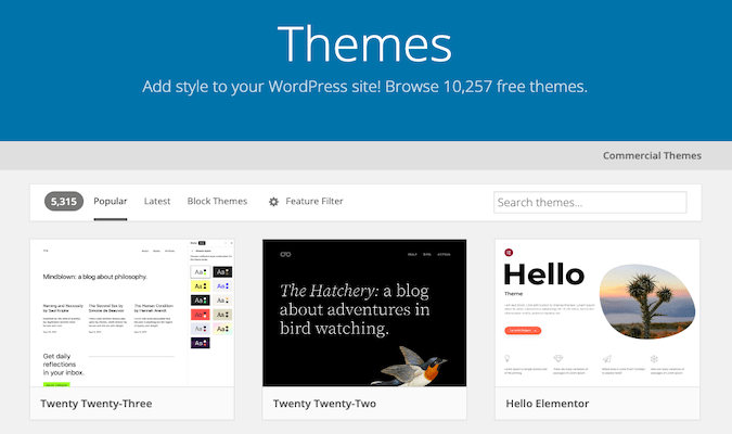
WordPress offers thousands of different themes, so it can be challenging to figure out how to pick the best one for your needs. Using a theme gives your blog consistent page layouts, navigation menus, text styles, backgrounds, and positioning of photos and artwork.
When you have an account with Hostinger to host your WordPress blog, you can select either a free or premium theme. Take some time to think about the theme you want to use, as it is difficult to change themes after building some blog pages. Each theme has its own specific design elements, and those elements may not match up well when you try to switch themes midstream.
Some of the aspects of different themes that may be especially important for you include:
- Widgets for connecting with social media
- Support for language translation
- Support for comment sections
- Support for user forums
- Ecommerce capabilities
- Support for SEO campaigns
- Customization options
Visit some blogs that you like to read to find some design elements you may want to use in your theme. However, don’t just copy the design of another site. Although you can borrow some aspects of design from other sites, you want your site to stand out from competitors. Try to give your site a unique look and theme, so visitors can quickly distinguish it from others.
An average WordPress premium theme will cost around $50 or $60. Although this seems like quite a bit of money, you have a better chance at creating a unique look for your blog with a premium theme versus a free theme.
How Do I Make My Blog Design Stand Out?

Using certain design elements in your blog can make the blog stand out from competitors.
Some of the most important design elements to consider for your blog include:
- Text size: Use a large text size in the body text, so visitors can easily read the information on the site.
- Type of font: Some fonts are extremely decorative, while others focus on simplicity and readability. Save decorative fonts for your blog’s banner images or logos. Use highly readable fonts in headlines and body text.
- Breaking up the text: Don’t use large blocks of text that occupy most of the page. Instead, use headlines, subheads, and artwork to break up the text.
- White space: Use white space within the text blocks and around artistic elements to break up the page.
- Graphical elements: Some blog owners will place a stock photograph at the top of each blog post. Some prefer illustrations or graphs that illustrate the point being made in the blog. Try to use the same positioning of introductory graphical elements in each blog page.
- Colors: Try to avoid using colored backgrounds behind your body text, as this makes it tougher to read. Save your colors for illustrations, photos, sidebars, banners, pull-out quotes, and footers.
- Animation: Although animation can help your blog stand out from the crowd, it also can lengthen page loading times. Use animation sparingly, if at all, for a blog.
- Personalization: You should place a byline on every blog post, even if someone is ghostwriting it for you. If you have a photo of the writer or an illustration that represents the writer, use it with the byline every time. Visitors want to feel like they know the person who is writing the blog posts.
- Social media: Make it easy for a visitor to share your blog on a social media site by including social media buttons on every page.
Regardless of which of these design elements you want to use, it’s important to maintain consistency on all the pages of your blog. Consistency helps visitors remember your site, and it gives the site a professional feel. If you use a different font on each of your blog pages, it’s going to seem like the pages may not be part of the same blog in the eyes of a visitor.
How Does Site Structure Fit Into Design?

Creating a site that looks great helps you draw in visitors who may want to learn more about your blog. Having an easily navigable site structure will keep them engaged for longer.
A great design in the site structure starts with having an easy-to-navigate menu, whether that is across the top of the page or along the side. Blog sites can sort posts by topic in the menu, so visitors can easily jump to the information they want to see.
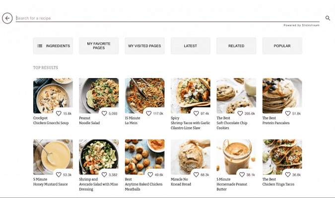
For a blog, a common site structure is to list three to six blog posts across the page in multiple rows. You can do this on the home page for the blog, and you can do this on topic subpages. Include a thumbnail image along with the title of the blog post in this list (as shown in the screenshot above).
When you are using a design element like a photo or an illustration at the top of every blog post, you can carry that design into the thumbnails for your site structure. This is a smart way to maintain consistency.
Some site visitors may want to search for an older blog post that they remember reading from a few months ago. If they don’t remember the post’s title, they might remember the photo or illustration. The visitor then can use the thumbnail to find the blog from the past.
What Are Some Common Blog Design Mistakes?

One of the biggest mistakes people make in blog design is not thinking about the design they want to use before starting a site. You don’t want to use design elements randomly on your blog site. You certainly can change or tweak your design on occasion, but it can be a time-consuming process. Spend plenty of time thinking about your design before you publish your first post.
Making your site too busy is another common mistake. With so many options available, it’s easy to go a little crazy with design elements, especially for novices. Simple fonts and color schemes are almost always better than complex ones. White space can be your friend, making your blog site easier to scan visually.
Using low-quality images, like blurry photos or unprofessional graphical images, leave visitors wondering about your blog’s professionalism. No image is better than a low-quality image.
Finally, make sure the design highlights your personality. People who are reading your blog want to feel like they are making a connection with you. Use your name on all your blog posts. Provide access to an “About Me” page in your design and make it available on every page. Use part of your blog’s design to give people insight into who you are, and they will be more likely to trust you and your blog.


