Prototyping helps teams identify design issues and evaluate the best solution before moving forward with later stages of product development.
When it comes to websites or apps, prototyping tools generate designs that can be usability tested. The results are then used by UX teams to improve designs before sending them on to developers. Prototyping helps avoid redundancy, saves time, and reduces unnecessary expense.
The Top Prototyping Tools: Our Top Three
This article dives into five of the prototype testing tools we consider worth your time. But if you want to choose something right away, here are our three top picks.
Figma: Best prototyping tool overall because it offers solid prototyping, robust collaboration, and end-to-end product development functionality. Give Figma a try for free.
Fluid UI: If you want to roll out a prototype asap and don’t need a ton of non-prototyping bells and whistles, Fluid UI is a top option. Its Free Forever plan lets you design a prototype in less than 15 minutes.
Moqups: When you want the easiest tool for everyone on the team to use, Moqups is a great choice. It lets anyone create wireframes and prototypes with a simple drag-and-drop interface. Try it out for free.
Figma: The Best Prototyping Tool Overall
Figma is our top choice because it not only does prototyping really well, but it also offers a full end-to-end solution that manages the design process from initial idea to final product. It’s a highly collaborative solution that can easily be used by everyone in an organization to contribute to the product design process.
Figma’s prototyping functionality is easy to use, with zero coding required to create appealing and functional prototypes. Designers can create realistic simulations using variables, conditional logic, and mathematical expressions. There are also GIFs, videos, animation, and pre-built interactions that can be applied. Drag-and-drop functionality makes it easy to have a new prototype ready to go in a very short time.
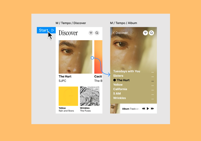
Collaborating with Figma is also a breeze. Since Figma is platform-agnostic and cloud-based, everyone from designers on Macs to stakeholders on PCs to testers on tablets can use Figma’s browser-based approach with zero hassles. No downloads are required, although there is a desktop app available, as well as a mobile app for both iOS and Android devices.
Figma pairs smoothly with a UX designer’s favorite tools, including UserTesting, Maze, dscout, and more. Figma also integrates with developer tools like GitLab, Visual Studio Code, and AWS Amplify Studio. Productivity and communication tools like Teams, Zoom, Slack, and Google Workspace are also covered. And live embeds of Figma files can be put into Asana, Dropbox, Trello, Notion, and more.
A big part of the design process happens after designs are approved, and Figma handles it with ease. Using the Dev Mode function, final designs can be easily handed off to the development team for coding. Designers can include measurements and annotations, giving developers a clear road map. Developers can quickly compare frame versions to identify what’s changed, reducing the need to go back to design teams for clarification.
Figma offers more than 300 templates to kick-start almost any aspect of product development, from brainstorming and strategic planning to research and design and more. The Figma community is also a resource that offers thousands more templates, plugins, and widgets. No matter what you need to streamline a process, you’re likely to find it.
There’s also excellent version control with Figma. With its branching tool, designers can explore alternative ideas without impacting master files. When an alternative is approved, it can seamlessly be merged into the main file. Version history keeps track of every file change and offers an easy-to-read timeline that includes who did what and when.
Finally, one other Figma callout is its centralized libraries and assets. All users have access to them, ensuring consistency across designs. And with variable mode, assets can be modified and applied to different projects down the road. Figma will scale with you.
Figma offers a variety of plans, all billed on a “per seat/per month” model, starting at $15 on the Professional Team plan. Pricing goes up from there. You can also jump in for free with Figma’s Starter Plan and see if it’s right for you.
Fluid UI: Best for Fast Prototyping
If you need a prototype ready to deploy within minutes, Fluid UI is an excellent option. There are thousands of ready-to-deploy components included in Fluid’s Material Design, iOS, Windows, and Wireframe libraries. Everything is in one place, and you can even add your own design assets to personal libraries for use in current and future designs.
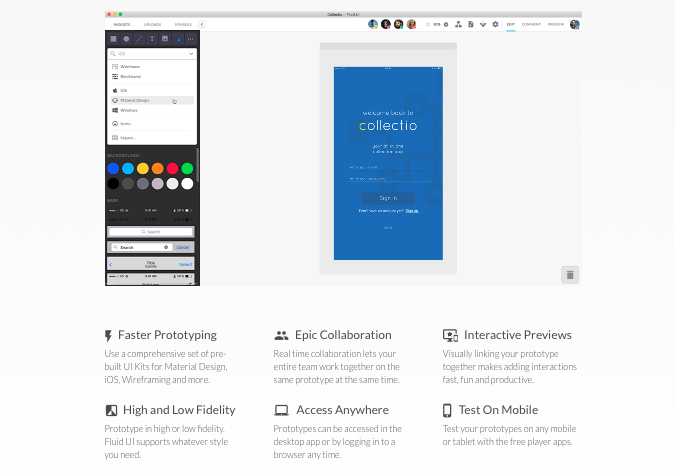
Fluid UI doesn’t spare interactivity in pursuit of speed, either. You can add interactive elements, including animations, taps, clicks, and swipes to give testers a realistic experience with your web and mobile prototypes.
Collaboration is also something Fluid does well. As a cloud-based solution, teams can work together on files and see each other’s contributions in real-time. Want to control who is making changes? Just lock a page so only you can make changes while working with your team.
There’s also a reviewer mode with Fluid UI. With it, you can invite anyone to view a prototype and add annotations to share their thoughts and ideas. These annotations can be resolved in real-time during live video presentations or working sessions. This streamlines the process of moving designs to the development phase.
A few other highlights about Fluid UI. You can run remote user testing sessions, giving you great UX research data to incorporate into your designs. There’s live chat support available, so you’re not left hanging if you hit a wall. And if you don’t have a development team to bring your product to life? Fluid UI has developer resources available.
Fluid UI understands that design teams of all sizes, from freelancers to large design departments, need to prototype. There are a variety of subscription plans available, starting with the Free Forever plan that’s ideal for a solo freelancer or anyone who wants to quickly prototype a single project. There are also paid plans including Solo starting at $99 per year, Pro starting at $229 per year, and Team starting at $499 per year.
Think Fluid UI might be right for you? Give it a go for free.
Moqups: Easiest to Use
When ease of use is your priority and you don’t need an end-to-end solution, Moqups is a great option. With it, everyone on the team can create wireframes and other design concepts with drag-and-drop ease. You can then bring these static pages to life with Moqups’ interactive elements. Even users with little to no design experience can dive in and start creating within minutes.
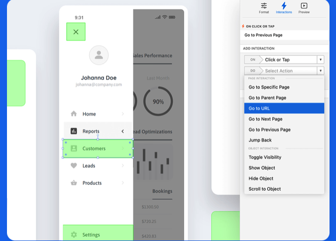
Moqups offers more than 100 templates of diagrams, charts, wireframes, graphs, UX flows, and frameworks. This means you don’t waste time reinventing the wheel for each project. You just apply the template, then customize it using a drag-and-drop interface.
There are thousands of elements you can add to any design. Choose from UI shapes, icons, stencils, and more, including Google’s Material Design. There are also frames for both iOS and Android devices.
Design reviews are simplified with Moqups’ callouts, annotations, and sticky notes. With these tools, designers can leave instructions, reviewers can leave feedback, and everyone has a holistic view of the design process in real-time.
Since Moqups is another cloud-based solution, everyone on the team can work right in their browser, whether they’re on macOS or Windows. And Moqups connects to Slack, Dropbox, Trello, Google Drive, Confluence, and Jira to give you a fully-integrated experience. Once you create a UI design element, it automatically syncs across your entire project. This means your entire project is always up to date.
All users can have full access to edit files, leave comments, and share. Alternatively, you can assign team roles at the user level to set guardrails as needed.
Moqups is a really easy tool to use, but that doesn’t mean you won’t hit a roadblock now and then. Support-wise, Moqups offers live chat, a well-fleshed out help center that’s easy to navigate, and a FAQ section that covers the basics.
Pricewise, Moqups is one of the least expensive options on this list. There are four plans to choose from, including Free, Solo starting at $9 per month, Team starting at $15 per month, and Unlimited starting at $40 per month.
Give Moqups a try for free today.
Sketch: Best for Mac Users
Sketch is a multi-purpose design and prototyping tool that bills itself as made by designers, for designers. Which explains why you can only use Sketch in the Mac ecosystem. Since most designers use Apple products, this is most likely a non sequitur. But if you’re an outlier designer using something else, Sketch isn’t going to work. For everyone else, read on.
Sketch is the closest competitor to Figma on this list. It offers design, collaboration, prototyping, and developer handoff features. This makes it a very strong end-to-end design tool.
Its prototyping functionality includes a very intuitive user interface that eliminates bloat in favor of creating a prototype quickly with just a few clicks. Interactive features include toggle effects like hover and press, hotspots, interactive overlays, a Smart Animation function that lets you add life-like movements, multi-directional scrolling, animated transitions, multiple starting points, and more.
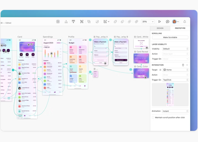
You can preview prototypes in your browser, the app, or on an iOS device, and adjust sizing to fit any scenario. Sharing is simple. Just copy the link from the prototype preview window, then send it to whoever needs to see it by email, chat, AirDrop, or other means. Collecting feedback is easy, too. Comments can be left directly in the prototype, eliminating the need to shift back to working files to leave feedback.
Collaboration is also easy with Sketch. You can share a workspace, and collaborate in real-time. You also have total control over the who, what, and when of sharing. Any changes made are synced in real-time, meaning the latest and greatest version of any workspace is available to everyone right away. You can also share libraries and components and create templates from any artboard.
Sketch excels in design features and functionality. There is vector editing, variable and OpenType fonts, reusable artboard templates, scalable design systems, and a user interface that looks and feels exactly like working in any other native macOS application.
When designs are ready to be handed off to the development team, Sketch makes it easy–even if the developers don’t work in macOS. Developers can inspect designs, get tokens, work with design libraries, leave comments, and download assets from any computer, and it won’t cost extra for this functionality. Sketch offers it for free.
Sketch offers a few different pricing options targeted to different users. For solo designers, the annual plan for $120 gives you a single Mac-only license and includes one year of updates. There are also two monthly subscription options available. The Standard Subscription starts at $10 per month (billed yearly), and the Business Subscription starts at $22 per month (billed yearly).
Sketch doesn’t offer any free options, but there is a 30-day free trial when you sign up for a paid plan.
Justinmind: Best for Beginners
Not everyone who needs a prototype is a superstar designer with decades of experience under their belt. That’s where Justinmind comes in.
It’s a straightforward prototyping tool with a very intuitive user interface, and lots of features specifically designed with beginners in mind. The goal is to help anyone create high-fidelity designs without relying on a single line of code or design expertise.
Justinmind works on both macOS and Windows systems, and offers everything needed to create beautiful designs. There are tools for vector design, wireframes, and more than 4,000 interactive components you can download via predefined UI kits. These kits are grouped by operating system and functionality, so you can pick and choose exactly what you need depending on your project.
When it comes to creating prototypes, Justinmind gives you all the interactions needed to create the full user experience. Mouse, keyboard, and gesture functions are available, as well as variable loading behaviors. You can add conditions, sequences, transitions, and effects, too.
You can easily design mobile app prototypes using actual gestures like rotate, swipe, and pinch, that simulate real-world performance.
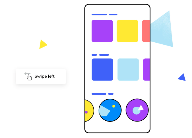
One of the nicest features is Justinmind’s emulators that let you view simulated prototype behavior while you design. It sounds complicated, but it’s not. Justintime’s simplified Navigator interface makes it easy. You can also test on any device using the Justinmind mobile app, and design prototypes that display perfectly on any screen size or orientation.
Collaborating is simplified with one-click sharing. Users can comment and chat with each other in your online prototypes in real-time. You can even define user roles to manage access. Developer handoff is also easy since developers can view and copy CSS styles, export assets, and view specs all from the prototype.
Justinmind offers an array of subscriptions or perpetual licenses. Subscriptions include Free, Standard starting at $9 per editor per month, Professional starting at $19 per editor per month, and Enterprise starting at $39 per editor per month. Perpetual licenses are $295 per editor on the Standard plan and $455 per editor for Enterprise plans.
Get started with Justinmind for free today.
What Matters Most When Reviewing Prototyping Tools
This is the criteria we used when researching our top picks for this list. It’s also the criteria we’ve personally used when choosing a tool for our own prototyping needs. All might not be relevant to you. But these four pillars provide a great framework as you move ahead.
Project type and goals
What it means: Figure out what your project needs are before choosing a prototyping tool. Straightforward projects with simple needs usually call for vastly different solutions than those with highly complex, high-profile demands.
Why it matters: Picking a prototyping tool jam-packed with advanced features and functionality might be overkill for your current project requirements or skill level. Like shooting a fly with a cannon, picking the wrong solution will leave you with a lot of unused resources and will probably hit your bottom line in a shocking way.
What to look for: Find the sweet spot where functionality and cost align closest with your project needs. If you just want a quick, low-fidelity prototype and nothing more, skip the all-in-one tools and focus on the precision tools designed to give you quick results with minimal input or expense.
Pricing
What it means: While we never advocate choosing a tool based on price alone, there is a reality-check that should be done before you go too far down the rabbit hole. Factors like team size, budget, and project type should guide you here. There is no one-size-fits-all approach.
Why it matters: Freelancers and smaller design teams have vastly different budgets than large design teams at enterprise-level companies. The good news is there’s a prototyping tool aligned with every designer’s needs and budgets.
What to look for: When you’re scouting for a prototyping tool, check out the pricing options early on. No matter how amazing a tool’s functionality is, if it will break your budget, you’ll eventually have to cross it off your shortlist. Better to find that out before you invest too much time falling in love with a cost-prohibitive tool.
Ease of use
What it means: You want to find the tool that strikes a balance between two things–being relatively easy to learn/use and powerful enough to meet business goals.
Why it matters: Choosing a tool that is hard to learn or use creates frustration all around, especially as team size grows. Of course, there’s always a learning curve when introducing a new tool to anyone, but some prototyping tools are easier to learn than others. That’s just a fact.
What to look for: Try a demo of the tool to get a feel for it. If you manage a team, have a few hand-picked team members give it a go, too. Also look at what’s available for free educational videos, help articles, and support options. Resources like these will help those struggling with the tool to get up to speed quickly.
Tool capabilities
What it means: Not every tool does everything well. Some tools focus on collaboration, others on ease of use, still others on working across multiple operating systems. PIcking the best prototyping tool starts by understanding how well any contender meets your project needs.
Why it matters: Choosing a tool that doesn’t meet your biggest priorities means you’ll either struggle using it or end up back at the drawing board choosing a different solution. Both cost you time and stress.
What to look for: When you’re considering a tool, ask yourself a few questions. How well will it help you create prototypes that meet your project goals? Who do you need to collaborate with? What operating systems, devices, and tools do you already use? Choose a solution that best answers your questions.
How to Get Started with Prototype Testing
Every new prototype starts with a need. A new product is being developed, an existing product is getting an upgrade, or a problem must be fixed. Getting efficiently from need to solution means choosing the best prototyping tool for your needs. Here’s how to do that:
- Identify your needs and goals. Starting any journey without a roadmap usually gets you lost. Define your needs, clarify your goals, and only then move forward.
- Find the tools that best meet those needs. Armed with your roadmap, find the prototyping tool possibilities that tick all the most important boxes. A tool falls short? Relegate it to the “thanks but no thanks” pile.
- Create your short-list. Your goal here is 3-5 serious contenders. More than that usually mires you in confusion, fewer might leave something great out altogether. You want the top options that merit additional investigative effort on your part.
- Dive into demos and free trials. Get your hands dirty. Jump in and play around. It won’t take long to know if this is the right tool for you and your team.
- Crowdsource data. Ask the contacts at your short-list contenders for customer referrals. Do some internet sleuthing on sites like G2 or Capterra. Even a simple Google search will likely turn up helpful information about each brand.
- Make your final pick. All the legwork finally paid off. It’s go time. Sign up, roll it out, and start building the prototypes you need.
If you complete all these steps and find Figma as your top choice, you’re not alone. With exceptional collaboration features, a device- and platform-agnostic approach, and plans to align with every team size and budget, Figma is a solid all-around prototype tool option.
Get started with Figma for free today.


