Free is just about everyone’s favorite word. So, we compared the best free web hosting options available for you. 75 hours of research and hundreds of reviews later, we unearthed what really matters to folks looking for free web hosting. In the end, Wix is the best free hosting for most people. Getting started is effortless and it comes with a flexible site builder and a massive amount of reliable features you’d have to pay to get from others.
The Best Free Web Hosting for Most
Wix
Best for Most
With a free SSL certificate, dozens of templates, and an intuitive website builder included, Wix provides the most features and customization options of any free web hosting platform.
It’s almost unbelievable how amazing Wix’s free web hosting solution is. But then you see how many people use it and know they can’t all be wrong. With Wix’s no-cost website builder, you get free hosting included, alongside over 970 designer-created templates.
But they don’t stop there. Wix gives you so much that you’ll think, “C’mon, when is the bill coming?” But it never does. You get automatic backups, SSL protection, and some of the fastest load speeds in the free hosting category, among many other great features.
The Best Free Web Hosting Options to Consider
- Wix – Best for most
- Square Online – Best for selling what you love online
- InfinityFree – Best if you want to use WordPress
- Weebly – Best for simple personal websites
- Strikingly – Best for single-page product launch websites
When It Makes Sense to Invest In Free Web Hosting
How did you feel the last time you got something of value for free? It’s rare, but not impossible. If you’re creating a website or online store and need to keep costs low, free web hosting is a great option.
And you can find incredible value if you know where to look. Crazy Egg to the rescue.
Most people consider free hosting when they have an idea for a site and maybe did a little research on shared hosting. Now, they want to see if there’s any free way to get the same results.
Most look for plans that fit their needs then figure out how to build their site on that host.
But for simpler needs, you can employ a different approach一find a good website builder that throws in web hosting for free. This is the basis of free web hosting.
However, there is one exception in our reviews, as you will soon see below.
Now, we all know the truth of “you get what you pay for.” With free web hosting, it’s no different.
The fact is, if you’re planning on creating a growing site that’s expecting a lot of traffic, you’re better off going with a paid hosting plan from the likes of affordable providers like Hostinger, DreamHost, or GreenGeeks.
For small projects, landing pages, small local businesses, or other simple website needs, then the free route can work for you. In brief, free web hosting only makes sense for a small group of websites.
And, if it’s your first time creating a website and you’d like to experiment with free hosting options first, then just about anything we recommend on this list can do the job.
#1 – Wix — The Best for Most
Wix
Best for Most
With a free SSL certificate, dozens of templates, and an intuitive website builder included, Wix provides the most features and customization options of any free web hosting platform.
Overall Score: 3.8/5
Wix gives you the fastest way to build a reliable and functional website free of charge.
Aside from a web store (which you have to pay for a Wix plan to build), you can create just about any type of website. From an online portfolio or event page to gather RSVPs to a simple business site or blog, Wix makes it easy to build and kicks in free web hosting to boot.
Plus, you get full design freedom with one of the most flexible drag-and-drop editors we’ve seen. That, combined with Wix’s 976 site templates, make it hard to end up with the same look and feel as other sites in your industry.
Let’s look at how well they did on all our tests.
- Functionality: 3.5/5
- Ease of use: 4/5
- Templates: 4/5
- Design flexibility: 4/5
- Limitations: 3/5
Functionality: 3.5/5 – Wix gives you way more than you’d ever expect in a free plan. It comes with a wide range of built-in business tools, including 29 in-house apps, 18 of which are completely free.
When looking at functionality, Wix ticked off three and a half of our five boxes. The free platform supports payment processing for invoices, marketing tools, event management (minus selling tickets), and basic menu features for restaurants.
The thing with Wix’s payment processing, though, is you can’t accept online payment for ecommerce products, but you can create up to five recurring payments via invoice for any services you offer.
So we gave Wix half a point for this.
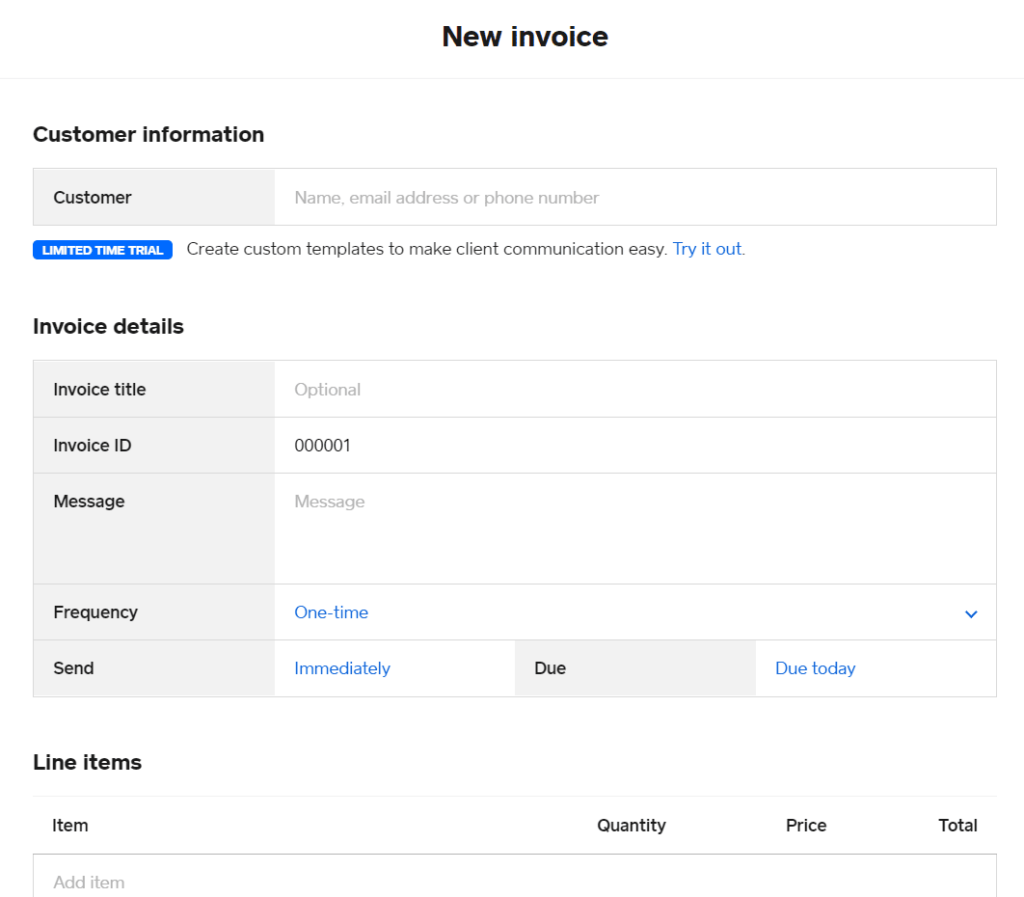
To create an invoice, all you have to do is click on Finances in the left-hand sidebar of your dashboard, then click Invoices. From there, you can manage your existing invoices and create new ones.
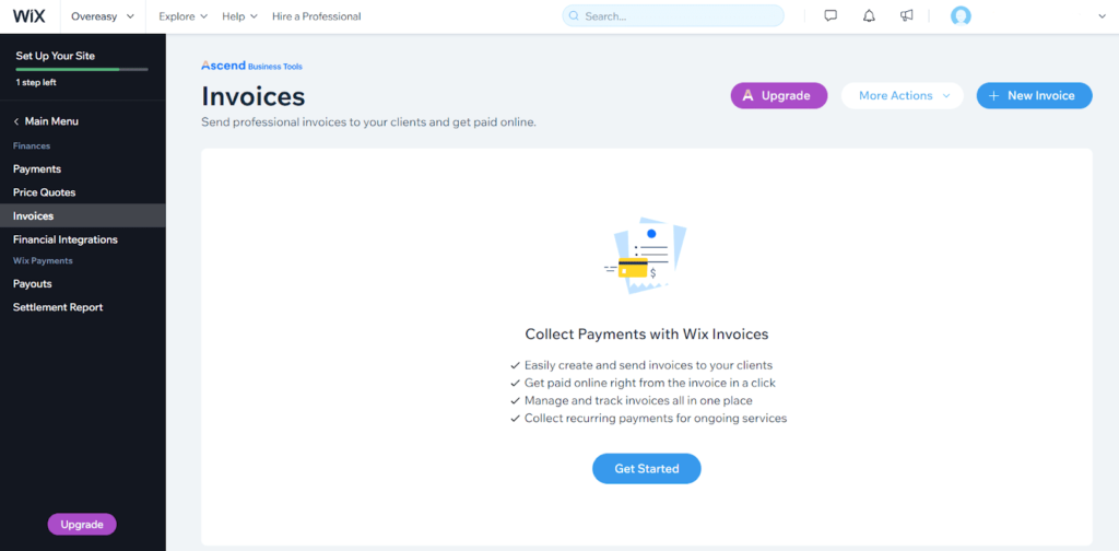
You can choose from a single payment—with an issue and due date—or a recurring invoice.
Wix also gives you built-in marketing tools like its robust blogging platform, free email and social media tools, a chat box for customer support, and basic video creation.
Wix is very clever in making sure you don’t have to look elsewhere to market your website effectively. And all the tools are ready for use from day one.
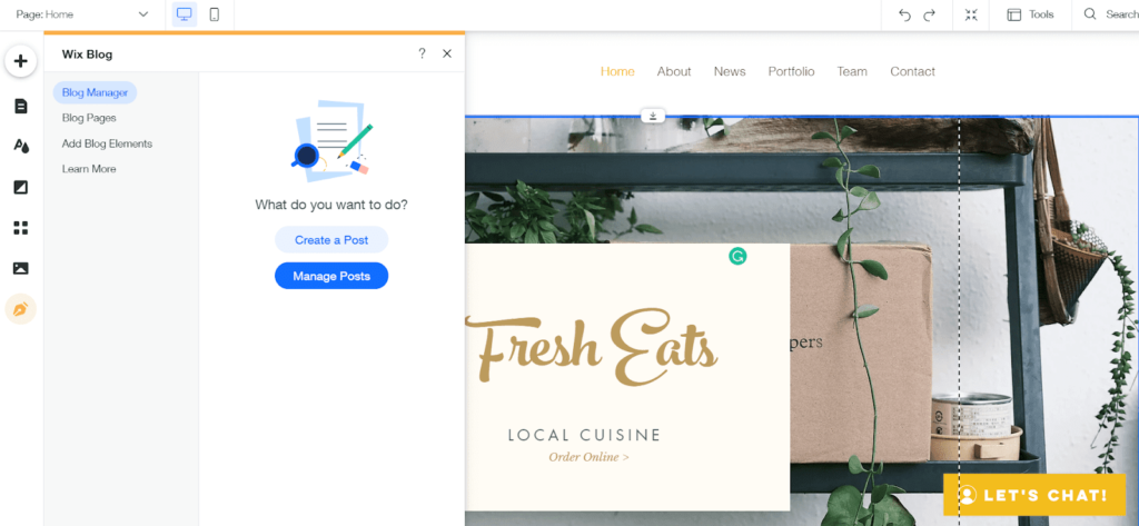
The blogging platform is flexible, easy to use, and customizable. You can decide how your blog posts look, add new posts, edit and manage them, and customize your blogroll. They also have some layout features that let you categorize your posts.
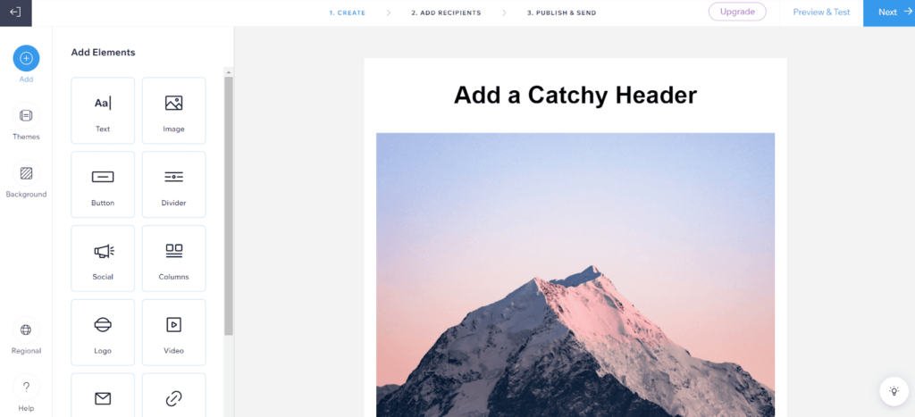
Moving on to email marketing, you can send up to three campaigns and up to 5,000 total emails per month. Since you’re on the free plan, all of your emails at the bottom will have “Created with Ascend by Wix.” It’s a little tacky, but not too distracting.
The free plan comes with a drag-and-drop email builder, so you can easily create beautiful emails in a few minutes with the pre-built templates they give you.
When it’s time to build your reputation on social media, Wix’s social media features include a drag-and-drop post builder (similar to Canva) where you can create social media posts for different platforms.
You can even publish them straight to Facebook, Instagram, and Twitter right from Wix. You get up to three per month on the free plan.
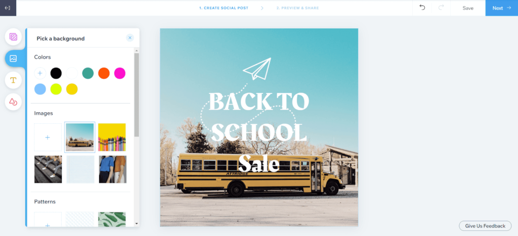
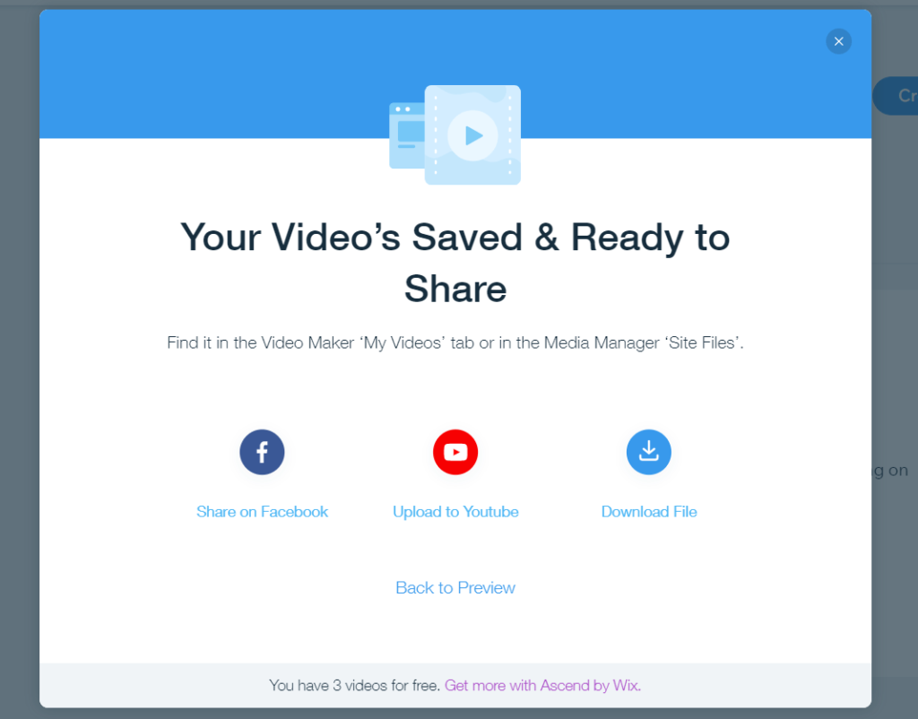
The last few stand-out features are the video creator, event management, and restaurant menu builder. They all are more than enough if you want to create something basic.
The free plan lets you create up to four videos for free, download them and use them wherever you want. Put it on YouTube or Facebook or add it right to your website. The choice is yours.
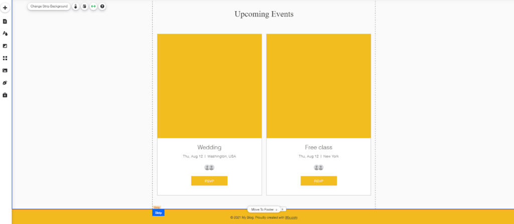
Wix also helps you with event management. If you host parties, weddings, or other RSVP events that are free to attend, Wix’s event management features are more than enough.
Just add the Wix Events app to your site. When you do, you get a new option in the site editor to add an upcoming events section.
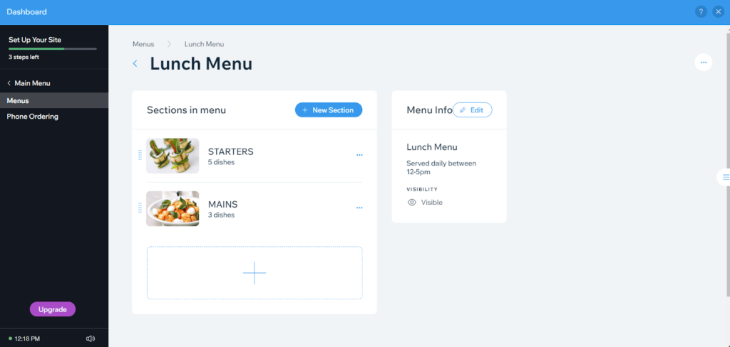
And if you’re in the restaurant industry, you can quickly set up a menu for your visitors to feast their eyes on.
Wix’s free plan includes a menu builder. But, to be clear, your visitors can’t order online or pay you online. Unfortunately you can’t make reservations either.
To set it up, add the Wix Menu app to your site inside the editor. Once you’ve added it, you can start customizing your menu. You’ll start with a demo menu that you can either delete or update to match your own.
In the end Wix gives you so much functionality for free, you’ll wonder how they make any money at all.
Ease of use: 4/5 – Wix is incredibly easy to use. The only reason they didn’t score a perfect 5/5 is because it’s not immediately clear what features you can and can’t use for free. It’s really easy to add a paid app by accident. We actually give you details about this in our customer support experience below.
As we went through the process of setting up our test Wix site, we focused on every little thing to pass our findings on to you.
When you first log into your dashboard, Wix has a getting started guide you can follow step by step. That makes your life so much easier when you set up your site..
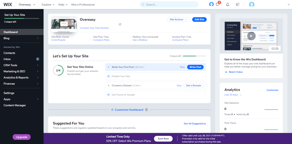
What’s great about this dashboard is you can add special applications right within it that add new functionality. Include a podcast player, website search, or menus for your visitors to use when they arrive on your site.
And when you do, they are also added to the getting started checklist. So, you get instant guidance when you apply the new apps一you’re not left in the dark on how to implement and use them.
When using the editor itself, there are a few quirky things we found. One is sizing your sections一it’s not automatic and you have to drag the edges of the section up or down to size them. But, it’s nothing you won’t get used to in a few minutes.
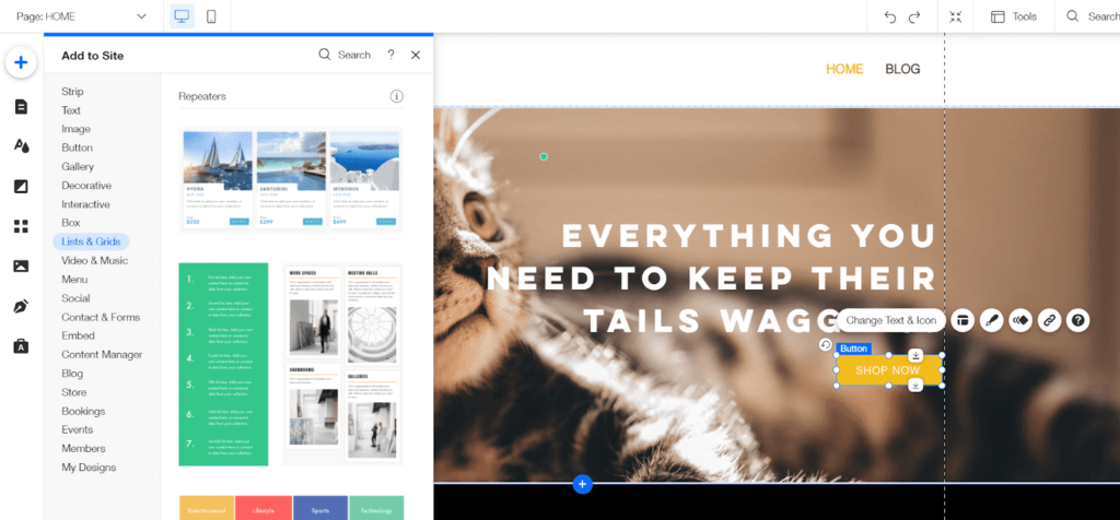
Here’s what the editor looks like:
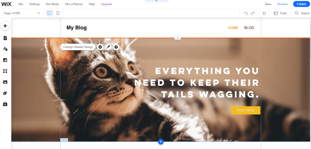
You can move elements anywhere you’d like by clicking and dragging them.
To change an element’s design, all you have to do is click on them. After doing that, you’ll see a small menu appear that lets you open up an additional customization box.
Depending on the element you’re editing, the customization box will have different options.
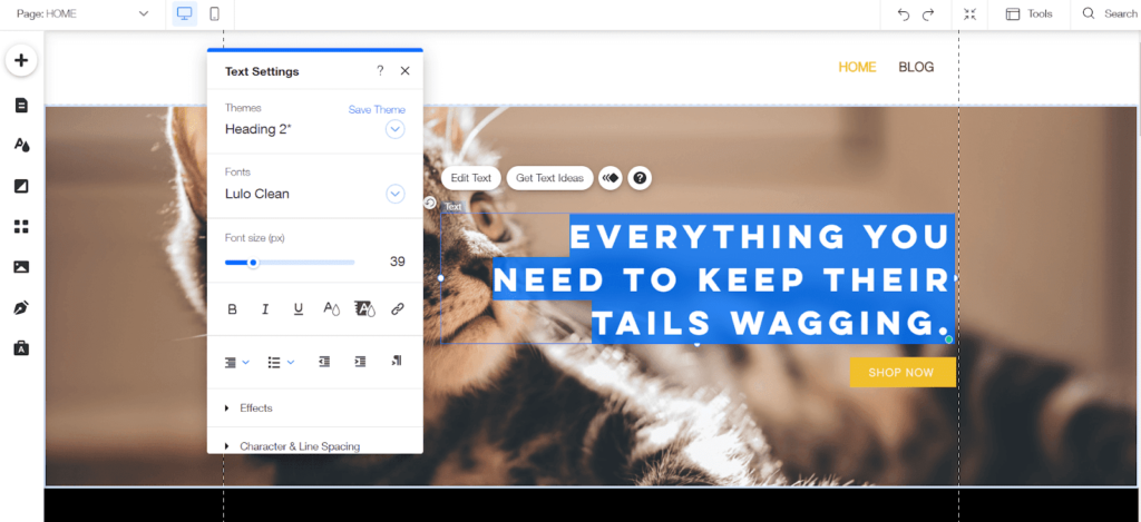
You can easily edit anything on the page individually or use the global color and font options to change your entire site in a few clicks.
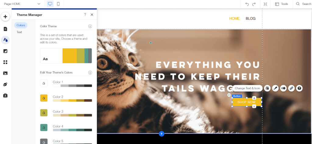
To add something new, just click the plus sign in the top left corner. From there, you can choose from hundreds of design elements and add them to your site in one click.
There are numerous prebuilt sections that look great out of the box, such as homepages, contact sections, and color schemes that are ready to use with zero tweaks needed.
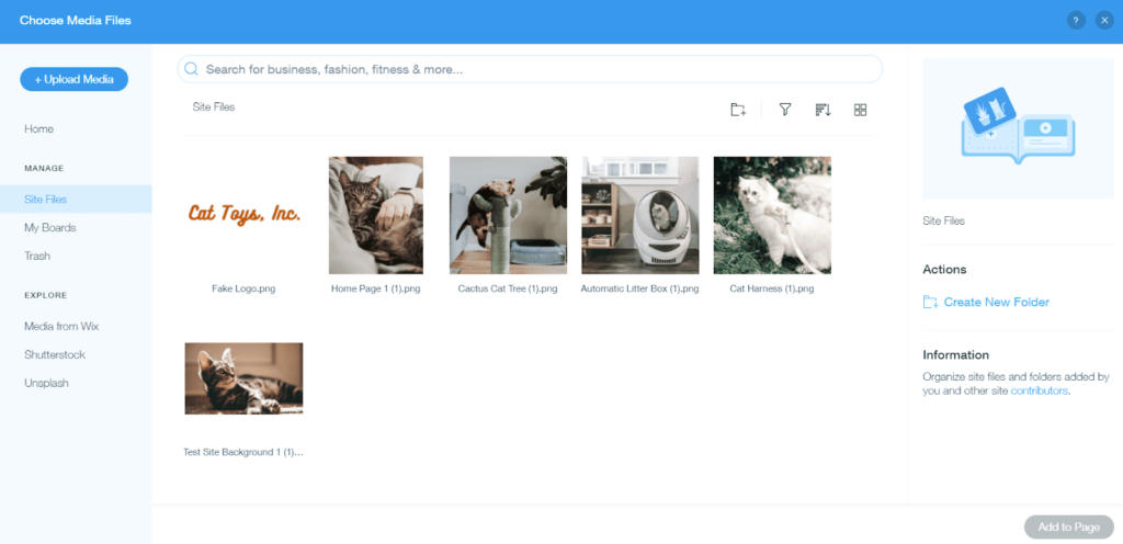
Managing your site media is simple, too.
You can access the Wix media file manager from the site editor or when you want to add an image to your site. It stores all of the files you’ve uploaded in the past so you can easily access them again and add them elsewhere.
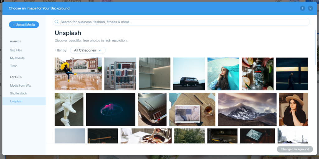
Wix is fully integrated with several stock image sites. Without leaving your editor, you can search through Wix and Unsplash for free images. You can also use Shutterstock for more professional image options. Just keep in mind you will have to pay for them.
When you need help because something isn’t working, Wix gives you a massive library of tutorials, guides, and videos to show you everything you need to know about the editor. You can even access these tutorials right from the editor itself.
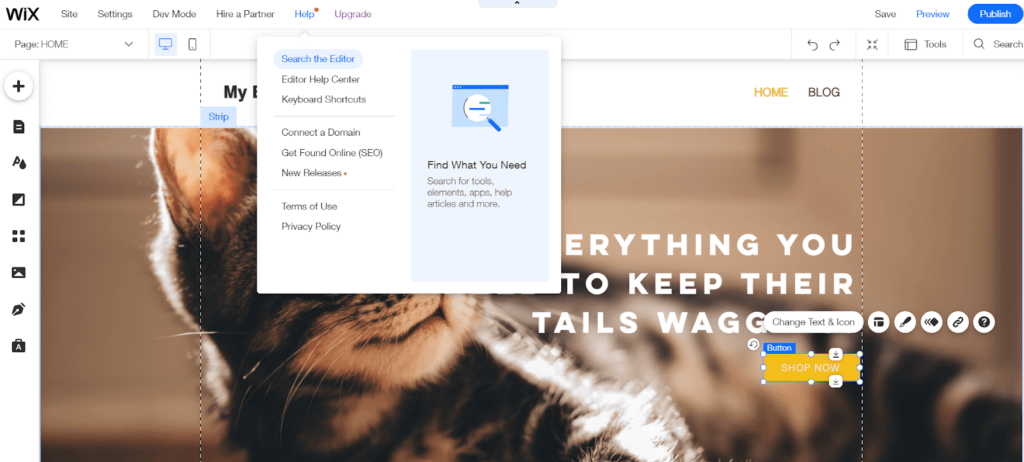
The knowledge base is extensive, covering a wide range of topics and frequent issues or questions.
See for yourself:
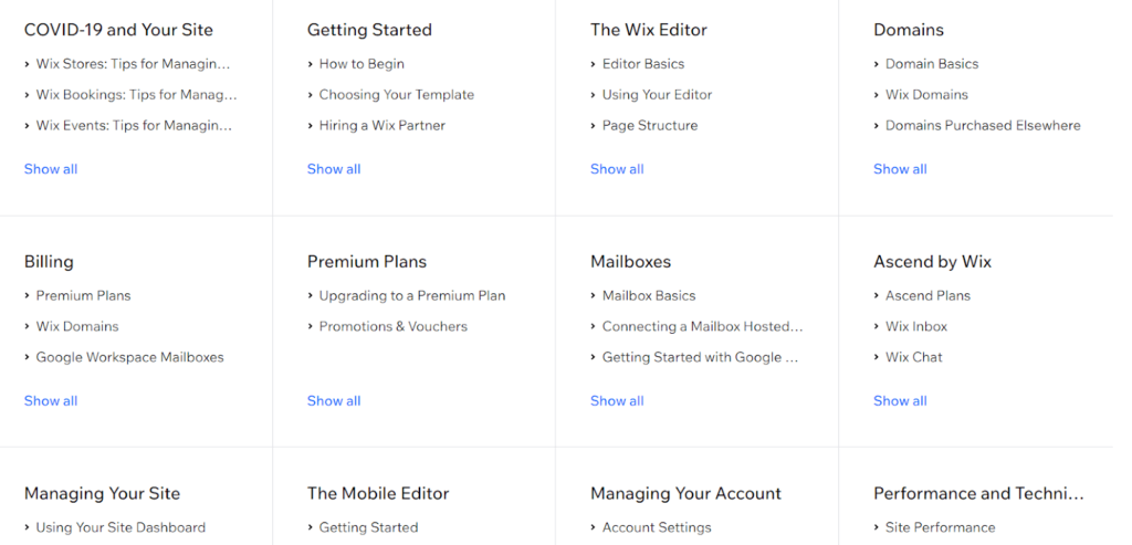
If you need further help or can’t find what you need there, you can contact Wix support and request assistance via your preferred communication method.
When testing the menu capability, we accidentally added the paid ordering feature and it wasn’t apparent how to remove it afterward. So, since we needed to test on only free elements (and didn’t want to get charged ourselves), we reached out to Wix support for help.
Wix’s support was helpful, answered our questions within eight minutes, and they didn’t try to get us to upgrade to a paid plan
Despite the service being free, we were surprised at how fast a rep connected and how friendly and helpful they were.
Templates: 4/5 – With a ton of high-quality templates to start from, Wix only lost one point for this section because switching templates is not simple and easy.
Once you start with one, the only option is starting over if you want to use a different template. If you want to explore different templates, you can’t easily preview or switch from one to another.
The good news is that you can create a new site without deleting your current site. So, you can choose a new template and then copy and paste the content from your existing site to the other if you want to test a different look out.
And you won’t run out of options to try. Wix gives you 976 templates to use, all free to use.
If you think you’ll get confused or overwhelmed by choices, don’t sweat that either. There are tons of filters and drop-down menus to help you sort through them and find the best options for the type of website you want to build.
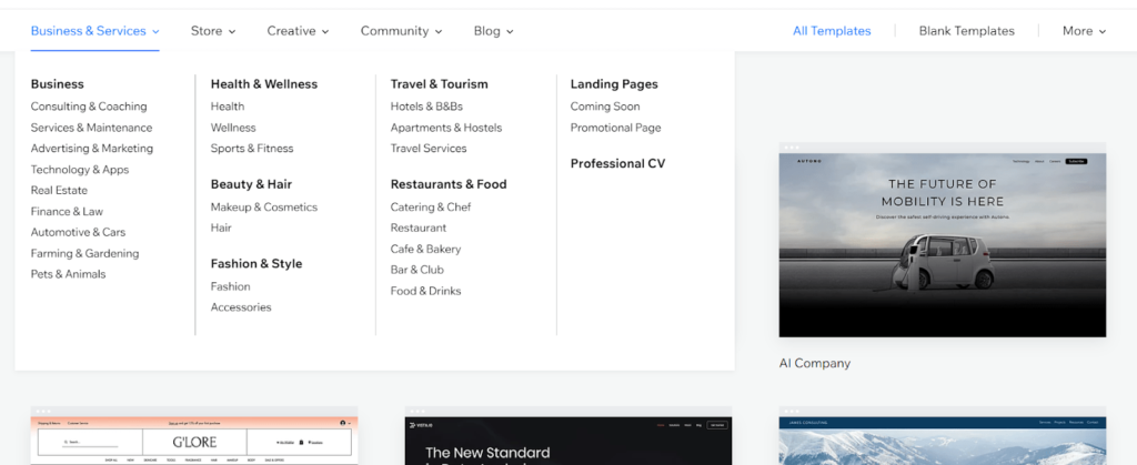
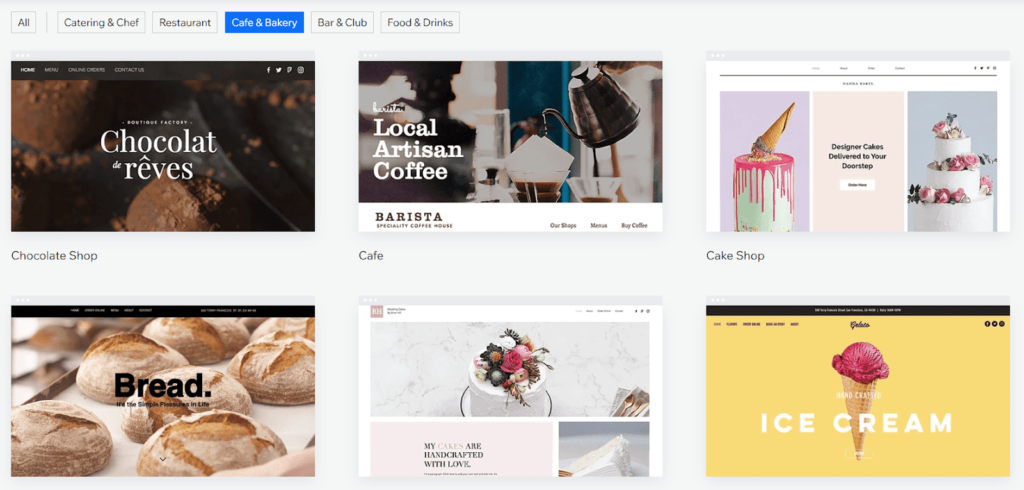
We have yet to find a template we thought looked bad. You are not sifting through designs from the early 2000s. These are crafted with today’s best practices that ooze style.
Here are a few examples of templates for cafe and bakery sites:
And six more from focused on coaching and consulting:
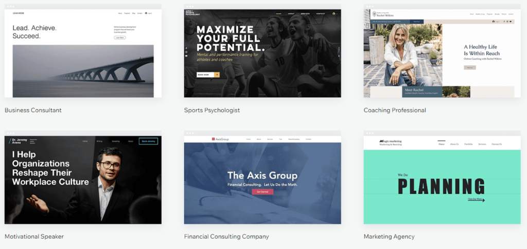
They’re all very distinct, no templates appear to be fundamentally the same as another with just a new picture and color scheme. These are really tailored to different needs and industries.
What is even better than having all these template options? Being able to make them your own with customization.
All you need to do is hit the edit button and you can drag and drop and add and subtract from them to meet your standards.
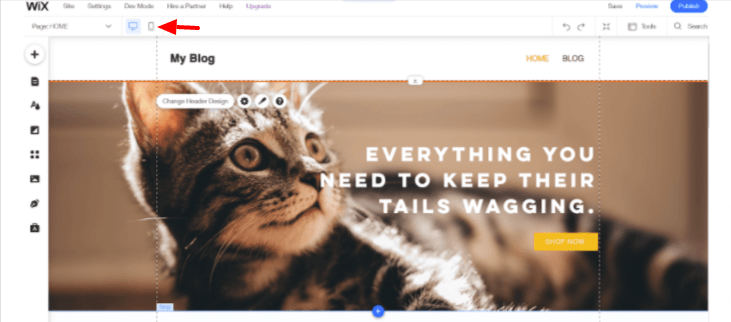
One thing that makes Wix stand out from the other page builders on our list is that you get full control over how templates look on mobile. And while they look great out of the box, you can make small tweaks to really squeeze the beauty of these templates out even further on mobile device displays.
To switch to mobile editing, all you have to do is click the mobile icon at the top left of the editor.
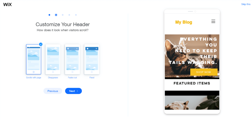
When you first open the mobile editor, you’ll have the option to change your mobile header. There are four options to choose from. You can also position your quick action buttons, place chat and Facebook Messenger, and enable or disable a back to top button.
After that, you can start editing your mobile site with just as much ease as your desktop version without worrying about changes affecting your desktop site.
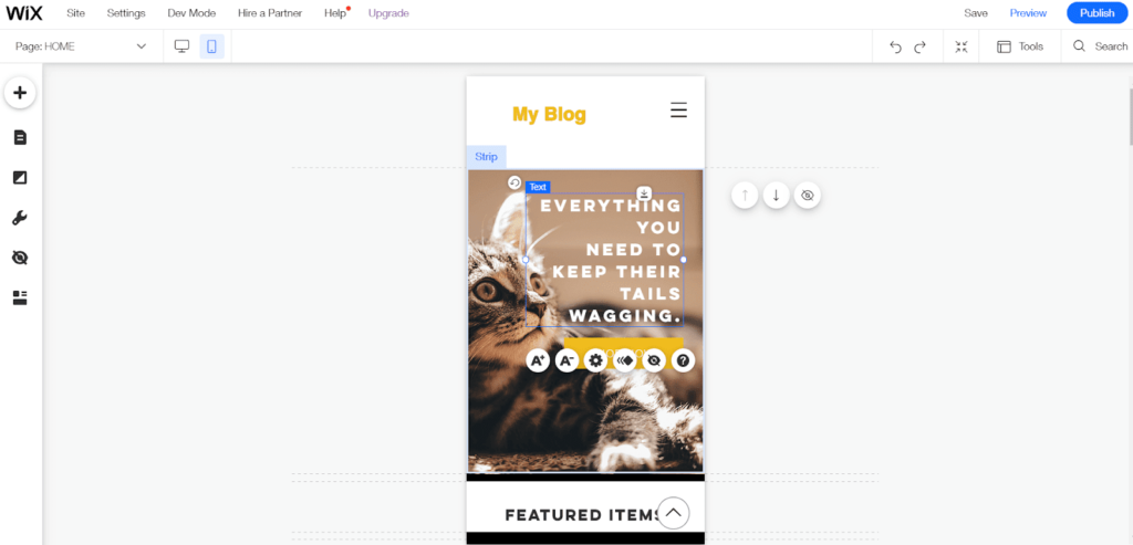
It’s marvelous how simple this is. Your site on mobile will be a user experience dream, even if you have no experience with mobile website development.
Design flexibility: 4/5 – The design flexibility of Wix is exquisite and can be seen from the moment you start using the editor. They only lost a point because there’s no option to edit a theme’s code.
But that’s no big deal for most users, who don’t even want to bother with coding elements anyway.
Manipulate the size, color, and location of elements easily. Wix even lets you make site-wide adjustments to design with the click of a button.
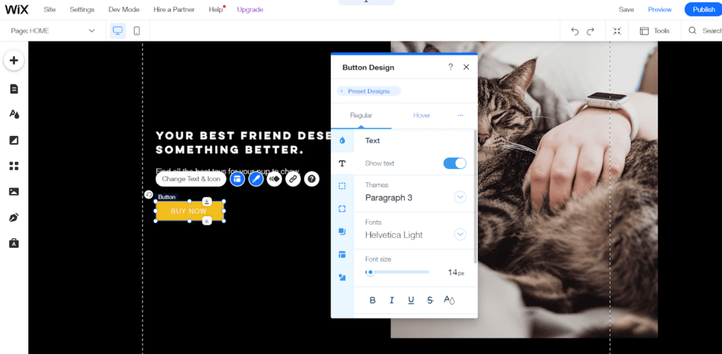
Wix is the only page builder on our list that doesn’t have predefined columns or snap-to locations. You can create your own overlaps or other custom design elements. You have full control over where things go.
You can even create your own reusable layouts and sections that you can add to other pages of your site.
Wix is also one of the few options that lets you upload and use premium fonts or custom-designed fonts for free. There are not many providers that allow you to do this for free.
To upload them, go to the theme manager section of the editor (the “A” symbol that’s two icons below the plus sign). Click on Text. Then, click on whichever type of heading or text style you’d like to change.
You can upload a custom font for any of them. After the customize box opens, click the blue drop-down arrow next to the current font name. From there, you’ll see the option at the bottom to upload your own font.
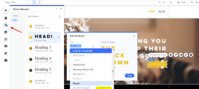
Now, you don’t have to accept plain and boring looking fonts for your site or have to pick a template based on the fonts it uses. It gives you an easy way for your site to look like no one else’s, even if they’re using the same theme or template. Plus, you can truly match fonts to your brand identity if your site is for a business or organization
Limitations: 3/5 – Among all the great things Wix gives you, it is a free plan. So it inherently comes with some limitations.
The biggest downside to Wix is not being able to connect a custom domain name to your free plan. This is more common than not with free hosting and site building platforms.
You also can’t upload and use your own favicon, that little icon visitors see on their browser tab..
Wix puts one ad at the top of your website, which does give away that you’re using a free plan..
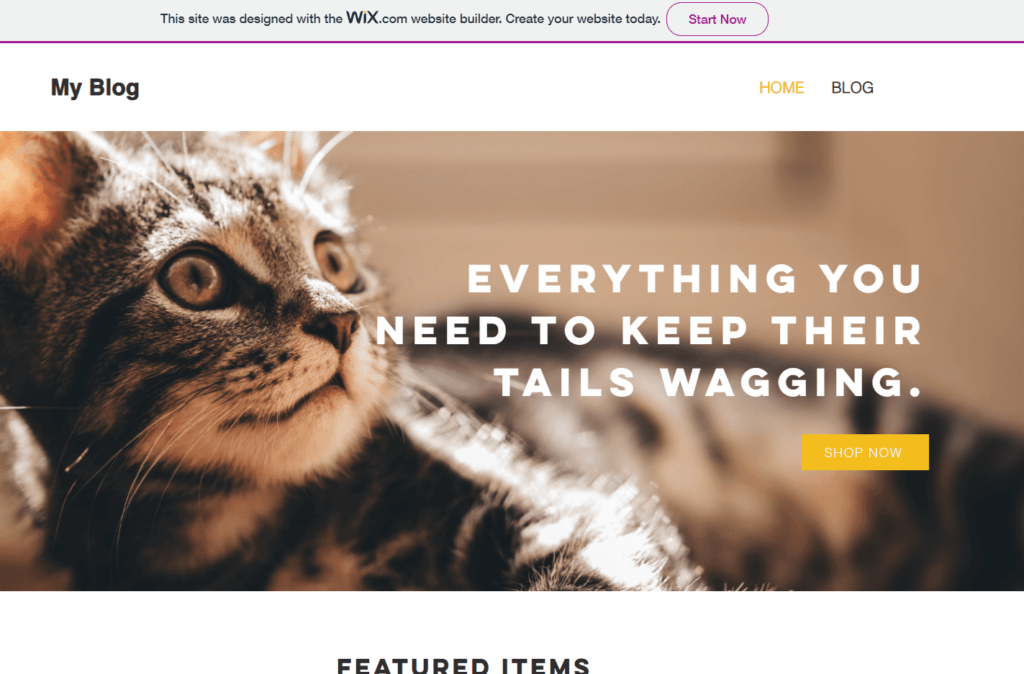
Another key limitation is that there is no option for ecommerce on the free plan.That’s disappointing, but you can’t get everything for free. It’s also pretty common in this category. You either get no ecommerce support or very limited site-building features.
You also only get 500 MB of storage space. That’s not a lot.
So, even though you have no limit on the amount of pages you can build, keep in mind your storage is very limited. You can’t go wild with videos on your site, for example, with only 500 MB of storage.
Also you might have to clean your media library from time to time to free up space. Both are nuisances but not total deal breakers unless you’re, say, a visual artist who wants to post tons of images and videos.
On the plus side, Wix doesn’t interfere with your dashboard with any ads.
Often, speed is a limitation with free web hosting that comes with site builders. Wix has a stellar built-in caching program that makes your site faster. That’s only enhanced by the many data centers they have around the world, with servers running AWS and Google Cloud for extra-reliable load times and uptime.
Our test site loaded in less than one second on average—840 milliseconds, to be exact. That’sreally fast for free hosting.
Here’s a screen grab of our first speed test:
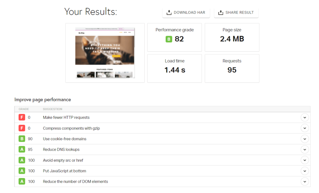
The site hadn’t been cached yet since this bot was the first visitor, so this instance was well over one second. The next two speed tests returned load times of 630 and 440 milliseconds.
So, after the site was cached, it loaded much faster.
Since the average time was under two seconds, Wix scored a point for this.
One thing Wix does suffer from is the clarity on what you can and can’t do on the free plan. You have to dig and play around with different features to figure it out.
So it would be nicer to have a list clearly showing you what is free.
In conclusion, if your site stays small, you don’t expect thousands of visitors per day, and you don’t want to sell anything online, you can use Wix’s highly flexible free plan forever and get a great site out of it.
#2 – Square Online — The Best for Selling What You Love Online
Square Online
Best for Selling What You Love
Use the biggest name in payment processing to build a site for free on free web hosting. Sell products and services, event tickets, and much more in an easy-to-use site builder.
Overall Score: 3.1/5
Selling things online used to be so hard. Not anymore.
You can use Square Online to get started and get your share of the massive ecommerce space.
You can sell your services or products online and pay lower transaction fees than before. How low? Well, Square Online offers the lowest transaction fees for ecommerce on our list and allows you unlimited product sales.
Put another way, they are the best if you want to accept payments for anything like food, products, services, and tickets.
Here’s what our research found out about them.
- Functionality: 4/5
- Ease of use: 5/5
- Templates: 2/5
- Design flexibility: 1/5
- Limitations: 3/5
Functionality: 4/5 – Square offers the most functionality across all the free hosts we tested. We were pleasantly surprised with how much you can do with this platform.
Out of the five major factors we tested for, built-in marketing tools is the only thing missing from the bunch.
This really hits a nerve, though. Yeah, you can build a web store for free, but you’re on your own to market it.
But Square is the gold standard for processing payments and sports some of the lowest transaction fees out there一2.9% plus $0.30 per transaction for online payments.
With Square Online’s free site builder, you can list as many products as you’d like.
Plus, it automatically syncs with Square POS (point of sale). For those of you who also sell in-person or have a retail location, this makes it easier than ever to consolidate sales into one platform and manage inventory from a centralized location.
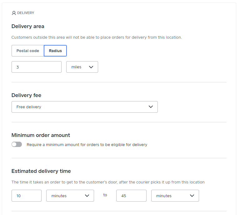
You can offer multiple delivery types on your Square online store, including delivery, shipping, local pickup, and even on-site mobile ordering for restaurants. Configuring all of these settings is very easy and takes just a few minutes.
If you want to offer online ordering within your business, you can easily set up custom QR codes, print them out, and place them at tables and seats. From there, people can scan the QR code, order, and pay entirely online, thus reducing close contacts in a public setting, which is a huge bonus at the moment.

You can even create invoice templates to create invoices lighting fast. And you can edit that template on the fly if you need to. Square really makes this amazingly simple.
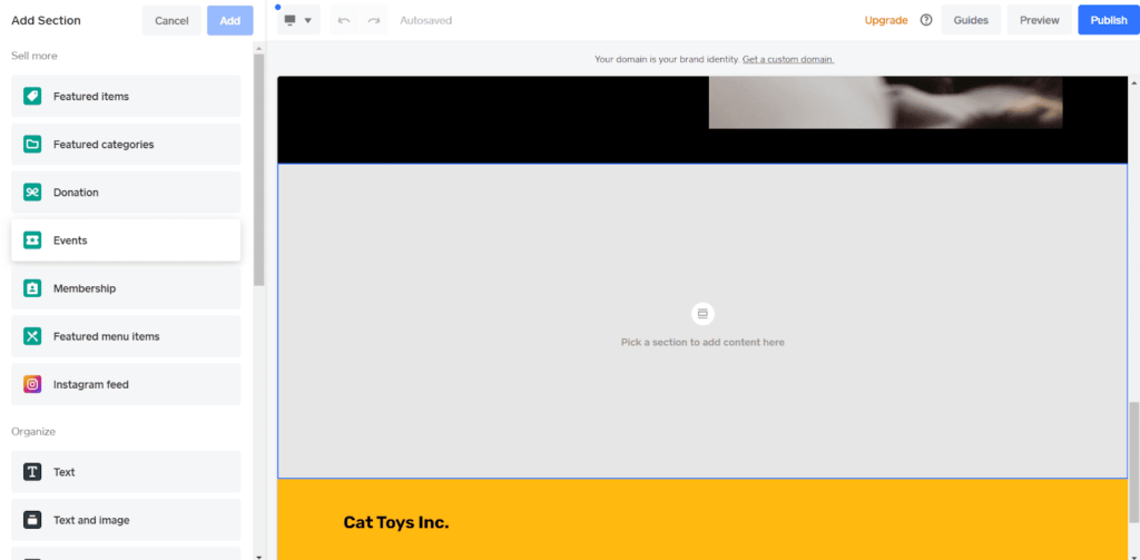
For event management you can add events to your Square Online site from the editor.
To do so, add a new section to a page and select the event option.
You can choose from two layouts: columns or rows. Both look great, so it’s just a matter of preference.
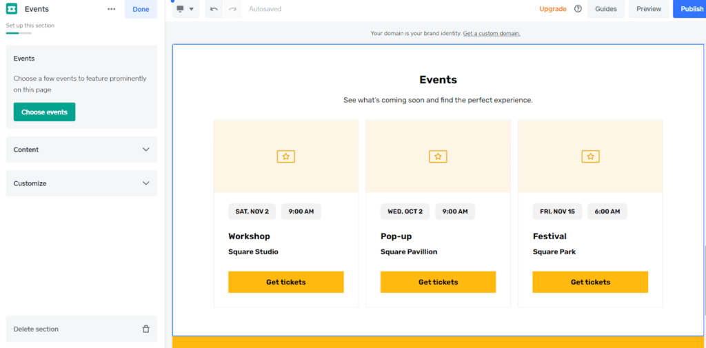
After you’ve added it, you can import and manage your events by clicking on Choose Events.
Square is the best free option if you want to sell tickets to events and accept payments for those tickets online, hands down.
Another piece of functionality we love is how you can easily set up booking appointments from the editor.
All you need to do is open the drop down menu in the top left corner and click + Add Page under the Standard Pages section. Click on Appointments and you can add it to your navigation menu.
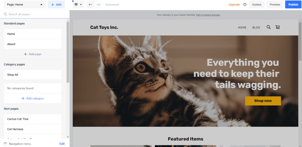
Now, you have a new page where visitors can book appointments with you.
What is disappointing about Square Online is the lack of marketing tools available. Square comes in subpar in this area. In fact, the only thing you can really do on the free plan is edit basic SEO settings.
We would have liked to see more options, like built-in email marketing tools or automations to add to your checkout like upsells
All in all, the functionality given to you in Square Online’s free plan is outstanding. There is a possibility you never have to pay for extra service, which is why Square Online scores the highest in functionality for all the hosts we reviewed.
Ease of use: 5/5 – Square Online excels in every area we tested for ease of use.
This makes it the easiest option to use on our list. You can practically get started blindfolded一it’s that simple.
When you log into your Square Online account, there’s a handy getting started checklist you can follow to set up your online store.
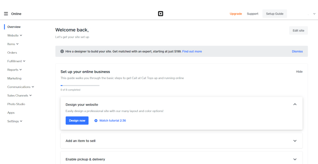
With each to-do item, you can click on it to expand it and learn more about what you need to do to complete it. There’s also a link to head to that area and get started. As you finish tasks, they’re automatically checked off.
Square’s site editor is the easiest to use on our list. It takes all the difficulty out of creating a site. You effortlessly flow through getting things set up.
The first time you go to edit your site, you’re taken through a short guided setup wizard where you can choose which features you’d like your site to have. There are quite a few to choose from and you can see how they look with the preview over on the right side of the screen.
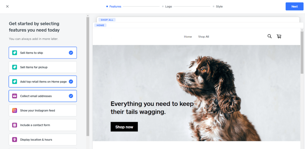
As you can see above, you have options for selling items to ship, ordering for pickup, or even listing your top-rated items on your homepage. You can even set up a means to collect emails with a few clicks.
Next you can upload your logo or skip that step, then move to choosing from five different fonts and 15 different colors.
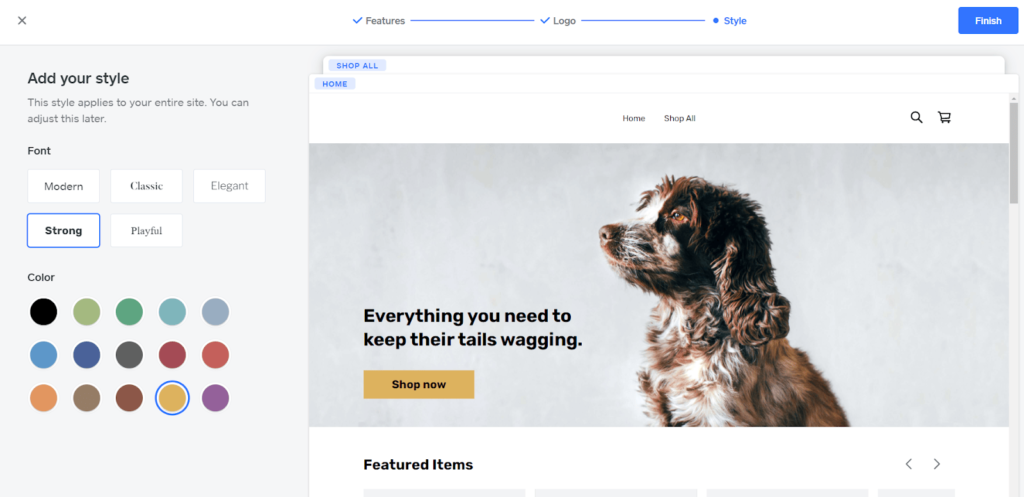
Changing the color on the left changes all of the buttons and the site footer. Changing the font changes the headings on your page but leaves the rest of the text alone.
Once you get into actually editing the site, you’re able to choose from a wider selection of fonts and you have more granular control over colors of individual elements as well. This is just a starting point and it ends up allowing for decent customization.
The next step is setting up your domain. You can buy one, connect one you already own, or use a free Square subdomain (yoursitename.square.site). However, buying a domain or connecting one you own requires you to upgrade to a paid plan.
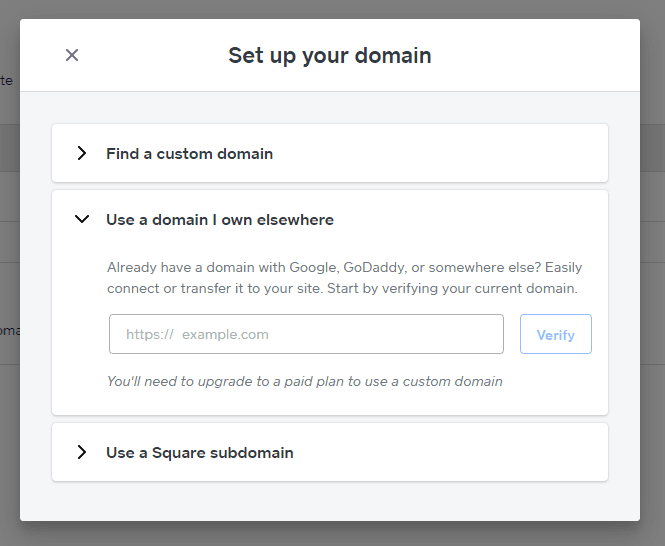
Next, there’s a four-step tour that shows you where everything is in the site editor.
To edit a section of the site, all you have to do is click on it. Once you do that, the settings for it appear on the left side of the screen. The section also gets highlighted so it’s easy to tell which one you’re actively editing.
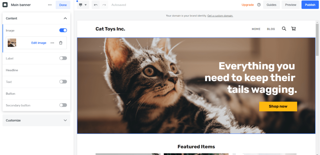
The editor is very intuitive and it only took us 10 minutes to build our home page.
Square Online stores all of the images you upload for your website in one place so you can easily add them to other pages as you’d like, without having to re-upload them.
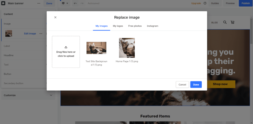
You can also add multiple logos under the logos tab. The free photos tab lets you search Unsplash images and add them to your website in one click
Square won’t optimize them though—that’s up to you. Keeping images small is crucial. Large ones can slow down your site suck up storage space, which is very limited on a free plan.
The Instagram tab lets you connect an Instagram account so you can use your images from there on your website, as well. You can bring your site visitors into your world一building an even closer relationship with them.
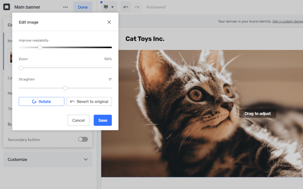
You also have a few basic options to edit images as well, including overlays, zoom, straightening, and rotating.
If you’re thinking this seems great, but you might need help一Square has you covered.
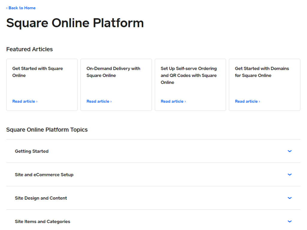
Square is a massive company with millions of customers across dozens of different products. As such, they have an immense customer support team ready to help with live chat assistance if you need it.
On top of that, there’s a knowledge base with hundreds of articles on all of Square’s products.
For the website builder itself, there are dozens of articles covering all sorts of features and topics with videos, tutorials, and more.
The last important detail about using Square is you know everything you get with your free plan. You’re not stuck getting excited about a feature you think you can use only to realize you have to pay for it.
Square is very transparent about what comes with your account and what doesn’t. If something is a premium tool, it tells you right at the top that you need to upgrade to use it.
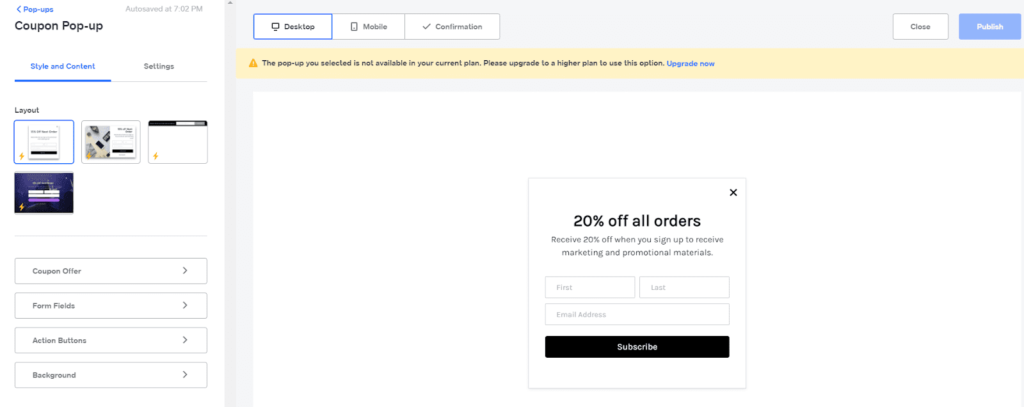
In brief, we don’t think you can find a simpler setup than what Square Online offers you. You are not left confused at any step.
Templates: 2/5 – Square does templates a bit differently than the other options on our list, so it didn’t score too well for this section.
You can decide whether you need a full website or if you just want to create an online checkout page to add to an existing website or send to a customer.
But other than that, you don’t get to choose a template. So, it lost a point for this.
Despite the lack of templates, the default layout is sleek, modern, and well-designed. Your site will look professional and clean no matter what settings you choose. It’s easy to adapt for different industries with the images, colors, and fonts you use.
When it comes to customization, it’s very easy to adjust and customize the layout. It’s one of the most intuitive site builders we’ve ever used
That makes Square Online a perfect option if you’re in a hurry or have never built a site before.
There are basic global color and font options, but you can also easily adjust the style of individual elements as well in a few clicks.

The sad thing is there isn’t any mobile control capability. What we mean is you can’t change how the design looks on mobile devices, so Square lost a point for this.
With that said, the templates look fine on mobile and don’t require much adjusting anyway. The simplicity of the pages built on Square Online helps your site easily adapt to mobile viewing.
Less customization means fewer things that can go wrong when transforming a desktop view to a mobile display.
You can preview what it looks like on mobile by clicking the desktop icon in the top left and clicking Mobile in the drop down menu.
Square also lost a point for an inability to switch templates since, well, there aren’t any templates.
So, Square didn’t do too well in this category, mostly because of the complete lack of templates. But, they offer an intuitive editor that can build a nice site quickly.
Design flexibility: 1/5 – It’s tough to make a one-of-a-kind site with Square Online. Design flexibility is pretty much non-existent.
That’s the tradeoff for being the easiest option on our list.
It only got one point for this section because you can change the style of individual elements separate from global controls.
So, you can tweak colors, fonts, and sizes, but forget about placing elements wherever you want.
You can add new sections, delete existing sections, and reorder them. But you can’t change the layout of those sections or move the elements within a section at all.
Moreover, you’re limited to pre-designed elements and sections. You can’t create your own or customize them aside from choosing between a few different layout options depending the section.
For example, you can choose from four different product section layouts. But you can’t choose the layout of menu section items. You also can’t upload custom fonts or edit the page’s HTML, which is a feature several people have been asking Square to include for some years now.
What you can do is embed custom HTML onto your website and inject header code to enable third-party scripts on your site.
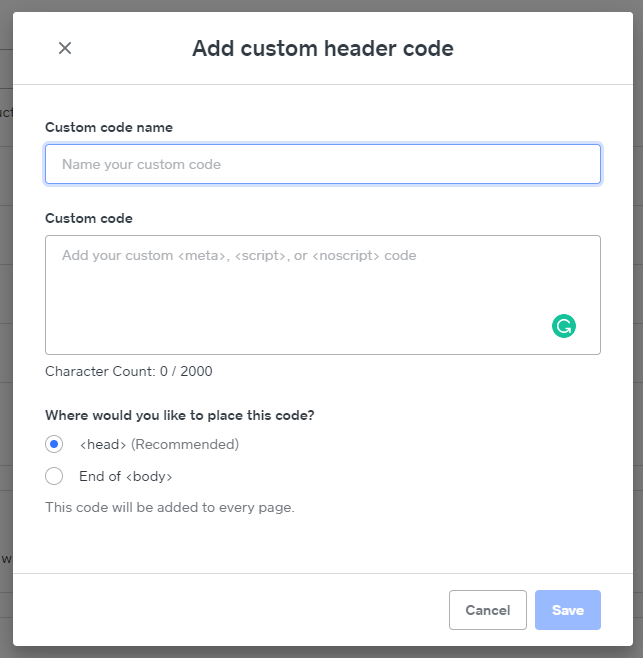
But you can’t actually change the theme files that control the look and feel of your website.
In the end, we disapprove of the rigid guidelines and think Square would be a real contender to dethrone Wix if they offered more flexibility in design. Until they make that leap, the simplicity of the editor is keeping them afloat.
Limitations: 3/5 – Square faces the same common limitations as every free web host out there.
We found that Square Online displays an ad on your website, costing it a point in our scoring. But the good news is that it’s the least intrusive ad out of the ones we’ve seen. It’s small and only visible at the very bottom below your footer.
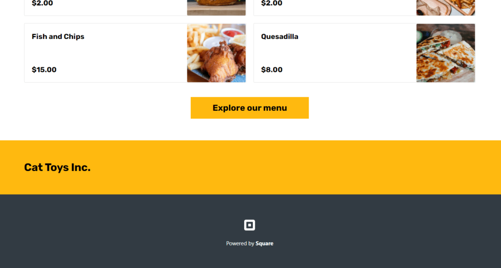
Another common restriction with free plans is using a custom domain. Square follows the norm一you can’t connect your personal domain for free, you’ll have to upgrade to a paid plan for that. You’re stuck with a Square subdomain (yoursitename.square.site) on free plans.
You can, however, create as many pages on your site as you want. And, aside from a few banners and small links inviting you to upgrade to a paid plan, there are no display ads in the backend of Square Online. This keeps your view unobstructed as you put together your site.
As far as speed limitations, free hosting with web builders is notorious for being slow. Square averaged 1.99 second, right around Google’s maximum recommended load time.
We ran three separate speed tests using Pingdom, getting load times of 2.25, 1.82, and 1.90 seconds.
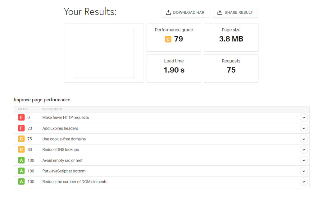
To score a point for this section, a host has to load in under two seconds. So, Square just barely got a point here.
But, it’s twice as slow as Wix and three times slower than Weebly, in comparison. However, they don’t limit your bandwidth usage, so if your web store takes off in popularity, you don’t get penalized when traffic spikes.
All said, Square Online is indeed the best free option for selling your products and services online. They make processing payments simple and building a website beyond easy. You have all the functionality to make your site work perfectly from day one, all for free.
#3 – InfinityFree — The Best If You Want To Use WordPress
InfinityFree
Best for Using WordPress
The rare truly free web hosting provider, InfinityFree combined with WordPress makes for a powerhouse combo you don't have to spend a dime to use. Limitless customization awaits with plenty of free plugins and tools at your disposal.
Overall Score: 3.0/5
InfinityFree is the last of a dying breed.
Why? Because they are a truly free web hosting platform, with no other tricks up their sleeve.
If you’ve been doing research on starting a website, you know WordPress is the best content management system in the world. The trouble is, you always have to pay for hosting a WordPress site.
Until now.
With InfinityFree you can use WordPress to create a dynamite site with premium plugins and host it for free. InifinityFree comes with Softaculous, so you can install scripts, web apps and more from right in the dashboard, including WordPress.
You can also do something no other host on this list lets you do—connect a custom domain name if you already own one.
Plus, you don’t have to worry about ads on your website or some frumpy, overlong domain screaming to the world that you’re using a free account.
Here’s how InfinityFree scored:
- Functionality: 0/5
- Ease of use: 2/5
- Templates: 3/5
- Design flexibility: 5/5
- Limitations: 4/5
Functionality: 0/5 – You can see right away InfinityFree lacks the simplicity of other providers. That’s because it’s truly a hosting provider, not a site builder that also offers hosting.
Out of the box, InfinityFree comes with no functionality whatsoever.
Instead, it’s a blank slate that’s entirely customizable to match your needs.
And most people will go for WordPress, which also is a blank slate. So you can actually set up the functionality we reviewed for the hosts by adding apps, tools, and plugins as needed.
Since there is no built-in functionality to InfinityFree and you have to set it all up yourself in WordPress, no points are awarded in terms of our scoring system.
So instead, we will talk about what you can do to add the top five factors we discovered are most important to people using free hosting.
For payment processing, the most common way to add ecommerce functionality to WordPress is with WooCommerce.
With it, you can accept just about every payment method, including credit cards, bank transfers, checks, cash, Apple Pay, Google Pay, and more. It integrates with 140 payment processors, so you can support any way your customers want to pay.
To add it to your WordPress site on InfinityFree, click Plugins, then on Add New. Search for WooCommerce; It should be the first option that shows up. Then, click Install Now to the right of the name and wait for it to install.
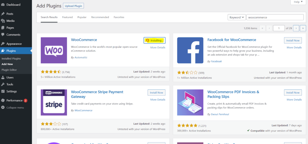
After it’s installed, click Activate. After that, you’ll go through a guided setup wizard.
For integrating email marketing, it’s as simple as doing the same search for your favorite platform. Just about all the email services we’ve reviewed have a WordPress plugin that you can install.
For everything else we tested free hosting functionality on—event pages, appointment booking, and posting menus online with ordering capability—follow that same process. The library of WordPress plugins and integrations is vast and likely includes the tools you’re already using or prefer.
In the end, InfinityFree scores a big fat zero in this category because functionally isn’t built in.
But at least they give you the freedom to add whatever your site needs. You can use robust blogging features, accept payments, and manage events like a champ and that’s just the beginning.
You might even say it’s better than a forced feature set. It really just depends on your needs and willingness to put in the work, doesn’t it?
Ease of use: 2/5 – InfinityFree is definitely the hardest option on our list to use because it doesn’t come with a page builder and there are a lot of steps you have to figure out on your own before you can start building your website.
It’s not intuitive or streamlined like our other options. But it has nearly unlimited flexibility, so it can be viewed as a reasonable trade-off.
InfinityFree doesn’t offer any help with getting started. After you create an account, you’re left to figure it all out on your own.
With that said, it’s not impossible and there are several guides you can look through if you need help. And if you’re familiar with WordPress and other hosting environments, you’ll likely have no problems. Beginners on the other hand, will face a steeper learning curve.
Each theme you can use in WordPress is easy to set up. But customizing the theme isn’t always intuitive. It’s often a totally different experience from one theme to another.
When it comes to media file management, WordPress is the best. There are multiple ways to upload new photos, files, fonts, videos.
One way is by clicking the Media link in the left-hand navigation menu.
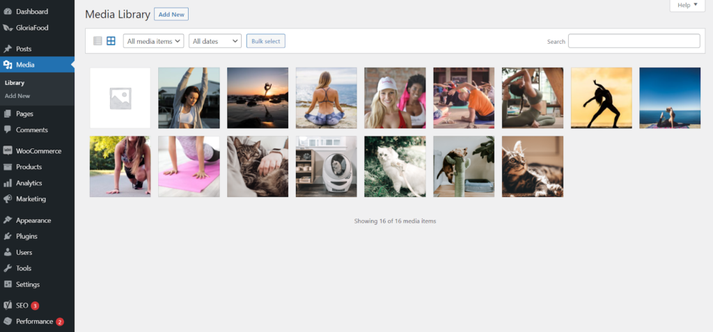
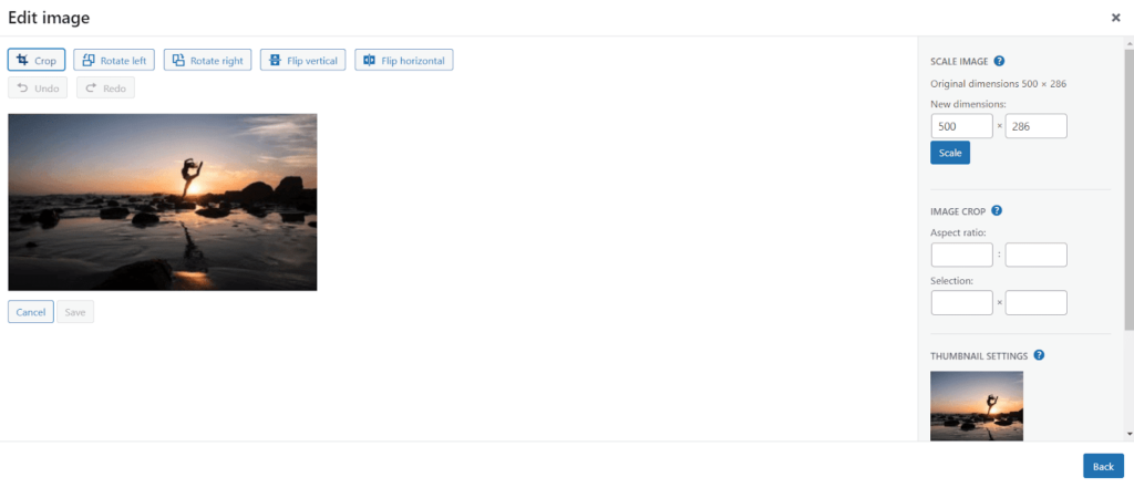
Here, you can upload files, set alt attributes, resize images, create thumbnails, set captions, and grab file URLs.
The second way to open up the media manager is inside of WordPress’ Gutenberg editor. All you have to do is add a new image block and you can browse the media library with one click.
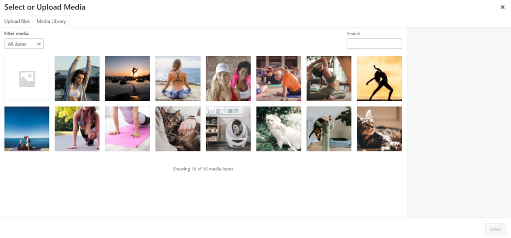
You can select the photo you want to use or upload a new one. All your images and other files are kept safely in one centralized location.
If you have a problem on the hosting side, like uptime issues, you can contact InfinityFree. But they may not be able to provide help on WordPress-related issues.
Luckily, there is a massive WordPress community through which you can find answers. Browse the helpful articles in the WordPress knowledge base or ask questions on the support forums and get help from experienced users.
InfinityFree is much more hands-on than the other options on this list. If you want a quick or more streamlined path from zero to up-and-running website, you likely will be better served by other providers.
Templates: 3/5 – WordPress certainly has the most themes一even beating out Wix’s impressive list of 976 templates一but they’re not all centralized in one place.
Instead, dozens of different companies, designers, and marketplaces sell them or offer them for free. Across dozens of theme marketplaces are thousands of themes to choose from.
Often, marketplaces like Envato offer a wide selection of both free and paid WordPress themes.
The WordPress theme library also holds over 8,500 free themes to choose from.
Or, you can even browse themes inside your WordPress dashboard. To get to that area, open up the Appearance link on the left-hand navigation menu and click Themes. Then, click Add New.
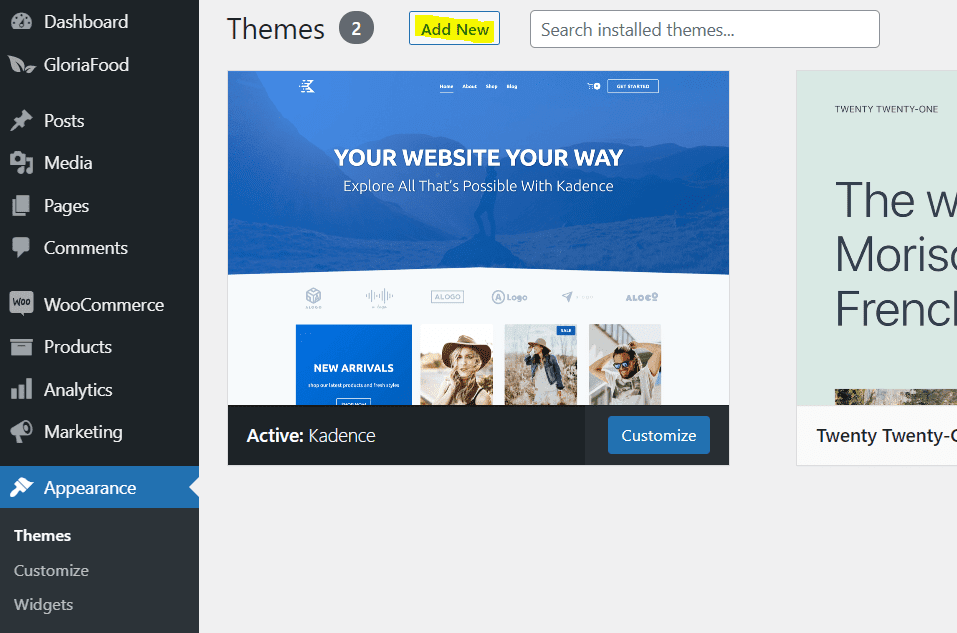
This allows you to add a new theme to activate on your site.
Some themes are so good you can even control the mobile style.
You also can take control of designing things yourself. WordPress has a few drag-and-drop builders like Elementor or Beaver Builder, which give you precision control over your site’s layour. But they also have their own block editor as well, Gutenberg.
With a little patience you can find the theme you and your visitors will love.
Design flexibility: 5/5 – WordPress is the most flexible option on our list. But, like we’ve mentioned above, all themes are different. Some will be more customizable and flexible than others.
If you use a page builder or the Gutenberg editor to build posts and pages, you can control the colors, fonts, and sizes of individual elements like buttons, images and text. Many themes also have very granular design options for different areas of your site.
Here’s what the color options look like for the free version of Kadence一the theme we used to build our demo site.
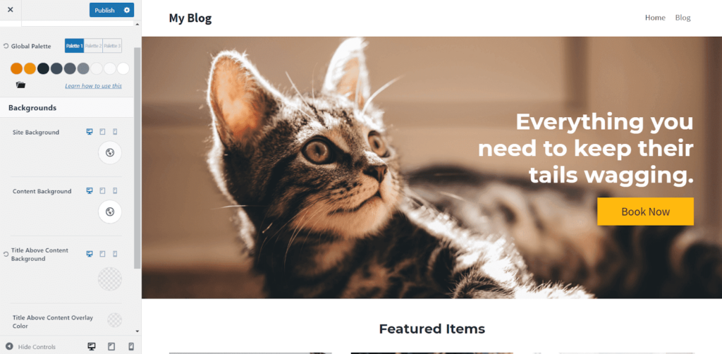
You can also change the style of blog post text and page text individually.
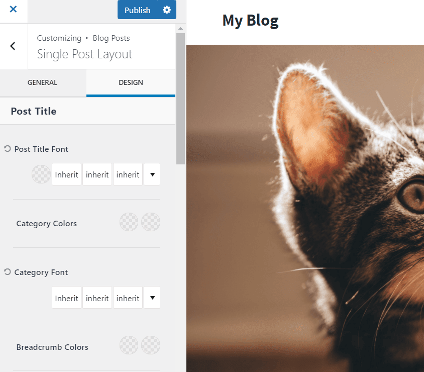
These are just a few of the hundreds of customizations you can perform. You need to play with the theme, be curious, and make the site your own. We recommend previewing your site, so you know exactly how it will look to your visitors on mobile and desktop.
With more intense WordPress page builders like Elementor, you can place elements anywhere you want on the screen and dive into margin settings, padding, and other spacing elements that allow you to overlap elements and images however you want.
The Gutenberg editor is pretty customizable but you can’t drag and drop things wherever you want like with Elementor. Elements have to go in predefined columns or rows.
For advanced users you can even edit the HTML and CSS in WordPress themes.
With WordPress on InfinityFree hosting, the possibilities are endless and, amazingly, can all be had for free.
Limitations: 4/5 – What’s great about InfinityFree is ttjat it starts with a clean slate and you can build your site as if you were on a paid hosting plan.
Only one out of the five main limitations we looked for in free web hosting showed up for InfinityFree.
Instead of placing ads on your website for the whole world to see, they make their money advertising to you on the backend dashboard.
It’s much more discrete and eliminates anyone getting a bad feeling about the quality of your website.
As for the other common limitations other free hosts have一they are all void for InfinityFree.
You can use a custom domain if you like—of course, you will have to buy one if you want that. You can buy a domain through InfinityFree by way of NameSilo or just purchase one from another registrar.
You can add an unlimited amount of web pages for WordPress on InfinityFree hosting.
For speed, it really depends on the type of site you have, the size of the media on your site, and the plugins that you use. Luckily, you can upload plugins for free that make your site even faster.
For speed testing our test WordPress site on InfinityFree, we used Pingdom from the San Francisco location. And, we installed the W3 Cache WordPress plugin to improve speed.
Our InfinityFree site loaded on average in 1.81 seconds, which is on the slow side of this list. Each of the three tests was remarkably consistent, coming in at 1.89, 1.75, and 1.78 seconds.
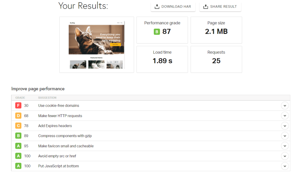
Remember, the site we built was really basic, so yours may load significantly slower if you have more elements or a different configuration.
To score a point for this, a host had to have an average load time less than two seconds (per Google’s recommendation). InfinityFree scored a point for this but there are definitely faster options on this list.
In brief, we love how you can customize your site any way you want and how they are the only free hosting provider that lets you use a custom domain for free.
If you are familiar with and prefer using WordPress, you can’t find a better free web host than InfinityFree. It stays out of the way and lets you create a commanding website without spending a penny.
#4 – Weebly — The Best for Simple Personal Websites
Weebly
Best for Simple Personal Sites
Weebly is the best for making your personal home on the web look beautiful. Build a portfolio, blog, or other simple site completely for free.
Overall Score: 2.6/5
Weebly offers a platform that is just customizable enough to be quite effective for portfolios, personal websites, resumes, and other simple sites.
It also has a good number of templates you can use to make the creative process even faster.
To be very clear, Weebly’s not suitable for highly custom sites. But they give you more than enough to build a portfolio to showcase your work and connect with clients or an online resume to help you stand out during your next job application.
Here’s how did they did in the five areas we tested:
- Functionality: 1.5/5
- Ease of use: 2/5
- Templates: 4/5
- Design flexibility: 2/5
- Limitations: 3/5
Functionality: 1.5/5 – Weebly only checked off one and a half of the top features we tested for in this category. And the areas it scored in are done way better by Weebly’s parent company, Square.
For payment processing, you can integrate with Square and sell products online. But the ecommerce features are really clunky and hard to use in comparison to Square Online.
Because it’s owned by Square, the dashboard looks similar. However, it’s not exactly the same, nor do you get the same functionality.
You can take payments online, but you cannot generate invoices, so only a half a point was awarded there.
As far as event management, built-in marketing tools, or appointment booking, none of these features are available on Weebly’s free plan.
But, when setting up your blog or portfolio, you can only tweak basic SEO settings to help you get found. You can also implement a Facebook Messenger button on your free site so visitors can reach out to you to ask questions or book appointments.
Restaurants can use a GloriaFoods menu and ordering system in tandem with a free Weebly site. You won’t be able to embed it on your Weebly site, but you can embed an order or reservation button that will direct a visitor to another site you can embed GloriaFoods on.
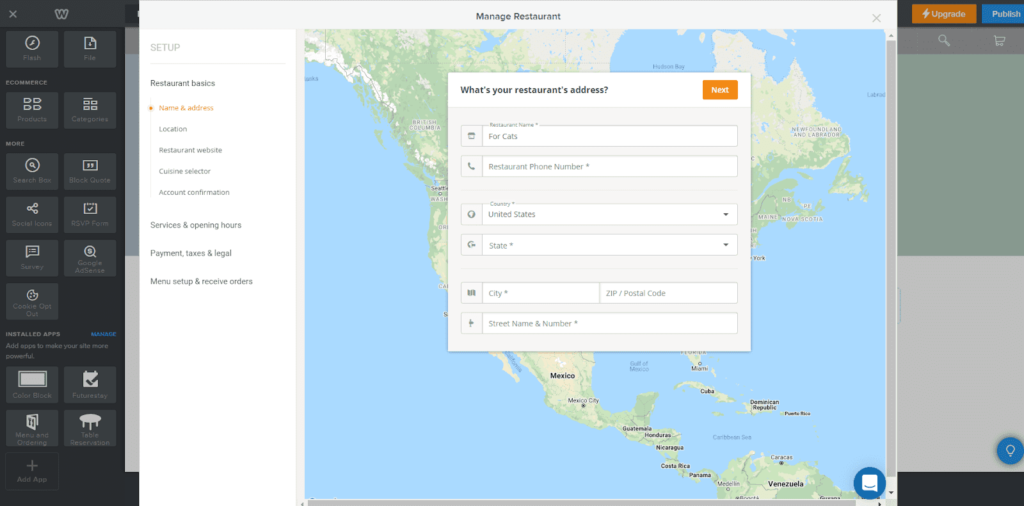
As a workaround, you can take a screenshot of your menu and embed it as an image on your Weebly site so visitors can see options before they’re taken to your GloriaFoods page.
If the main purpose of your website is to offer online ordering, we recommend Square instead for being more streamlined and easy to implement.
Ease of use: 2/5 – When it comes to building your site, Weebly is hardest to use among the other site builders we’ve tried on this list. And there’s a lack of clarity about what you can and can’t do for free on Weebly.
Since Weebly is owned by Square they have a very similar getting started checklist. It makes finding out what you need to get your site ready for launch simple.
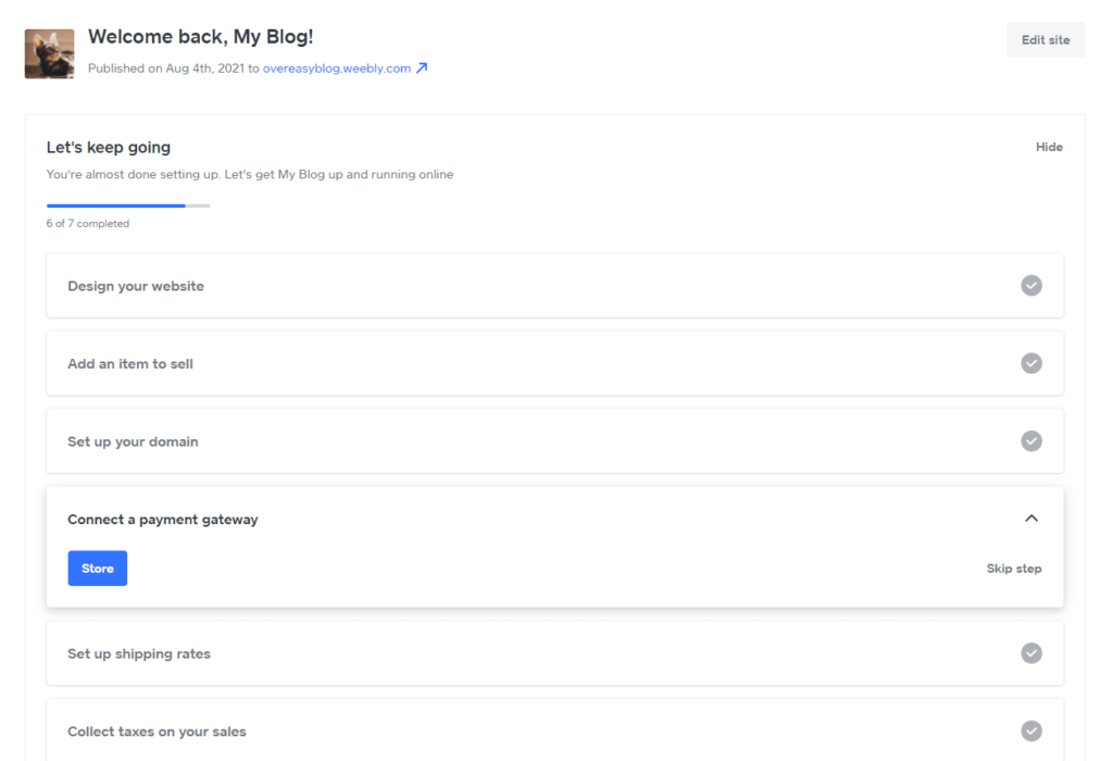
You know exactly what to do before publishing your site.
However, once you start building in the editor, you realize things are not going to be so simple.
For example, you can’t change the design or size of buttons whatsoever. You’re limited to the four style choices (seen below).
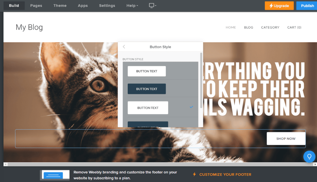
It just doesn’t make sense why you wouldn’t be able to change the color to whatever you want. Not having access to a color wheel is way out of the norm for website customization and severely limits your design options.
On top of that, there’s no media management, so you have to upload an image everytime you want to place it on your site. This is frustrating and too time-consuming for a simple site builder.
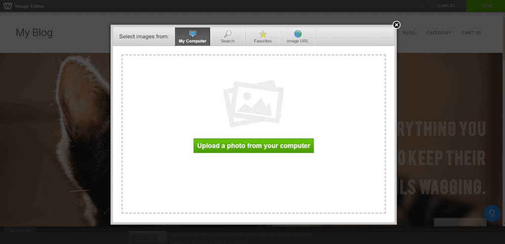
There’s a search function that lets you find Flickr images to put on your site. But at the bottom, it says you’re not allowed to crop or edit images since that’s a copyright violation. And it also says it’s up to you to ensure you’re using them in a way that doesn’t violate copyright.
Reading that, does it make you feel comfortable using any of the images they have?
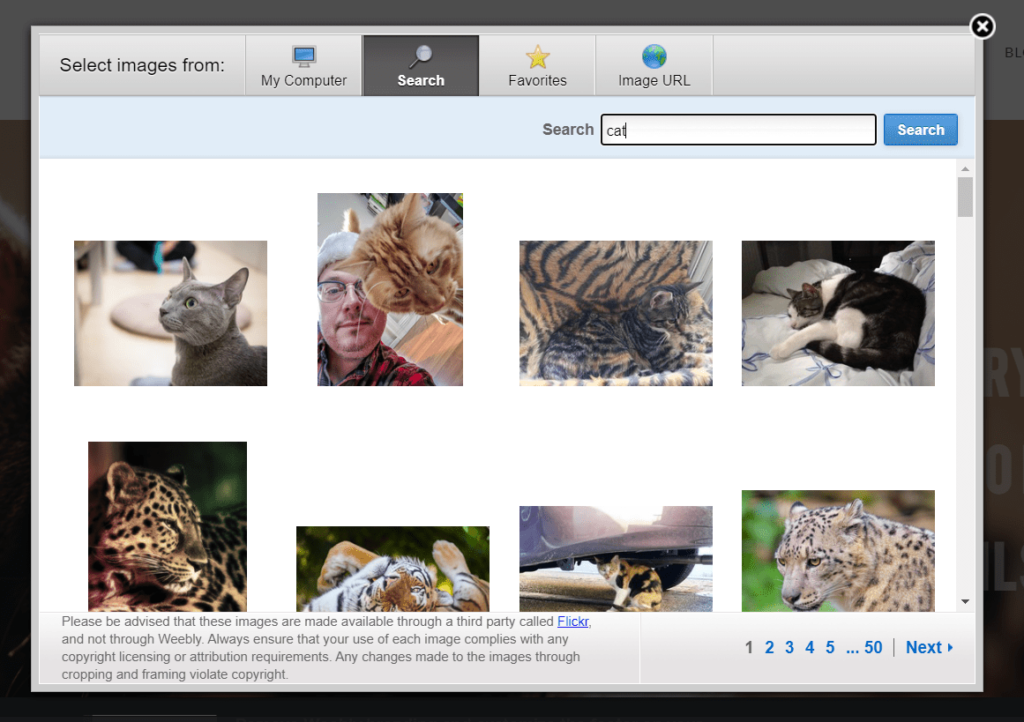
And if you’re wondering what the favorites tab is for, it only works for Flickr images. You can favorite the ones you want to use but you can’t favorite images you’ve uploaded.
Overall, we found Weebly was not easy at all to use. So, it really helps that they offer customer support on the free plan, via live chat, email, and community forum support.
There are also 286 knowledge base articles as well. Email support is 24/7 and live chat is available from 9 a.m. to 9 p.m. Eastern every day.
Weebly’s chatbot lets you ask your initial question. If you type “representative”, you’re given the option to contact Weebly support. From there, you can email or start a live chat if it’s during business hours.
Here is a look at our chat conversation.
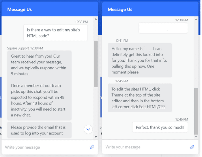
The rep helped us once we verified the account. They told us exactly how to edit the theme using HTML and CSS.
What frustrates us, however, is how you don’t really know what Weebly services you can use for free. There are 56 apps listed as being free or freemium out of the 380 Weebly apps. You would think that you can use any of the free or freemium apps on the free plan, but there are quite a few you can’t actually use but won’t know until you try to add it to your site.
The totally free ones are pretty limited and only really add basic functionality to your site.
Templates: 4/5 – Weebly offers dozens of high-quality, modern templates for tons of different use cases. It’s easy to swap out template content with your own and it’s easy to switch templates as well.
The only reason Weebly didn’t get a full five-out-of-five for templates is because you can’t control how they look on mobile. All other factors are available for your immediate benefit.
There are 55 templates to choose from. Whether you want to create a portfolio, an online resume, a basic business site, or another type of personal site, there’s a template that’ll work for you.
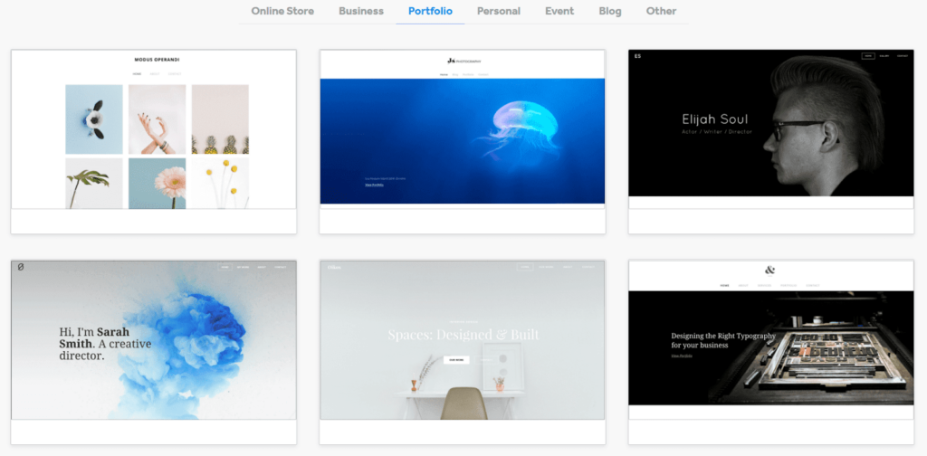
The quality of the templates are amazing. We did not find any that made us cringe. No matter which one you choose, your site will look professional and well done.
You can change colors and fonts of templates globally through the options Weebly gives you. Different templates have different global color and template options. Some only have light and dark options, while others have predefined colors chosen for you. Some let you set multiple global colors, and some only let you choose one.
In the end, adjusting your template is quite easy, but you don’t get comprehensive options.
Weebly’s templates are mobile responsive, but you can’t control the look and feel separately from your site’s desktop display.
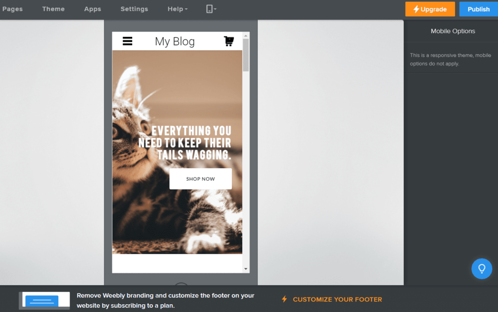
Even though you are stripped of adjusting your mobile experience for your visitors, they do give you the chance to switch between templates better than most. You can switch out templates and keep your content and elements.
Change up your site in a few clicks with no extra work adding or fixing content. All you have to do is click on Theme at the top of the editor and then click Switch Theme. From there, you can look through all the available themes and choose one. You can switch themes as many times as you want.
Design flexibility: 2/5 – Weebly is more flexible than Square and Strikingly but significantly less flexible than Wix, unless you’re familiar with coding.
As mentioned earlier, you can control the style of some individual elements but not all of them. For example, you can’t change the style of buttons individually. You’re stuck with whatever colors are available with your theme.
Weebly isn’t truly drag-and-drop, either. You can’t place elements wherever you want and you’re restricted to predefined columns.
You can add a bit of variety to your layouts with spacers and columns, but that’s about it.
Once you’ve added a blank section, though, you can use any combination of elements you’d like to create a custom layout. Or, use a pre-designed layout and customize it later.
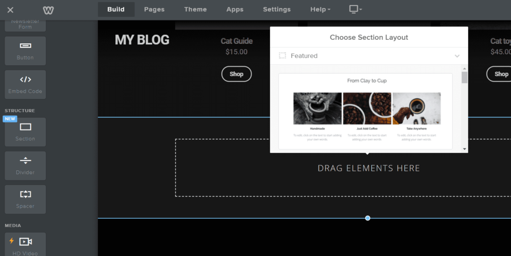
Weebly is the only page builder on our list that lets you access and edit your theme’s code.
To edit it, click on Theme again and then click Edit HTML/CSS in the bottom left-hand corner.
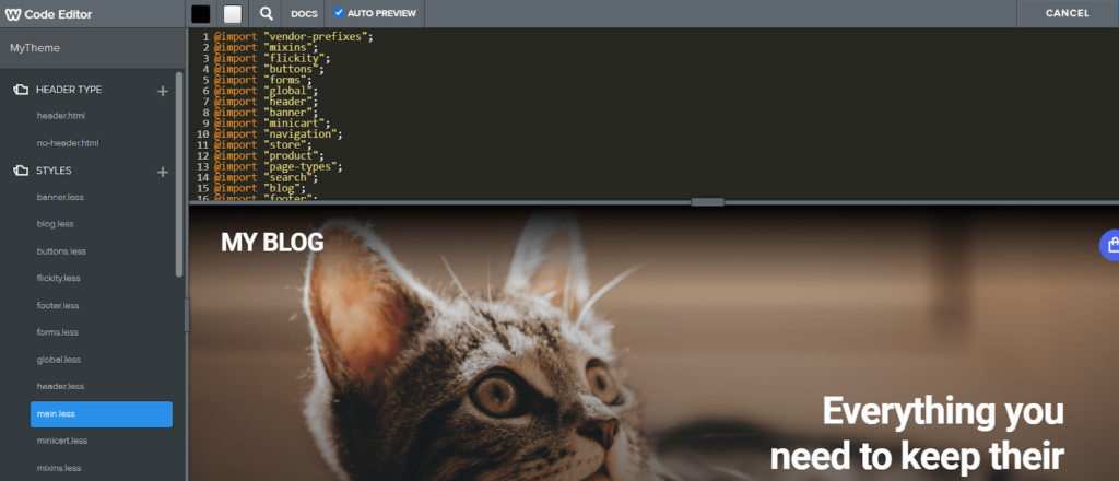
You can even preview your changes in the bottom pane before pushing them live to your site.
So, even though Weebly gets a two out of five for design flexibility, you get nearly unlimited customization options as long as you’re comfortable with going into the code一for a free plan, that’s pretty amazing.
If you’re creating a simple site, though, it might not be worth the effort to learn HTML and CSS coding or hire someone who knows it.
But, if you are willing to put in a little time and work, not only can you make your Weebly site really unique, you can gain the confidence for using code on other site builders, like WordPress, down the road.
Limitations: 3/5 – Weebly does a decent job of not falling into the same common free web host limitations.
But the two they have are obvious. All free Weebly sites display a Weebly ad in the bottom left corner of every page. It’s sticky and always visible to visitors. It’s pretty annoying and it expands when you hover over it.

The next problem is that you can’t use a custom domain name, so your website name will have a Weebly subdomain (yoursitename.weebly.com). You have to upgrade to a paid plan to avoid that.
The free plan, however, has no limits on pages created, so you can have a full website free of charge. You’re not limited to a single page site like some other free plans.
Some providers make their money by piling up the dashboard with upsells and paid ads, but Weebly doesn’t. That’s another plus in their favor.
They are also pretty fast.
Normally free web hosts make for slow websites. When we tested our Weebly site speed with Pingdom, it returned an average load time of 650 milliseconds, making it the fastest out of all the free hosts we tested.
One speed test returned a 719 millisecond load time, but the other two were incredibly fast for free hosting at 606 and 615 milliseconds.
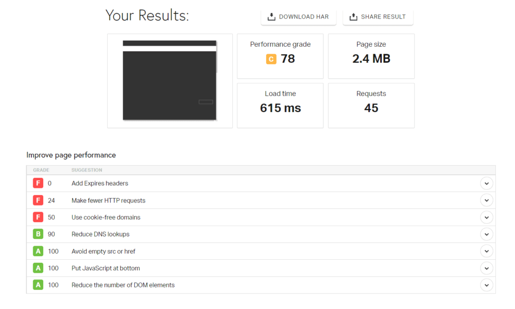
For a free web host you could not ask for more.
We had a really simple site though, so your experience might be slightly slower depending on your content, media, and website size. But this is an encouraging result when testing a bare-bones Weebly site with its free hosting.
Overall, the limitations for Weebly are not bad, and if you have a simple portfolio or professional site, it won’t be a problem. Plus, it will be blazing fast. Not bad for the jaw dropping price of $0.
#5 – Strikingly — The Best for Single-Page Product Launch Websites
Strikingly
Best for Single-Page Sites
Strikingly makes it easy to quickly deploy landing pages, lead gathering forms, marketing offers and more. Build as many one-page sites as you need in an easy-to-use platform.
Overall Score: 2.4/5
Do you want an easy product launch experience?
How about the ability to create as many free one-page websites you want, and manage them all in one place?
Strikingly makes your life so simple with their free plan. You can sell one physical product or service without spending a penny for hosting.
But, digital product sales are off-limits for the free plan, so that is one limitation.
Strikingly is a great option for landing pages, too. You can quickly and easily whip up a new one-pager that captures lead data or extends an offer as part of a larger marketing campaign.
Let’s delve deeper into what you get for free with Strikingly.
- Functionality: 2.5/5
- Ease of use: 4/5
- Templates: 2/5
- Design flexibility: 1.5/5
- Limitations: 1/5
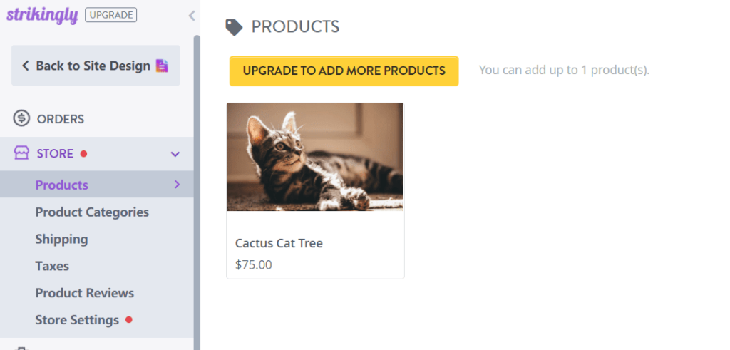
Functionality: 2.5/5 – With Strikingly, you can sell one product on the free plan. So it’s safe to say payment processing features are limited.
You can sell either a physical product or a service. Digital products aren’t available unless you upgrade to a paid Strikingly plan.
To enable store features, all you have to do is add a store section to your site.
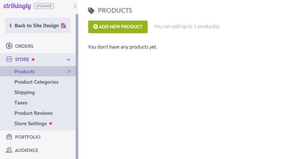
From there, you’ll be able to add your product, set up shipping and taxes, and configure basic store settings.
Even though you can only sell one product, Strikingly lets you upload up to 10 images to show it off to site visitors. Just add images, set the product name and price, type a description, and set other parameters all in the same place.
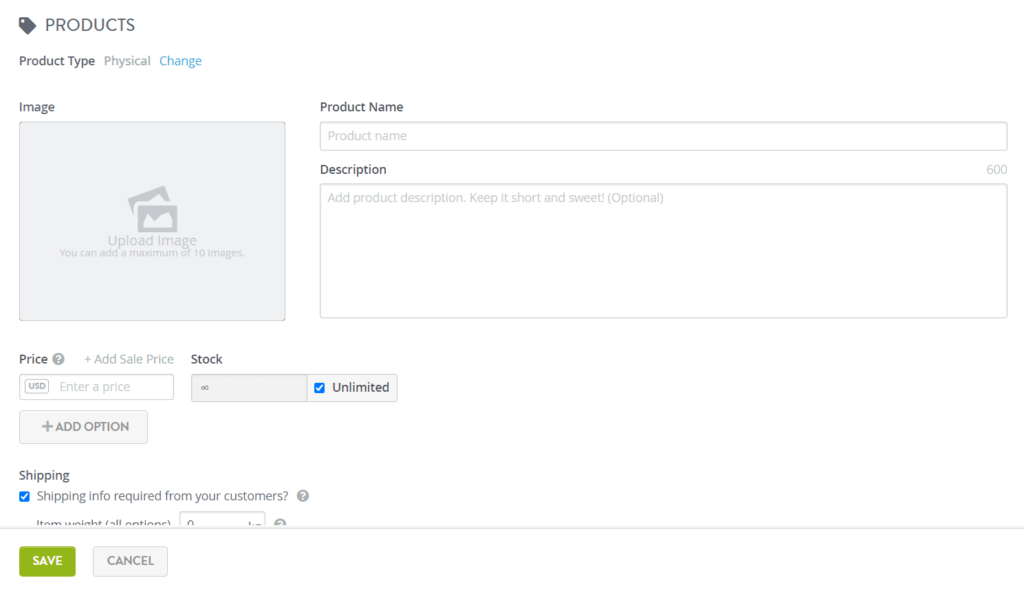
Here is what the products page looks like with a demo product added.
Strikingly supports the use of Stripe, Paypal, Square, and offline payment methods. We connected our PayPal account to make sure it works and that you can in fact do it for free. It all works as you’d expect it to.
When you are ready to market your product or service, the Strikingly free plan includes basic web forms and email with up to 100 sends per month across all of your free sites.
You’re able to send 100 messages per month and save up to 100 contacts on your free plan. To do any more than that, you have to upgrade to a paid Audience plan.
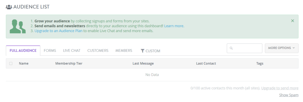
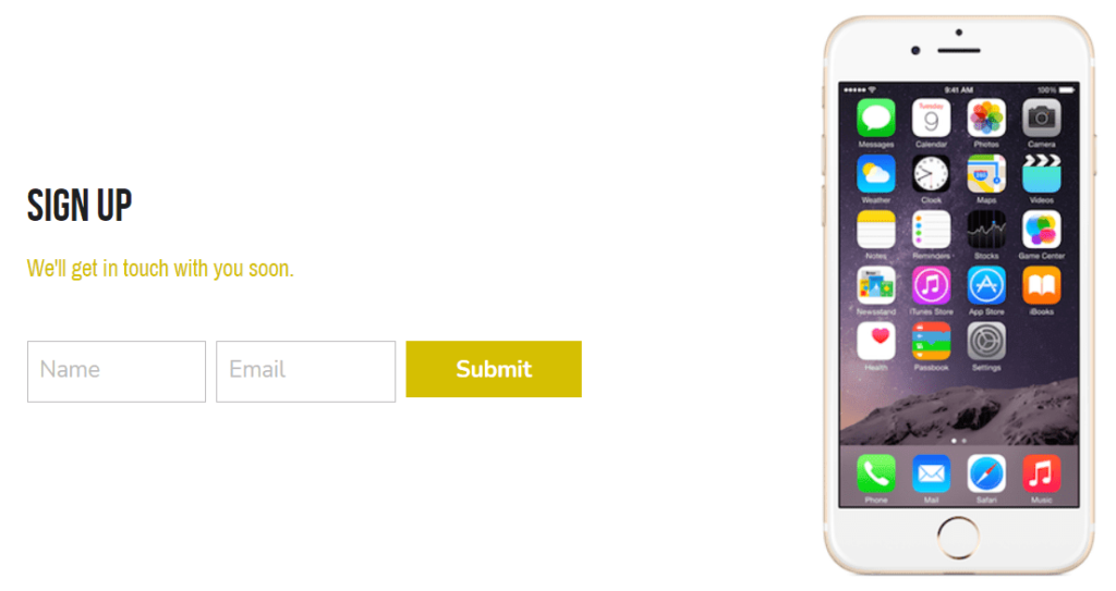
To start collecting emails, all you have to do is add a form on your site. Then, anyone who fills it out will appear in your Audience list and you can start sending newsletters.

You also have the option to add an image on either side of the sign up form.
However, you can’t create coupons or use pop-up forms on the free plan, though that’s a common limitation.
Today getting people to read about your product or service increases conversions, so having a blog—even a simple one—can help.
When you add a blog section, it does create separate pages for your blog and its posts. But that’s the only way to make your free Strikingly site into a multi-pager—the blog functionality is built into the platform.
There are three blog layouts to choose from:
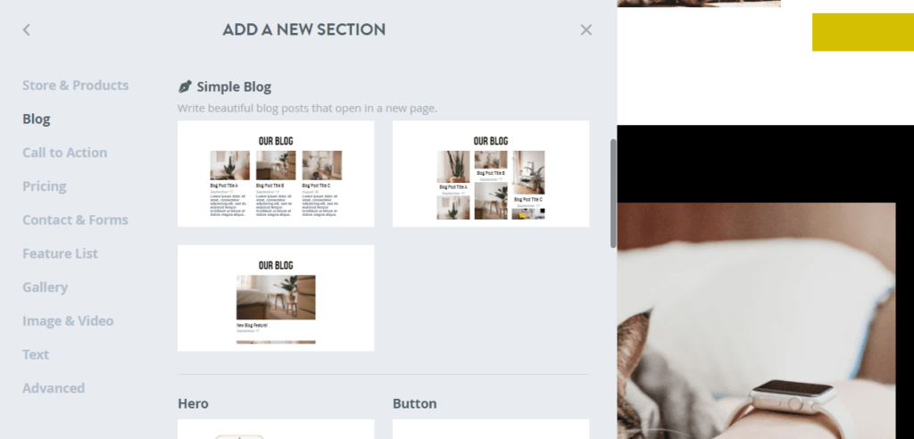
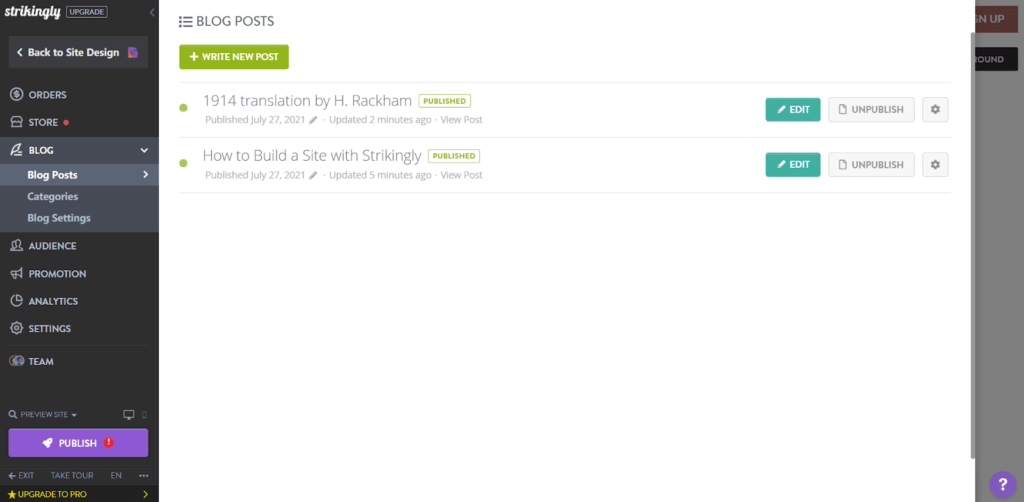
After adding a blog section, you’ll be able to add new posts and manage existing posts by clicking on the list of posts in the editor. We added a few posts just to see what they end up looking like.
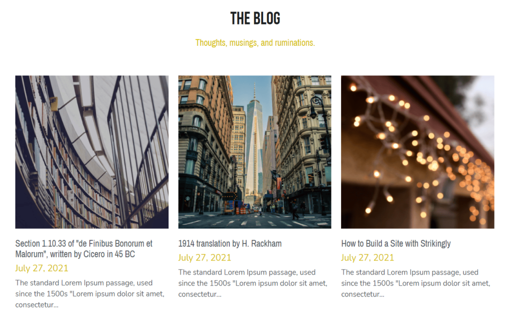
Here’s what it looks like on the front end after you’ve added a few posts:
To create even more revenue, you can offer tickets to free or paid events. Strikingly allows you to do that with the Eventbrite app. You add that by scrolling to the bottom of the “Add New Section” area.
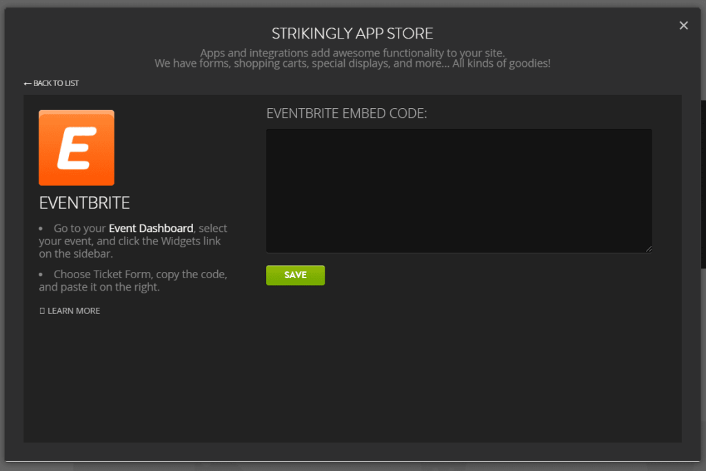
You can create both free and paid events with no monthly fees. You can also choose whether your customers pay the Eventbrite fee or if it’s absorbed into the ticket price.
Creating events with Eventbrite is really easy. There’s a guided walkthrough for all of the settings, so there’s virtually no learning curve with it.
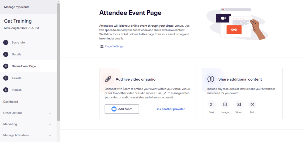
After you set up your event, you simply take the code they give you and embed it into your page.
As far as other functionality goes, restaurant menus and ordering and appointment booking are not offered by Strikingly on its free platform.
In the end, Strikingly scores just below average for functionality. But, when it comes to simple sales and event sites, it does more than enough.
Ease of use: 4/5 – Strikingly is definitely one of the easier site builders we tested. Strangely, though, there’s no checklist for getting up and running. You’re on your own when it comes to making sure everything is ready to go before publishing
When you create your account, you are brought to your user dashboard.
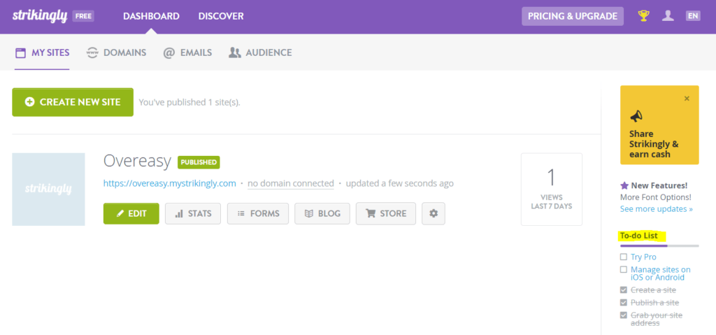
There is a to-do list on the right-hand side of your dashboard, but you are not walked through by Strikingly on how to do it. And one is really just an upsell pitch to try its paid plan out.
The Strikingly editor is really easy to use. Everything makes sense and most users said it took only a few minutes to learn how to use it. To us, it feels well thought out and the settings are never hard to find.
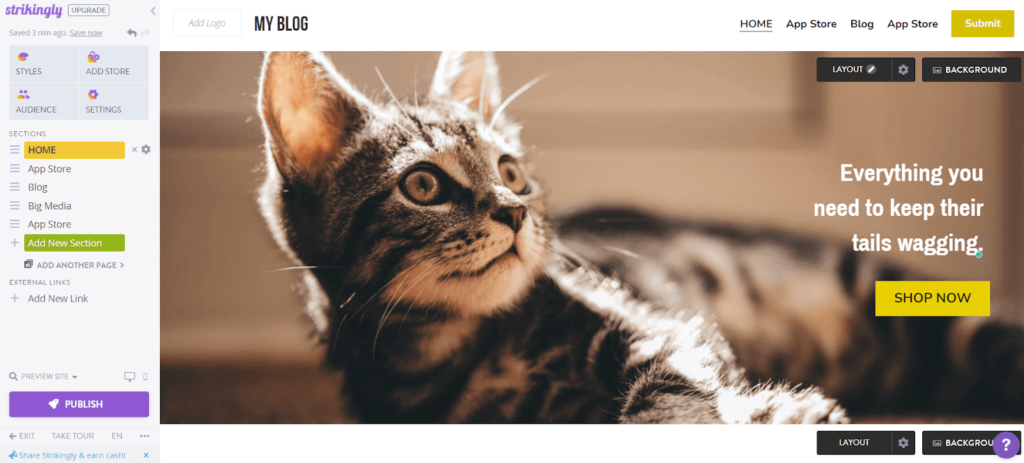
For instance, all of your color and design options are organized under the Styles section.
You can also easily add a store in one click, open up your audience insights, and adjust basic settings.
Adding new sections and removing existing sections is a breeze. You can also easily decide whether a section appears in your site’s navigation menu. Renaming the sections on the left renames them in your nav menu, as well.
To reorder sections, all you have to do is click the three lines to the left of one and drag it where you want it. To edit an element, all you have to do is click on it. And, you can easily change section backgrounds by clicking Background at the top of any section.
You never have to guess where a setting or option is. It’s right where you expect it to be.
When it comes to managing media files, it’s also very simple for you to do. Anytime you need to add a photo to your site, you can choose from any of the images you’ve already uploaded.
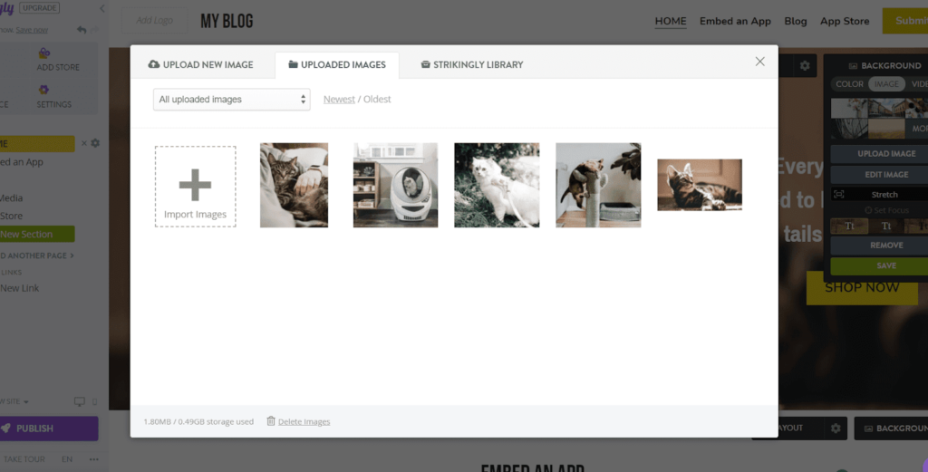
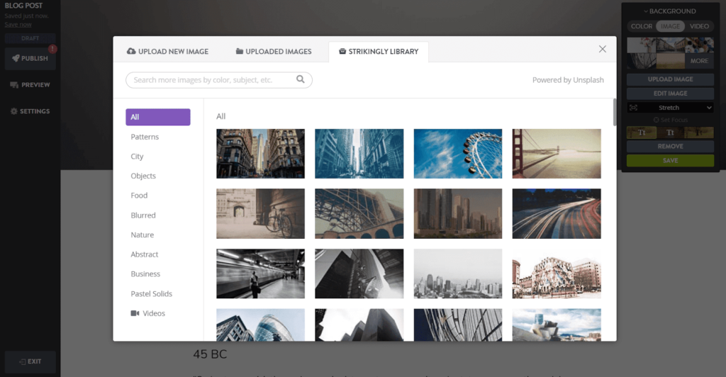
Strikingly also offers an Unsplash image library.
You can also change the background image for each blog post by either choosing one from the library or uploading your own.
We also wanted to check how Strikingly’s customer support compared to the rest of the list.
In short, we were floored by how great it was.
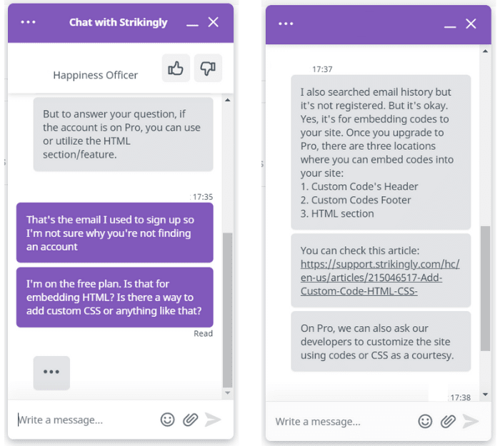
First off, Strikingly has an extensive knowledge base packed full of helpful articles for every stage of the site development process. But if you can’t find what you need there, you can reach out to support via live chat 24/7.
So we did and were immediately connected with a rep who asked how they could help. We were honestly surprised at how easy it was to start a chat and how fast we connected with an actual person.
All the other options on our list make you hunt around or go through a lot of hoops to actually connect with someone, so it was a refreshing change.
Here’s our chat below:
Customer support wasn’t the only thing that was pleasantly surprising with Strikingly.
We also love that you never have to guess what you’re allowed or not allowed to do on a free plan. All of the restrictions are clear and any time you try to access a restricted feature, it lets you know right away.
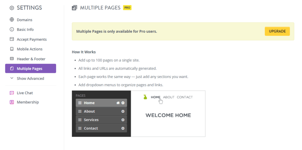
You don’t have to waste time playing around with features only to find out you can’t actually use them.
You can easily set up your one-page Strikingly site with zero experience. And, if you need help, you get it fast. You don’t have to play email tag or waste time trying to explain to a bot what your problem is. Strikingly really makes setting up a stress-free experience.
Templates: 2/5 – Strikingly offers 32 templates to choose from. But they don’t come close to the quality when compared to the other providers on this list.
They don’t necessarily look bad, they’re just not particularly great.
There are a few store, business,creative, and blog templates to choose from. However, there really aren’t that many in comparison to other free hosts. And the range of use cases is pretty limited.
With that said, you can customize them to match what you need, but we wish there were more choices tailored to specific industries.
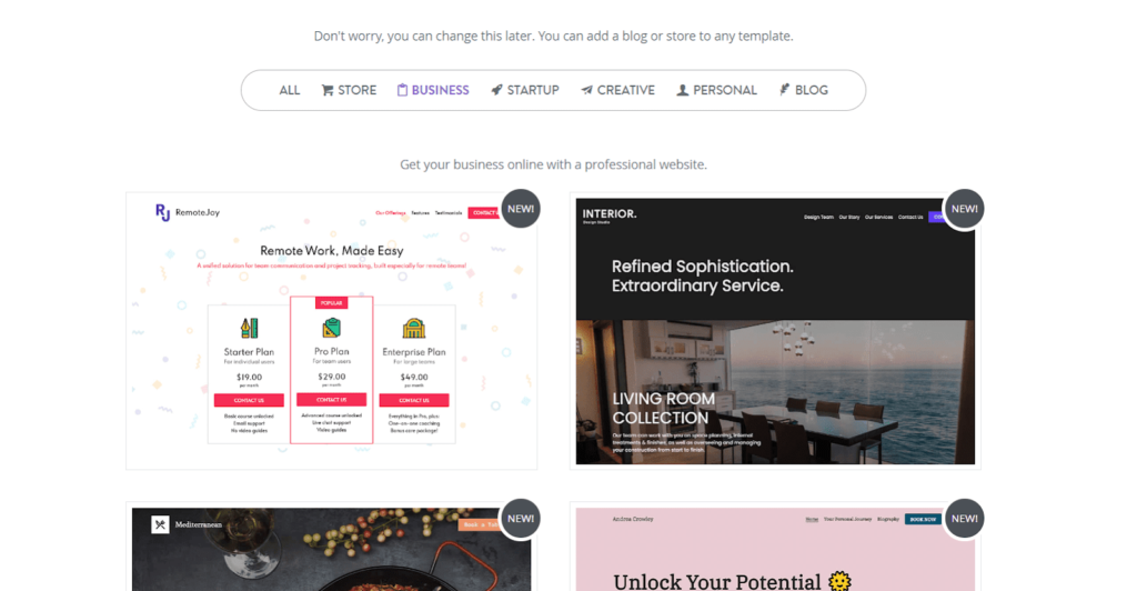
Since there are so few to choose from, you’ll probably have to go with one that doesn’t match your exact specifications, then customize it to match your needs.
If you want a real modern feel, you are going to have to do a lot of work. To make matters worse, some of the templates aren’t created in a way that makes them easy to use.
One template uses a background image of squares (see below).
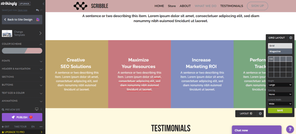
The problem with the template above is you can’t even change the colors of the squares without creating a separate image that’s a solid block of color, then uploading it.
That’s an enormous amount of work for something that should be very easy.
You can choose two global colors and define basic font styles across your site. You can also choose from eight header styles, apply styles to all of your buttons, and add basic animations.
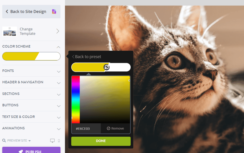
The custom changes you can make will give your site a more unique look and feel.
There is one very important thing to be aware of—you can preview your site in mobile view and make edits to it, but the edits you make affect your desktop site. So, you can’t specifically control the look and feel of your mobile site. With Strikingly you will be rearranging your desktop view at the same time.
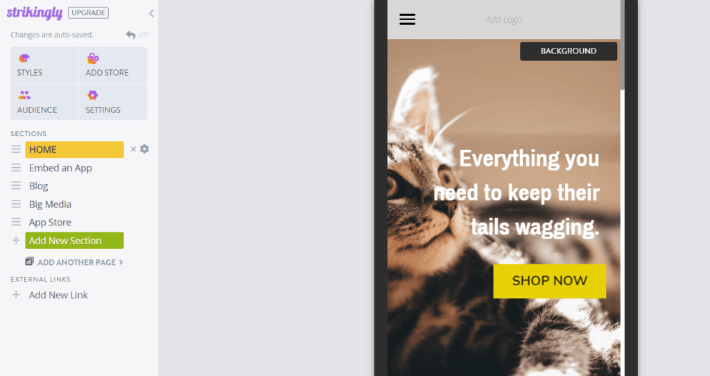
Switching templates is really easy with Strikingly and you can keep all of your site’s content when you switch. It takes just a few clicks to pick a theme, preview it, and install it on your site.
Open the Styles tab and you’ll see an option to change templates.
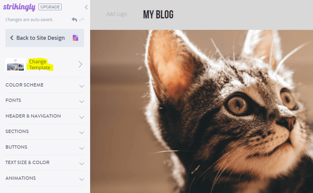
After you click on it, you’ll see a list of all the available templates and you can preview the changes before publishing them.
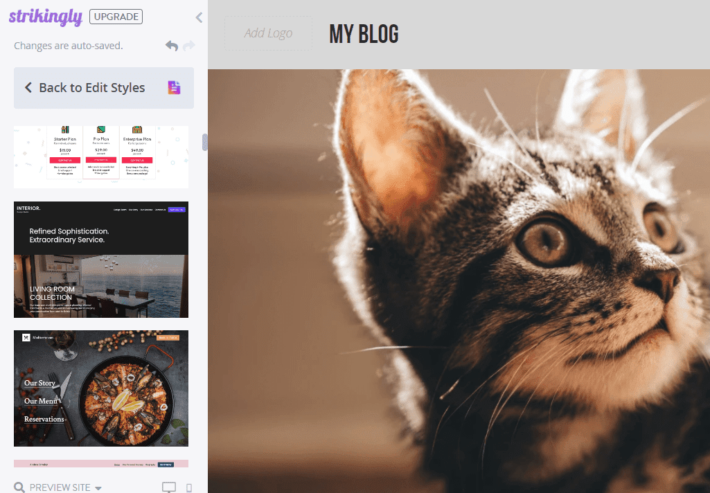
Simple enough, right?
You can see that your template choices are limited, but you have options for customization and the ability to switch between them in a snap.
Design flexibility: 1.5/5 – Strikingly is the second-least flexible option on our list, only beating Square Online by half a point.
You can’t use custom fonts or edit your theme’s HTML. You can’t even add scripts or HTML to your footer or header. It’s also not truly drag-and-drop, making it pretty difficult to actually make your site your own.
You do have some control over the style of individual elements. It’s not the most customizable but it’s also not the least customizable.
You can choose whatever color you want for buttons. You can also change the size of buttons as well. So, some things are more customizable on an individual level than others.
For example, you can only choose between a selection of colors that’s based on your site’s global colors. You can’t choose just whatever color you want.
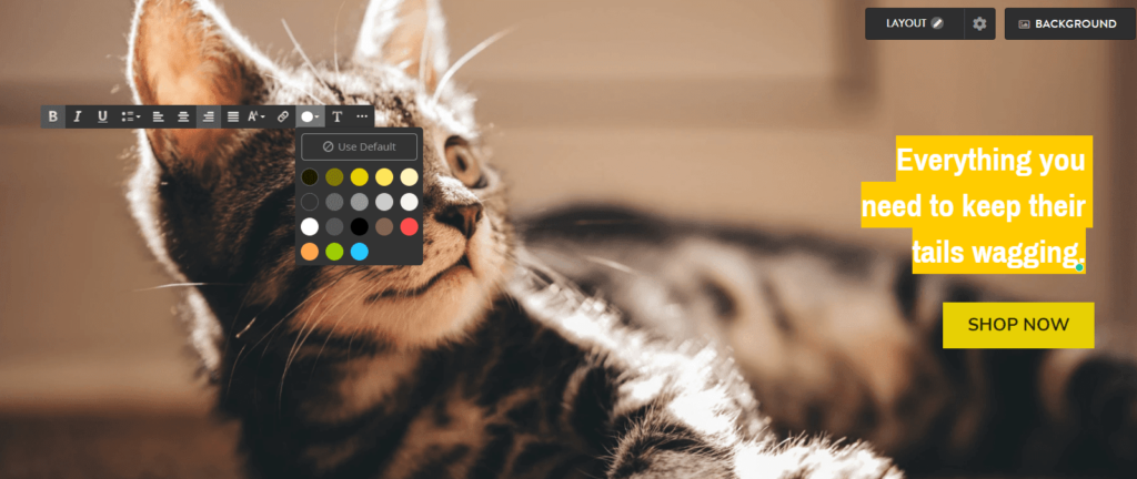
Adding to the limitation of design, Strikingly isn’t truly drag-and-drop.
You can’t place elements wherever you want and you’re restricted to predefined columns and sections. You can add a bit of variety to your layouts with spacers, but that’s about it.
You also have restricted customization within the layout adjustment. We gave Strikingly half a point for this because the layout of some of the elements are customizable whereas others are not.
If you click Add New Section and scroll all the way to the bottom, there’s an option to create your own section.
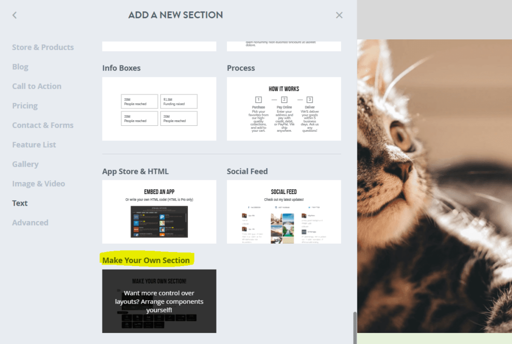
With this section type, you can add text, images, videos, buttons, signup forms, contact forms, featured products, an image card, a gallery, or a profile.
You can add as many elements as you want and arrange them in columns as well.
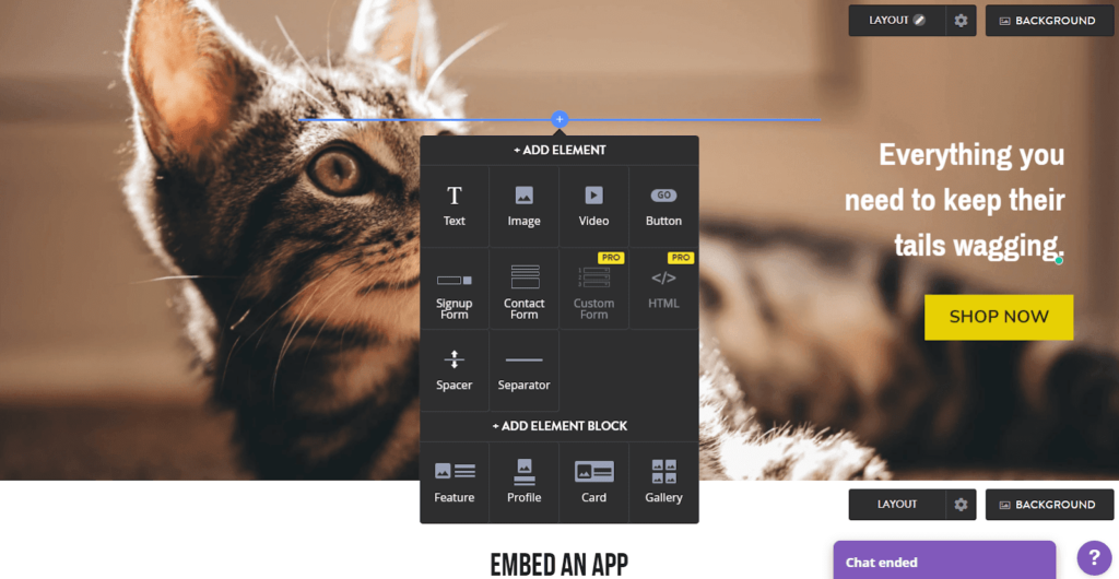
So with Strikingly, you get a little bit of customization, but not a lot. The platform is rigid, but allows you to bend the rules in certain ways.
Limitations: 1/5 – The limitations for Strikingly are plentiful on the free plan.
All free Strikingly sites display an ad in the bottom center. It’s not visible when someone first lands on your page, but as they start to scroll, the ad appears and stays at the bottom of the screen.
There’s also another ad at the very bottom of your footer.
But you don’t have any ads on your backend dashboard which is a good thing and also a common place for ads to show up with free hosting plans.
They do follow tradition with custom domains not being available for use in the free plan.
As far as speed goes, Strikingly is atrocious.
We always assume speed will be slower on free web hosting but Strikingly proved that beyond any of the others on our list, earning them the spot for slowest provider.
Their average load time after three separate speed tests was 3.17 seconds, a full second over Google’s recommended maximum of two seconds.
Two of our Pingdom tests were horrifically slow at 4.26 and 3.62 seconds. One test was much better at 1.62 seconds.
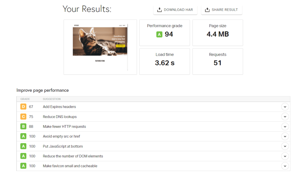
Many users won’t wait three seconds for a page to load, so this can drastically decrease your traffic.
Now, the good news is that once your site loads, your visitors don’t have to go anywhere else since your site is one page. But when they go to buy your product or service, they again might deal with slow processing.
Also remember our site is basic and not full with a ton of content and images like yours will be. So speed for your site might be even slower.
In closing, free plans all have limitations, some just have higher restrictions than others. Strikingly falls into the latter group. But it’s still a straightforward and truly free option for quickly putting up single-page sites for your marketing or product launch needs.
Get started on Strikingly’s free plan today.
Methodology for Choosing the Best Free Web Hosting
In order to properly judge free web hosting options, we had to change our testing approach from our other hosting reviews. We needed to put more focus on the site builders attached to free hosting providers.
This is a very different approach to the more traditional hosting metrics like speed, uptime, and—of course—pricing.
The best way to find out which free hosting platform works best was to jump in and do the work. Because there is no way to figure this stuff out for sure without doing it.
Sure, there are other ways but that involves copying others or guessing. At Crazy Egg, we’re appalled at the thought of that.
S,o we came up with our own testing structure that covers the top five most important things users want in free hosting.
How do we know what those are?
We combed through hundreds of reviews for the most-used free hosting providers.In doing so, we found what people were saying一what’s important and what can be ignored.
That’s how we found that functionality, ease of use, templates, design flexibility, and limitations are the hot button topics people looking for free web hosting care about.
This makes sense, because you can have all the features, designs, templates and even start easily一but if the platform doesn’t do what you need it to do it’s useless, right?
Our research shows that functionality and ease of use are the top considerations, followed closely by the number and quality of templates, their flexibility, and then the limitations inherent to free plans.
Let’s remember these are free options, so limitations come with the territory. But some free web hosting options have fewer restrictions than others.
We then weighted each criteria in order of importance to create a formula for each product’s overall score.
- Functionality (30%)
- Ease of use (25%)
- Templates (20%)
- Design flexibility (15%)
- Limitations (10%)
We did the research and spent time with each and every provider on this list, detailing what’s good and bad from our own perspective so we can tell you who offers the best free hosting for a variety of needs.
What Can You Actually Do with Your Free Hosting and Site?
So you found a free host for your website. Great.
But even though you’re not paying a dime for this platform, none of the other things we talk about below are useful without good functionality.
Just because it’s free does not mean you have to struggle or settle for an underwhelming experience.
We consider this the most important criteria, because it’s the foundation for everything else.
For instance, many reviews showed users were frustrated because they were limited to a one-page website.
When we tested providers, we judged their functionality on five important functions that cover the most common use cases for free hosting and site builders:
- Built-in payment processing and invoice creation
- Built-in marketing tools like email, ad management, and social media
- Manage event registrations for free or sell paid tickets
- Create a restaurant menu and let customers order either by phone or online
- Add an appointment booking system to your website for free
Each function scores one point for the provider.
When you are looking into a free web host provider, you want one that’s versatile and leaves room for lots of possibilities as your website or business grows or changes. A lesser provider will have one or two things, but doesn’t offer anything else to their free users.
It’s Free, But Is It Easy to Use?
One of the biggest drawbacks of free hosting is simplicity.
It lets you carve out a space for your businesses online with no risk of losing money. But can you do it in a way that doesn’t make you want to pull your hair out?
In our experience, any free platform needs to quickly benefit whoever’s using it, even if it’s for the first time.
In this category we look at five clearly defined criteria:
- There’s a helpful getting started checklist
- Customizing and updating your site is intuitive
- You’re able to upload and manage images and media
- There’s customer support if you need it
- It’s clear what you can and can’t do for free
Most of you want to be able to sit down, fire up your computer, and get started fast, right?
You want to actually build and customize your website with an editor that makes sense and is stress-free to use. We get it. It shouldn’t be clunky, confusing, or not as streamlined as it could be.
Plus, you don’t want to invest time building a site on a free platform, only to find that you need to pay something to finish what you started. That’s just sneaky.
With this article, you sidestep that problem.
Bottom line一if you don’t mind a little learning curve and figuring things out on your own, all of the hosts on our list are relatively easy to use.
You can’t really go wrong with any of them. But some of them clearly put everything out there for you to see and some require a little more digging and searching for things.
Designing is Hard一Avoid It With Killer Templates
Unless you have a design degree, you shouldn’t be spending countless hours designing your site. That’s why templates were created. They take the guesswork out creating something that grabs visitors’ eyes.
Good free hosting should come with a free site builder and templates you actually want to use.
And, honestly, no one cares if your website was free to make. They only care that your website looks dynamite and is functional.
So when we researched this for you, we looked at what everyone else building websites with zero experience said they wanted:
- There’s a wide range of templates for different use cases
- Every theme is modern, high-quality, and sleek out of the box
- Templates are easy to customize
- You can control how templates look on mobile
- You can switch templates easily
In some cases, templates look good out of the box but are actually poorly-designed, which makes them a pain in the butt to customize and edit.
So, it’s not as simple as it sounds.
Your host should have a huge variety of different templates for whatever type of site you are creating.
Three hosts offer a wide range of templates, one host offers a small range of templates, and one host only offers one template.

The theme of the template needs to be attention-grabbing, using modern day design techniques visitors find engaging. All templates should have options for customization, too.
Some can only be customized in terms of colors the provider offers, so you don’t get to really brand your site. And that’s extremely limiting.
We also did a great deal of reviewing on whether you can switch your design template easily.
If you choose a template that doesn’t end up working out, is it easy to switch to a different one? Or, If you can switch, do you get to keep all of your content or do you have to start over?
In a perfect world, you’d be able to keep all of your content and switch templates in one click.
Overall, we looked at every theme for every host in detail, so if there’s a possibility of choosing a poorly done theme, we know it, and the host loses a point for this section.
So What If It’s Free一Who Wants A Cookie-Cutter Site?
How much do the drag-and-drop editors help you make your website your own?
There were hundreds of reviews that mention people wished the templates had more flexibility. Having control over your design gives you the freedom to both tweak templates or make a blank site into what you imagined.
Since we spent so much time with each host, we know first-hand the benefit you get from having access to this kind of freedom. We signed up for each provider we recommended and built a site with each of them in order to really see how customizable each actually is.
At some point, you will need to make changes to your designs to accommodate your visitors一like adding a call to action button to boost sales or a signup form for your email list.
When you have a provider that already gives you customization flexibility, you save time, boost conversions because of better design, and can confidently test new website layout ideas at no cost to you.
Let us be clear, however—design flexibility is one of the well known tradeoffs of choosing free hosting providers. So, it plays a smaller role in the overall score for the host.
For design flexibility, We looked at five factors:
- Individual element style options
- Placing elements where you want
- Are you limited to pre-built sections without flexibility?
- Are you able to upload fonts of your choice?
- Can you actually edit your theme’s HTML/CSS?
If you’re hung up on what HTML and CSS are, they are computer languages. HTML creates the skeleton of every website on the internet and allows you to place your images, buttons and content anywhere on a webpage. While CSS (Cascade Style Sheets) is what creates the styling of any website or template you use.
Let’s face it, free platforms have limitations, but the more skilled you are with design and programming, the more control you will have.
We go so far as to tell you which providers allow you to control the size, color, feel, and size of single elements like a button or text box.
Four out of five hosts on our list give you a fair amount of control over the style of individual elements on your site, but one host does not.
Free Hosting Comes with Limitations
Having limits is the way most free plans work. Else, you would never pay for one.
But with our advice here at Crazy Egg, you can find out which providers allow you to stretch that free account to the limit.
Aside from design flexibility, there are a few really common restrictions with free hosting:
- Including ads on your site
- No support for a custom domain
- Limited number of pages you can build
- Ads in your backend dashboard
- Poor site speed
When there are ads on your site it’s an obvious indicator to visitors that you’re using free hosting. To some visitors, that may be a deal breaker and they may jump to another site. But it’s very common in free web hosting.
The big question is, how intrusive are the ads?
Some of the ads are more in your face than others, smack in the middle of your navigation bar, or stuck on the right side of the page as a sticky element, making the site look less professional.
So when any free host places ads like this on your site, the provider loses a point on our scorecard.
Four hosts on this list place ads on your website and one doesn’t.
When you have a custom domain, free hosts hate that because you take away from their advertising. Their company name usually follows your domain name for your free site.
So you’re usually stuck using a subdomain that has the name of your host in it (e.g. yoursitename.mystrikingly.com or yoursitename.weebly.com).
Not only does it look less professional but it’s also harder to remember. But in these cases you can’t use a custom domain. They don’t allow it. And many users find not being allowed to use it annoying.
Backend ads can ruin not only the experience you have when building your site but also how it slows your website speed down.
Now in order to keep free hosting free, several hosts advertise on your live site and in the dashboard you use when you manage the site. It’s how they make money.
We think it’s unsightly having to look at ads in your site dashboard as you work, plus your site speed takes a hit. Not only are these ads unsightly and annoying, they can also severely slow things down.
Fortunately only one host includes tons of ads in the backend but the other four don’t. Keep in mind though all four of them do place an ad on your live site.
The majority of the hosts on this list don’t let you connect your custom domain on the free plan. That tends to come with the territory.
But, surprisingly, one host does.
We also looked into which providers allow for building more than one page on their free plans. Tons of people complained about a specific host on this list only allowing one-page website builds.
What’s great is we found that four out of the five providers let you have as many pages as you want.
In our last criteria for limitations, we looked over site speed.
Your host plays a big role in how fast or slow your site loads. And since all of the hosts on our list are free, we assumed they’d all be pretty slow.
But we decided to check for ourselves to be sure, and we are glad we did.
We plugged each of our test sites into Pingdom’s site speed checker three separate times and took the average. A host gets a point for this section if the average load time was less than two seconds (per Google’s recommendation).
When it was all done we got stunning results. Two hosts came in under a second, two other hosts came in right under two seconds, and one host did really poorly coming in over three seconds.
Wix
Best for Most
With a free SSL certificate, dozens of templates, and an intuitive website builder included, Wix provides the most features and customization options of any free web hosting platform.
Summary
To get free hosting, you usually have to use a site builder.
Fortunately, free site builders can pack a lot of punch, making it easy to build and host your site for free.
Wix takes first place as the most well-rounded and easy-to-use free hosting option for anyone out there trying to start a website without paying for any hosting costs.
The best way to sell items online for free is to use Square Online.
Want full, limitless customization? Couple the free web hosting you get from InfinityFree with WordPress and take your free site in any direction your heart desires.
Strikingly is great for building a one-page product or marketing site, while Weebly is a great option for simple personal sites.


