I’m picky about what I subscribe to. I look at blogs and landing pages every day, and each one tries to capture my email address, but I don’t subscribe to them all.
I’m not playing hard to get.
Most often the site didn’t do a good enough job of capturing my attention and selling me on the benefits of subscribing. And I’m not talking about content here. I’ve read blogs that publish incredibly useful and in-depth content, but I still haven’t subscribed to them.
No, the problem here is the lead generation form, the means of capturing email addresses.
Building an email list requires a high converting lead generation form. Without it you might receive a lot of traffic but only a trickle of email addresses.
Now, high-converting lead generation forms have a number of components, all of which must be present to make the form effective. If you miss one or more of these components, your form isn’t optimized and you lose out on emails.
In this article we’re going to look at the various key elements of high-conversion lead generation forms, and how each element contributes to improving conversion rates.
[tweet_box design=”box_04″]#amreading: The Anatomy of a High Converting Lead Generation Form on @CrazyEgg[/tweet_box]
Placement
Sidebar, header, footer, popup: There are so many places your lead generation forms can go.
Conventional thinking is that they should be above the fold on your landing page. However, as we’ve seen many times before, you must always test it on your page. Let’s have a look at two very different strategies and see how they worked for their respective sites.
Above The Fold
So here’s the logic. Anything above the fold gets the most number of eyeballs. The percentage of people who drop off increases as they scroll down the page.
That means placing the form above the fold will maximize its exposure.
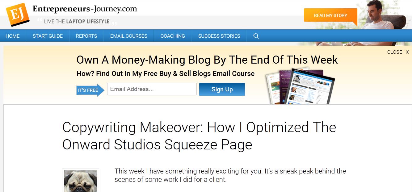
Entrepreneurs-journey.com is a good example of a form that is placed above the fold. It loads last when you land on the page, so you see the content first and then you see the form appear in the sub-header. The motion draws your attention to it.
Most landing pages follow the above-the-fold concept. If you’ve ever downloaded an ebook from Unbounce or Kissmetrics, you’ll see what I mean.
But just because it works for them, doesn’t mean it will work for you. Sometimes the opposite works best…
Below The Fold
Do you remember age-old marketing concept called AIDA?
There’s an epic scene from Glengarry Glen Ross where Alec Baldwin explains the concept. It stands for Attention, Interest, Desire, Action, and it is based on the idea that, before making a decision to take an action, a visitor has to be directed through a series of steps that grabs their attention and piques their interest.
By that logic, it means getting visitors to take action on your lead generation forms should be the last step on your landing page. Sacrilege!
Let’s see a real example of AIDA below.
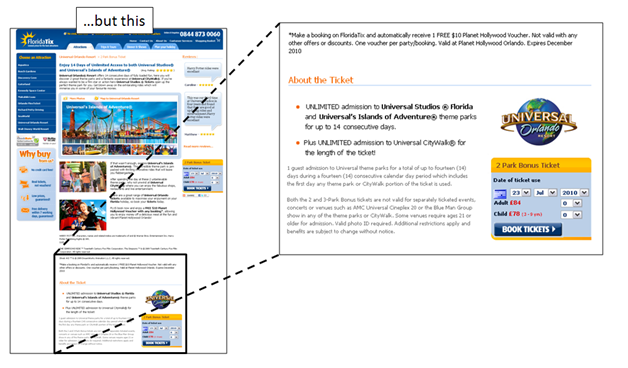
FloridaTix sells tickets to Universal Studios in Orlando on their website. The landing page used to look like any regular ecommerce page. You had a brief description on one side and a lead generation form on the other, all above the fold, with more details below.
However, when they tested shifting the form below and pushing the details up, they found a 20% increase in form submissions!
In their case, prospects were more inclined to submit the form because they read through the details of the offer first.
Many long-form sales pages use this concept. They give you paragraph after paragraph of detail first before they show you the lead generation form.
If you find that your forms aren’t converting above the fold, try the AIDA concept and test placing the form at the bottom of your page.
[tweet_box design=”box_07″]Remember, it’s not sacrilege to move your lead gen form below the fold. [/tweet_box]
Design
[tweet_dis]Design is more about making your form stand out than making it look pretty.[/tweet_dis] Sure, it needs to be pleasing to the eye, but if visitors can’t find the form at a glance, then you’re just making them work for it and that causes friction.
Let’s look at some common methods of designing forms.
Use Containers
Placing your form inside a container does two things. First, it catches the eye, especially if it’s a different color from the rest of your page. Second, it implies that the elements inside the box are part of the same group, and separate from elements surrounding it.
This helps distinguish between form and non-form elements on the page.
QuickSprout.com is a perfect example of an encapsulated form.
Since the rest of the page is white, it’s easy to see the lead generation form on the right side. You’ll also notice a subtle shadow near the bottom corners, giving the box a little popping effect, like it’s peeling off from the page. It’s just another way of catching attention.
Use Directional Cues
Directional cues also play a key role in improving conversion rates as it shows your website visitors where to focus next.
Like a traffic police directing cars, directional cues make sure your visitors are seeing the important elements of your page, in this case the lead generation form.
In the QuickSprout example, the header of the form points slightly towards the bottom where the form fields and CTA button are placed.
Here is another example of directional cues from The Art Institutes. The arrow placed at the top of the form directs attention towards the form fields and call to action below it.
Copy
Now that you’ve got eyeballs on the lead generation form, it’s time for some compelling copy. Capture visitors’ interest with an interesting headline and maybe some images, before you go into the details of your offer.
We’ve written enough about copywriting so let’s go into some tips and tricks to make your copy more compelling.
Increase Perceived Value
Many people assume, incorrectly, that in order to grow your email list it is necessary to offer something really huge to subscribers. The reality is that your offer doesn’t actually need to cost a lot. It just needs to be perceived as high-value.
Again, look at the copy on the QuickSprout form. Here’s the title of the form: Free Course: “Double Your Traffic in 30 Days” + Secret Bonus. (Valued at $300)
Of course, it doesn’t actually cost $300 to make each copy. And, contrary to what the image implies, it doesn’t actually come in CDs and books. It’s a digital product that you can view online. But, by specifying a dollar value, it increases the perceived value of the product.
The use of the word ‘FREE’ multiple times in the copy is intentional too. By signing up, you’re getting something that you’d normally pay $300 for. That sounds like a pretty good deal!
Solve A Real Problem
[tweet_dis]It’s not enough to give away something of high value if it doesn’t solve a problem.[/tweet_dis] At best your leads will be weak, and at worst you won’t get any leads at all.
For example, if you gave away a free iPod, you’d get anyone and everyone to subscribe. But are they really going to buy your products or services later? Probably not. They only came for the iPod.
On the other hand, if you give away something that solves a problem your audience has, that’s incredibly powerful. To those people, it’s better than a free iPod.
Go back to the QuickSprout example. The form copy promises to double or triple website traffic. That’s immensely more valuable than an iPod because it solves a real problem for marketers.
[tweet_box design=”box_07″]Your optin gift should have high perceived value BUT only to your best prospects.[/tweet_box]
Form Fields
Form fields are the greatest source of friction in lead generation forms (obviously) but they are unavoidable.
Here’s a genius idea. Create a browser plugin that stores values for common field names and inserts them into a form on click. I was actually working on something like this years ago while interning at Yahoo! Sadly it never saw the light of day.
Until we have one-click form fillers, we’ll have to make do with some best practices to reduce friction as much as we can. Here are a couple of tips.
Reduce The Number Of Fields
This seems obvious, but unfortunately it needs to be repeated.
When I was at the Unbounce conversion road trip this year, one of the presentations broke down the conversion rates of lead generation forms by number of fields. That forms with two fields converted the highest shouldn’t be surprising. What was surprising was that there were forms out there with as many as 90 fields (not a typo)!
After analyzing over 40,000 landing pages, Dan Zarrella at HubSpot found that conversion rates improve when unnecessary fields are eliminated. This makes sense because shorter forms are easier to fill.
When creating your lead generation forms, think about what fields you really need. Obviously an email field is required, but beyond that, you need to be careful about what information you’re asking for.
For example, studies show that [tweet_dis]asking for phone numbers can cause a 5% dip in conversion rates.[/tweet_dis] If a phone number is not absolutely crucial to your marketing strategy, you don’t need to ask for it. The same goes for addresses, zip codes, your dog’s name, and other fields that plague long forms.
Validate And Verify The Form Data
Sometimes, reducing the number of form fields can results in poor lead quality. For example, Iron Mountain, a B2B software company, discovered that just asking for a name and email address was not enough to qualify leads.
So instead of reducing the number of fields, they focused on improving the quality of leads by validating each field and making the purpose of the form clear.
This strategy helped them improve the number of qualified leads by 140%.
[tweet_box design=”box_07″]Optimize for your conversion goal. Otherwise, the results won’t matter.[/tweet_box]
Pre-Fill Form Fields
Who needs one-click form fillers when we’ve got zero-click form fillers! If you’ve downloaded more than one ebook from Hubspot, you’ve seen this in action.
Every time you download something, Hubspot’s lead-generation forms recognize you, automatically fill out the information you gave them previously, and then add on a couple of extra fields to collect further information.
I’ve downloaded so many resources from them that I’ve exhausted every question they can ask me, so all I have to do is click the CTA!
Call To Action
The CTA is the final step in your form. It’s the point of no return, and thus the point of hesitation for your visitors. Again, you want to make it compelling and pre-empt all lingering objections. There are a few things you can do.
Differentiate Your CTA
Make sure your users can easily identify your CTA. You want it to stand out so that it attracts attention and encourages clicks. Have a look at an example from Performable.
Performable wanted to figure out whether changing the color of a CTA button would make a difference to conversion rate. Initially, they had a green button that was consistent with the green branding on their site. They decided to test this against a red button.
At the end of the test, they found that the red button outperformed the green button by 21%.
Now this doesn’t mean red will always outperform green. It’s about using contrasting colors rather than colors that blend in. If your site already has a lot of red on it, try changing your CTA to a different color.
Go back to the QuickSprout example and look at the CTA again. You’ll notice it’s yellow, while the rest of the page has green, white and black.
Another thing you might have noticed in all the examples so far is that the CTA is always a button, as opposed to a link. Again, this separates it from other elements on your page and makes it clear that people need to click on it.
Make The Intention Of CTA Button Clear
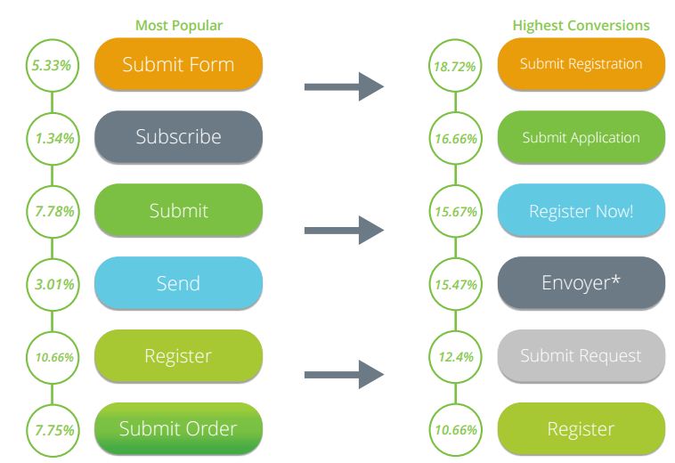
Formstack conducted a survey and found that little changes in button copy can increase conversion rates tremendously.
In addition, they also found that making your button copy clearer can double the conversion rate.
If you have a look at the button copy on the QuickSprout form, you’ll see that it’s much clearer than just saying “Subscribe.” The copy says, “Yes, Let’s start the FREE course,” reiterating that the course is free and that subscribers are not getting marketing emails but something valuable that will teach them a real skill.
Over To You
Your website and audience is different from the examples in this post. So, instead of blindly following the suggestions here, you need to test each one on your site. That being said, your form needs to have all 5 elements described here if you want to maximize conversions.
Which of the five elements do you think is the most important for lead generation forms? Share your thoughts with us.
And while you’re at it, check out other Crazy Egg posts by Sid.


