The call to action is where your blog makes money. All your idea generation, research, writing, editing, posting — it all boils down to a call to action — a CTA. If you don’t have a CTA, then your blog is not nearly as profitable as it could be. It’s time to make bank from your blog.
But what does a blog CTA look like, sound like? How is it different from a landing page CTA? Where is it located? What components does it have?
Blog CTAs are different. But they are still important. Unfortunately, there’s a deluded belief that blogs shouldn’t have CTAs. Wrong! Blogs are one of the most important places to put CTAs.
I wrote this blog to show you six of the most powerful CTAs in the industry. Each has a bunch of pros, plus a few cons. In an effort to be completely transparent, I’ve shown you both sides of the coin for each CTA.
1. Persistent header CTA.
The persistent header is one of my favorite CTAs. It’s a simple bar that appears at the top of the page. The great thing about it is that it remains at the top of the screen even if a user scrolls down. It racks up a ton of CTRs and conversions on my blog. I use the HelloBar by Crazy Egg.
Bufferapp uses the Hellobar on their blog, too. It’s similar to my Quicksprout bar.
Pros:
- It’s unobtrusive. Even though it is constantly present, it’s not obnoxious.
- It’s noticeable. The header bar usually has a contrasting color, making it different from the rest of the blog. Because it’s a single horizontal line, it’s very easy to read.
- It is located strategically. Eye-tracking studies show that the top of the page — the upper edge of above the fold — is the most-viewed piece of real estate on a web page. That means that the persistent header is in a strategic location for viewability and clickability.
- It never goes away. I like the idea of always having a CTA somewhere on the screen while the user is reading an article. If at any point during their action they want to convert, they can. The persistent header is right there, all the time.
Cons:
- It doesn’t contain much room for more words.
- It has limited design potential.
- After repeated viewing, it can become less noticeable.
2. Above-the-fold capture forms.
Every blog should have at least one capture form. My Quicksprout blog has three. My personal site has one. At the very least, include one capture form above the fold.
The above-the-fold capture form is different from the sidebar capture form (see below), because it appears in the main area of blog content — right where the article appears.
Buffer’s blog — which is very popular — has an above-the-fold capture form that is just huge. You don’t even get to see the article until you first scroll through the capture form.
Pros
- It creates a brief delay barrier to viewing the article that may improve conversions.
- It is a simple and direct path to conversion.
- It is highly relevant to the context.
Cons
- It can be slightly frustrating if someone wants to read the article. First, they have to scroll through the CTA.
- Because it appears before any content, it doesn’t have the same level of engagement that a user might have after he or she reads content.
3. Sidebar capture forms.
The sidebar is another perfect location for a good call to action. To be most effective, this CTA should be above the fold, and have a very short conversion process. A simple email capture should do the trick.
Funnelenvy.com has a subscription CTA for their sidebar capture form.
The sidebar on my blog is for a free course:
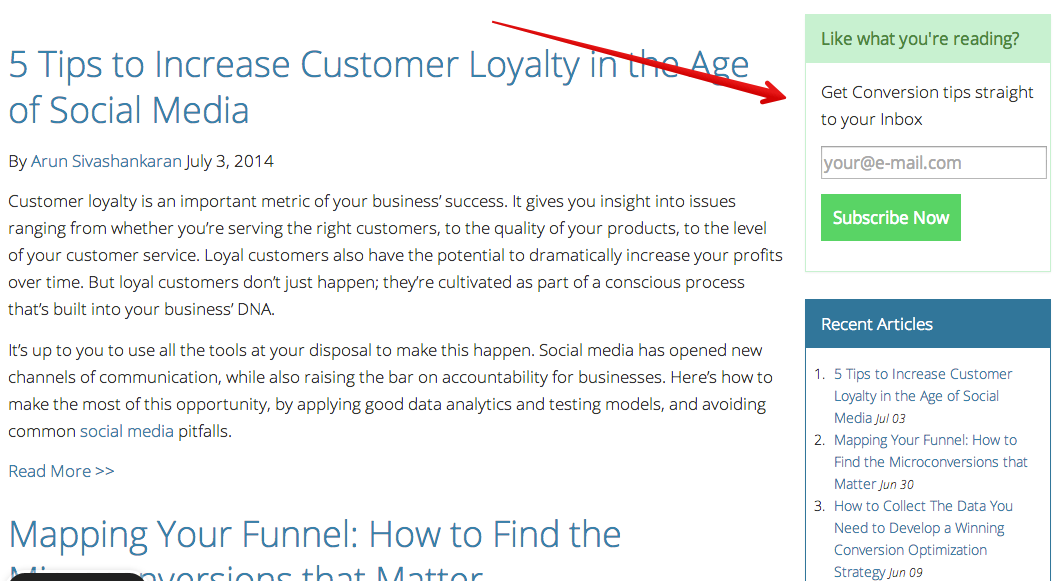
Conversion XL uses a subscription CTA.
Pros
- It provides a simple on-page capture form, creating a short path from reading the blog itself to the point of conversion.
- It is very relevant. The CTA aligns perfectly with the content that the user is reading.
- It is located in a high-visibility area of the blog.
- It does not detract from the user experience.
- It is easy to install. A simple WordPress plugin or sidebar widget does the trick.
- It has lots of room for design features. I use a colorful design scheme including headline, image, description, call to action statement, and email capture. Bonus: I use a yellow CTA button for maximum conversions.
Cons
- Once the user scrolls down away from the CTA, they are less likely to convert.
- It might receive fewer views due to “banner blindness,” in which users are cognitively trained to not notice at ad-centric portions of a Web page.
4. Sidebar ads.
If you’re featuring paid ads on your blog, you are reducing your user experience and maybe even damaging your SEO. Besides, who wants to provide ads to offsite locations? The revenue you might generate from these ads does not justify the risks.
Instead, include ads to your own products or services. These ads are much more appropriate on a blog, and they provide a better revenue source — your own product or service.
I use several of these on my blog:
Here are Hubspot’s sidebar ads:
Here’s what Buffer’s blog ad looks like:
Pros
- It keeps traffic onsite.
- It is an ideal space to throw in some design flair. I use images of Ben Huh and Michael Arrington to create some extra visibility. The photo is creative and curiosity-building.
- It is easy to design and add. Again, a quick design job and WordPress install are all you need to put this on your WordPress blog.
Cons
- It is part of the blog real estate that has lower areas of viewing and CTRs. Usually, these ads are positioned below the fold and lack the high-visibility of other CTAs. I don’t really see this as a problem, though. What would I rather have — an ad with possible conversions or just blank space? I would rather have the ad.
Bonus tip: Like the persistent header, you can create a persistent sidebar ad, too.
5. End-of-content CTA
CTAs are all about placement. That’s why I use the end-of-content CTA. This is a call to action that appears right at the end of the article. If a reader reaches the end of an article, they are engaged and ready to convert. Before the comments, trackbacks or anything else, I put a strong CTA in the view path. This is the largest of my CTAs and has the most content.
One of the reasons why this CTA is so valuable to me is because it provides lots of features — trust signals, anti-spam policy, capture form, value prop, image, headline, strong CTA button, etc. It’s my chance to really crank up the conversion power.
Here’s what it looks like:
Hubspot uses these in nearly all their blog articles. Their CTA appears after the last sentence. Usually, they use two CTAs!
Pros
- It can be as big (or small) as you want. I choose big, because this is a potentially high-value spot on the blog. Besides, it’s my last chance to score a conversion.
- Viewers who reach this point on a page are probably more engaged, and thus more likely to convert.
- It has lots of space for design features.
- It uses a capture form that gains both name and email address.
Cons
- The CTA may be frustrating to a user who simply wants to read the comments.
- The reader may stop at the end of the content, and not view the entire CTA. However, my tests have shown that most viewers do scroll to see the whole CTA.
6. Slider or popup capture form.
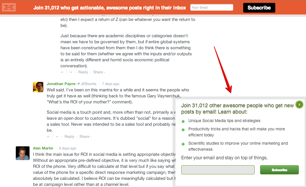
Slide-ins are a great way to capture leads, gain visibility, and snag some more conversions. A slider (or popup) capture form automatically enters the screen at a specific point in the user’s scroll path. It comes in halfway through the page, at the end of the article, or at the very bottom of the page.
Buffer’s CTA enters the screen once you scroll to the comments:
The slider on JeremySaid.com enters the screen about halfway through the article:
This is what Conversion XL’s looks like:
Pros
- It is attractive. At least it can be. As long as you’re doing good design, the slider is a great place for viewability.
- It is attention-grabbing. The motion of the slider on the screen makes it impossible to ignore.
- It has plenty of room for content and a compelling call to action.
Cons
- It can be annoying.
- It might cost. Unless you have some programming skills, a slider widget might cost some money.
Conclusion
The most successful blogs have lots of CTAs. They appear at the beginning, middle, and end of the content. The whole point of the blog isn’t merely to publish information around on the Internet, but rather to engage users with your brand, product, or service.
To do that, you need calls to action.
Obviously, you don’t have to use every CTA I’ve described in this article, but you should use several. If you don’t, you’re missing out on a huge source of revenue and conversions.
What is your highest-converting blog CTA?

