What do great salespeople have in common?
They’re great listeners and strong judges of character.
When faced with detail-oriented prospects, they morph into data nerds.
When faced with fast-moving prospects, they crank up the charm.
This is often loosely described as being ‘good with people,’ but there’s a more technical explanation.
It actually means that—whether they know it themselves or not—these salespeople are attuned to the 4 buyer modalities (buyer types), and they make adjustments on the fly according to the type of buyer they’re faced with.
But on the Web, this traditional salesperson doesn’t exist. Instead, we have mostly static landing pages, content and CTA buttons. The adaptability of a salesperson has been stripped away.
So how can you appease different buyer types in a digital environment?
By tailoring your copy and graphics to suit the 4 buyer modalities.
The whole point of buyer modalities is to gain insight on how buyers:
a) Approach purchasing decisions
b) Behave during a purchase
And once you understand the 4 buyer types, you’ll have an inside track on how your buyers are motivated, which can then inform some groundbreaking hypotheses for your A/B tests.
The 4 buyer modalities
First off, kudos to Angie Schottmuller for her outstanding presentation on buyer modalities at the first annual Unbounce Call-to-Action Conference.
In her presentation, Angie discussed concepts that were first introduced by Bryan and Jeffrey Eisenberg in Waiting for Your Cat to Bark.
The Eisenbergs argued that customers can be segmented into four fundamental buying types: competitive, spontaneous, methodical, and humanistic.
Buyer modalities are interesting because you’ll instantly recognize which category you fall under, and chuckle to yourself as you think of others you know.
Today’s discerning breed of customer makes buyer modalities especially important. Online customers cannot be accommodated with a one-size-fits-all approach—and the numbers prove it.
Forrester states that 83% of users won’t come back to a website if the experience doesn’t meet their expectations; they don’t like being treated as another spoke in the wheel.
All buyers are driven by one basic question: what it’s in it for me (WIIFM)? But their modality determines how they approach the purchase.
Competitive buying modality
Competitive buyers comprise 5–10% of the buying spectrum.
This type of buyer is driven to make smart and assertive decisions quickly; they see speed and decisiveness as a competitive advantage.
Competitive buyers are driven by achievement, and they see knowledge as a vehicle to achievement. They strive for recognition and employ goal-driven techniques to make this happen.
Competitives are often independent and seek to control in important situations. They use this control to make fast, logic-based decisions.
If niceties or red tape are causing inefficiencies, expect competitives to object. As customers, they’ll be quick to tell you if they don’t like the way you do things.
Capturing the competitive buyer
Competitives want to know your product is the best. They’ve usually done their homework, so make sure you can use logic to convince them why they should choose you.
Your best approach with competitive buyers is to provide proof, rational probabilities, and avoid unsubstantiated claims.
Appeal to their inner competitor. The advantages you offer—and therefore the advantages they’ll benefit from—must be stressed.
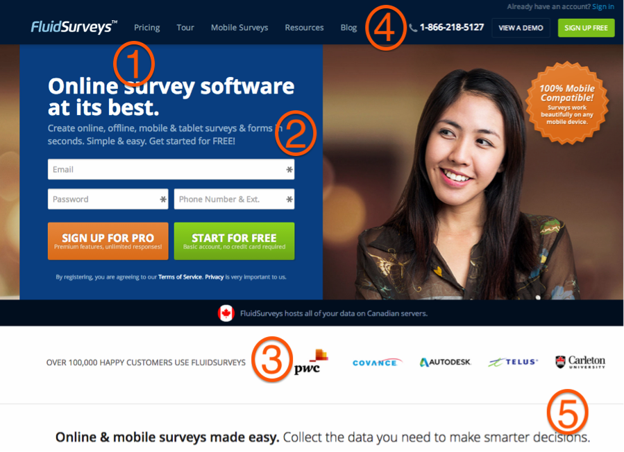
Here’s a good example of a competitive-focused landing page from FluidSurveys.com
- The headline conveys a classic “best” angle that appeals to competitives
- The subheader conveys clear advantages: “Create online, offline, mobile & tablet surveys & forms in seconds”
- A healthy dose of social proof to substantiate the claims
- Background information provides the educational resources competitives value
- Use of the phrase “smarter decisions” appeals to competitive motivations
Methodical buying modality
At 45%, methodicals make up the largest segment in the buying modality spectrum.
Methodical buyers focus on reviewing all data and available information; they’re in no rush and feel uncomfortable making quick decisions.
These buyers do research, ask questions, and will go to great lengths to get all the information they want. Make sure you’ve got nothing to hide, because they won’t feel comfortable making a decision until all the cards are on the table.
Logic rules all with methodical buyers. They need to know every detail and are willing to conduct thorough research. They prefer side-by-side comparisons when considering products, and trust expert opinions.
Capturing the methodical buyer
Your best approach with methodical buyers is to nail the hard evidence:
- Use hard numbers whenever possible
- Provide reputable trust badges
- Watch the fine print; they’re likely to read it
- Don’t ask for too much information
Never say anything you can’t back up. Any dishonest claims will repel them from your site. To appease them, you’ll need to back up every claim with full details.
Here’s an example of a methodical-focused landing page from Highrise:
- Though light on specifics, the headline sets up a clear need that could appeal to methodical buyers. And serves as a testimonial from a real buyer as well—the image goes to further prove the authenticity of the testimonial
- A clickable link on the testimonial gives methodicals an avenue to dig into the background and verify claims.
- Hard numbers on the capacity of the Highrise service.
- More specifics on what the service provides.
- A clear screenshot of the product to help illustrate the claims.
- A final dose of hard data that will appeal to methodical buyers.
Finally, don’t bother with the contests, time-sensitive discounts or free shipping offers. If anything, such offers build skepticism in the methodical buyer.
Spontaneous buying modality
This modality comprises roughly 25–35% of the buying spectrum, making it the second largest segment.
Spontaneous buyers delight in quick purchases with perceived emotional benefits rather than following logic. Their decisions are driven by feelings.
This type of buyer craves the feeling of tackling something new and interesting, preferably in a setting with plenty of social interaction.
Like competitive buyers, spontaneous buyers make decisions quickly, but that’s where the similarities end.
Rather than following strict logic, spontaneous buyers make decisions based on feelings. This often leads them to exhibit the following characteristics:
- Subjective decision-making
- Distraction
- Distaste for traditional processes
- General impatience during purchasing decisions
Capturing the spontaneous buyer
Spontaneous buyers move quickly, and your website better keep up. If you’re boring, they’ll be gone.
A healthy dose of urgency is advisable. They respond quickly to sales, discounts, and time-sensitive offers (such as free overnight shipping).
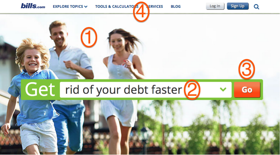
Bills.com does an excellent job of appealing to the spontaneous buyer:
- Strong imagery of excited people
- An appeal to the speed motivation of spontaneous buyers
- A strong sense of urgency in the CTA
- Background information to appeal to more logic-driven buyers
Address their needs immediately; never make them wait. If rationality has to suffer because of this, so be it.
Get excited. If you’re not excited, they won’t be. Use details sparingly. If they’re not highly relevant, leave them out.
Humanistic buying modality
Humanistic buyers are driven by emotion. They comprise 10–15% of the total buying spectrum, but are thought to be the fastest growing segment.
Naturally, things that affect human emotion are known to sway their decisions: creativity, storytelling, rich media, social belonging, and helping others.
Humanists care greatly about the people around them. The emotion behind their decisions drives these primary motivations:
- A desire to help others
- An interest in social well-being
- A need for ethical approval from peers
There are several trends feeding the growth of this buyer modality. The Web has given rise to a new breed of ‘social’ customer that aligns her values, beliefs and ethos with likeminded companies.
Technology has equipped humanistic buyers with the tools to align their values with brands long before entering the sales funnel. They want to understand whom they’re buying from.
Also, a greater awareness of sustainable development and social entrepreneurship is feeding growth in this segment.
Capturing the humanistic buyer
Capturing the humanistic buyer can be quite valuable for organizations, as given their predispositions, these buyers often become social ambassadors.
Your best approach with humanistic buyers is to focus on social proof; testimonials, photos of customers and staff all work, and work even better if spun into a creative presentation. Faces are key.
Belvedere’s campaign in association with (Red)—a fund that supports HIV/AIDS research in Africa—displays obvious humanist appeal:
You want to get social with humanistic buyers. Let them vote on reviews, interact with other users, and facilitate discussions. User-submitted videos and photos can work, as do live chats with company representatives.
Putting it all together: What type of buyer visits your site?
So here’s the rub: you can’t segment your incoming traffic according to buyer modalities.
That said, you can make some safe assumptions about who’s visiting your site:
- If you’re selling last-minute getaways, chances are spontaneous buyers make up a good portion of your visitors
- If you’re selling telescopes, methodicals likely make up the lion’s share
- If you’re pushing donations for an environmental cause, humanistic buyers are your best bet
But since people from each buyer modality will visit your site, your best bet is to:
- Account for all 4 within your copy and graphics
- Focus your messaging on what you believe is the dominant buyer modality of your visitors
- Test variations of your messaging that focus on different buyer modalities
So how do we appease all 4 modalities without leaving anyone out, or worse, alienating a particular group?
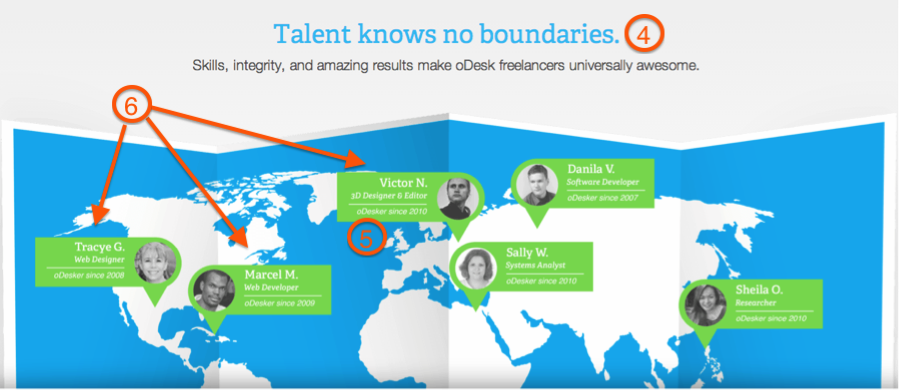
Odesk’s homepage is a masterful example of reaching out all 4 modalities in careful balance:
In the hero section:
- Competitive and methodical appeal through use of specific claims in the subhead
- Spontaneous appeal with the headline “Get more done” and an urgent the urgent CTA “Post a Job!” which allows visitors to instantly take action
- Humanistic appeal through bright, smiling faces and naming the freelancers specifically
Below the fold:
- Competitive appeal by talking up how skilled, talented and “awesome” Odesk professionals are, plus the excellent subheader “Talent knows no boundaries”
- Methodical appeal by indicating how long each freelancer has been an Odesk professional
- Humanistic appeal by naming specific freelancers and showing faces, in addition to identifying where freelancers are located
And in the social proof section, Odesk appeals to all 4 modalities with specific, referenced testimonials that convey clear benefits, while also allowing visitors to investigate the source.
Testing your modality-driven messaging
So once you’ve developed messaging targeted at one or all of the buyer modalities, it’s time to test it out.
Like any value proposition, the best place to test messaging is on landing pages or homepages, but checkout pages can also yield good results.
Another excellent place to test modality-driven messaging is within the text of an exit pop-up (exit overlay).
Since exit pop-ups activate only when users begin to abandon your site, they’re fertile ground for messaging targeted specifically at users who weren’t sold by your landing page/homepage copy.

An exit pop-up on XeroShoes.com—targeted at methodical and competitive buyers—and activated only when an abandoning visitor is detected
Pop-ups sometimes get a bad rap, but when executed properly, they can generate outstanding results.
Wherever you decide to test your modality-driven messaging, remember that every great test starts with a strong hypothesis. Use a combination of data and intuition to guess what type of buyer visits your site, then use buyer modalities to predict their behavior.
Takeaways
- The purpose of identifying buyer modalities is to gain insight on how buyers approach purchasing decisions, and how they behave during a purchase
- Ultimately, it’s important to appeal to all 4 modalities within digital experiences, but some sites appeal more to certain buyer types
- Marketers should hypothesize the type of buyer making up the majority of their visitors, then test these hypotheses on landing pages, homepages, checkout pages, and exit pop-ups
If conversions are low, or if you want to target users with more precision, buyer modalities may be key. It can also add that missing element that a one-on-one sales presentation provides—the ability to speak directly to buyers based on their approach to the purchase.
Which modality seems to fit your ideal customers, and how are you speaking to them to increase engagement and conversions?


