You’re planning a new business. You’re excited. You’re almost ready.
You need to pick a color scheme.
Before you do a scornful snort-laugh, hang on a sec. Color is important. As many marketers will tell you, color psychology has an enormous impact on how people perceive your business, how they respond to your marketing, and how they interact with you and your product.
Believe it or not, color choice is a big factor in the success of your business. I’m going to tell you a few of the facts behind the science of color psychology that will help you pick a color scheme for your new online business.
In this article, I consider three of the most popular color choices — blue, green, and orange. If you’re angling in on either of these three colors, you need to know a few things.
Color is important.
Let me start out with the premise that underlies this whole article: Color is important.
According to research, 85% of shoppers indicate that color is the primary reason why they buy a certain product. This holds true for everything from cars to shoes, but color as a psychological factor plays a role in non-material goods, too.
In what way does this happen? Brand recognition for one. Color alone is 80% of brand recognition, which is inextricably tied to consumer confidence.
But what about your online business? How does color affect online conversions? In more ways than you think. 42% of shoppers form an opinion of a website based on its design, including color scheme. What’s more, 52% of shoppers do not visit a website again if they don’t like its aesthetics. (Stats from Kissmetrics.)
Color, for reasons that neuroscientists are still discovering, possesses the ability to attract individual types, change preferences, and alter behavior.
Here are the characteristics of blue, green, and orange, three of the top colors for websites.
Blue is safe.
The safest color scheme is blue. Any shade of blue works, and any combination of blue in the color scheme is effective.
What do I mean by “safe?” I mean two different things.
- Safe = Blue is the favorite color of the majority of the population, regardless of gender, age, etc.
- Safe = Blue is a color that people associate with trust, authority, and reliability.
There is safety in numbers, and the numbers show that more people like the color blue than any other color.
A full 57% of men and 35% of women declared that blue was their favorite color. By an overwhelming margin, participants chose the color blue as their preferred hue. The closest runner up was purple (for women), which still lagged by 52% after the first choice of blue.
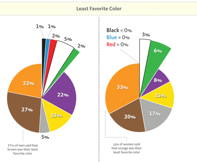
To look at the issue negatively, virtually no one dislikes blue. According to survey data, only 1% of men said that blue was their least favorite color, and 0% of women said that it was their least favorite color.
Why is blue so popular? Theories run the gamut. Some point upward, indicating that the blue of clear skies (safe weather) or the ocean (reflecting the safe skies) make us think of safety, trust, and authority, leading us to prefer the color blue above all other colors.
A lot of sites go with this safe approach.
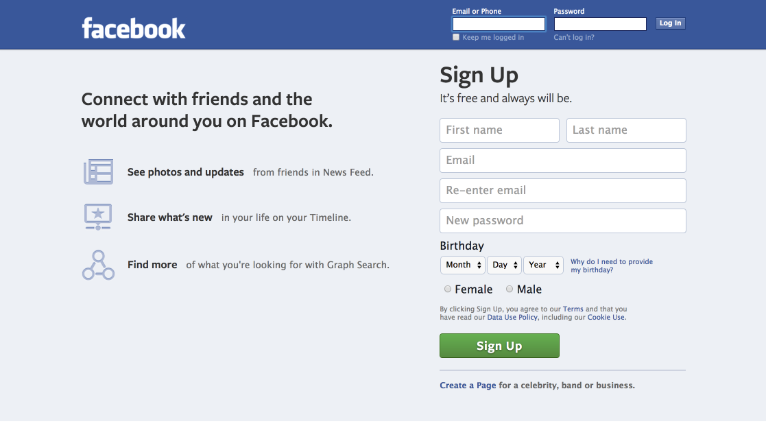
Facebook is a familiar shade of blue.
Twitter is blue, too.
And, yep, even LinkedIn likes the color blue.
Wal-Mart — the world’s largest brick-and-mortar retailer — also chooses blue.
A lot of banks use blue, too. The main color of Citibank is blue, with a bright red splash.
Bank of America has red, but the main color emphasis in their text is blue.
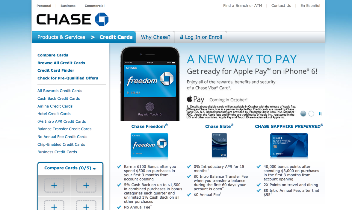
Chase Bank uses a blue website and logo.
Many companies, especially those that are in industries where trust and authority are indispensable, use a lot of blue. The following is a landing page for First American Home Warranty.
USAA, the United Services Automobile Association is a major insurance provider. Their websites are dominated by blue.
New York Life, one of the nation’s premier life insurance companies uses the well-known blue box logo.
We used blue at Kissmetrics to establish ourselves as a trusted provider of analytics and reporting. Although our logo is multi-colored, we chose a blue-schemed site.
To sum it up, you can’t really go wrong with blue. Sure, it’s used. Maybe it’s overused. But it’s still safe.
Karen Haller, an Applied Colour Psychology Specialist, writes this about the color blue:
Blue is the colour of the intellect, the mind, making it the colour of communication and when you think about social media, it’s all about communicating. Blue also has the perception as being trustworthy, dependable, safe and reliable. These are the perceived positive qualities of a business who chooses blue.
When to pick blue:
- Your business will only succeed if it has a high level of trust.
- You want to appeal to user’s intellect
- You will be appealing to a broad swath of users of both genders, many ages, and a diverse array of demographic features.
- You want to be safe.
Green is for growth.
The main meaning of green is growth. That’s the meaning that comes to most people’s minds when they consider the color green.
The reasons for this are obvious. Most plants are green. Most plants grow.
Green has another upside. It’s one of the easiest colors for the human eye to process. When people think green, they automatically think healthy, vibrant, growing, and natural.
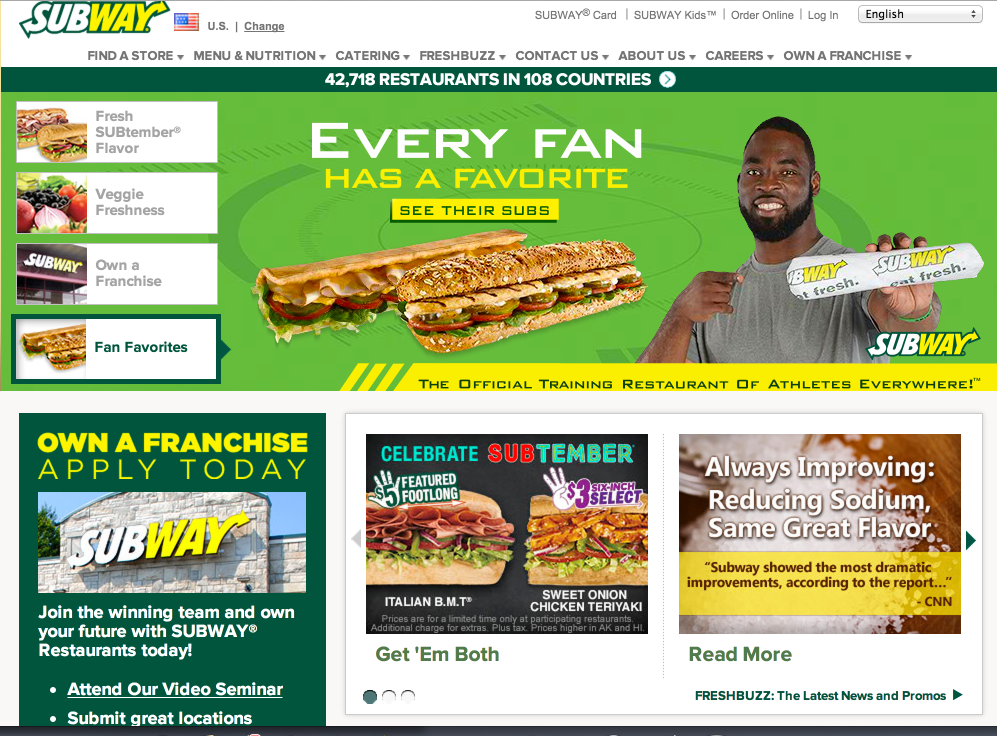
Subway, whose branding revolves around their being a healthy fast food alternative, uses green in their logo and on their website.
My blog, Quicksprout, is all about the idea of growth — growing your business, your presence, your company. Even the name, Quicksprout, suggests growth. I use green everywhere on the site. I want to consistently push the growth idea in any way that I can.
Performable was a marketing automation company (bought out by Hubspot in 2011). They used the green star as their logo, which played into their branding as a company that creates and inspires growth.
Image from Hubspot.
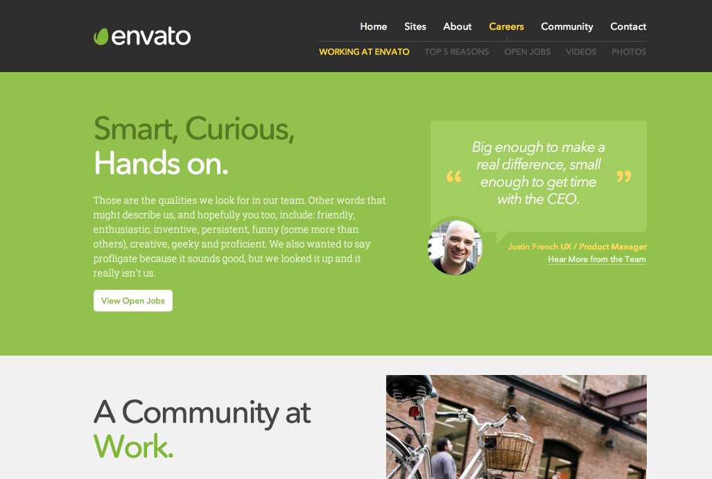
Envato uses the color green to appeal to their target audience of startups. Their approach is to attract users who want to jump start their businesses with early-on growth.
Some of the world’s biggest and most famous brands use green to promote certain ideas and sensations.
When to pick green:
- You want to advance the idea of health
- You want to advance the idea of growth
- You want to create a feeling of wellness or freshness
- Your company has anything to do with food, health, or nature
Use orange with extreme caution.
Orange is one of those colors that’s a bit dangerous. In fact, some color psychologists say that the color orange is, of all the colors, most closely associated with risk-taking.
Why is it a dangerous and risky color? Scientists aren’t totally sure, but we have been trained to see certain things and think “Wait This is a potentially dangerous situation!”
Hunters wear orange vests to, ideally, avoid getting shot at. And construction workers in dangerous situations also wear orange vests.
Not many brands and colors use orange, but those who do, have a clear intention. The idea is always energy, vibrancy, excitement, and sometimes a little risk.
The Home Depot appeals to the adventure-taking crowd of DIYers. Their color of their logo effectively plays into this philosophy.
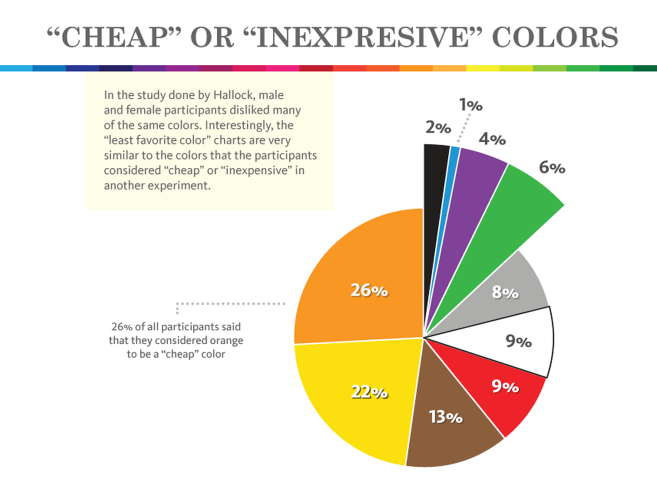
There are some potential downsides to using orange. For one, it’s considered a “cheap” color. Forbes first hypothesized this in a 1991, article, and surveys confirm this. Nearly a quarter of all respondents called orange a cheap color.
Business psychology writer Amy Morin tactfully expressed the “cheap” connotation of orange by expressing it this way: “People associate the color orange with a good value.” And by “good value,” she’s not talking about high-end quality.
Washington Post columnist Jeff Turrentine made a tormented attempt to redeem orange from its stature as an unsavory color. He commented that, “there’s nothing really wrong with bright orange,” but admitted that it has “almost vulgar origins.”
Whatever your intent with origin, be careful.
Hootsuite’s logo color is orange.
However, in the majority of their online presence, they don’t use their primary logo color. Instead, the logo is black, and the main color, at least on their homepage, is green.
Nonetheless, many companies have used it with some apparent success.
Hubspot is one company that doesn’t hide their orange branding.
Although orange isn’t a favored color or logo scheme, it is a great CTA color. If you’ll notice, a lot of effective CTA buttons are orange.
When to use orange:
- You want to inspire a sense of adventure
- You want to encourage risk taking
- You want to emphasize inexpensive products
Conclusion
When considering colors for websites, green and blue are great choices. Orange is a risky one. Whatever you choose, make sure you thoroughly understand the way that people will respond to the color.
Once you pick a color scheme, it’s hard to go back. Give it a lot of thought, because, like I said in my introduction, color is important.
What color are you choosing for your online business? Why?


