Starbucks, BMW, Wells Fargo.
These are world-class brands with high-dollar budgets. And their websites don’t disappoint.
Let’s take a look at the design elements on ten of the most powerful brands in the world.
1. Apple
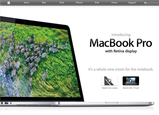
Apple’s design aesthetic has influenced modern web design significantly. It focuses on large areas of white space and big margins in honing in on single areas of content. Its homepage features a large product shot with single tagline and demo videos linked underneath. By not throwing everything at you at once, the design is welcoming and allows you to easily navigate throughout the pages. On subsequent pages, marketing copy is oftentimes broken up by clean icons that give color to an otherwise plain design, The site also employs HTML5 and new web standards, a necessity for this innovative company.
2. Amazon.com
Amazon.com has built their user experience around trying to increase the likelihood of visitors making online purchases. On the homepage, distinct elements make this achievable, such as a prominent search bar as well as the ability to shop by department on the upper left hand side of the screen. Also of note is how the shopping experience is customized to the individuals preferences – the main content on the homepage is based on how the user has interacted with the product search feature. Besides this, elements that aide in the shopping experience, such as the shopping cart, stand out due to subtle gradients that give it a 3-d effect.
3. Starbucks
Starbucks utilizes an interactive slideshow of videos to market their latest products and social efforts. These messages play a more dominant role in the marketing hierarchy and are thus given more screen real estate than the thumbnails below. Starbucks is a company that actively engages in social media efforts and links to these sites are easily accessed on the homepage.
4. Johnson & Johnson
Johnson & Johnson is a company that strives towards making people healthier and safer. As such, there is a lot to communicate on their website. They made great strides in organizing information through drop down navigation, while dedicating the slideshow on the homepage to case studies of their environmental and social initiatives.
5. BMW
BMW prides itself in not being a typical car company. We are immediately shown the results of their labor on the homepage in form of high quality photography and a professional animation. While the site is easy to navigate, they could enhance their branding by making their logo a pivotal part of the design. As of now, it’s placed unconventionally in the top right and given a minimal size.
6. Intel
Intel creates a rich user experience on their homepage through the use of a full screen slideshow generated by the visitor. This is a modern trend in web design and executed very well on the Intel website through the use of creative yet professional photography. A simple menu link reveals a hidden navigation which allows the homepage to retain a clean appearance free of excess text. If you miss the navigation a prominent search field makes getting around the site quick and efficient.
7. Wells Fargo
The website for Wells Fargo takes a user-friendly approach in garnering the trust it needs to acquire and retain customers. The simple, grid-based design contains a tabbed navigation for easy navigation in addition to a well-placed log-in area.
8. Ralph Lauren
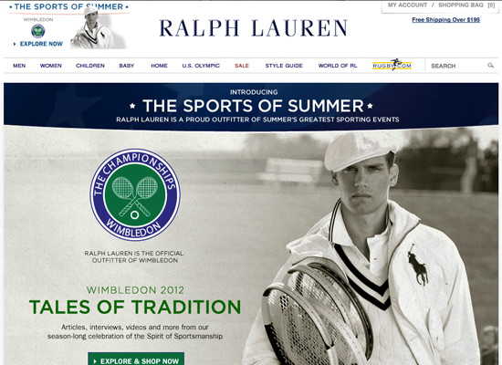
Photography and product/model images play an important role in any e-commerce website, and this is no different for Ralph Lauren. The interactive website allows you to shop based on the sports of summer, explore style and culture in RL magazine, and find one-of-a-kind vintage pieces.
9. St. Jude Medical
St. Jude Medical is committed to advancing the practice of medicine by reducing the risk whenever possible. The immediate impression the website generates is that it’s a forward-thinking company. A clean, slick interface along with a vibrant slideshow of latest products draw the visitor in. Subsequent inside pages feature photography of patients along with a quote of how the company helped them. This approach helps humanize an organization that may otherwise be considered scientific and cold.
10. Costco Wholesale
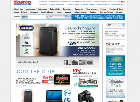
The website for Costco includes links to specific sections openly in the navigation to find what your looking for quickly. Current offers are showcased in a slideshow which dominates a majority of the page. Other prominent sections, Join the Club and Warehouse Offers, links you’d look for on a site of this variety, are given equal weight. Inside pages allow you the option of sorting through items by a variety of filters which aides in navigability.
What do you find interesting about the design of these big brand websites?


